

You are using an out of date browser. It may not display this or other websites correctly.
You should upgrade or use an alternative browser.
You should upgrade or use an alternative browser.
Marts 52 for 2011 Week 20-Promise - Another Added
- Thread starter Marts
- Start date

OP
- Messages
- 737
- Name
- Martin
- Edit My Images
- Yes
Hiya Martin
Good boy
As for this weeks photo, I like the idea as some of these crosswords can be very hard. Pity you didn't get the 27 across in the shot, and the pen pointing to the word, that would have been great.
As has been mentioned about the crop, I agree.
Otherwise it is a nice clear shot.
Well done
Now I have to put my thinking cap on for this one, have been toying with some ideas today, but feel a bit lost for inspiration on this one so it may take me a day or two to come up with something.
Cheers
Dawn")

Hello Dawn.
Thanks for stopping by and commenting. @posiview was actually winding me up about 27 Across being "Hard". I could have put it in anyway, like you say with the pen pointing, but it only needs some anally retentive to point out that I have got 27 Across wrong
 . The answers I did complete were right btw, but they were the only ones I got.
 With regards the crop. Its a mistake I keep making. I am gonna have to start taking bigger framed shots and then cropping in PP. Learning slowly.
Martin
- Messages
- 2,175
- Name
- Neil
- Edit My Images
- No
11 across is better..............
Nice idea, and well composed, however using a blue pen would have added a bit of colour to an otherwise nearly monotone image. Nice shot though
I like the thinking.
It's comments like this that remind me to think longer about my shots.
Think about what could be better.
- Messages
- 229
- Name
- Mark
- Edit My Images
- Yes
I like this one. Very simple, uncluttered and the bold black of the crossword looks great in contrast to the white.
- Messages
- 7,694
- Name
- Tina
- Edit My Images
- Yes
Welcome to the challenge...so many taking part I'm randomly flailing about trying to view them all
I love your shots and can add no more to the critique that you have had; Agree with Dawn that after seeing your submission for 'open' I was a little concerned what you might have posted for this week
I love your shots and can add no more to the critique that you have had; Agree with Dawn that after seeing your submission for 'open' I was a little concerned what you might have posted for this week
OP
- Messages
- 737
- Name
- Martin
- Edit My Images
- Yes
Welcome to the challenge...so many taking part I'm randomly flailing about trying to view them all
I love your shots and can add no more to the critique that you have had; Agree with Dawn that after seeing your submission for 'open' I was a little concerned what you might have posted for this week
Thanks for dropping by and commenting. I did laugh when I saw what the theme was but wouldn't dare go there lol. not whilst I am still a newcomer here anyway
Martin
drodd
Also loves to mass debate
- Messages
- 5,519
- Name
- Dawn
- Edit My Images
- No
<snip>I did laugh when I saw what the theme was but wouldn't dare go there lol. not whilst I am still a newcomer here anyway
Martin
Don't worry, I have done one especially for you tonight .... whether I post it is another story
cheers
Dawn
Last edited:
OP
- Messages
- 737
- Name
- Martin
- Edit My Images
- Yes
drodd said:Don't worry, I have done one especially for you tonight .... whether I post it is another story
cheers
Dawn
I am ever so curious now Dawn. I just had a look for it (at 5.15 in the morning). I don't see it yet. Maybe you thought better of it lol
OP
- Messages
- 737
- Name
- Martin
- Edit My Images
- Yes
Why do we all keep nuts and bolts from discarded flat pack crap, when we know damn well we will never have a use for them
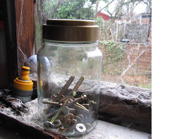
clutter by martinchargreaves, on Flickr
I found this weeks theme quite a challenge. I have messed about with lego scattered on the floor, footballs bursting out of a cupboard and allsorts. Finally decided upon the clutter that is my shed.
clutter by martinchargreaves, on Flickr
I found this weeks theme quite a challenge. I have messed about with lego scattered on the floor, footballs bursting out of a cupboard and allsorts. Finally decided upon the clutter that is my shed.

- Messages
- 6,704
- Name
- Colin
- Edit My Images
- No
Why do we all keep nuts and bolts from discarded flat pack crap, when we know damn well we will never have a use for them
You've answered why you keep them by taking this shot
Great idea.Now why do the rest of us keep nuts and bolts from discarded flat packs?

drodd
Also loves to mass debate
- Messages
- 5,519
- Name
- Dawn
- Edit My Images
- No
Hiya Martin,
Good question ..... I still wonder why I have all the nuts and bolts, etc, etc that were left over from the kitchen installation 6 years ago, although on the odd occasion I have found a need for a couple of the bolts.
You certainly have found a use for them for this theme, so well done.
There are quite a couple of cluttered cobwebs there too which adds to the image
Cheers
Dawn
OP
- Messages
- 737
- Name
- Martin
- Edit My Images
- Yes
Hiya Martin,
Good question ..... I still wonder why I have all the nuts and bolts, etc, etc that were left over from the kitchen installation 6 years ago, although on the odd occasion I have found a need for a couple of the bolts.
You certainly have found a use for them for this theme, so well done.
There are quite a couple of cluttered cobwebs there too which adds to the image
Cheers
Dawn
Hi Dawn,
I originally had the jar on a shelf to the left of the window, until I spotted the cobwebs- which said clutter to me. Nice that you appreciated them too
Martin
- Messages
- 1,310
- Name
- Amir
- Edit My Images
- Yes
Hard: LOVED this shot! The depth of field is great and the way you composed the picture really worked well IMHO. Really solid picture.
Clutter: I try to avoid looking at the submission for the week before i have taken my own shot. Grrrr I stumbled across yours though lol. I like the idea, and was thinking of doing something similar myself (I.e. bolts). I think I found the bright background a little distracting. Did you explore taking the photo in a dark and dusty corner with cobwebs? Maybe on a shelf with wood in the background.
Clutter: I try to avoid looking at the submission for the week before i have taken my own shot. Grrrr I stumbled across yours though lol. I like the idea, and was thinking of doing something similar myself (I.e. bolts). I think I found the bright background a little distracting. Did you explore taking the photo in a dark and dusty corner with cobwebs? Maybe on a shelf with wood in the background.
OP
- Messages
- 737
- Name
- Martin
- Edit My Images
- Yes
michael23 said:I quite like that picture Martin, well done!
Thanks for the encouraging comment Michael
Martin
OP
- Messages
- 737
- Name
- Martin
- Edit My Images
- Yes
Great take on this week's theme Martin, and as already posted above, I think we can all relate to it!
Thanks for stopping by, looking and commenting Sanna
Martin
OP
- Messages
- 737
- Name
- Martin
- Edit My Images
- Yes
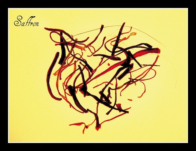
As soon as I saw the theme for this week I was stumped. Delicate implies fragile, weak , etc. and I thought it might demand a close up of something.
I wondered how I would get on without one of those new fangle dslr thingies with a macro lens doodah. Anyhow, I got as close in as I could with my retro kit. lol.
Trouble is I can't decide which image to go with, they might both be as bad as each other but I like them both for different reasons. They were taken in the same shoot, just with different methods.
Which one goes........You decide
Saffron
Delicate to handle, delicate flavouring....
Saffron
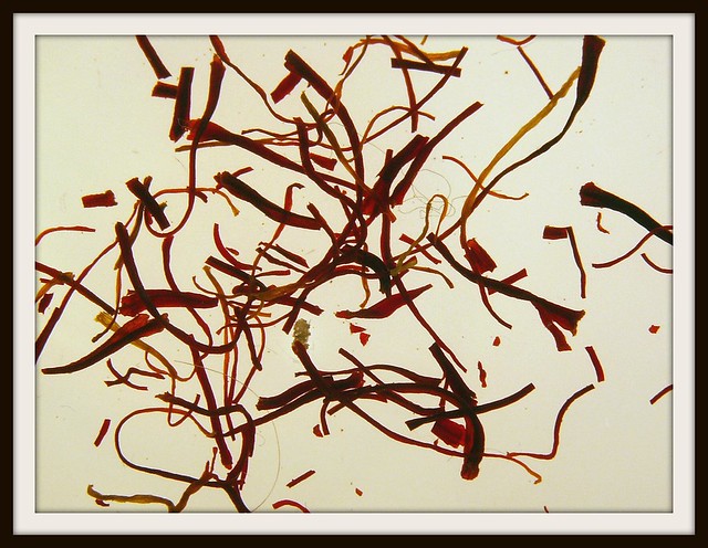
Saffron
I wondered how I would get on without one of those new fangle dslr thingies with a macro lens doodah. Anyhow, I got as close in as I could with my retro kit. lol.
Trouble is I can't decide which image to go with, they might both be as bad as each other but I like them both for different reasons. They were taken in the same shoot, just with different methods.
Which one goes........You decide
Saffron
Delicate to handle, delicate flavouring....
Saffron
Saffron
Last edited:
OP
- Messages
- 737
- Name
- Martin
- Edit My Images
- Yes
What is it with me! I've only just found out the word and you have defined and created images never mind posting!
The colours on #1 are warmer and so the saffron on it looks more saffrony! Not a good critique, apologies
No apologies needed Tina. Comment is comment and I appreciate you looking and I appreciate you commenting
. I prefer shot 1 but my other half preferred 2.Didn't you know that the word is now announced at around 17.30 on a Saturday rather than on a Sunday
Martin
- Messages
- 4,274
- Name
- Paul
- Edit My Images
- Yes
Hi Martin,
must say I prefer the layout of the saffron on image #2, but I do prefer the background colour of #1. Could maybe benefit from slightly better lighting (would make the strands a bit more 3 dimensional), but it's a great idea and very pleasing on the eye!
must say I prefer the layout of the saffron on image #2, but I do prefer the background colour of #1. Could maybe benefit from slightly better lighting (would make the strands a bit more 3 dimensional), but it's a great idea and very pleasing on the eye!
drodd
Also loves to mass debate
- Messages
- 5,519
- Name
- Dawn
- Edit My Images
- No
Hiya Martin,
Well done on getting your week 7 posted so quickly. Both are fanastic photos.
Even though I like both, I prefer the first one because of the colour of background and the way the saffron are positioned makes it look like an abstract art. I t also looks neat and tidy and I like the title and font your have chosen in the top left. Oh yes and the border compliments the image well.
Like the second one too, but it would have been interesting to see that with a similar background to the first. It looks a lot busier and the very fine strands of saffron look more like hair. Not sure if it would have also benefited from a similar border to the first.
Considering how much saffron costs, and the amount you have displayed, I'd say you have quite a healthy supply of saffron - I take it you use it a lot in your cooking.
These would be great hanging on the wall in a dinning room or restaurant.
Well done
Cheers
Dawn
- Messages
- 8,398
- Name
- Lynne
- Edit My Images
- Yes
Hi Martin
really like the 1st Saffron shot ,background color suits it ,the frame works really well , the writing fits perfectly & its set out in a pleasing shape ,great shot
The 2nd image seems a bit flat in comparison to the 1st ,sorry
really like the 1st Saffron shot ,background color suits it ,the frame works really well , the writing fits perfectly & its set out in a pleasing shape ,great shot
The 2nd image seems a bit flat in comparison to the 1st ,sorry
OP
- Messages
- 737
- Name
- Martin
- Edit My Images
- Yes
Hi Martin,
must say I prefer the layout of the saffron on image #2, but I do prefer the background colour of #1. Could maybe benefit from slightly better lighting (would make the strands a bit more 3 dimensional), but it's a great idea and very pleasing on the eye!
Thanks for stopping by Paul.
I agree with your comment regarding better lighting to give the strands some dimension. I was experimenting with back lighting with the saffron on a dish sitting on it, which as a consequence gave it a flat look.
Thanks
Martin