

You are using an out of date browser. It may not display this or other websites correctly.
You should upgrade or use an alternative browser.
You should upgrade or use an alternative browser.
rpn's 2011 Project 52 + Bonus Nature Added ***FINISH***
- Thread starter rpn
- Start date
- Messages
- 7,694
- Name
- Tina
- Edit My Images
- Yes
I love your clutter! An excellent take on the theme, I like the b&w presentation as it allows the viewer to concentrate on the various and many dishes!
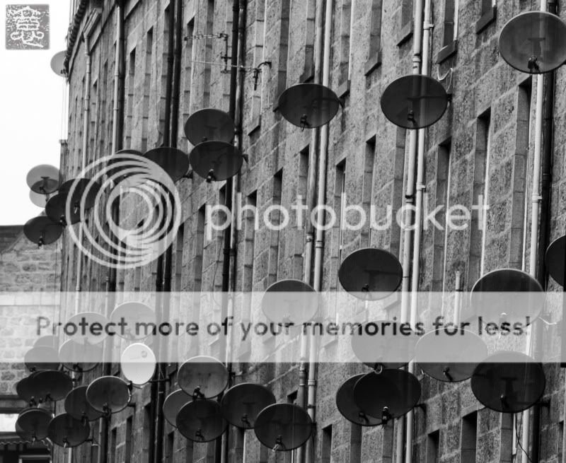
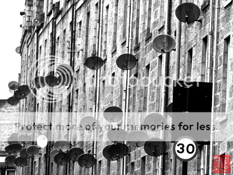
It might be improved by the back of the traffic light and the speed limit sign being removed, could it be taken without them in shot? Or would that be a job for Spiderman?
It might be improved by the back of the traffic light and the speed limit sign being removed, could it be taken without them in shot? Or would that be a job for Spiderman?
- Messages
- 8,398
- Name
- Lynne
- Edit My Images
- Yes
Hi rpn
thats a great shot for clutter & the B&W suits it perfectly")
thats a great shot for clutter & the B&W suits it perfectly
OP
- Messages
- 9,711
- Name
- Stan
- Edit My Images
- Yes
I'm really struggle this week and find the theme quite difficult. Doesn't help with long working hours again even finding time to think about different ideas :shake:
One of my other idea was a photo of a Delicatessen (playing with word here) shop front or the sign but the poor and wet weather put an end to that.
So I ended up with this one but I'm not entirely happy with it. So easy on me please. Will try to do better next week.
One of my other idea was a photo of a Delicatessen (playing with word here
) shop front or the sign but the poor and wet weather put an end to that.So I ended up with this one but I'm not entirely happy with it. So easy on me please.
Will try to do better next week.
- Messages
- 298
- Name
- Adie
- Edit My Images
- Yes
Hi,
I missed your clutter shot when first posted, and love the thought process in taking it. Depending on if you took a colour version, i think there is still another shot in there waiting to be viewed.
If your feeling like playing with the shot a bit more, try this:
The converging verticals are distracting, and need adjusting in PS.
The left side needs cropping to loose the other building and washed out sky.
Crop the top to just below the top right dish.
loose the red logo bottom right
leave in the signs, they add a juxtaposition, and point of reference.
Try and bring back a little more detail in the black sign (if possible)
Use adjustment levels in PS during the B&W conversion process to add more contrast, and less flat grey to make it a bit punchier.
Add a black and white thin border, to frame the shot.
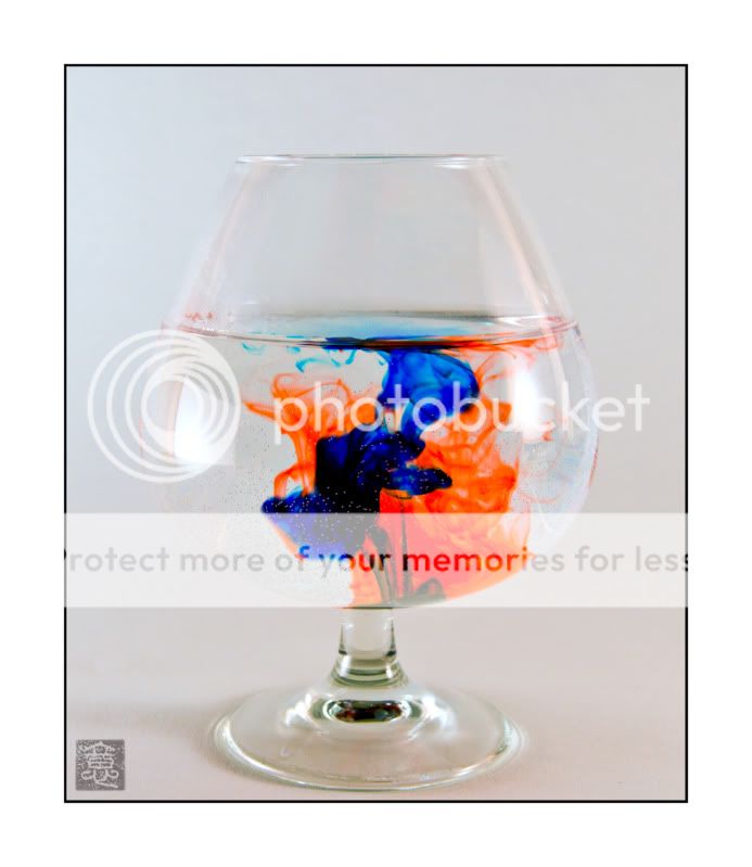
The delicate shot has some stunning elements, but also some distractions that take your eye away from the ink patterns.
The air bubbles on the side of the glass, the two hotspot light reflections, the red mark above the water line on the left of glass and the murky ink mixing one the water surface.
A brave attempt at a difficult shot, and in my opinion, so nearly there.
Rgds
Adie
I missed your clutter shot when first posted, and love the thought process in taking it. Depending on if you took a colour version, i think there is still another shot in there waiting to be viewed.
If your feeling like playing with the shot a bit more, try this:
The converging verticals are distracting, and need adjusting in PS.
The left side needs cropping to loose the other building and washed out sky.
Crop the top to just below the top right dish.
loose the red logo bottom right
leave in the signs, they add a juxtaposition, and point of reference.
Try and bring back a little more detail in the black sign (if possible)
Use adjustment levels in PS during the B&W conversion process to add more contrast, and less flat grey to make it a bit punchier.
Add a black and white thin border, to frame the shot.
The delicate shot has some stunning elements, but also some distractions that take your eye away from the ink patterns.
The air bubbles on the side of the glass, the two hotspot light reflections, the red mark above the water line on the left of glass and the murky ink mixing one the water surface.
A brave attempt at a difficult shot, and in my opinion, so nearly there.
Rgds
Adie
- Messages
- 1,764
- Edit My Images
- Yes
Hi mate
Just wanted to say LOVE the clutter shot idea... a great spot... You would think in areas like that they would have one dish for all... mind you if they had you would not get such a great image... That said... I thought you had maybe at first cloned more in in PP but then I seen a similar street myself today... It's mental...
Great work !
OP
- Messages
- 9,711
- Name
- Stan
- Edit My Images
- Yes
Thanks all for the kind comments. As said before I'm just a bit too busy with work currently to re-work or re-visit the theme photos.
However I'll try to re-process the Clutter theme taking on Adie's (Webby 962) comments and will re-take week 7 sometimes when work is quieter!
However I'll try to re-process the Clutter theme taking on Adie's (Webby 962) comments and will re-take week 7 sometimes when work is quieter!
OP
- Messages
- 9,711
- Name
- Stan
- Edit My Images
- Yes
I try not to fall behind and keep up with the weekly theme and here's my offer for this week. However, I'll be on leave the next two weeks, of course I'll have the camera with me so depends on the theme I may have to do a bit of catch up in a couple of weeks time.
This is one corner my work's car park on a better day but normally it's pretty 'CHAOS' with cars parked everywhere and any available gaps!
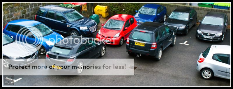
This is one corner my work's car park on a better day but normally it's pretty 'CHAOS' with cars parked everywhere and any available gaps!
- Messages
- 8,398
- Name
- Lynne
- Edit My Images
- Yes
Hi rpn
now why didn't I think of that idea :bang:
Simple but effective & bet the land rover driver was none too impressed !
Really like your delicate shot as well ,as said by Adie the reflections distract a touch but a brave shot to try & I think you've done really well with it
now why didn't I think of that idea :bang:
Simple but effective & bet the land rover driver was none too impressed !
Really like your delicate shot as well ,as said by Adie the reflections distract a touch but a brave shot to try & I think you've done really well with it
- Messages
- 2,735
- Name
- Patrick
- Edit My Images
- Yes
Some great shots in your thread.
The "clutter" is a great image trying to get out. The crop is definitely better, but it still needs more "punch". Adie's crit is great advice. But it's still a very eye-catching shot.
The "chaos" pic is also a great idea and grabs attention. The different car colours add to the shot. I'd be tempted to try some different crops - maybe chop out the two cars on the right and lose a little off the foreground.
Some really imaginative shots in your 52.
Patrick
Got a couple of ideas for this week's theme. But the problem is finding the time to take them and having to work 7:00 to 6:00 for 6 days a week in the past few weeks don't really help my cause. The other difficulties is trying to keep up with my main aim of taking on this project of going out with the camera as much as possible. So decided to take the camera to work and try to go out at lunch break to turn the ideas into photos.
Anyway I drive along this road often and always find it quite amuse with all these..... CLUTTER of satellite dishes
This is fantastic.
OP
- Messages
- 9,711
- Name
- Stan
- Edit My Images
- Yes
Thanks and very much appreciated for all the kind comments.
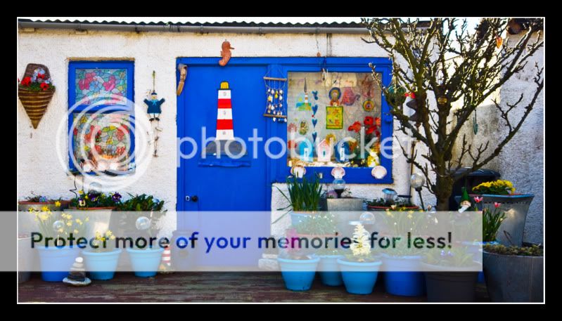
This week's theme been kind to me not that I have lots of ideas, far from it, the reason is that even though I'm on vacation I'm still manage to keep up to date with this project and I have to thanks my wife for this too since it's her idea for this photo.
She is very keen on Sudoku and here's one of her "Finish-ed" puzzle.
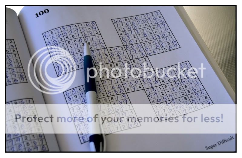
Last edited:

OP
- Messages
- 9,711
- Name
- Stan
- Edit My Images
- Yes
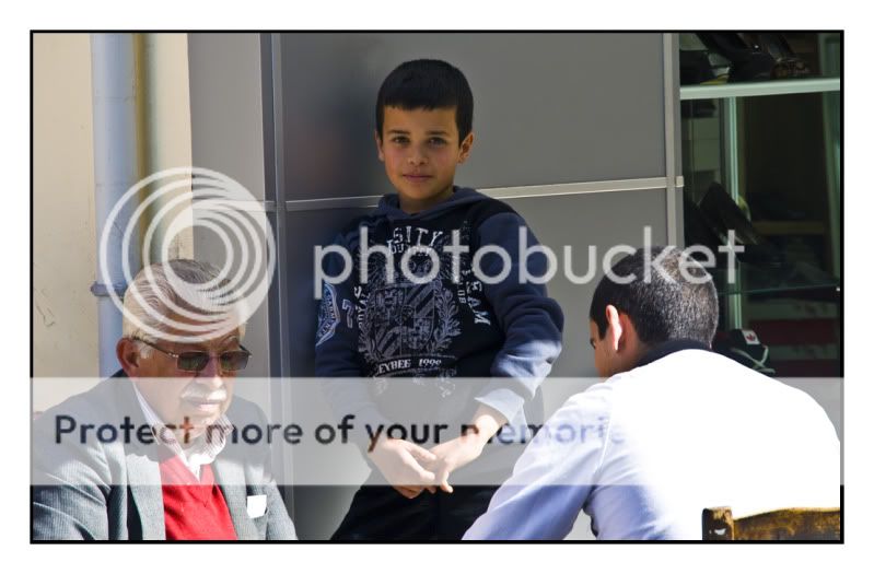
This is the alternative photo for this week's theme, "TRIO" of gossiping women. Also taken in TRNC Nicosia.
I decided to use the 'Trio Generations' because of A; the three generations and B; their heads formed a perfect triangle. Would be even better if the young boy was looking down at the game board rather that at the camera.
I decided to use the 'Trio Generations' because of A; the three generations and B; their heads formed a perfect triangle. Would be even better if the young boy was looking down at the game board rather that at the camera.
Last edited:
drodd
Also loves to mass debate
- Messages
- 5,519
- Name
- Dawn
- Edit My Images
- No
Hiya,
Another 52 thread I seem to have missed, sorry.
I have had a quick peek at all the photos so far and must say I am very impressed by them and all on theme.
Well done
Now that I have your thread tagged I hopefully will be able to keep up with your project.
Cheers
Dawn
Another 52 thread I seem to have missed, sorry.
I have had a quick peek at all the photos so far and must say I am very impressed by them and all on theme.
Well done
Now that I have your thread tagged I hopefully will be able to keep up with your project.
Cheers
Dawn
OP
- Messages
- 9,711
- Name
- Stan
- Edit My Images
- Yes
A wee bit late for Week 11 reason being not feeling too well all week.
I was please to found out the chance to reshoot some of the previous themes because I'm just not happy with some of my theme so far.
This is my Re-shoot of Chaos
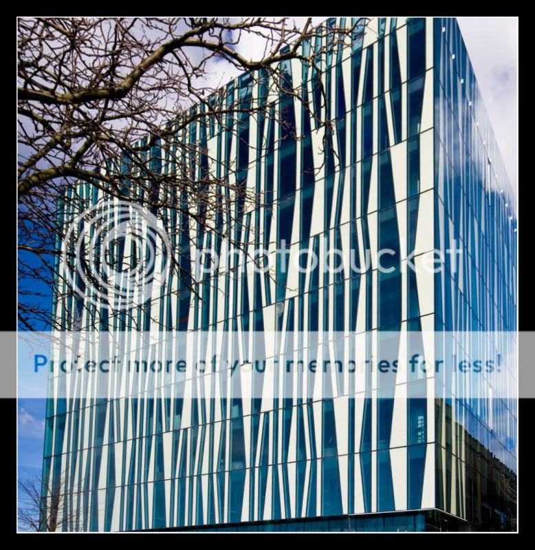
And I also decided to do the week's theme too. This is the new library building, 'Faculty of "Knowledge"' of Aberdeen University.
I was please to found out the chance to reshoot some of the previous themes because I'm just not happy with some of my theme so far.
This is my Re-shoot of Chaos
And I also decided to do the week's theme too. This is the new library building, 'Faculty of "Knowledge"' of Aberdeen University.
- Messages
- 244
- Name
- Dan
- Edit My Images
- Yes
Oh nice!
I like the chaos, but the university building is also a really good shot
How come all the public buildings in Stoke look rubbish?
(including the new hospital they're building)
Sent from my iPad using TP Forums
I like the chaos, but the university building is also a really good shot
How come all the public buildings in Stoke look rubbish?
(including the new hospital they're building)
Sent from my iPad using TP Forums
drodd
Also loves to mass debate
- Messages
- 5,519
- Name
- Dawn
- Edit My Images
- No
Hiya
Nice take on the re-shoot for chaos, the colours are amazing, not sure the focus is spot on though.
The building for 'knowledge' is fantastic, what an unusual looking building. I was at first a bit distracted by the 'smokey' haze on the right and then realised it is the reflection of the clouds.
Both fab shots though.
Well done
Cheers
Dawn
OP
- Messages
- 9,711
- Name
- Stan
- Edit My Images
- Yes
Thanks for all the kind comments, very appreciative and encouraging. 
Now, onto this week's theme. As someone already said 'How can you take a picture of moderation?" :shake: i thought.... Photo of a glass with a nip of whisky? - 'drink to moderation' then what else?
Until.... "MODERATION" of success came to me and here a photo of some medium size leisure yachts taken about 10 days ago in Latchi in Cyprus

Now, onto this week's theme. As someone already said 'How can you take a picture of moderation?" :shake:
i thought.... Photo of a glass with a nip of whisky? - 'drink to moderation' then what else?Until.... "MODERATION" of success came to me and here a photo of some medium size leisure yachts taken about 10 days ago in Latchi in Cyprus
- Messages
- 2,735
- Name
- Patrick
- Edit My Images
- Yes
Wow, that library shot for "knowledge" is amazing. You've caught it really well. The angle and composition work well and the tree coming in from top left adds to the image. Brilliant
The shot of the boats doesn't do a lot for me, although I can see how it fits the theme and it's well lit, exposed and looks sharp with good DOF.
Cheers, Patrick
The shot of the boats doesn't do a lot for me, although I can see how it fits the theme and it's well lit, exposed and looks sharp with good DOF.
Cheers, Patrick
OP
- Messages
- 9,711
- Name
- Stan
- Edit My Images
- Yes
Thanks Patrick,
I used a 10-20mm lens for the library photo and as you can imagine the building lines were very distorted, but after some pp the end result is very striking and dominating.
I think its slightly OOF because I was using my son's D90 for the first time. My own camera (D300) is away for repairs (cracked top LCD).
- Messages
- 626
- Name
- Kaz
- Edit My Images
- Yes
Hi rpn, some very nice shots here!
Accommodation: I like the unusual angle you went for, I think it works well. Lovely colours.
New: Nice vignet and shallow dof. It works well. I actually like the detail of the photo on the calendar. Gives some useful detail to what would have otherwise been a fairly bland shot.
Style: I too prefer the second version. Although I think it could do with a bit more contrasty curves and more sharpening.
Open: Great shot, but lighting is a bit harsh and the background seems a tad dull and has funny smudges. Hats off to you for attempting something as difficult and expensive as this.
Hard: I absolutely love it. Great idea using the computer monitor image to be reflected onto the disk. Might have to steal the idea at some point!
Clutter: Nice take on the theme. I think the PP works well and makes the dishes pop out. I prefer the first version but don't like the red logo it's too distracting.
Delicate: I like the composition but lighting could be a bit better and the reflections are distracting. Air bubbles take away from the image also imo.
Chaos: Funny photo! I had similar idea but couldn't find one. Nice crop and framing.
Finish: Doesn't do much for me sorry.
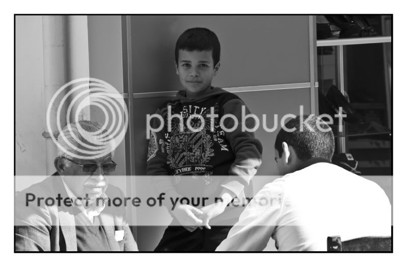
Trio: The B&W conversion is great and the boy's gaze at the camera is fantastic. Love it.
Knowledge: Another great architecture shot and well framed. Looks soft/blurry though?
Moderation: I like the composition but it seems a bit underexposed to me.
Looking forward to more of your 52 and keep up the great work!
Accommodation: I like the unusual angle you went for, I think it works well. Lovely colours.
New: Nice vignet and shallow dof. It works well. I actually like the detail of the photo on the calendar. Gives some useful detail to what would have otherwise been a fairly bland shot.
Style: I too prefer the second version. Although I think it could do with a bit more contrasty curves and more sharpening.
Open: Great shot, but lighting is a bit harsh and the background seems a tad dull and has funny smudges. Hats off to you for attempting something as difficult and expensive as this.
Hard: I absolutely love it. Great idea using the computer monitor image to be reflected onto the disk. Might have to steal the idea at some point!
Clutter: Nice take on the theme. I think the PP works well and makes the dishes pop out. I prefer the first version but don't like the red logo it's too distracting.
Delicate: I like the composition but lighting could be a bit better and the reflections are distracting. Air bubbles take away from the image also imo.
Chaos: Funny photo! I had similar idea but couldn't find one. Nice crop and framing.
Finish: Doesn't do much for me sorry.
Trio: The B&W conversion is great and the boy's gaze at the camera is fantastic. Love it.
Knowledge: Another great architecture shot and well framed. Looks soft/blurry though?
Moderation: I like the composition but it seems a bit underexposed to me.
Looking forward to more of your 52 and keep up the great work!
OP
- Messages
- 9,711
- Name
- Stan
- Edit My Images
- Yes
Hi Kaz, thanks for the comments on the individual photo, very much appreciated and also thanks to all other comments too.
Well, Im really peed off just now. I still having got my camera back from the repairer (see above). Found out today that they are waiting on parts (top LCD screen). What really annoy me is that they got the camera over two weeks ago and I have spoken to them a month before that to get an estimate and time. I confirmed then that I was happy with the price and duration etc and requested them to order the parts and stated that I WILL get the camera to them for repairs after my holiday. Guess what? Yes they waited until my camera arrived, then sent me another estimate (although cheaper!) a week later. I then have to reconfirm to them to go ahead again and now waiting on parts! WHY cant people trust each others on verbal instructions now a day? Why have to be paper, paper and more 8loody paper! :bang: :bang: :bang:
Aaarrrrrrrrrrrgg .. breathe in and breathe out . and calm. Thats better now and thanks for listening.
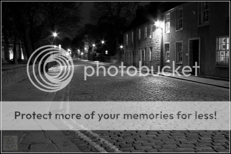
On to this weeks theme, now that all the students are away for their Easter break the streets around the University compound are pretty quiet and here is....
An EMPTY Street
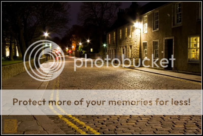
and a Black & White version too. I'm not sure which I prefer
Well, Im really peed off just now. I still having got my camera back from the repairer (see above). Found out today that they are waiting on parts (top LCD screen). What really annoy me is that they got the camera over two weeks ago and I have spoken to them a month before that to get an estimate and time. I confirmed then that I was happy with the price and duration etc and requested them to order the parts and stated that I WILL get the camera to them for repairs after my holiday. Guess what? Yes they waited until my camera arrived, then sent me another estimate (although cheaper!) a week later. I then have to reconfirm to them to go ahead again and now waiting on parts! WHY cant people trust each others on verbal instructions now a day? Why have to be paper, paper and more 8loody paper! :bang: :bang: :bang:
Aaarrrrrrrrrrrgg .. breathe in and breathe out . and calm. Thats better now and thanks for listening.
On to this weeks theme, now that all the students are away for their Easter break the streets around the University compound are pretty quiet and here is....
An EMPTY Street
and a Black & White version too. I'm not sure which I prefer
drodd
Also loves to mass debate
- Messages
- 5,519
- Name
- Dawn
- Edit My Images
- No
Hiya,
Wow that is an empty street, I too can't make my mind up about which I prefer, so I will just go with 'I like both equally', because each has a different feel to it.
Especially like the star burst lights
Cheers
Dawn
Wow that is an empty street, I too can't make my mind up about which I prefer, so I will just go with 'I like both equally', because each has a different feel to it.
Especially like the star burst lights
Cheers
Dawn
- Messages
- 7,694
- Name
- Tina
- Edit My Images
- Yes
Ooooh, difficult choice here, The concept is great and fits the theme well.
The colour image is a warm and relaxed emptiness, but I find the red lights distracting - if they were also white I don't think it would be an issue, or even amber. On that basis I choose the b&w although it gives a rather more bleak feeling to the empty.
I have to agree they look a tiny bit soft, but with the long exposure is there a chance you knocked the camera, or didn't use a remote release? Or had you left stabilisation on?