rpn's 2011 Project 52 + Bonus Nature Added ***FINISH***

This photo was taken on Saturday noon during Aberdeen Tartan Week celebration not knowing the week’s theme. However, when I was transferring the files to my computer and I thought it could fit this week’s theme!

A ‘Wind’ instrument (Bagpipe)

hi stan great colours but lacking in focus no one item really sharp.:shrug:
maybe next time the mouth of the nearest piper or the badge on the girl pipers hat(y) suits the theme well though hth mike
 
Hi all,

After my holiday in Vietnam I’m trying to get back on track with my Project 52 with quite a bit of catching up to do. So here’s the first of many;

Week 32 ‘Evolution’ of mobile computers

W32Evolution.jpg


I have tried different concept, compositions and angles but this one seems to turn out the best.

This is actually my second idea for the theme, can’t get enough help and props to do my original one.
 
stan..quirky colours but good use of the steps... ??? what on earth is that at the bottom... were they seriously ever like THAT??? .. :D

things are looking a bit soft, but composition (y) ...but like Tina says.. colours... [sharp in take of breath] ... marmite as one says...
 
Thanks everyone for the comments, I think I need to sort out the White Balance and re-pp.

Andy/Kev, the front one is a Compaq SLT 286 (yes, 286 :D) bought in 1990 before Windows GUI operating system! Weight about 14lbs :puke: and I use to carry it to work more or less every day including 6 months temporary assignment in Germany!

Just for info, from the front; Compaq, Sony Vaio, Apple MacBook Pro, Samsung Netbook NC10 and Apple iPad.
 
Do you work at Curry or something, you have a lot of electrical equipment!

I think I prefer the 2nd, but I'd like to see them spaced out more with them casting a strong shadow to the left from a neon style light on the right; just a thought.

I got the one on the left, have had for about 7 years now, it's still going strong, well that is if you don't relay on battery life!
 
Hi Neil,

Thanks for the comment. I have tried various lighting angle including what you said and this is the result of my effort without any pp.
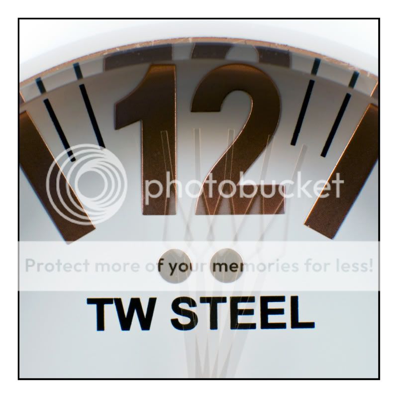

16092Temp.jpg

I like this one and the lighting is :clap:, love the shadows.

I never save thigs like this, they all get binned....:wacky:

Cheers.
 
The 2nd is better.
It needs a little PP to tide the BG up, but I prefer it.
I'm still thinking a neon blue light may add to the electronic feel.

@ Andy - if you have anything newer than a first generation iPod, don't bin it, donate it to me so I don't have to hide my ageing one when I'm on the train!
 
Hiya Stan,

OMG you definitely do have a collection of electronic gadgets, and very interesting to see considering I have never seen some of them, although I have to say I seem to recall some of the older models :eek:

I don't mind the composition and processing too much, however the bit in the top right corner of the last post is distracting.

Great idea though for evolution.

Cheers

Dawn :)
 
I know this is a bit out of sequence I yet to do week 33, 34 & 35 but decided to jump straight to this week’s (36) theme. Actually I have already taken the photos for those weeks but haven’t pp them yet. I’ve been keeping up-to-date with the theme while I was holidaying in Vietnam and those weeks are from there!

For this week I got this watch, TW Steel CEO, as a birthday present earlier this year.

Week 36 ‘TIME’

W36Time.jpg
 
Like it. I tried a square crop but it didn't work.

Nice amount of motion and clarity is great.

I've had a few sherberts....but the number one doesn't look vertically straight (just a mm or so off) :thinking:

Cheers.
 
WOW ... missed your thread for a while now.... LOVE all the ideas and shots... and even though everyone has already said it... cant believe how much electronic kit you have held on to!

LOVE the last evolution shot... the shadows really make it! If I had one comment I'd have shot at a slightly lower angle and i'd have possibly cropped a touch tighter. I find the light reflection to the top right a bit distracting too. But all in all great work!

Love your time shot... I really have been needing a macro lens during this 52... just wish I had the cash!

Mark
 
Hi Stan


wonderful image for Time....nice n sharp & love the effect you caught with the hand movement :clap:
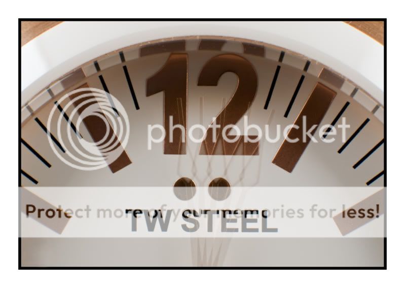
...didn't notice & still can't really tell that the number if off centre !

Evolution.... what an amazing collection of music players...I've only just discovered CD's:LOL: of all the versions I prefer the 2nd one in your original post , nice colors & well laid out (y)
 
Hiya Stan,

Excellent shot for Time .... have to say I prefer the second version (pardon the pun).

Well done :clap:

Cheers

Dawn :)
 
Hi ya Stan

I like your revised version of Time ...better being closer & bigger............ BUT...
you may have straightened the number 1 but now the words TW STEEL are off the straight....tilted slightly up at the righthandside:bang:
....sorry

actually, now I've looked closer , I much prefer your original version :D just needs a 2 millimeter tweak to the left & it'll be bang on (y)
 
Thanks Lynne,

I think because the camera; out of interest I was using a 50mm lens with a 20mm Kenko extension tube; wasn’t positioned align with the watch. So I can only manage to align either the numbers or the letters but not both.

Anyway, must do some catching up and so back to week 33.

This is one of thousands of photos taken when I was in Vietnam. This shot shows part record of name of donors and fund contributors toward the major refurbishment of a temple. I like the vibrant and vivid colour and the orderly writing of the Chinese characters.

Week 33 ‘RECORD’ set in stone

W33Record.jpg
 
Hi Stan,

I like the blue in your week 32 reshoot, it real adds to the shot.
However, I prefer the longer shadows of the previous take and that the shadows were all in the same dirction.

Record, umm, I cannot say that this one grabs me.
It covers the theme as memorials are certainly a record, but the image doesn't offer any interest to me.

A shot across the face may have helped illustrate the texture in the engraving/ stone and would have offered the chance to use DOF across the names to add interest but not lose the point. Getting more of the memorial in the frame would also help identify it as a memorial and suit the theme better.

Neil
 
Hi, there.

Record, could be anything and doesn't scream record (unless you can translate?).

I like the format and colours but don't feel any texture. Perhaps getting a lot closer?

Cheers.
 
Hi Stan

lovely colors in your Record shot...it is indeed a record of something which has meaning in the words if you understand them (which I don't :LOL: )


Maybe a wider shot to give more context would have helped..ie as it was inscribed on part of the tomb maybe a pair of shots with the 2nd one showing the temple ? Or as mentioned before a shot across the face of it or coser up to pick out the textures ?
 
Back
Top