

You are using an out of date browser. It may not display this or other websites correctly.
You should upgrade or use an alternative browser.
You should upgrade or use an alternative browser.
rpn's 2011 Project 52 + Bonus Nature Added ***FINISH***
- Thread starter rpn
- Start date
- Messages
- 19,461
- Name
- Andy
- Edit My Images
- Yes
Like them. Superb vibrancy. One occasion when eye contact would ruin the photograph.
Ah, just noticed top middle on first one....sneaking a quick look at the camera.
It's only when I look at these kind of repetitive jobs that I realise how fortunate I am...
Keep up the great work.
Ah, just noticed top middle on first one....sneaking a quick look at the camera.
It's only when I look at these kind of repetitive jobs that I realise how fortunate I am...
Keep up the great work.
- Messages
- 2,175
- Name
- Neil
- Edit My Images
- No
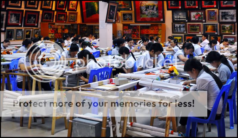
Blimey, what ever next on the mass production market.
I think I'd rather a print of an original than a mass produced 'hand painted' image.
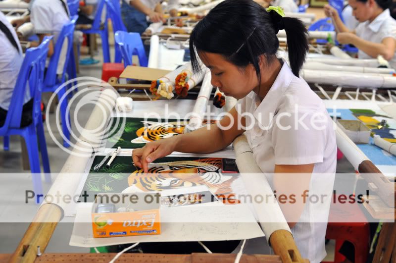
Assuming they are actually hand painting, one looks like finger painting, or is it embroidery of some sort
Great colours, mad situation.
That girl has a mobile phone (possibly two if that's one in the box) so it cannot be all bad.
I think I'd rather a print of an original than a mass produced 'hand painted' image.
Assuming they are actually hand painting, one looks like finger painting, or is it embroidery of some sort
Great colours, mad situation.
That girl has a mobile phone (possibly two if that's one in the box) so it cannot be all bad.
OP
- Messages
- 9,705
- Name
- Stan
- Edit My Images
- Yes
Assuming they are actually hand painting, one looks like finger painting, or is it embroidery of some sortThey are embroidery/needlework. Quite surprise to see boys amongst the mainly girl workers
- Messages
- 2,175
- Name
- Neil
- Edit My Images
- No
Quite surprise to see boys amongst the mainly girl workers
They're obviously switched on boys!
It's like the time I was a lap dancer, not the best job I had, but nice colleagues

OP
- Messages
- 9,705
- Name
- Stan
- Edit My Images
- Yes
It's like the time I was a lap dancer, not the best job I had, but nice colleagues
Not in a gay club were you? - Messages
- 2,175
- Name
- Neil
- Edit My Images
- No
OP
- Messages
- 9,705
- Name
- Stan
- Edit My Images
- Yes
The last missing week up to week 37
Well I have never tried this technique before and having seen these shots in magazine and websites I thought Ill give it a go for this theme. Thats the whole idea and the ultimate aims for taking on this project at the start of the year is to challenge myself and step beyond my usual topic, genre, comfort zone and try something different or totally new area of photography; Abstract.
Photoshops Levels, Contrast and Tone were used to enhance the colours.
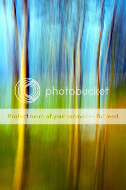
Week 35 BLUR (Vertical panning)
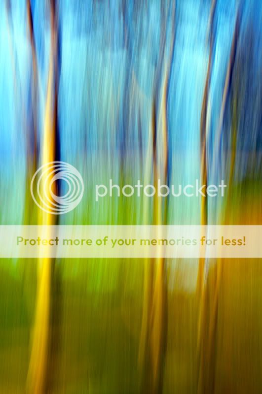
Well I have never tried this technique before and having seen these shots in magazine and websites I thought Ill give it a go for this theme. Thats the whole idea and the ultimate aims for taking on this project at the start of the year is to challenge myself and step beyond my usual topic, genre, comfort zone and try something different or totally new area of photography; Abstract.
Photoshops Levels, Contrast and Tone were used to enhance the colours.
Week 35 BLUR (Vertical panning)
- Messages
- 19,461
- Name
- Andy
- Edit My Images
- Yes
I tend to go with my first reaction and that was, "Like it".
Has an impressionist (Monet) feel to it. Lovely colours, well balanced.
I had a quick edit in LR to increased the contrast an reduce some of the highlights. Felt a tad better, for me.
Anyway, big") from me.
from me.
Cheers.
Has an impressionist (Monet) feel to it. Lovely colours, well balanced.
I had a quick edit in LR to increased the contrast an reduce some of the highlights. Felt a tad better, for me.
Anyway, big
from me.Cheers.
- Messages
- 19,461
- Name
- Andy
- Edit My Images
- Yes
Hey, thanks Andy.
I am open to critique and comment and still very much to learn especially in the post process front, like to post up your version? BIG please
Here you go. Just my personal preferences...

NOT MINE BLUR by andysheader, on Flickr
OP
- Messages
- 9,705
- Name
- Stan
- Edit My Images
- Yes
I like that too Andy, stronger colour and definitely more impact. I put them side by side for comparison
OP
- Messages
- 9,705
- Name
- Stan
- Edit My Images
- Yes
No other comments on blur?
Righto, lets push on to another week another theme and they are coming quick and fast.
Anyway another technique that I havent tried that often; mono tone, well at least from the onset of the shoot I have mono colour in mind for this not an after conversion! If you know what I mean
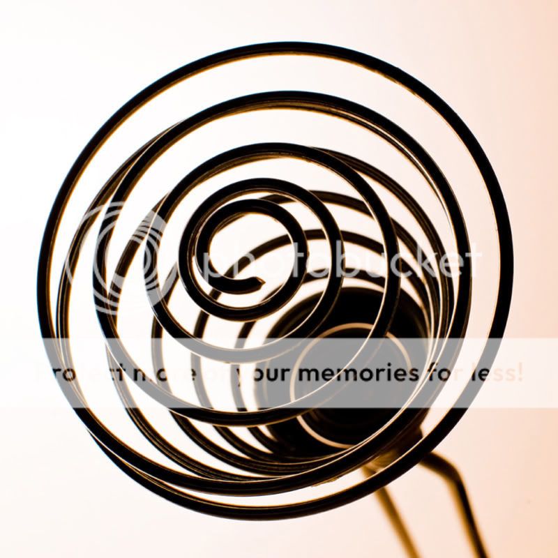
I know the proper name for this object is a whisk but to me is a .
Week 37 Food Mix_er
Righto, lets push on to another week another theme and they are coming quick and fast.
Anyway another technique that I havent tried that often; mono tone, well at least from the onset of the shoot I have mono colour in mind for this not an after conversion! If you know what I mean
I know the proper name for this object is a whisk but to me is a .
Week 37 Food Mix_er
OP
- Messages
- 9,705
- Name
- Stan
- Edit My Images
- Yes
Hi, Stan, before I comment any chance of a slightly smaller photograph?
Might be because I'm on a laptop but to see the full photograph I have to scroll up and down.
Cheers.
These are 800 max side.
OP
- Messages
- 9,705
- Name
- Stan
- Edit My Images
- Yes
I rather like the mix(er) but wonder whether it couldn't be lit in such a way as to be less...dark?
Hi Tina, thanks for the comment.
I set up the shot as back lit on purpose to enhance the helix/spiral shape of the whisk (mix_er)
drodd
Also loves to mass debate
- Messages
- 5,519
- Name
- Dawn
- Edit My Images
- No
Hiya Stan,
Having only just got round to posting my week 36 tonight (a bit behind myself at the mo), I thought I better do some catching up on commenting while I think about what to do for 'mix'.
I see you have posted quite a few photos since my last visit, so doing a quick catch up here:
I like your last post for 'Evolution' .... the colours are great
The 'record' shot is fantastic! I love the colours and I love this sort of writing (even though I can't read it), but anything resembling Chinese/Japanese etc gets a from me.
Both 'work' photos are bang on theme, and the colours and detail you have caught are great too.
Now 'blur' image ..... .... this is my kind of pic and I love everything about it from the colour to abstractness and look like a lovely watercolour and I bet would be fantastic printed on canvas and hung on the wall. I like both your version and Andy's edit .... they each look quite different in a way. Well done on this one .... so what was it that you used as the subject?
I can see your idea about the 'mixer' shot .... but not sure if it is working for me. I may have to look at this one again with fresh eyes tomorrow.
Well done though on your catch up, I have enjoyed looking at your photos.
Cheers
Dawn
Having only just got round to posting my week 36 tonight (a bit behind myself at the mo), I thought I better do some catching up on commenting while I think about what to do for 'mix'.
I see you have posted quite a few photos since my last visit, so doing a quick catch up here:
I like your last post for 'Evolution' .... the colours are great
The 'record' shot is fantastic! I love the colours and I love this sort of writing (even though I can't read it), but anything resembling Chinese/Japanese etc gets a
from me.Both 'work' photos are bang on theme, and the colours and detail you have caught are great too.
Now 'blur' image .....
.... this is my kind of pic and I love everything about it from the colour to abstractness and look like a lovely watercolour and I bet would be fantastic printed on canvas and hung on the wall. I like both your version and Andy's edit .... they each look quite different in a way. Well done on this one .... so what was it that you used as the subject?I can see your idea about the 'mixer' shot .... but not sure if it is working for me. I may have to look at this one again with fresh eyes tomorrow.
Well done though on your catch up, I have enjoyed looking at your photos.
Cheers
Dawn
- Messages
- 14,766
- Name
- Michael
- Edit My Images
- No
Hi Stan, sorry I missed blur, I remember seeing it on the tp app on my phone, must have got sidetracked somewhere along the line. I love it! Beautiful, punchy and bold colours, I like Andy's version too. Not done vertical panning, will give this ago some time.
I really like your mix photograph too, the whisker mixer is very well lit, nice one
I really like your mix photograph too, the whisker mixer is very well lit, nice one
OP
- Messages
- 9,705
- Name
- Stan
- Edit My Images
- Yes
Hiya Stan,
I like your last post for 'Evolution' .... the colours are great
The 'record' shot is fantastic! I love the colours and I love this sort of writing (even though I can't read it), but anything resembling Chinese/Japanese etc gets a
Both 'work' photos are bang on theme, and the colours and detail you have caught are great too.
Now 'blur' image .....
I can see your idea about the 'mixer' shot .... but not sure if it is working for me. I may have to look at this one again with fresh eyes tomorrow.
Well done though on your catch up, I have enjoyed looking at your photos.
Cheers
Dawn
Hi Dawn,
Thanks for the kind comments very much appreciated. I know you are busy and thanks for dropping by too.
The blur subject is trees and panned vertically to give the blur motion. The shot was taken hand-held and thats why the wobble lines near the top!
Will try to use a tripod when I get a chance next. I will also post up the actual un-blurred (is there such a word? ) shot later.
OP
- Messages
- 9,705
- Name
- Stan
- Edit My Images
- Yes
Hi Stan, sorry I missed blur, I remember seeing it on the tp app on my phone, must have got sidetracked somewhere along the line. I love it! Beautiful, punchy and bold colours, I like Andy's version too. Not done vertical panning, will give this ago some time.
I really like your mix photograph too, the whisker mixer is very well lit, nice one
Thanks Michael, cheers
SamuelSlade007
RENEGADE!!!!!!
- Messages
- 7,802
- Name
- Frank
- Edit My Images
- No
stan...don't touch that MIX>.. that did my eyes in...what an optical illusion angle you've caught... i love it.. my eyes went round and round... simple colouring...lighting used has brought out the confusion more and adds to it...
now... i need to find some escker pictures to put my eyes right with...
now... i need to find some escker pictures to put my eyes right with...
OP
- Messages
- 9,705
- Name
- Stan
- Edit My Images
- Yes
stan...don't touch that MIX>.. that did my eyes in...what an optical illusion angle you've caught... i love it.. my eyes went round and round... simple colouring...lighting used has brought out the confusion more and adds to it...
Thanks Kev, I know what you mean just don't look at the MIX shot too long
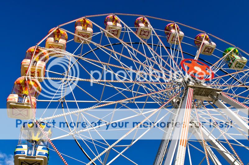
My plan for this weeks theme was to take this shot at night with long exposure for light trail experiment too. But mid-week and mid-term put a stop to that as the fair just isnt busy enough to have the lights switched on never mind the ride open!
Anyway this shot was taken in late afternoon between heavy showers and sunshine thats why the sky is so blue but the polarizing filter help too.
Week 38 - All the FUN of the Fair
- Messages
- 2,175
- Name
- Neil
- Edit My Images
- No
I like the fun shot Stan, colours are great, but there is something about the composition that I'm not a 100% happy with.
The cropped car in the bottom left is a little distracting and the framing of the wheel takes up a lot of the frame but has no holding point for the eye.
I think placing the main 'A' frame more on the right-hand third and standing further back may help. Being further back would get more colour in from showing the side of the cars and may help avoid cutting through a car.
A night shot would be good though.
OP
- Messages
- 9,705
- Name
- Stan
- Edit My Images
- Yes
That really is awesome Stan! Great sky, did you use a filter?
Colourful and perfectly exposed.
Mix I also like. Striking image.
Joe
Thanks Joe, yes a circular polarizing filter
I like the fun shot Stan, colours are great, but there is something about the composition that I'm not a 100% happy with.
The cropped car in the bottom left is a little distracting and the framing of the wheel takes up a lot of the frame but has no holding point for the eye.
I think placing the main 'A' frame more on the right-hand third and standing further back may help. Being further back would get more colour in from showing the side of the cars and may help avoid cutting through a car.
A night shot would be good though.
I know what you mean about the cropped car Neil, but there are other obstacles like flag poles, barrier, light stands and the like in the way too. Not so easy to get a good composition and avoiding them at the same time.
I took a few others with different angle too so will search them for them later.
Cheers
OP
- Messages
- 9,705
- Name
- Stan
- Edit My Images
- Yes
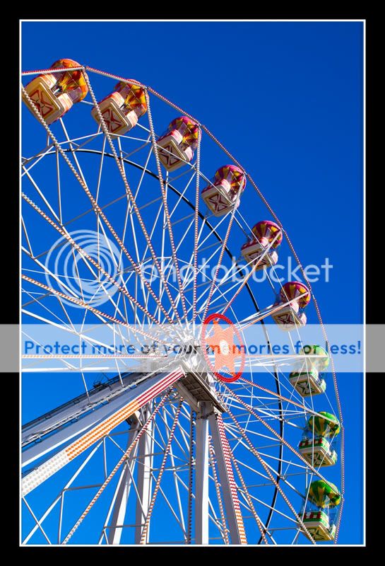
I like them both to be honest, the first one still does it for me with the larger cars. break them rules
But I really can appreciate why the second works so well.
Thanks Joe, pleased you like both shots.
Hi Stan, like both versions of the wheel. Great exposure and the sky is excellent. Well done.
Hi Michael, appreciate your kind comments. Thanks.
Hiya Stan,
Well done on the 'fun' shots, both are great ... the first for the larger Ferris Wheel cars and the second for the composition.
But the 2nd shot takes the cake for me
Well done
Cheers
Dawn
Hiya Dawn, thanks for the comments.
Now that I have more time to compare the two I seem to like the second one more not just because of the composition but the portrait format seem to have more impact too.
- Messages
- 8,398
- Name
- Lynne
- Edit My Images
- Yes
Hi Stan
Love you 2nd version of FUN..liked the 1st as well just not as much ! Brilliant color in the sky & great angle for the shot
MIX...like the unusaul angle of the whisk & the color
Totally love your 2nd shot...another I can see in a frame or on a large canvas, really great
Love you 2nd version of FUN..liked the 1st as well just not as much ! Brilliant color in the sky & great angle for the shot
MIX...like the unusaul angle of the whisk & the color
Totally love your 2nd shot...another I can see in a frame or on a large canvas, really great
SarahLee
TPer Emerita
- Messages
- 13,060
- Name
- Sarah
- Edit My Images
- No
You've absolutely nailed it for me with the 2nd fun shot Stan.
Much as I liked the first, the composition was niggling away at me. I'm a traditionalist at heart
Colours, vibrance, framing are all spot on - works perfectly.
I also think that your mix shot is inspired.
Not something I would have ever thought of for the theme and the angle works brilliantly. But for me, it's the backlighting and darkness of thewhisk mixer that make the image . . . gives it some real impact and an abstract feel.
Much as I liked the first, the composition was niggling away at me. I'm a traditionalist at heart
Colours, vibrance, framing are all spot on - works perfectly.
I also think that your mix shot is inspired.
Not something I would have ever thought of for the theme and the angle works brilliantly. But for me, it's the backlighting and darkness of the
- Messages
- 2,175
- Name
- Neil
- Edit My Images
- No
I prefer the 2nd Stan.
Bigger cars would have been better, but I think the composition works much better than the first.
Bigger cars would have been better, but I think the composition works much better than the first.
OP
- Messages
- 9,705
- Name
- Stan
- Edit My Images
- Yes
I prefer the 2nd Stan.
Bigger cars would have been better, but I think the composition works much better than the first.
Shot 2 for me!
Better crop and the border nails it!
Adie
Thanks for the feedback, Neil & Adie
Now on to this week.
Volume; another theme that I found quite challenging, apart from control knobs which already been done by others, how or what else can you take photos of volume? Being an engineer I can only relate volume as an object of cubic units!
Anyway, after some thoughts and head scratching
I come up with this
. Week 39 Traffic VOLUME

- Messages
- 19,461
- Name
- Andy
- Edit My Images
- Yes
#2 fun is very nice. The composition really works for me as does the colours.
Volume, well, nice trails but I'd like it better if you could loose some of the light off the road to emphasise the trails. Not an easy one to get volume across - it show the literal volume of traffic but I'd like to see a more high volume of traffic.
Cheers.
Volume, well, nice trails but I'd like it better if you could loose some of the light off the road to emphasise the trails. Not an easy one to get volume across - it show the literal volume of traffic but I'd like to see a more high volume of traffic.
Cheers.