SamuelSlade007
RENEGADE!!!!!!
- Messages
- 7,802
- Name
- Frank
- Edit My Images
- No
stan..two very good pieces there... awesome light!! 'ing ...liking the reflections in number 2 the best. great blue sky ")

2 nice pics there Stan, The composition of number 1 is really good, and I like it being taken from low down. Nice reflections in number 2.
stan..two very good pieces there... awesome light!! 'ing ...liking the reflections in number 2 the best. great blue sky

Hiya Stan,
I'm a bit behind with commenting on fellow 52'ers projects, so doing a quick catch up here:
Living: wow I really like this shot and fits the theme well. The lighting is fantastic, composition and angle great and the background fab! The frame compliments the image well too.
Light: Again another 2 super shots. Great composition and the low angle works well in #1 with a nice light burst at the end that really draws my eye into the image. Love the reflection in #2.
Well done
Cheers
Dawn

Hi Stan
Like your shot for Safe..very literal....nice simple colors, possibly a little dark to the left but good capture..like it
Living....like the different angle...the BG color & the idea....the eye is drawn to the new living shoot but it all seems a little oof to me...can't see a clear focus spot ? Sorry
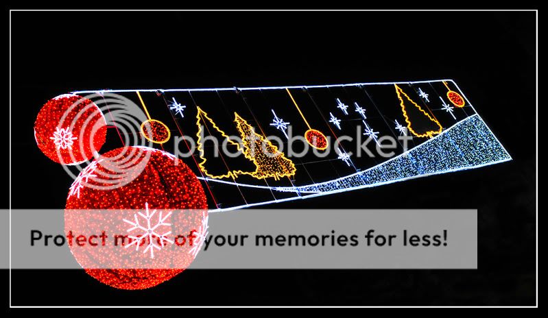
Absolutely love your 1st Image for Light.....great colors , detail in the sky, symetry....excellent shot
) in the summer when I was in Vietnam.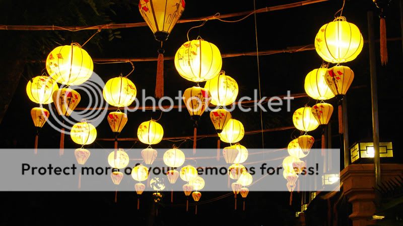
 )...... Then, until my son & his gfs pet jumps or rather hops to the rescue.
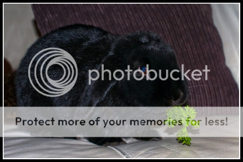 The green veg is a nice touch.
What else can I say but..... Cute bunny!!!!!!!
Bunnies are certainly cute, a great subject for the theme. Also like your pic for light as well
Hiya Stan,
Really like the Light 3 shot and the bunny is so cute, especially like how you have captured it with the green in its mouth.
Cheers
Dawn
Hi, Stan light #1 for me. I like the low angle, nice colour in the sky and good depth.
My immediate thought was it's a tad skewed, for want of a better word, and I thought it deserved closer inspection. I viewed in LR with a grid and I thinks it's the vertical supports that may have caused this.
Cheers.
Stan, I love teh light photos.
As for cute, well done you

Hi ya Stan
ooooh...cute bunny...lovely shot
Like the shot from Vietnam as well....any chance you could nip back over there & do the shot again...without cropping the 1st lantern
 .....I like the composition .... but there is just something very weird about the colours ....not sure if it could be due to WB ... it just doesn't seem realistic. But heyho .... that is how it may have appeared .... after all nature has it's own way of presenting itself to us.
 Hi ya Stan . apologies for not popping in sooner...life's been getting in the way again :bang:
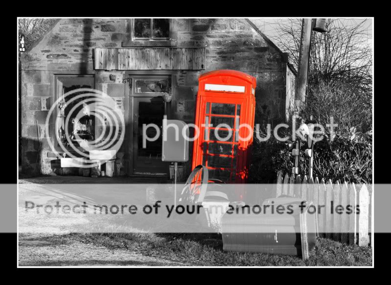
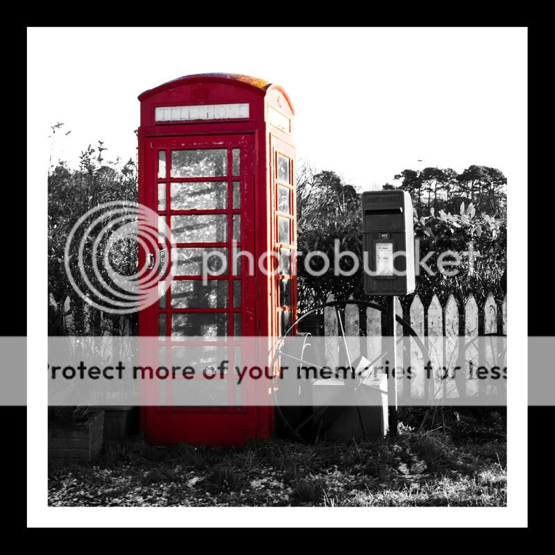
Prefer the 1st image for TALK..(I couldn't find a phone box like that round here),the slightly blown sky niggles me but I do love SC so def a
The 2nd image for TALK just doesn't have the same impact for me but I still like it
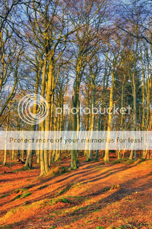
Weather....I still don't understand HDR:bonk:I like the thinking behind the shot , like the colors , the shadows, the glimpse of blue sky but there's something that niggles me which I can't put my finger on...possibly the tree trunks seem slightly soft ?
Well done for the year & good luck with your personal challenges for next year...look forward to seeing what you come up with
Hi, Stan, well spotted with your Talk. they are a bit cluttered, and you've lost the sky in #1 which is quite distracting and in #2 you seem to have lost some detail in the reds. For these I think a nice close up of the door handle and 'pull' would have worked very well.
Weather, now this has real potential and you've done well. I really like the detail in the branches, especially the upper branches. It is a bit over saturated for me. I also think it would work better if you got closer; I did a crop and it just felt better, more compact if you like, to me.
Cheers and 2 more to go...
Stan, your first talk image is an on theme composition but I find the selective colouring distracting. The second image I found more messy and unappealing. So #1 for me
I just love your weather picture, the colours and the bare trees tell us about that day so well. A great take on the theme
Hi Stan,
I like the recent posts.
Nice talk theme and nice sunny forest.
Not long now!