

You are using an out of date browser. It may not display this or other websites correctly.
You should upgrade or use an alternative browser.
You should upgrade or use an alternative browser.
weekly Lizzy23's 52 thats me i made it 1/2 way, won't get to the end
- Thread starter lizzy23
- Start date
- Messages
- 999
- Name
- Roly
- Edit My Images
- Yes
Nice take on the theme, prefer the second version personally .
Keep up the good work")
Keep up the good work
- Messages
- 1,513
- Name
- Alex
- Edit My Images
- Yes
Like both, think #1 at the moment. Good take on the theme.
Cant believe how many have been posted already. Must crack on
Cant believe how many have been posted already. Must crack on
*Sarah*
Peel Me!
- Messages
- 1,873
- Name
- Sarah
- Edit My Images
- Yes
Like both, think #1 at the moment. Good take on the theme.
Cant believe how many have been posted already. Must crack on
I think I'm following you around tonight Alex!!
I also prefer no1, I like that it is darker and fits into the song title better, not sure if the skulls on the second take my eyes away from the words!!
Well done Liz!
- Messages
- 13,760
- Edit My Images
- Yes
Hey Liz - Enjoying your take on the first 2 weeks so far, personally prefering the Colour versions of both
Looking forward to seeing your reshoot - and of course the rest of your 52... Good Luck
Looking forward to seeing your reshoot - and of course the rest of your 52... Good Luck
- Messages
- 6,502
- Name
- Peter
- Edit My Images
- Yes
It's #1 for me Liz. Feels a bit cleaner.
- Messages
- 8,398
- Name
- Lynne
- Edit My Images
- Yes
Hi Liz....1# for me  ...can't explain why ,just prefer the color though the thingy ( torch?) to the right seems a little odd ? Iron Maiden....belting band ...you've got me started now...off to put Run to the Hills on
...can't explain why ,just prefer the color though the thingy ( torch?) to the right seems a little odd ? Iron Maiden....belting band ...you've got me started now...off to put Run to the Hills on jgs001
Brian Cox
- Messages
- 12,646
- Name
- John
- Edit My Images
- Yes
Direction : I'm torn between them Liz... I love that blue colour in the first one... but I really like the mono... either way... nicely done.
Fear : The first works... but I prefer the second one... I think it's more fitting for the theme.
Fear : The first works... but I prefer the second one... I think it's more fitting for the theme.
- Messages
- 478
- Name
- Phil
- Edit My Images
- Yes
Hi Liz, thought I would come and comment on your thread seeing as you were kind enough to comment on mine. I know it's been said before but I think that my other half would disown me if I tried to comment on everyone's thread. Lol
Direction - I really like the first shot, the background works well.
Fear - I think your second shot works better than you first due to the torch being visible although it may work better if the torch was a little more subtle. Maybe you could have tried a little light painting to pick out the torches body. :shrug: just a thought.
Look forward to rest of your challenge.
- Messages
- 4,828
- Name
- Alan
- Edit My Images
- Yes
Hi Liz
Good e.g. of theme on the first - prefer the colour as it seems to have more depth to me. I have a similar shot taken against a grey sky and it was hard to get any depth.
#2. Like a lot, particularly the first. Again, to me it is more subtle, has greater depth. The fold(?) in the card(?) encompasses the words better and seems to funnel down as the width of the text reduces and it becomes more out of focus. I agree that the torch is hard to identify but that would just have been a matter of reposition and reshoot? Also like how the word 'behind' refelcts in the torch barrel.
OP
- Messages
- 2,167
- Name
- Liz
- Edit My Images
- Yes
when i saw the theme yesterday, i thought B****r what the hell do i shoot for this, but it came to me today so i thought a bit of fun with the nifty fifty which hasn't been out for a while, and one all the ladies will relate to if they hate it like me, everyweek i do it and at the end let out a huge sigh and say thank god thats done, well it goes two fold this week, because i've manged the shot as well
2 again for you
#1
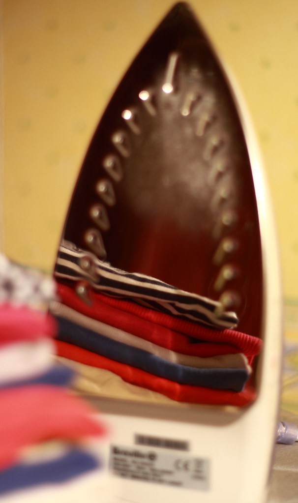
sigh 1 by jalizcazan, on Flickr
#2 slightly different angle
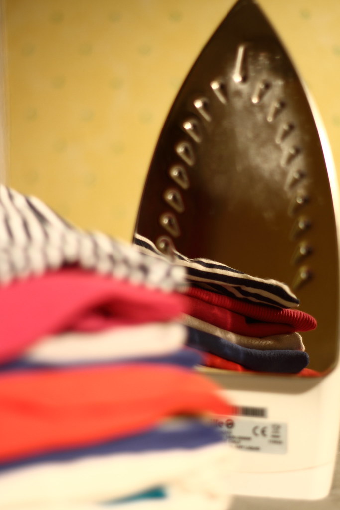
sigh2 by jalizcazan, on Flickr
2 again for you
#1
sigh 1 by jalizcazan, on Flickr
#2 slightly different angle
sigh2 by jalizcazan, on Flickr
Nikon_Nick
Shirley
- Messages
- 6,348
- Name
- Nick
- Edit My Images
- Yes
Great idea for this weeks theme Liz! Number 2 for me also, as the small bit of visible cord in the top one distracts a little
D
Deleted member 3428
Guest
just the thought of that makes me sigh... tighter crop is better I think.
Last edited by a moderator:
- Messages
- 1,513
- Name
- Alex
- Edit My Images
- Yes
Definitely gets a big sigh from me so thats why I avoid it at all costs!! Good thinking and interpretation of the theme (feel like I may be saying that a bit this week).
The reflection in the iron is very clear and a makes it a different.
The reflection in the iron is very clear and a makes it a different.
Last edited:
OP
- Messages
- 2,167
- Name
- Liz
- Edit My Images
- Yes
Definitely gets a big sigh from me so thats why I avoid it at all costs!! Good thinking and interpretation of the themem (fel like I may be saying that a bit this week).
The reflection in the iron is very clear and a makes it a different.
Thanks Alex, i think i've pulled off what i wanted to which was a play with reflections and depth of field.
- Messages
- 1,513
- Name
- Alex
- Edit My Images
- Yes
Thanks Alex, i think i've pulled off what i wanted to which was a play with reflections and depth of field.
Yup definitely nailed those elements. I need to get thinking!
- Messages
- 2,820
- Name
- Mark
- Edit My Images
- Yes
Yep, definitely sigh worthy that! Great use of reflections and depth of field too!
- Messages
- 13,760
- Edit My Images
- Yes
Great thought Liz... Both great captures, for me the second shot with more of the base plate in focus just pips it
OP
- Messages
- 2,167
- Name
- Liz
- Edit My Images
- Yes
My wife knows that sigh only to well, nice work with reflections.
Thanks Darren, never has the bottom of my iron been so clean
- Messages
- 478
- Name
- Phil
- Edit My Images
- Yes
Good idea on the theme, and a great use if reflections : thumbs:
- Messages
- 2,908
- Name
- Summer
- Edit My Images
- Yes
good idea for sigh, also the steam sounds like a sigh, maybe? I LOVE ironing ha ha (I know) but it gives me immense satisfaction to iron out creases (hold on ladies, don't send me all yours lol)
anyway, I can see what you've done with the reflection but the OOF iron looks weird to me. I will try it myself to see how it works before I judge it though
anyway, I can see what you've done with the reflection but the OOF iron looks weird to me. I will try it myself to see how it works before I judge it though
blakester
Shine On Harvest Moon
- Messages
- 6,679
- Name
- Iain
- Edit My Images
- No
Liz, apologies for not visiting your thread earlier, there are so many to get round.
Direction, a nice simple take on the theme but very well executed. I too prefer the colour version, lovely sharp silhouette against the clear blue sky really works.
Fear, another good take on the theme, my preference with this one is #1, the torch in the #2 is a little distracting.
Sigh, a fun image for this week, although not so much fun doing the ironing eh? I like the composition of the second one, the stripes in the clothes giving a good lead in.
Great start to your 52, I shall look in again now I have found your thread. Iain
Direction, a nice simple take on the theme but very well executed. I too prefer the colour version, lovely sharp silhouette against the clear blue sky really works.
Fear, another good take on the theme, my preference with this one is #1, the torch in the #2 is a little distracting.
Sigh,
a fun image for this week, although not so much fun doing the ironing eh? I like the composition of the second one, the stripes in the clothes giving a good lead in.Great start to your 52, I shall look in again now I have found your thread. Iain
- Messages
- 999
- Name
- Roly
- Edit My Images
- Yes
Great take on the theme, made me sigh as it reminded me i need to iron my uniform for tomorrow..
Another vote for #2, really like the DOF
Another vote for #2, really like the DOF