
The goblin
<span class="poty">POTY Winner 2015</span></br>
- Messages
- 4,407
- Name
- Marsha
- Edit My Images
- Yes
Thanks for that Liz.


")
Thanks for that Liz.
Hi, missed your Win. AAhhh, look at them eyes....so sweet. 1st prize
I like the fact you've cropped the rosette....I think too many people don't know how to crop (in camera of in post).
Shiny #1, looks very shiny. For these types of photographs they have to be perfectly composed or the tend not work work....symmetry is all important.
Shiny #2, like it, nice and minimal. Just the orientation of #1 let's it down a bit. I had an edit in PS, and then converted to B&W and, for me, I think it improves.
Siny #2, edit. Like it. Nice low POV. Tad off the bottom and right to match the space on the right and it's a winner. I really like how you're in a church and you managed to get a cross in the photograph at the top
Cheers.
Love cathedrals, nice shots
Very shiny.
Money - I'm torn between the two here... I like the composition of the first, and think with a tiny bit more light on the cash would be my fav
Win - Certainly prefer the 1st shot, waht a lovely looking dog, captured really well - nice shot
Shiny - No: 2 for me, Shows much more shine to me, nice angle too
#2 for me as well
 Maybe taking this from the otherside would have shown the handmade part more
Shiny - I prefer #2, but actually much prefer the 'in context' shot, it is super. Mike
This is another thread I need to catch up on Liz
Industry #3. I think I quite like it with the missing cake
Root #1 although would have liked the focus on the hand
Handmade Thats not another fleece your making is it Liz
Money #2 gets my vote because of the better lighting
Win #1 for me although as has been said its a bit soft for my liking
Shiny I prefer the context #2 shot as well.
Your second shine shot's the one for me! I think it's lovely. Possibly needs a slight bit of straightening, but very very good.
I think I like the edit the best some great colours
Hi Liz
I am not sure why I have fallen behind on commenting on your Challenge - don't know why - sorry.
Win - like the first image but wold have preferred to see the rosette in focus as well. Lovely colour rendition.
Shiny - like both shots but the simplicity of the brass marker does it for me for both the theme and the composition.
Hi Liz some good shiny shots there. I prefer no.2
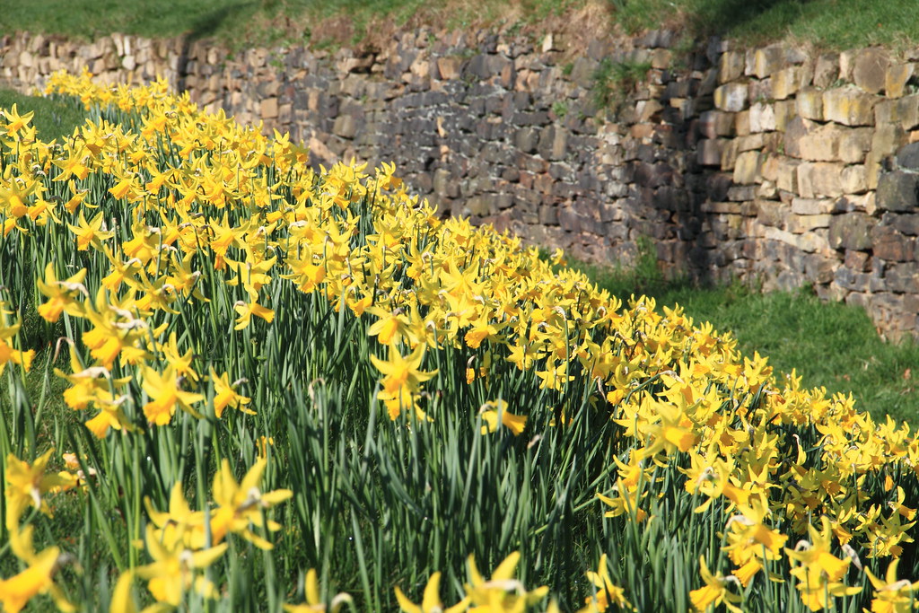
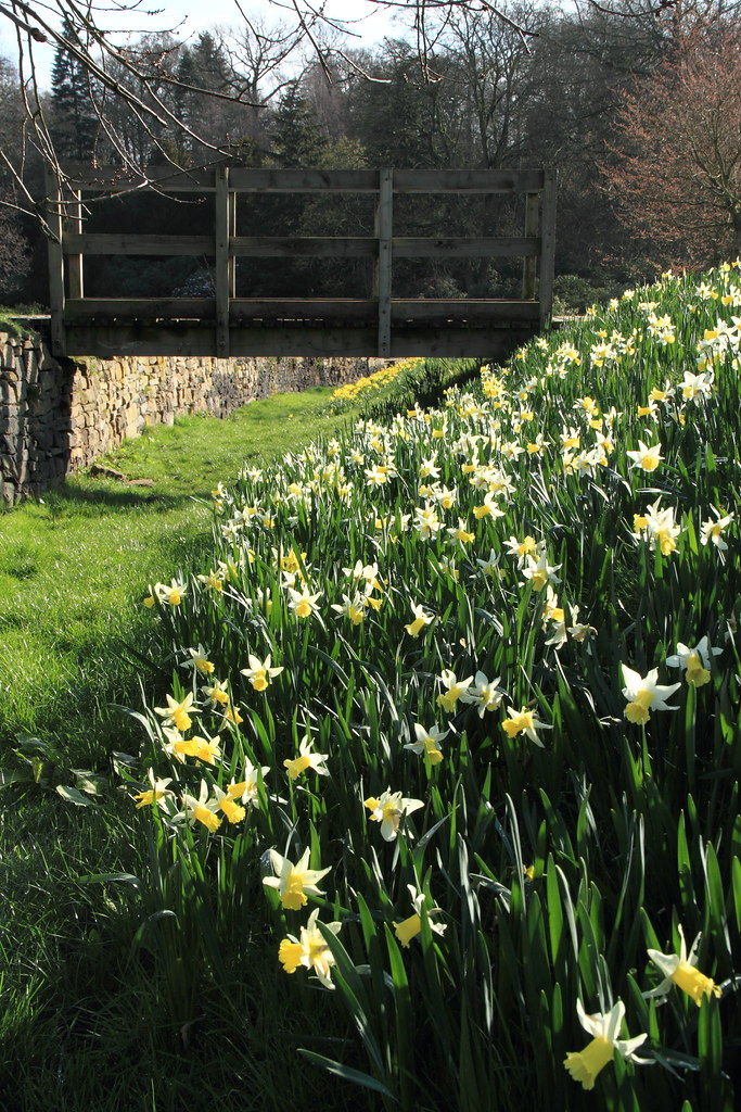
What beautiful daffodils! I think I prefer number two, not sure why.
Mother nature is definitely magical! I like your take on this theme. A very simple interpretation
Both lovely photographs Liz, a different take on the theme.
#1 gets my vote though, I love the composition you've taken here because of the triangles within the frame. The bright yellow daffs against the stone wall makes it very pleasing on the eye.
I am with you on getting out and about with my camera. I prefer outdoor photography to indoor staged images but sometimes needs must. A good week Liz. Iain
Thankyou its nice to see other 52's getting where i'm coming from
Liz
loving you magical shot, has to be #2 for me.
#1 looks oof, but i like the composition in this shot.
very nice work.
Number 2 for me, I prefer the composition in that one, perhaps number 1 would work if you were below the bank of daffodils and looking up? A great take on the theme.
I love both these pics ... Personally I know how magical daffodils are ... They always make me smile and get me excited for the summer x
hey liz
i had the same idea but for trees. I was just waiting for the sun to help me and then i read this thread, you have got two great photos here i love the POV and the colours are top well done
I completely agree nature is a magical thing. Number 2 for me my eye is drawn through the shot and under the bridge. Makes me want to know what's on the other side. Good job
Ooooo another vote for no:1 from me, I too like the angles in the pic, a good take on the theme
Hi Liz
I like your interpretation - I think there is absolutely nothing wrong with a bit of interpretation when applied to what you see around you. I love just walking around with my camera with the theme at the back of my mind, and just see what appears.
I prefer your #1. The bold colours I think swings it for me. Doesn't really help you I'm afraid you seem to have a pretty even split between #1 and #2. Mike
I prefer the composition of number 2 but I wonder if it would be better if you lightened the area of the bridge as its quite dark?
Magical - number 1 is the better for me, composition is key here.
Hi Liz
the Magic that is Spring....2 lovely images but think it's #1 for me....simply cos I prefer the colors of the daff's in that one......

Hi Liz
the Magic that is Spring....2 lovely images but think it's #1 for me....simply cos I prefer the colors of the daff's in that one......
Hi Liz, I agree with Lynne on this!