

You are using an out of date browser. It may not display this or other websites correctly.
You should upgrade or use an alternative browser.
You should upgrade or use an alternative browser.
weekly Bilko's 52 for 2012 - Week 48 Shadow Added
- Thread starter Bilko
- Start date
- Messages
- 4,831
- Name
- Alan
- Edit My Images
- Yes
Hi Robert
Soft - good pov and focus . I like the cut off below the nose
Pride - spot on theme and a very simple shot well executed.")
Soft - good pov and focus . I like the cut off below the nose
Pride - spot on theme and a very simple shot well executed.

- Messages
- 6,408
- Edit My Images
- No
Lovely images of your cat. I like the depth of field and the focus on the eyes. Like the way that he's nestling on soft cover lovely lighting too. Nice work. Nick
- Messages
- 6,502
- Name
- Peter
- Edit My Images
- Yes
This is a cracking image. I really like the selective colour and composition on this one
OP
- Messages
- 989
- Name
- Robert
- Edit My Images
- Yes
Thank you very much everyone. All your replies are greatly appreciated.
Week 16 Short.
I really struggled a lot to get a picture this week. The best idea I could come up with was Short straw. Off camera flash on a stand, direct from above. Then converted to black & white.
I hope I'm forgiven for a weak shot.

Week 17 Short by robertalexandershaw, on Flickr
Week 16 Short.
I really struggled a lot to get a picture this week. The best idea I could come up with was Short straw. Off camera flash on a stand, direct from above. Then converted to black & white.
I hope I'm forgiven for a weak shot.
Week 17 Short by robertalexandershaw, on Flickr
The goblin
<span class="poty">POTY Winner 2015</span></br>
- Messages
- 4,407
- Name
- Marsha
- Edit My Images
- Yes
Hi Robert, just visiting here for the first time, sorry it's taken me a while!
Secure, lovely shot.
Magical, great PP.
Vice, I like the DOF here. The colourful pills really stand out.
Entrance is superb, the road really draws the eye and lovely symmetry. You should go back when there is a better sky.
Soft, lovely cat, nice focus on rather sleepy looking eyes.
Pride, says it all really. I like the SC here, it always works well in this situation.
Short. Like it, not the first short straw on here but a slightly different style. The B&W suits it.
I'll try and keep up from here on in!
- Messages
- 8,398
- Name
- Lynne
- Edit My Images
- Yes
Hi Robert
Like the B&W for this & certainly on theme ,I quite like the shadows on the fingers
Like the B&W for this & certainly on theme ,I quite like the shadows on the fingers

- Messages
- 6,502
- Name
- Peter
- Edit My Images
- Yes
Nice use of B&W and the shine doesn't bother me either. I would have liked to have seen a little more light in the hard shadow areas e.g. bottom right.
- Messages
- 2,820
- Name
- Mark
- Edit My Images
- Yes
I like that shot for short. Agree re the shine, but I think the B&W and the composition work extremely well. Love it!
- Messages
- 255
- Name
- neil
- Edit My Images
- No
Hi Robert....
Short = Great minds think alike
Short = Great minds think alike
- Messages
- 6,408
- Edit My Images
- No
Hi Robert,
Short - very nice monochrome image fits the bill nicely. Nick
Short - very nice monochrome image fits the bill nicely. Nick
OP
- Messages
- 989
- Name
- Robert
- Edit My Images
- Yes
Thanks everyone, appreciate the comments.
Week 18 Flight.
I had a couple of ideas that fell on their arse when I tried to implement them. So in a last gasp effort to get a picture I went down to a spot where there's a few birds about. I took a lot of shots and there was a lot of blurred and OOF pictures. After about an hour I hoped I had a picture I could use.
I did a bit of a clean up with PS
Best of a bad lot I think.
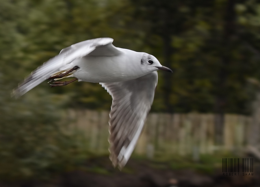
flight-253a-sm by robertalexandershaw, on Flickr
Week 18 Flight.
I had a couple of ideas that fell on their arse when I tried to implement them. So in a last gasp effort to get a picture I went down to a spot where there's a few birds about. I took a lot of shots and there was a lot of blurred and OOF pictures. After about an hour I hoped I had a picture I could use.
I did a bit of a clean up with PS
Best of a bad lot I think.
flight-253a-sm by robertalexandershaw, on Flickr
- Messages
- 2,820
- Name
- Mark
- Edit My Images
- Yes
I tried shooting gulls a while ago, and couldn't believe how hard it was to focus, so think you've done extremely well. Nice close, well composed and well exposed photograph
Last edited:
- Messages
- 1,513
- Name
- Alex
- Edit My Images
- Yes
Short - good thinking and good idea. Wouldnt say its a weak shot by any means. Nice lighting and well done.
Flight - great capture and bang on theme
Flight - great capture and bang on theme
The goblin
<span class="poty">POTY Winner 2015</span></br>
- Messages
- 4,407
- Name
- Marsha
- Edit My Images
- Yes
Great capture. Yes the focus has just been missed but with such a difficult subject you've done well to get anything at all
- Messages
- 13,760
- Edit My Images
- Yes
Hi Robert
Short - I like the lighting on that shot, and an unusual idea, good one !!!
Flight - Well caught that man !!! Nice composition of the bird flying into the frame, I like the background, and the motion blur in the wings adds to the shot nicely - Great Shot !!!
Short - I like the lighting on that shot, and an unusual idea, good one !!!
Flight - Well caught that man !!! Nice composition of the bird flying into the frame, I like the background, and the motion blur in the wings adds to the shot nicely - Great Shot !!!
blakester
Shine On Harvest Moon
- Messages
- 6,679
- Name
- Iain
- Edit My Images
- No
Well done Robert
Good composition with the bird flying into the frame, lots of detail in the feathers, I like the motion in the wings too. A little soft but I suspect you've cropped this a little so softness might be expected. Takes nothing away from a lovely photograph. Iain
Good composition with the bird flying into the frame, lots of detail in the feathers, I like the motion in the wings too. A little soft but I suspect you've cropped this a little so softness might be expected. Takes nothing away from a lovely photograph. Iain
- Messages
- 6,502
- Name
- Peter
- Edit My Images
- Yes
Slightly oof but you've caught a nice bit of motion blur in the wings.
- Messages
- 4,831
- Name
- Alan
- Edit My Images
- Yes
Hi Robert
Short - I like the mysterious atmosphere that you have created with the lighting and the focus. It makes me feel as if there is really something im;portant riding on the outcome of the draw. Good shot
Flight - really hard to get birds in flight in focus. You seem to have got the legs ok But good crop with the space for the bird to fly into and nice subtle colours
Short - I like the mysterious atmosphere that you have created with the lighting and the focus. It makes me feel as if there is really something im;portant riding on the outcome of the draw. Good shot
Flight - really hard to get birds in flight in focus. You seem to have got the legs ok
But good crop with the space for the bird to fly into and nice subtle colours
OP
- Messages
- 989
- Name
- Robert
- Edit My Images
- Yes
Thanks everyone.
Week 19 Authority.
As ever, I struggled.
Belfast City Hall and its council offices was the best I could come up with.
The sky was blown bad, so I tried to change that in PS

week19authority by robertalexandershaw, on Flickr
Week 19 Authority.
As ever, I struggled.
Belfast City Hall and its council offices was the best I could come up with.
The sky was blown bad, so I tried to change that in PS
week19authority by robertalexandershaw, on Flickr
- Messages
- 8,398
- Name
- Lynne
- Edit My Images
- Yes
Hi Robert
thats sure a building for Authority , skies can be a pain but you've got a little bit of detail back . Hate myself for this but the verticals must have been a nightmare...not sure if can change them much in ps but the LHS is seriously leaning whilst the RHS looks almost straight...not sure what could be done
thats sure a building for Authority , skies can be a pain but you've got a little bit of detail back . Hate myself for this but the verticals must have been a nightmare...not sure if can change them much in ps but the LHS is seriously leaning whilst the RHS looks almost straight...not sure what could be done
blakester
Shine On Harvest Moon
- Messages
- 6,679
- Name
- Iain
- Edit My Images
- No
If you have an image with more room at either side of the building Robert, the converging verticals are easy fixed in pp. It is just that you need space around it otherwise it will crop the sides off the building.
I like this image, there is a lot of detail in there, it looks an imposing building which with a moody sky behind it would look even more imposing. Definitely one worth a revisit when the weather is kinder to you.
Its on theme, on time so the objectives have been met.
I didnt find this theme particularly inspiring either.
Iain
- Messages
- 4,831
- Name
- Alan
- Edit My Images
- Yes
....
It shows I rushed it. ....so I've not been as attentive as I should have done.
I think that you have identified how to improve it.
Good subject for the theme and on another day and another time you might find a shot that you are really happy with. It is a super building to evoke the feeling of authority over the years.
The goblin
<span class="poty">POTY Winner 2015</span></br>
- Messages
- 4,407
- Name
- Marsha
- Edit My Images
- Yes
Hi Robert, I agree with Lynne about the leaning LHS. I've just googled how to straighten converging verticals, it looks simple but I bet it messes something else up in the image Here's the link if you want to try it.
I'm not too keen on the sky, it looks a little 'dirty' as opposed to detailed! I have tried fixing blown out flat sky in some of mine too and just given up in the end as I always make it look like it's been dusted for finger prints:bonk:
It is a great building though, and definitely one to consider for a reshoot when you have a lovely blue sky or moody clouds.
Here's the link if you want to try it.I'm not too keen on the sky, it looks a little 'dirty' as opposed to detailed! I have tried fixing blown out flat sky in some of mine too and just given up in the end as I always make it look like it's been dusted for finger prints:bonk:
It is a great building though, and definitely one to consider for a reshoot when you have a lovely blue sky or moody clouds.
- Messages
- 6,408
- Edit My Images
- No
'Authority' - Don't beat your self up over it. It's not that bad, when the sky is all blown often monochrome is the way to go. Certainly bank on theme. I like the colour in the copper topped domes.
Nick
Nick
- Messages
- 255
- Name
- neil
- Edit My Images
- No
Hi Robert.
well it fits the theme, nuff said
well it fits the theme, nuff said
- Messages
- 8,398
- Name
- Lynne
- Edit My Images
- Yes
Thanks Lynne. Appreciate your post. It is a bit of a mess isn't it?
It shows I rushed it. I'm getting seriously bad here at my time management and things have been getting on top of me and so I've not been as attentive as I should have done.
Hi ya
not a mess at all...just bloomin verticals are a mare . Think Iain hit the nail on the head with using a wider image...I tried to straighten it in pp but cropped too much off....a wider shot would work for sure.... but on the + side you've noted the slight error & next time it'll be spot on...I've also learnt that just from Iains post