weekly Lizzy23's 52 thats me i made it 1/2 way, won't get to the end

Soft - #1 for me as I felt it was more on theme

Pride - Well looks like I'll be offending Millie as my vote goes to Molly in #2 :LOL:


Thanks Peter, Millie is now officially sulking with you, and don't think for one minute she's forgotten what you look like:p:p
 
lizzy23 said:
Ermm how do i do that:LOL::LOL::LOL:

I'm not sure what software you have. If you got onto YouTube or Google and search layer masks in ??? whatever software you use there will be some videos to guide you. I've only just discovered masks and I'm still learning here!
 
ermmmmm a bit late this week but will get there!!
 
excuses, excuses!!!:LOL::LOL::LOL::LOL:

look forward to seeing your next shots Liz, it's great to see how your photography has come one during this challenge!:)


Been very busy, the real job has got in the way this week
 
Better Late than never, and the good news is i have something lined up for flight:):)

Apologies for being predictable, but it was the only thing i had hand, not that i like a drink or anything:LOL::LOL::LOL: i have 2 as always

#1


Short 1 by jalizcazan, on Flickr


#2


short 2 by jalizcazan, on Flickr
 
'Pride' - very nice image of your Springer in action, good choice of camera speed and good focus for such a fast moving object.

'Short' - I prefer No 1, no doubt you will get slated for putting ice in as I did ! I like your corner background and composition. Works nicley.

Nick (y)
 
'Pride' - very nice image of your Springer in action, good choice of camera speed and good focus for such a fast moving object.

'Short' - I prefer No 1, no doubt you will get slated for putting ice in as I did ! I like your corner background and composition. Works nicley.

Nick (y)

Thanks Nick, good job it wasn't really whisky;);) but it did the job
 
Another one for #1 Liz, I see you're using your drinks measure well!!

Save some for me, I'll pop over once I get off these antibiotics and can start drinking again!!
 
Another one for #1 Liz, I see you're using your drinks measure well!!

Save some for me, I'll pop over once I get off these antibiotics and can start drinking again!!


You know where we live!!
Number one for me too Liz, I like the composition and the lighting too.

Two looks a little washed out for some reason, maybe a little over exposed:thinking: but I'm not too good at this critique business.

Thanks Marsha
 
Hi there
My favourite is number 1 as I like the composition but also in the second shot the dust in the decanter draws my eye but great shorts (hehe)
 
Hi Liz


Short...... both images right on theme & a rather nice single malt to boot (y)
ICE....NOOOOOOOO :LOL:
1st Image....don't ask me why but images with objects in them displayed like this seem to work better with odd numbers....I'd lose the silver drinks measure & possibly , maybe, go for a slightly lower POV .The BG is a little distracting...maybe a sheet of black card or similar wouldv'e worked , though I do like the corner in the BG.

2nd Image....prefer the 3 itmes & lower POV, poss just a little soft on the decanter top....were you using a tripod ? The DOF if great & helps to hide the BG a bit more...card or cloning maybe ?

Sorry if I seem to be a bit harsh...just saying it as I see it & no doubt others will totally disagree cos I'm not known for being right :LOL:
 
Number 1 for me, deffinately. Mines a double please!
 
Hi there
My favourite is number 1 as I like the composition but also in the second shot the dust in the decanter draws my eye but great shorts (hehe)

I think you're right

I like the first short picture. Good work.

Thanks

Hi Liz


Short...... both images right on theme & a rather nice single malt to boot (y)
ICE....NOOOOOOOO :LOL:
1st Image....don't ask me why but images with objects in them displayed like this seem to work better with odd numbers....I'd lose the silver drinks measure & possibly , maybe, go for a slightly lower POV .The BG is a little distracting...maybe a sheet of black card or similar wouldv'e worked , though I do like the corner in the BG.

2nd Image....prefer the 3 itmes & lower POV, poss just a little soft on the decanter top....were you using a tripod ? The DOF if great & helps to hide the BG a bit more...card or cloning maybe ?

Sorry if I seem to be a bit harsh...just saying it as I see it & no doubt others will totally disagree cos I'm not known for being right :LOL:

Not harsh, i think the soft on the top is more than likely dust, it wasn't sparkling and yes a tripod was used

Short - I much prefer the shallow dof of #2, but it does look a bit washed out - the colours of #1 are better. But on balance #2 gets it for me.
Sorry - me too about the ice - tut tut!! (he he)

Thanks

Number 1 for me, deffinately. Mines a double please!


Thanks

Would just like to add, no whisky was polluted with ice in the making of this photograph, it was tea, and although Glenlivet is a nice single malt it is an even nicer lagavulin in the decanter which is going nowhere near any ice!!
 
1st short pic for me the 2nd one would be better maybe darkened but then i am no expert
 
I suspected you'd photograph your digs for pride. Of the 2, it's #1 for me. Nice low angle and nice tongue. The both look a bit over exposed??

Short, I'd remove the box and feel it would work better. Bit off the bottom, maybe and the BG is a bit distracting. #2 seems a bit over exposed?

Cheers...now where's flight??
 
A combination of the two would get my vote Liz.
The more contrasty #1 combined with the lower pov and composition of #2.
You've certainly got the elements there to really nail it. Good work though on keeping/catching up, Iain.
 
Well going to be late again, I'm determined I'll be on time next week
 
Liz, a tip for you to help you catch up. Shoot everything you see, then on Saturday morning just shoehorn one to fit the theme. Here's an example:

Theme; Brick.

"I shot this photograph of a post box, because post boxes accept letters. I once wrote a letter to my bank about some charges they made, and they passed it to Ms Fatcat in the sales prevention office. Ms Fatcat was, at the time, dating Wayne from Romford, although she hadn't shared that important fact with her husband Tarquine. I think she just fancied a bit of rough to be honest, and why not? It's not like Tarquine had much to offer, what with his job as a female impersonator taking so much of his time, and anyway there's very little fun to be had at the bank besides winding customers up. As it happens Wayne's Dad, who owned a chain of burger vans stretching from the east end of lay-by number 9 on the A13, all the way to the west end of it, lived in a house made out of (….wait for it….), BRICKS!"

See; easy!
 
Last edited:
Well made it i did have an idea for flight when they came i went looking for something else, but ended up back at the original idea, i think they've come out on will post 2 for you

#1


Flight 2 by jalizcazan, on Flickr

#2


Flight 3 by jalizcazan, on Flickr
 
and Back on track with Authority :):):):):)

again 2

#1 speaks for it self really


Authority 2 by jalizcazan, on Flickr

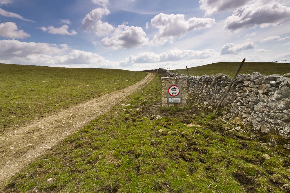
#2 slightly less obvious but signs do have authority like it or not we do pay heed to them,theres a few of these in the dales and they always make me giggle


Authority 3 NO Cars by jalizcazan, on Flickr

Now i've managed to catch up i will do my level best to get round to everyones thread this week
 
Flight - like the idea, good thinking. Think I like #1 the best. Good composition.

Authority - Wetherby Police station?

Love the sky in #2, lovely clouds and the colour of the fields are good too. Might need my specs seeing to but would be better, for the theme, to be a tab closer to the sign.
 
Flight - like the idea, good thinking. Think I like #1 the best. Good composition.

Authority - Wetherby Police station?

Love the sky in #2, lovely clouds and the colour of the fields are good too. Might need my specs seeing to but would be better, for the theme, to be a tab closer to the sign.

Thanks Alex, and no the police station is at the top of Headingley coming back in to Leeds, had one of those moments, when i spotted it and parked in a convenient bus stop after slowing down rather quickly, good job there was nothing behind me:LOL::LOL:
 
Flight #1 for me, nice and close, the red band really sets it off.

Authority #1 is good, just the yellow salt container does detract and I suspect could be cloned out.

Authority #2, good but I'd like a bit closer and a tad off the right. Also, wonder why you didn't use your grads :thinking::thinking:

Cheers.
 
Hi Liz, it took my a second to see what I was looking at in your flight shot as I was looking at the bird of prey:amstupid: I prefer number one for the better composition.

Authority, police are definitely that! Shame about the grit bin though, it does draw the eye!

I really like number two, the track and the wall really lead your eye through the scene. For the theme the sign could be closer, but why ruin such a nice shot?

For all you Wakefield/ Yorkshire lot we're coming up to Barnsley on the 17th May, I was wandering if any of you were free to meet up on the Friday?
 
Good work on catching up Liz, you're bang up to date now with the rest of the week off seeing as you have this weeks theme in the bag. (y)

Another vote for #1 flight image Liz. You have handled the exposure well on what looks like quite a tricky subject. The composition works better on #1, #2 is just a little too tight in the frame.

#2 for authority gets my vote, the sign is a little small in the frame but that doesnt take anything away from the image. Lovely big sky, with the leading line of the track drawing the viewers eye in. Just a little off the bottom to lose some of the grass and it would be perfect IMHO. Iain
 
Flight #1 for me, nice and close, the red band really sets it off.

Authority #1 is good, just the yellow salt container does detract and I suspect could be cloned out.

Authority #2, good but I'd like a bit closer and a tad off the right. Also, wonder why you didn't use your grads :thinking::thinking:

Cheers.

Thanks Andy, will have a go at cloning the bin, i am getting a bit better in lightroom, on the second one i did use my grads stacked , but by this time it was midday the sun was coming in from the right, throwing the sign into shadow, will have a look later if i have a better one:)

Number 1 out of the flight shots, I prefer the composition and the exposure looks better.
Authority, #2 for me, very nice sky with a lovely scene. Like the connection to the theme in there.

Thanks

Hi Liz, it took my a second to see what I was looking at in your flight shot as I was looking at the bird of prey:amstupid: I prefer number one for the better composition.

Authority, police are definitely that! Shame about the grit bin though, it does draw the eye!

I really like number two, the track and the wall really lead your eye through the scene. For the theme the sign could be closer, but why ruin such a nice shot?

For all you Wakefield/ Yorkshire lot we're coming up to Barnsley on the 17th May, I was wandering if any of you were free to meet up on the Friday?

Thanks Marsha, i know theres a meet planned for the 25th but maybe some of us could get together on the Friday, would be evening for me though, why don't you start a meet thread

Good work on catching up Liz, you're bang up to date now with the rest of the week off seeing as you have this weeks theme in the bag. (y)

Another vote for #1 flight image Liz. You have handled the exposure well on what looks like quite a tricky subject. The composition works better on #1, #2 is just a little too tight in the frame.

#2 for authority gets my vote, the sign is a little small in the frame but that doesnt take anything away from the image. Lovely big sky, with the leading line of the track drawing the viewers eye in. Just a little off the bottom to lose some of the grass and it would be perfect IMHO. Iain


Thanks Iain, again i took a few of the sign on the track so will go back and see if i have a closer one
 
Another #1 for flight.
Authority - #2 Good idea but would like a bit nearer to give prominance to the sign.
 
Another #1 for flight.
Authority - #2 Good idea but would like a bit nearer to give prominance to the sign.

Flight. Has to be number 1, lighting is better
Authority - like both shot, but going for number 2, as Fazer has pointed out would have looked better with the sing a tad closer.
Darren


Thanks Both
 
Back
Top