weekly DK's 2012 '52' - UPDATED 28-12-12

I think vignettes work best when very subtle. In most cases, I don't think the viewer should notice they're there until they're pointed out. It doesn't take much to make a big improvement (and not a lot more to ruin the picture!)..
Noted (y)
 
Hey DK, yay for being in on time, I've stolen your mantle and am now behind:bonk:

Abstract, I didn't have a clue what it was either, even after you said what it was!!! I prefer the original as you cropped a bit of the starburst off in the second version! B&W looks good though and great for the theme.

Symmetry, I prefer number one for the detail in the fence, like you say the arch is lost in the second one. I like the idea and the fact it's not a straight on shot. Personally I would have shot in landscape view to cut out some of the surrounding trees and stuff, maybe got a bit closer too:thinking:
I would say to get blue sky shoot when the light is favourable, but I don't think we're getting any more favourable sky this summer:bonk:

Onto week 25, nearly half way :eek:
 
Original abstract is better.
Thanks Michael... confirms my thoughts

Abstract - I think I agree with the others about the crop - I prefer the original. PS I am none the wiser now you have told us what it is !!
Cheers Mike... Having a teenage daughter into 'alternative' idea's is handy at times :D
Symmetry - I'm not getting it to be honest - doesn't really look symmetrical to me.
Ahhhh it's not meant to be symmetrical, that was my idea, the theme of 'symmetry' I wanted to show the fence that has many attributes that show symmetry, the panels are symmetrical, the arch is in the middle with 3.5 panels each side so a picture dead on would be symmetrical, I was trying for symmetry in a round and about way - confusing I know :D
 
Hi DK


what on earth is that thing in your alternative Abstract image ? looks like an alien , very evil object...mono suits & think I prefer the original image....just googled Steampunk goggles....ummmmm:LOL:

Symmetry.....still pondering this one , far to complicated for me to think of something that is symmetrical but shown in a non symmetrical way.....n that sentence doesn't make sense even to me :LOL:
 
Liking the symmetry shots and you look to have a lovely garden! One of those places that you can always find a quiet corner to read a book! Ok getting carried away!!

I like..........#1 I think!
 
Hi DK


what on earth is that thing in your alternative Abstract image ? looks like an alien , very evil object...mono suits & think I prefer the original image....just googled Steampunk goggles....ummmmm:LOL:
Hi Lynne... you not got a pair of them then :D

Symmetry.....still pondering this one , far to complicated for me to think of something that is symmetrical but shown in a non symmetrical way.....n that sentence doesn't make sense even to me :LOL:
Excellent... that's the idea :nuts:

Thanks for the great comments

Liking the symmetry shots and you look to have a lovely garden! One of those places that you can always find a quiet corner to read a book! Ok getting carried away!!

I like..........#1 I think!
Hi Alex... you certainly can, even more at the moment as the grass is so long, just need some more descent weather to enjoy it :)

And thanks too :)
 
Hi Dean :wave:
I have not been around commenting much but am attempting a catch up in avoidance of grass cutting this fine Sunday morning :LOL:

Those glasses are certainly abstract, I prefer your first version and the not so tight crop. I must have been a magpie in a former life, photographs of shiny things are very eye catching and these are no exception. You've handled the light well, and the starburst works well too.

From a symmetry point of view, #1 works best but as has been mentioned about the sky, #2 works better. As far as being on theme, I have commented on Summer's thread on this very point. My interpretation is symmetry not symmetrical therefore I think objects/people can be in symmetry without being identical so I think yours works on that score. Iain
 
Hi Dean :wave:
I have not been around commenting much but am attempting a catch up in avoidance of grass cutting this fine Sunday morning :LOL:
Lucky you... just finished mine a little while ago before it got too out of hab=nd... done a quick mow (not strimmer as well) and it still took 2 hours... god damn rain makes the grass grow !!!!

Those glasses are certainly abstract, I prefer your first version and the not so tight crop. I must have been a magpie in a former life, photographs of shiny things are very eye catching and these are no exception. You've handled the light well, and the starburst works well too.
I had noticed, and made a mental note to hide all my shiny stuff if you every pop around for a cuppa ;)

Glad you think it's abstract, it was tough for me to think of something odd...

From a symmetry point of view, #1 works best but as has been mentioned about the sky, #2 works better. As far as being on theme, I have commented on Summer's thread on this very point. My interpretation is symmetry not symmetrical therefore I think objects/people can be in symmetry without being identical so I think yours works on that score. Iain
YAY !!!! my thoughts too, although my explanation may have not been so digestible :D

Thanks for popping in and commenting (y)
 
Hmm... Symmetry, tough one... I prefer the first image for the theme, it's an interesting angle, and beats the dead ahead view... and I think that's a bit lost in the second, but do prefer the sky in the second.
 
Hmm... Symmetry, tough one... I prefer the first image for the theme, it's an interesting angle, and beats the dead ahead view... and I think that's a bit lost in the second, but do prefer the sky in the second.
Hi John... sounds like you agree with most, cheers for popping by (y)
 
A short trip to Gt Yarmouth hoping to get the moody skies over the offshore wind farm, the sea was rough but the clouds were not playing ball - Buggers

Wk25 - 'Moody' Looking inland
(2 alternate shots on Flickr - I must stop doing that)


Wk25 - 'Moody' by TP DK..., on Flickr


Ignore the blown sun... it's not really there - it adds to the shot really :cautious:

I knew I was going to have a manic week and hoping to get another shot in... but took these on Sat as reserve shots

Thanks for looking :D
 
:thinking: :thinking: :thinking:

Missed loads of yours...how strange!

Apologies (y)

Shiny..cracker. I didn't read your commentary but knew before I did that you'd left the bonnet line in for a reason. Doesn't work half as good without it. I had a quick play with levels in PS and quite liked increasing the contrast.

Entranced..I was looking to do something similar but Isabelle wouldn't stay still long enough. Like it, nice and sharp, reflections work really well. Just clipped the left eye lashes.

Abstract...no idea what it is...but I'm a bit frazzled. Nice flair.

Moody...like it. Blown bit don't bother me at all. Cracking light and nice muted colours.

Now subscribed...(y)

Cheers.
 
:thinking: :thinking: :thinking:

Missed loads of yours...how strange!

Apologies (y)
No problem at all... we all miss people (y)

Shiny..cracker. I didn't read your commentary but knew before I did that you'd left the bonnet line in for a reason. Doesn't work half as good without it. I had a quick play with levels in PS and quite liked increasing the contrast.
Nice one... thanks :)

Entranced..I was looking to do something similar but Isabelle wouldn't stay still long enough. Like it, nice and sharp, reflections work really well. Just clipped the left eye lashes.
Thanks again - It was a tricky one... as my daughter nearly always blinks during photo's

Abstract...no idea what it is...but I'm a bit frazzled. Nice flair.
Again - Thank you, i'm surprised how few people know what they are - in fact nobody - does that make me odd :cautious:

Moody...like it. Blown bit don't bother me at all. Cracking light and nice muted colours.
Cheers... again was a tough choice, would have preferred heavily dense clouds, but the weather is so un-predictable
Now subscribed...(y)

Cheers.
Nice One :)
 
:wave: hi ya

Moody....lovely image , another that doesn't mind the blown bit as it does add to the feeling, wonderfull clouds , liking the building in the distance & the few beams of sunlight......LOVE IT :clap:
Hi Lynne - Thanks... I wasn't sure actually whether to clone out the buildings or not, but in the end just put it up so I wasn't too late this week :D
 
Symmetry - I'm afraid it doesn't shout the theme but as others have said #2 is the better of the two exposure wise.

Moody - Fits the theme and strangely rather than just the dark sky it's the glow in the bottom right hand corner that makes it work for me
 
Symmetry - I'm afraid it doesn't shout the theme but as others have said #2 is the better of the two exposure wise.

Moody - Fits the theme and strangely rather than just the dark sky it's the glow in the bottom right hand corner that makes it work for me
Cheers Peter :)

I was hoping the glow was going to get captured in more detail as it looked real nice at the time.. what ever I tried in PP made the sun area blow alot more - I must learn how to do areas selectively :thinking:
 
Blown bit, what blown bit? Oh that bit!

Like it. Not one of your strongest I think, just because, well, it's the sky, but it is a great shot. It's just your others are even better!
 
Blown bit, what blown bit? Oh that bit!

Like it. Not one of your strongest I think, just because, well, it's the sky, but it is a great shot. It's just your others are even better!
Cheers Mark... know totally where you are coming from, not an alternative shot that's for sure (y)

I did not spot it at first but the bottom corner that Peter mentions is what makes it. That section is all about the moody!!

Nice sky shot!
Hi Alex - Thanks for the compliment :)


I like that, a nice moody sky and the blown bit doesn't bother me. Out of the the alternatives I really like number 2.
Thanks Michael... I'm glad the blown section doesn't bother people, as the brightness of the sun was very intense there :)

Alternative 2 was nearly my choice for the week, but the sun coming through sealed the given shot in the end !!!
 
Last edited:
Hi Dean, well done for getting back on track early this week!:)

I like your moody sky like Peter and Alex have said the bottom right makes it, but I think I prefer moody 2 on your flickr!
I was hoping to get out and capture a moody sky this week but either the sky wouldnt play or I coudn't get out and had to look at the moody sky from the house.

Now wheres your reshoot!!:LOL::LOL:
 
Hi Dean, well done for getting back on track early this week!:)
Thanks Sarah - It's nice to be up to date again :)

I like your moody sky like Peter and Alex have said the bottom right makes it, but I think I prefer moody 2 on your flickr!
Do you - Well I am surprised there wasn't more of an even split, as it was a tough choice for me , Glad you like them
I was hoping to get out and capture a moody sky this week but either the sky wouldnt play or I coudn't get out and had to look at the moody sky from the house.
It sure has been so un-predictable hasn't it

Now wheres your reshoot!!:LOL::LOL:
:p

Seriously I may do one tomorrow if things go to plan

Hi DK

Moody - good shot. The elements go together to create a mood iand it is the sum of the parts that makes it for me. :clap:
Hi Alan - thanks buddy :)
 
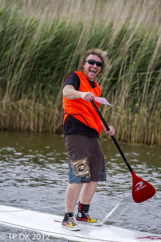
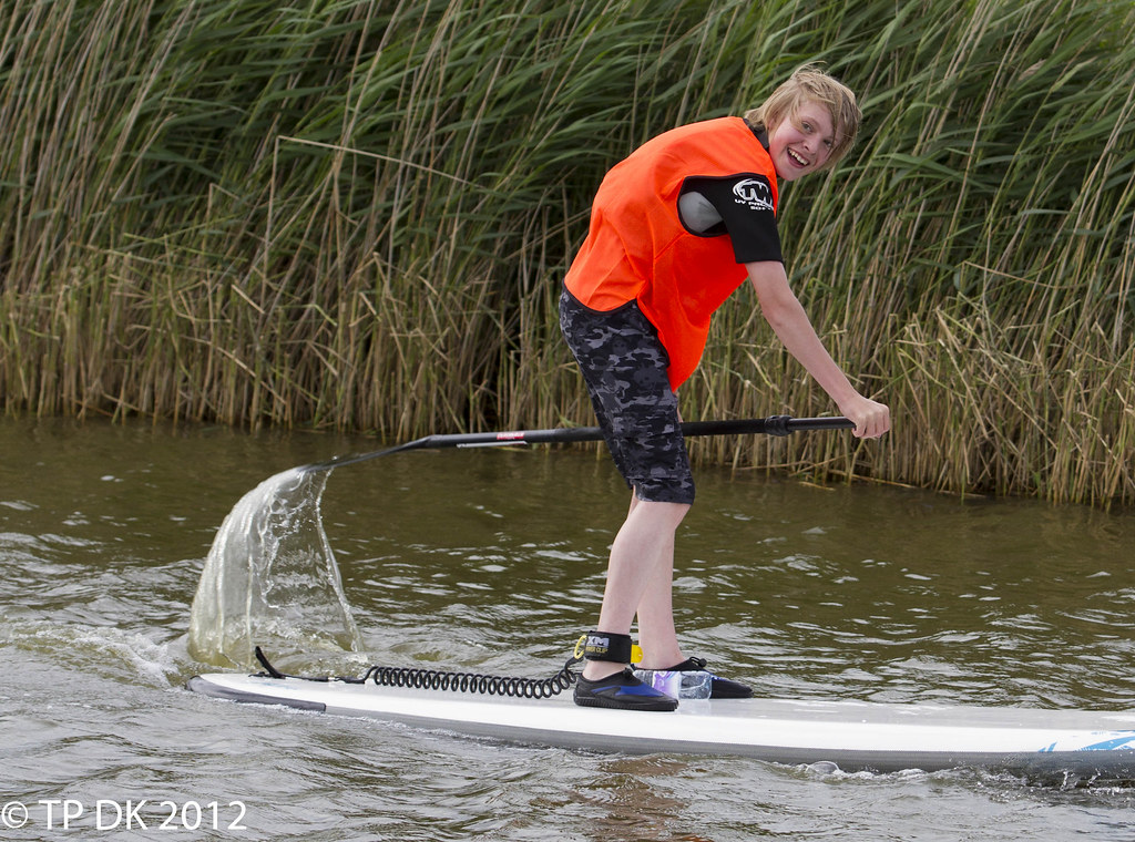
SUP Racing

Stand Up Paddle Surfing is an ancient form of surfing. It can be traced back to the very early days of polyenisia.

I went for a walk on Saturday as I noticed there was a 'Norfolk Classic SUP race' happening at one of the local broards... I went along and would you believe it, I got 'volunteered' as the official photographer :cautious:

Anyway - on to the pics, not sure whether 'Joy' is fully captured but they were all 'Joyous' when they crossed the finish

Here are a couple of them:

  • The Junior race is a good 4 miles
  • The Mens and Womens race is a staggering 13 miles

I prefer the overall image of the winner of the Junior race, yet this guy although not first was VERY pleased to have made it !!!!

I'll let you choose (y)

Wk26 - 'Joy' at crossing the line, albeit rather knackered :D


Wk26 - 'Joy' 1 by TP DK..., on Flickr


Wk26 - 'Joy' 2 by TP DK..., on Flickr

Cheers for looking
 
Last edited:
Both very good images Dean, number 2 for me, number 1 is good, but think might benefit from a tighter crop?
Cheers Michael :)

I was struggling at what to crop... closer to head and more of the board front ??

I wanted to keep the paddle/water in to help show the movement, do you think that would work still ??
 
I would crop just to the left of the splash over to where the large patch of blue ends

Good thinking... he is rather central isn't he, there was me tring to keep in as much board as possible thus ignoring basics :bonk:

Hows this ??


Wk26 - 'Joy' Edit 1 by TP DK..., on Flickr
 
Definitely joy 2 is bang on theme. The look on the blokes face says it all. The bright colours in his bib and the flash footwear all add to the theme Dean, good work there (y)

You are determined not to have the lastminutedotcom title from me aren't you? :cautious:
I will hold onto it for another week but after that, someone else can have it :LOL:
Cheers Iain :)

Well... I just wonder who will pick up the Trophy next week, I'm hoping it's not going to be me :D
 
Back
Top