weekly Lizzy23's 52 thats me i made it 1/2 way, won't get to the end

Hi Liz.

Temperature it'd have to be number 2 for me; the angle change makes it a more interesting shot by a factor of 10 IMHO.

Abstract I'd have to go for number 1. I love the second, contrasting, swirl toward the bottom. I might be tempted to crop out the yellow spot top left and with it the heavier curved line at the top, making it even more abstract and placing the centre of that second swirl on the bottom left third, like below. Personally I think that lifts it from superb to stupendous!!!


7342184916_eeefc24487_b.jpg by MarkBerry1963, on Flickr
 
Hi Liz, trying to catch up with last 10 weeks so apologies.

Abstract - nice set, no.3 my favourite of the 3.

Temperature - bang on theme, colours spot on, 1st of the 2 shots for me, not sure on the dof on the 2nd tbh.

Authority - edit on the 2nd pic for me, but also the police sign did make me smile as it looks like it's just plonked in the middle of nowhere.

Random - great idea and love it :)
 
Hi Liz, I prefer #1 of your temp - its nice and sharp and the colours are soo vibrant - I prefer the angle of this one!

Abstract - another great set - I like the circles on the first one and wonder what it would look like if you framed it around this!:):)

I've just seen Marks edit - brilliant!!
 
Last edited:
Temperature nice colour but N02 for me and 1 or 3 on abstract leaning toward 1 as the pink is a bit too vibrant in the top of 3
 
Hi Liz.

Temperature it'd have to be number 2 for me; the angle change makes it a more interesting shot by a factor of 10 IMHO.

Abstract I'd have to go for number 1. I love the second, contrasting, swirl toward the bottom. I might be tempted to crop out the yellow spot top left and with it the heavier curved line at the top, making it even more abstract and placing the centre of that second swirl on the bottom left third, like below. Personally I think that lifts it from superb to stupendous!!!


7342184916_eeefc24487_b.jpg by MarkBerry1963, on Flickr

Thanks Mark, and the edit is spot on

Hi Liz, trying to catch up with last 10 weeks so apologies.

Abstract - nice set, no.3 my favourite of the 3.

Temperature - bang on theme, colours spot on, 1st of the 2 shots for me, not sure on the dof on the 2nd tbh.

Authority - edit on the 2nd pic for me, but also the police sign did make me smile as it looks like it's just plonked in the middle of nowhere.

Random - great idea and love it :)

Thanks

Hi Liz, I prefer #1 of your temp - its nice and sharp and the colours are soo vibrant - I prefer the angle of this one!

Abstract - another great set - I like the circles on the first one and wonder what it would look like if you framed it around this!:):)

I've just seen Marks edit - brilliant!!

Thanks

Number 2 for temperature. Abstract has to be number 1 with Marks crop. Very nice.

Thanks, yes Mark's crop has made it

Temperature nice colour but N02 for me and 1 or 3 on abstract leaning toward 1 as the pink is a bit too vibrant in the top of 3

Thanks
 
Hi Lizzy , glad to see you back on form :)

Temperature.....number 2 for me , the nagles just works better , like the bold colors (y)

Abstract.....ummm great set of images but number 2 for me as well , the swirl really sets it apart from the rest,love that vibrant pink , the cropped version better to lose that little smudge top right.....good work girlie , keep it up :clap:
 
Last edited:
Hi Lizzy.

Pleased that you have your camera back. I sympathise with your comment

'...but its the first time in my life that i've ever had anything that expensive brand new, just because i wanted it' Sickener when it doesn't work.

Random - good choice for theme. Prefer layout in #2

Temperature - great idea, well executed - lots of well produced colour.(y) Like both versions but #2 is better, partic as the letters on the labels have a better 3D effect.

abstract - Again good choices. At first thought that #3 was best as #1 had distracions but edit at post #441 shows what a good pic it is - good colour.
 
Hi Lizzy, good to see you back

Temperature - I'm going to have to go fro no:2, as 1 is too squiffy - really like the colours in both, and the seconds adds a bit more depth to it too

Abstract - No:1 for me on this one, nice strong colours in all 3, but I like the extra swirl in the bottom section... Great edit too (y)
 
Hi Lizzy , glad to see you back on form :)

Temperature.....number 2 for me , the nagles just works better , like the bold colors (y)

Abstract.....ummm great set of images but number 2 for me as well , the swirl really sets it apart from the rest,love that vibrant pink , the cropped version better to lose that little smudge top right.....good work girlie , keep it up :clap:

Hi Lizzy.

Pleased that you have your camera back. I sympathise with your comment

'...but its the first time in my life that i've ever had anything that expensive brand new, just because i wanted it' Sickener when it doesn't work.

Random - good choice for theme. Prefer layout in #2

Temperature - great idea, well executed - lots of well produced colour.(y) Like both versions but #2 is better, partic as the letters on the labels have a better 3D effect.

abstract - Again good choices. At first thought that #3 was best as #1 had distracions but edit at post #441 shows what a good pic it is - good colour.

Hi Lizzy, good to see you back

Temperature - I'm going to have to go fro no:2, as 1 is too squiffy - really like the colours in both, and the seconds adds a bit more depth to it too

Abstract - No:1 for me on this one, nice strong colours in all 3, but I like the extra swirl in the bottom section... Great edit too (y)


Thankyou all, i enjoyed taking these even though i was pushed on time etc
 
Temperature - #2 for me due to it being on more of an angle. I'd maybe have preferred a slightly wider DoF to get all the writing in focus though.

Abstract - #1 for me - I think the lines work nicely together.
 
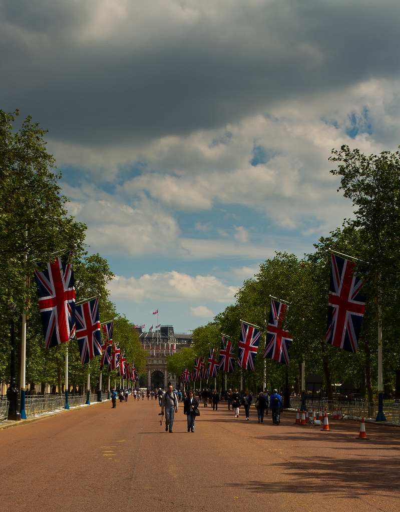
Sorry everyone, i'm managing to take the photos but am really struggling to get round and comment, here are my symmetry submissions, i've been to London with work today and i always have a couple of hrs to kill so my camera has been with me this time, i think the Flags down The Mall are very symmetrical, i have two for you, one in either direction

#1


Symmetry 2 by jalizcazan, on Flickr

#2


Symmetry by jalizcazan, on Flickr
 
A few steps to the side was what I thought as well. I'm plucking for #1 though as I find the statue and palace in the background pulls the eyes towards them more. Looks like you were getting better weather than we were up here.
 
Hi Liz

Symmetry - Another vote here for no:1, would also have liked to see it a couple of paces to the left to get the full effect, BUT even as it is I think it works very well as Symmetrical, It also has great light on the flags and monument which give it a nice bit of punch to me
 
Hiya Liz, I am going to go with image number 2, I like the 2 people walking towards you and I prefer the overall composition as well. Nuber 1 is good, but I keep wanting to see it taken from a few steps to the left.

i did think that when i got home, but i do like it

A few steps to the side was what I thought as well. I'm plucking for #1 though as I find the statue and palace in the background pulls the eyes towards them more. Looks like you were getting better weather than we were up here.

Much better Peter, was wasndering round in shirt sleeves:)

Hi Liz

Symmetry - Another vote here for no:1, would also have liked to see it a couple of paces to the left to get the full effect, BUT even as it is I think it works very well as Symmetrical, It also has great light on the flags and monument which give it a nice bit of punch to me

Thanks
 
No 1 for me has a better focal point at the end and with everyone els with a couple of steps to the middle of the road, but i like it anyway :)
 
Hi Liz. I think I would have preferred these truly symmetrical, but they're lovely shots with great colours. I like the sky in number 2 but the sun on the flags in number 1!!!!
 
No 1 for me has a better focal point at the end and with everyone els with a couple of steps to the middle of the road, but i like it anyway :)

Thanks

Hi Liz. I think I would have preferred these truly symmetrical, but they're lovely shots with great colours. I like the sky in number 2 but the sun on the flags in number 1!!!!

Thanks Mark, one of the things i'm really finding with the 52, is where my interest lies photography wise, and now i've discovered Lightroom, how to make the most of my processing:):)
 
Like these, especially the light. Well balance with cracking detail in the sky.

I'd like them better if you were central in the Mall (?).

Cheers.
 
Hi Liz, #1 for me as well. It looks like you had better weather down there as well!!

Thanks Sarah

Like these, especially the light. Well balance with cracking detail in the sky.

I'd like them better if you were central in the Mall (?).

Cheers.

true, will have to go back for another crack,although i have a feeling the flags will have gone by the next time;)
 
Works for me as symmetry preferring the second one although maybe a square crop to get rid of most of the big grey cloud at the top.
 
#1 for me, like the light on the flags and the fact its leading up to the palace. Both imply symmetry and shows that symmetry is everywhere but the fact that you are not dead on central does not bother me.

Sounds like your trip to London was successful!!
 
Much better Peter, was wasndering round in shirt sleeves:)

This is why we southern softies grumble when visiting up north!!!

Another fan for number one, the sunlight on the flags really highlights them. If only you could take the lovely blue sky from number two and PP it into number one!

Glad you had a good trip to London. Working so close I really should make the effort to go in for some photography!
 
Taken on Friday on my way up to Northumberland, it was a grey moody naff day, so thought i would go for some really grainy processing, some will like some won't.


_MG_3032 by jalizcazan, on Flickr
 
First up Liz, it was great to meet you over what was a fantastic weekend :D

I like your moody photograph, the leading lines through the image work well, lots of detail in the stone work, the subject suits the B&W conversion and the composition is spot on. The only thing I am unsure of is lighthouse or wall as the focal point :thinking:

I will have another look and see :LOL: Iain
 
The only thing I am unsure of is lighthouse or wall as the focal point :thinking:

Hi Liz :) I had the same thought: the wall is fab, but the lighthouse seems a little lost in darkness. If it was surrounded by spooky silvery mist that'd be perfect, but I don't see any. Maybe lighten it up a little, restore some detail and texture?
 
Moody of sorts, but I like it....I could really get to like B&Ws...:D

The lack of focus on the lighthouse doesn't really bother me, but a tad closer to get rid of the LH thing on the wall or a clone in post?

Cheers.
 
hi Lizzy

Symmetry - good shot and well spotted. #1 has the better colour and contrast I feel and i do like the emphasis on the gold statue at the end. Just had another look as writing this and I realise that it is the brightness of the flags in #1 that stand out whereas in #2 many flags are in shade.

Moody - there are a few niggles with that post thing at the side and the point of focus but overall I think that this is a high quality composition (y) - strong lead in lines, good vertical stop point, good crop, good processing - the mono really suits the moody theme.
 
Last edited:
Now that I like! The processing really suits it and the black and white is lovely.

First up Liz, it was great to meet you over what was a fantastic weekend :D

I like your moody photograph, the leading lines through the image work well, lots of detail in the stone work, the subject suits the B&W conversion and the composition is spot on. The only thing I am unsure of is lighthouse or wall as the focal point :thinking:

I will have another look and see :LOL: Iain

Hi Liz :) I had the same thought: the wall is fab, but the lighthouse seems a little lost in darkness. If it was surrounded by spooky silvery mist that'd be perfect, but I don't see any. Maybe lighten it up a little, restore some detail and texture?

Hi Lizzy, as above really, but I love the shot and the processing, loads of nice textures and tones everywhere, great composition too, just a tad more focuc on the lighthouse someway and it would be perfect :)

Moody of sorts, but I like it....I could really get to like B&Ws...:D

The lack of focus on the lighthouse doesn't really bother me, but a tad closer to get rid of the LH thing on the wall or a clone in post?

Cheers.

Nice lead in but I'd have liked to have seen the lighthouse in a bit more focus and (forgive the pun) lightened a bit.

hi Lizzy

Symmetry - good shot and well spotted. #1 has the better colour and contrast I feel and i do like the emphasis on the gold statue at the end. Just had another look as writing this and I realise that it is the brightness of the flags in #1 that stand out whereas in #2 many flags are in shade.

Moody - there are a few niggles with that post thing at the side and the point of focus but overall I think that this is a high quality composition (y) - strong lead in lines, good vertical stop point, good crop, good processing - the mono really suits the moody theme.

Hi Liz, I hadn't noticed that little nobbly thing on the left until it was pointed out :bonk: Great shot though, the grain really adds mood to the shot. Yes it would have been even better if the lighthouse was sharper, but it doesn't bother me too much.

Great leading line, love the colour (or lack of it!). Definitely looks moody. Good textures and details.

Thankyou all i've been a bit manic this week so have not been back to my thread, the focus was on the wall, i felt it made a great leading line and it was such a crappy day that some extreme processing was called for, i always knew this would be a bit of a marmite shot as i have concentrated on the texture in the wall, leaving the lighthouse a bit oof
 
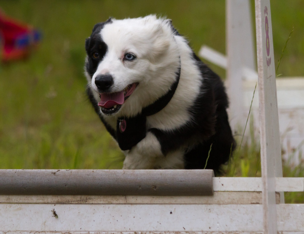
only a day late and have an idea for small, so Joy, nothing more joyfull than watching a woofa do something that she loves, and a bit joyfull going back to my photography roots this is Missy at flyball training today


_MG_3684 by jalizcazan, on Flickr
 
Back
Top