weekly Summer's 52 - week 51 negative

thanks Marsha :)

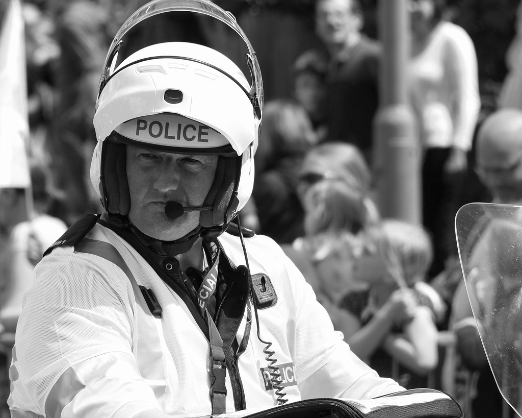
seems my son likes doing fun shots so now he's trying to think of a funny one for 'straight' :LOL:
 
I tried to darken the sky but not sure if it's helped. I have a new laptop and the screen seems to have low contrast (which I can't adjust). I may well do an experiment later...
 
his jacket was a bit bright so I think I just managed to catch it un-blown. I did it in mono to emphasize the serious look ha ha - if you look at my other pics you can see how much fun he was :)
 
Yep a great take... the B&W sure helps give attention to his face, I'm sure the colour shot would have the jacket standing out way too much, really like the background too, can make out the people but perfectly oof which gives good atmosphere - Nice One
 
Last edited:
You've done well to handle the exposure on the face given how bright the fluorescent jacket must have been. As DK has pointed out the oof background works well.
 
Nice idea for small works well

Straight looks very stern nice capture (y)
 
thanks guys :) Pleased you like it :clap:

Marsha, we were worried he was going to stand there right in our way lol, but then he started high 5'ing all the other bikers, he did the crowd too and sat on his bike blowing his whistle and blasting his sirens, he was brilliant, really cheered everyone up (we'd been in the queue for a few hours by then). I also got a good one of him smiling :)
 
Small works well, though the exposure isn't quite balanced between the two boys I think.

Straight is very very good, and the conversion suits it extremely well.
 
thanks Sarah and Mark :)

the exposure should be the same as it one photo - only pp is blurring the background and desaturate. Or did you mean something else? I guess because my son is closest he might seem a bit darker?
 
Yes, I just think the "smaller" guy looks a little too bright to match the position he's meant to be in. I guess he must have been catching some light. I tiny bit of local adjustment would sort it out.
 
ooo my pp skills aren't up to that :LOL:
 
week 29 - letter

for this I was glad I like writing so much.

Here I have used a Murano Glass fountain pen and ink pot. I have also used some letters from my American pen-pal who I used to write to in the 70's. She was the grand-niece of Abraham Beame who was the mayor of NY at the time.

please be sure to comment on the lighting/contrast as I'm using a different monitor and I'm pretty sure the contrast is not set right (haven't worked out how to change it yet)

there is another version on Flickr but I wasn't sure which I preferred.


week 29 - letter by moominmama, on Flickr
 
Hi Summer,
I looked at your other version over on flickr and do prefer the more muted colour tones of that version. However, I prefer the composition and dof you have taken with the tp version.
The contrast appears fine to me but I am on a laptop which is uncalibrated. Perhaps someone with a calibrated monitor will be along soon to give a more informed opinion.
Iain
 
the one I've uploaded here looks far too dark on my screen but the one on flickr looks far too bright, I wish I hadn't changed my lap top now :(

well, no that's not true because this one can handle RAW yay
 
Hi Summer

catch up time , 'pologies for being slack !

Small.....brilliant ...great idea , great pp(I presume ?)...far better than i could do...excellent :clap:

Straight...I just love policebikers....even more so if they are scottish :D...great DOF , great focus , great expression.....I'd have had the urge to SC it but like the mono (y)

Letter...I prefer this version , lovely warm tones that suit the verse , gorgeous pen ,lighting & contrast look fine to me...lovely image (y)
 
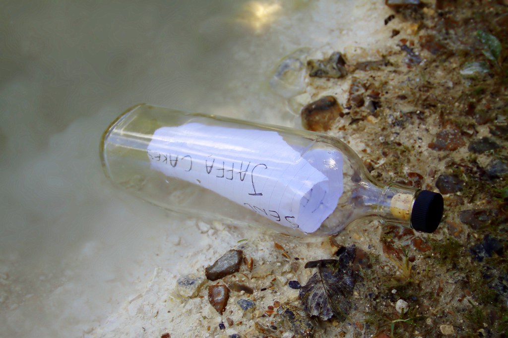
I did this one just for fun...I thought it was a good enough idea but I'm nowhere near the sea so I had to use the local duck pond. The edge had a steep drop so I couldn't stand the bottle up in the water (was wary of it floating away across the pond, which would have netted me a fine) so I did the best I could :LOL:


Help! send Jaffa Cakes by moominmama, on Flickr
 
Hi, Summer, Letter #1 is well composed, if a little busy for me.

It has a nice warm feeling to it I'd prefer the pen to be besides the paper.

Letter #2, like it and great message.

Good show.

Cheers.
 
Lighting and contrast seem fine on my monitor prefer number 1 as Jaffa cakes are just wrong, nice idea just wrong biscuit/cake. ;)
 
thanks for the comments guys :clap: I think I've got the contrast etc sorted now, phew :banana:
 
Hi Summer, sorry i've missed a few.
Small - a great idea and well composed. Think the BG a bit too fussy though.
Straight - A good take on theme and BW works.
Letter - I like this layout and nice pen. I find the candle a bit distracting maybe a darker one with just the flame?
Contrast - works for me. straight lines of the bag, complemented by the wavy background with excellent lighting(y)
 
Back
Top