

You are using an out of date browser. It may not display this or other websites correctly.
You should upgrade or use an alternative browser.
You should upgrade or use an alternative browser.
weekly Bilko's 52 for 2012 - Week 48 Shadow Added
- Thread starter Bilko
- Start date
- Messages
- 1,513
- Name
- Alex
- Edit My Images
- Yes
Good shot, really like this for the theme. Works well as a B&W, would be easy to focus in on the red shirt. Nice solid black background, nice and strong.
The goblin
<span class="poty">POTY Winner 2015</span></br>
- Messages
- 4,407
- Name
- Marsha
- Edit My Images
- Yes
Hi Robert, I am with you on the lack of time thing which is why I've not dropped in on your thread for quite some time:bonk:
Symmetry, great shot! Mainly because of how you've dealt with the lighting, whenever I try and use a flash on a background I get harsh bright spots, my flash knowledge is limited!
Moody, again nice lighting, I like the composition.
Flight reshoot is excellent, I have soooo many issues getting the focus right when something is travelling towards you, you've captured this gull perfectly
Joy, nice black background and your son well lit. His posture definitely says joy but his eyes look like they're ever so slightly mid blink and a tad tipsy looking
It looks like you're enjoying your new camera.
- Messages
- 2,820
- Name
- Mark
- Edit My Images
- Yes
Moody looks great; wonderfully lit!
Reshoot is a fantastic and unusual point of view, well captured.
Joy is perfect for the theme, and the B&W just makes it. Lovely picture")
Reshoot is a fantastic and unusual point of view, well captured.
Joy is perfect for the theme, and the B&W just makes it. Lovely picture
OP
- Messages
- 989
- Name
- Robert
- Edit My Images
- Yes
Thank you everyone for taking the time to post your critique. Greatly appreciated.
Week 27 Small.
I found Brian out the front trying to dodge the rain and I noticed how he was smaller than the average snail.
To show his small size I used a boot. I had two flashes bouncing the light from either side of the camera with Brian moving across a piece of card.

Week 27 Small - Brian by robertalexandershaw, on Flickr
Week 27 Small.
I found Brian out the front trying to dodge the rain and I noticed how he was smaller than the average snail.
To show his small size I used a boot. I had two flashes bouncing the light from either side of the camera with Brian moving across a piece of card.
Week 27 Small - Brian by robertalexandershaw, on Flickr
- Messages
- 4,828
- Name
- Alan
- Edit My Images
- Yes
Robert
Small - Like this shot a lot.
Clear focus, good lighting, partic the way the shadow falls over the snail and the darker triangle to the right.
A few specks on the boot. Probably the boot is too clean , which shows up the specks.
Good handling of the 'BRIAN' word too
Small - Like this shot a lot.
Clear focus, good lighting, partic the way the shadow falls over the snail and the darker triangle to the right.
A few specks on the boot. Probably the boot is too clean , which shows up the specks.
Good handling of the 'BRIAN' word too
- Messages
- 1,513
- Name
- Alex
- Edit My Images
- Yes
Awww poor brian. He looks like fun though, good idea for the theme. Thinking outside of the box and it has worked well.
Nice focus, good lighting, well delivered!
Nice focus, good lighting, well delivered!
*Sarah*
Peel Me!
- Messages
- 1,873
- Name
- Sarah
- Edit My Images
- Yes
Aww I hope Brian made a swift escape!!
The snails round here are def not small at the moment after eating most of all my plants!!
A great idea and very well taken though I can't decide whether a bit of mud on the boot would add to it or not!!
The snails round here are def not small at the moment after eating most of all my plants!!
A great idea and very well taken though I can't decide whether a bit of mud on the boot would add to it or not!!
The goblin
<span class="poty">POTY Winner 2015</span></br>
- Messages
- 4,407
- Name
- Marsha
- Edit My Images
- Yes
That made me chuckle! I hope Brian wasn't injured in the taking of this?Can I ask how you set your flashes up? How far away, bounced that sort of thing? Or a photo of your set up?
blakester
Shine On Harvest Moon
- Messages
- 6,679
- Name
- Iain
- Edit My Images
- No
Great work on small Robert, just don't let Lynne (Blondie) see this because after meeting her on the recent Northumberland meet, I think she has something of a snail fetish Perfect lighting on this. Its funny, creative and very well executed (Lynne excuse the pun
) Iain
OP
- Messages
- 989
- Name
- Robert
- Edit My Images
- Yes
Thanks Everyone.
Marsha, here's a set up picture. Brians not in the picture. You'll be glad to know he's gone back to roaming the garden.
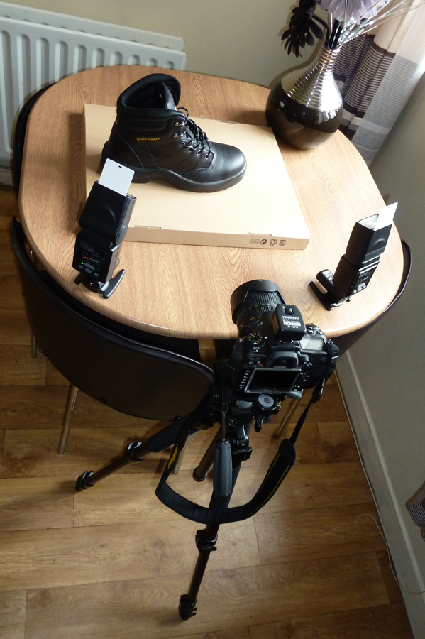
setup1 by robertalexandershaw, on Flickr
Marsha, here's a set up picture. Brians not in the picture. You'll be glad to know he's gone back to roaming the garden.
setup1 by robertalexandershaw, on Flickr
The goblin
<span class="poty">POTY Winner 2015</span></br>
- Messages
- 4,407
- Name
- Marsha
- Edit My Images
- Yes
Thanks Robert. I need to practice more with mine.
OP
- Messages
- 989
- Name
- Robert
- Edit My Images
- Yes
Thanks Robert. I need to practice more with mine.
Your welcome.
I practice with different power settings. It's still a lot of guess work for me.
- Messages
- 6,502
- Name
- Peter
- Edit My Images
- Yes
Nice idea. I'm glad to hear Brian is alive and well
OP
- Messages
- 989
- Name
- Robert
- Edit My Images
- Yes
A big thank you to everyone for posting. It definately helps.
Week 28 Straight
I had to think quick as I'm off to Lincoln in a few hours on a scooter rally.
So, I went down to the 12th Parade here in Belfast to get some pictures.
Here's straight, as in the band in a straight line. Weak effort, but I didn't know what else to do.
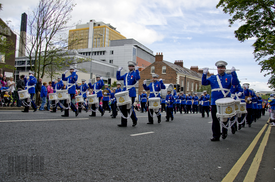
week28straight by robertalexandershaw, on Flickr
Week 28 Straight
I had to think quick as I'm off to Lincoln in a few hours on a scooter rally.
So, I went down to the 12th Parade here in Belfast to get some pictures.
Here's straight, as in the band in a straight line. Weak effort, but I didn't know what else to do.
week28straight by robertalexandershaw, on Flickr
- Messages
- 6,502
- Name
- Peter
- Edit My Images
- Yes
I suppose you couldn't have chosen a better day to take this picture. Isn't 12th July supposed to be the marching day?
Not a bad photo at all. It's a good record of the event and I like the low viewpoint. I see lots of straight lines in there as well. Not just the marchers but the yellow lines plus the roofs.
Not a bad photo at all. It's a good record of the event and I like the low viewpoint. I see lots of straight lines in there as well. Not just the marchers but the yellow lines plus the roofs.
- Messages
- 13,760
- Edit My Images
- Yes
Hi Robert
Small - Excellent mate, no crit at all from me, great set up lighting and capture !!!
Straight - Have to agree, a great angle for the theme, plenty of straight lines of marching, the vivid blue makes the band stand out from the crowd nicely
Small - Excellent mate, no crit at all from me, great set up lighting and capture !!!
Straight - Have to agree, a great angle for the theme, plenty of straight lines of marching, the vivid blue makes the band stand out from the crowd nicely
The goblin
<span class="poty">POTY Winner 2015</span></br>
- Messages
- 4,407
- Name
- Marsha
- Edit My Images
- Yes
Hi Robert, I agree with others about lots of straight lines in it I would maybe crop some of the foreground out
I would maybe crop some of the foreground out- Messages
- 2,820
- Name
- Mark
- Edit My Images
- Yes
I like small; it works very very well
Not so keen on straight; it's a good picture, and it is taken from a nice perspective, but I don't think it says straight too well, and the background is a bit fussy for it to be perfect.
Not so keen on straight; it's a good picture, and it is taken from a nice perspective, but I don't think it says straight too well, and the background is a bit fussy for it to be perfect.
- Messages
- 1,513
- Name
- Alex
- Edit My Images
- Yes
Makes you think about straight in a different way. Could be a competition - how many straight lines can you see in this picture??
I do like the angle and I think it is a good shot. Nice record of the event as well as meeting the theme.
Enjoy the scooters!
I do like the angle and I think it is a good shot. Nice record of the event as well as meeting the theme.
Enjoy the scooters!
- Messages
- 4,828
- Name
- Alan
- Edit My Images
- Yes
Hi Robert
straight - lots of elements in there for the theme. Good pov to pick up the lines of men as well as the street lines. But background is a bit incoherent with the different styles of buildings, large chimney etc.
straight - lots of elements in there for the theme. Good pov to pick up the lines of men as well as the street lines. But background is a bit incoherent with the different styles of buildings, large chimney etc.
jgs001
Brian Cox
- Messages
- 12,646
- Name
- John
- Edit My Images
- Yes
Robert, that's a good pic for the march, and love the POV... there's plenty of straight lines there, but... I'm not sure the straight lines come through quite so well in the main subject... it's there, but the crowds and background distract from it.. there's nothing you could have done about it of course
OP
- Messages
- 989
- Name
- Robert
- Edit My Images
- Yes
Thanks for the comments.
Week 29 Letter
I came off my Lambretta last week on the way to Lincoln and broke the 18-105 lens. It's away to Nikon so at the moment I'm using the 70-300 and when I walked round town today I struggled.
Anyway, here's the best I could come up with.
It's from the NCP car park sign.
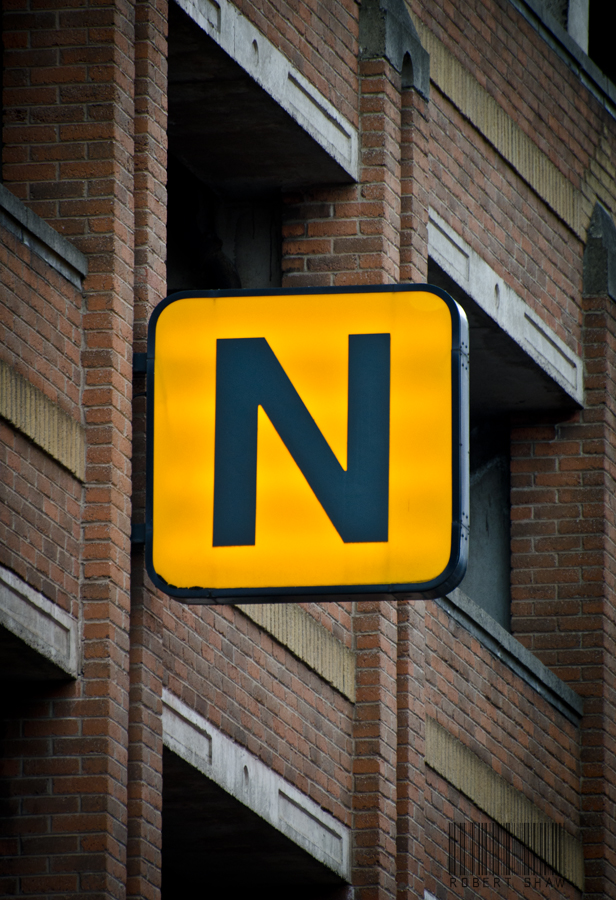
week29letter by robertalexandershaw, on Flickr
Week 29 Letter
I came off my Lambretta last week on the way to Lincoln and broke the 18-105 lens. It's away to Nikon so at the moment I'm using the 70-300 and when I walked round town today I struggled.
Anyway, here's the best I could come up with.
It's from the NCP car park sign.
week29letter by robertalexandershaw, on Flickr
- Messages
- 8,398
- Name
- Lynne
- Edit My Images
- Yes
Hi Robert
glad to hear that Brian is back in the wild & enjoying life again.....fascinating little creatures & as Iain mentioned....I have developed a bit of a "thing" for them....must have taken 100+ shots in Northumberland , they were everywhere
Anywayz...belting shot , great lighting , creative thinking to use the boot to show his size...great work mister....the only teeny weeny niggle....I'd lose his name on the shell....everyone knows snails are called brian
Straight.....different take on what you'd have thought was an easy subject....tis amazing how many straight things there are that aren't actually straight when you look through a view finder. Lots of Straight lines , roof tops, sky scraper buildings etc...shame you could'nt have got a shot from bang in front of them though .As it is I like it , nice rich colors & good focus
Letter...hope you didn't hurt yourself , off's are not good mister
Like the sharpness & the strong color , not so sure about it being bang central though , but then not sure how else you could've taken it ?
Keep up the good work , apologies for not popping in more , will try harer from now on
glad to hear that Brian is back in the wild & enjoying life again.....fascinating little creatures & as Iain mentioned....I have developed a bit of a "thing" for them....must have taken 100+ shots in Northumberland , they were everywhere
Anywayz...belting shot , great lighting , creative thinking to use the boot to show his size...great work mister
....the only teeny weeny niggle....I'd lose his name on the shell....everyone knows snails are called brian Straight.....different take on what you'd have thought was an easy subject....tis amazing how many straight things there are that aren't actually straight when you look through a view finder. Lots of Straight lines , roof tops, sky scraper buildings etc...shame you could'nt have got a shot from bang in front of them though .As it is I like it , nice rich colors & good focus
Letter...hope you didn't hurt yourself , off's are not good mister
Like the sharpness & the strong color , not so sure about it being bang central though , but then not sure how else you could've taken it ?
Keep up the good work , apologies for not popping in more , will try harer from now on
The goblin
<span class="poty">POTY Winner 2015</span></br>
- Messages
- 4,407
- Name
- Marsha
- Edit My Images
- Yes
Hi Robert, I like the simplicity of this shot with just the one letter and agree with Michael about the nice bold colour.
I actually like the central position of the letter as the brickwork behind breaks the shot up into thirds, if anything I would crop the RHS slightly to make the two vertical pillars more evenly spaced out.
Edited after looking at the shot again!
I actually like the central position of the letter as the brickwork behind breaks the shot up into thirds, if anything I would crop the RHS slightly to make the two vertical pillars more evenly spaced out.
Edited after looking at the shot again!
Last edited:
- Messages
- 6,502
- Name
- Peter
- Edit My Images
- Yes
Works nicely with some nice colour against the brick. Can I offer a different suggestion others for the crop which is to use an angle to maybe give it a dramatic effect.
OP
- Messages
- 989
- Name
- Robert
- Edit My Images
- Yes
Thanks for posting comments. As usual, I try to take in the feedback and learn.
Week 30 Contrast
I was at the point of posting my resignation from the challenge. I'm still only using the 70-300 while the 18-105 is away to being fixed at Nikon. I was finding it so hard to get the picture for this weeks task.
Anyway, this afternoon I crossed the road for the Contrast photo.
The reasoning behind the choice.
The houses in these surrounding streets were built as Homes for Heroes.
For the home coming veterans of the Great War and the street names named after places of battle in France.
I thought that the street names were so contrasting to the streets and houses themselves. Scenes of sheer horror of the First World War in quiet streets, in pleasant surroundings.
I lowered the clarity a bit in PS to soften the photo.

contrast2 by robertalexandershaw, on Flickr
Week 30 Contrast
I was at the point of posting my resignation from the challenge. I'm still only using the 70-300 while the 18-105 is away to being fixed at Nikon. I was finding it so hard to get the picture for this weeks task.
Anyway, this afternoon I crossed the road for the Contrast photo.
The reasoning behind the choice.
The houses in these surrounding streets were built as Homes for Heroes.
For the home coming veterans of the Great War and the street names named after places of battle in France.
I thought that the street names were so contrasting to the streets and houses themselves. Scenes of sheer horror of the First World War in quiet streets, in pleasant surroundings.
I lowered the clarity a bit in PS to soften the photo.
contrast2 by robertalexandershaw, on Flickr
- Messages
- 889
- Name
- John
- Edit My Images
- Yes
Straight - Plenty of lines in there, the colour of the uniforms make it stand out. As said, probably would have benefitted taken from centre of road but imagine unachievable.
Letter - Nice and bold, slight crop on right needed.
Contrast - With the story connection I can see where you're coming from but the shot alone does'nt work for me I'm afraid. Are there any other clues in the area to signify the quiet/peacefull element? Wider view perhaps?
Letter - Nice and bold, slight crop on right needed.
Contrast - With the story connection I can see where you're coming from but the shot alone does'nt work for me I'm afraid. Are there any other clues in the area to signify the quiet/peacefull element? Wider view perhaps?
Last edited: