weekly Bilko's 52 for 2012 - Week 48 Shadow Added

Hi Robert. I'm desperately trying to catch up so hopefully this is sweet as well as short!

Thank you everyone for taking the time to post your critique. Greatly appreciated.

Week 27 Small.

I found Brian out the front trying to dodge the rain and I noticed how he was smaller than the average snail.

To show his small size I used a boot. I had two flashes bouncing the light from either side of the camera with Brian moving across a piece of card.


Week 27 Small - Brian by robertalexandershaw, on Flickr

Totally agree with this for small.

I agree with what you've said about straight - I really struggled with that one too.

So sorry to hear about your lens! :(

Love the colour on the N, but the background seems off to me. Perhaps something straight-on, tight square crop with a light vignette?

Contrast - I think the photo could work as a decent stock image, something about "location" perhaps. The green-and-white is nice, always a favourite of mine. I like the story too, but without it the shot really doesn't say contrast.

Don't give up! I've just had a few weeks of work-related hell, but it all comes out in the wash.
 
Hi Robert

hope you get your lens back soon , you've come to far & posted too mnay good images to abandon us now (y)

My 1st thought for your Contrast image was ...hmmmm , like it.I was going for the contrast between the white of the houses & the green of the hedge - the obvious contrast which works well for me (y). Your story add's another dimension...lest we forget our hero's
 
Sorry to hear about the lens, dont give up!

Letter - simple and nicely taken. Fits the theme.

Contrast - nice imagine, looks a lovely place to live. Very pretty. Nice to have a story with a picture, works well as a bit of a different interpretation on the theme.
 
Contrast, that's a lovely peaceful looking scene, leafy and idyllic, but it doesn't really say contrast to me, it needs the story to give it meaning...
 
hi Robert

letter - on theme, clear and bold. Various suggestions for the crop etc. would be worth consideration.

Contrast - the back story explains your reason for taking the shot. I do like it - good strong greens and washed out white - even that has an element of contrast. Maybe the connection does not hit in the face but very worthwhile.
 
I'm afraid I'm with others of not seeing the connection without the story.

Keep with the 52 even with being one lens down though. We're not accepting resignations at this stage Robert. (y)
 
Hi, there, sometimes themes don't work, even if the one who posts them feels the do....take my Mineral, for example :puke:

Keep at it, some weeks are easier than others (y) The TP52 started with 101 and for Contrast a mere 14 remain :clap:

And we know where you live....and we'll 'pay you a visit' :bat:

Cheers.
 
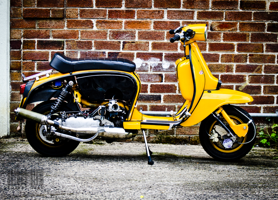
Thanks very much for the comments. I had a choice and the original picture I was thinking of using for contrast was this one of my Lambretta, but I went for the other shot instead.


contrast1 by robertalexandershaw, on Flickr

I totally understand where I went wrong and as with all critique, it's to take and learn from and I'm really glad the critique is honest and open otherwise it would be pointless.

Anyway, week 31 and Mineral (Who's coming up with these themes)?!?!

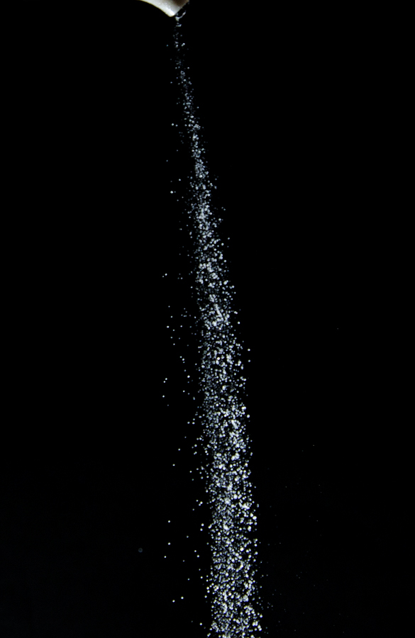
The only idea I had was of falling salt.

Black card background with off camera flash directed towards the camera and holding a salt pot.


mineral1 by robertalexandershaw, on Flickr
 
Last edited:
Hi Robert, I'm glad you're still with us and hope that you get your other lens back soon! you have done well with the lighting on this one and it could have covered contrast as well! I'm not sure if I'd like to see more of the salt cellar in shot or not at all!!:)
 
Thanks Sarah.

I forgot to add, I got my lens back from Nikon. So all is well.

I tried the shot without the cellar and I thought the shot needed to show the point of exit. If that makes sense?
 
Showing the tip of the cellar makes this work although a little bit more of its shape would have been better, also the lighting and composition are fine. Good shot.
 
Hi Robert , glas to see you're still here (y)

Thats a great image of your Lambretta mister....love the color of it & the pp...really pops (y)

Yup , mineral...who the hell put these theme's in the bagg ??? As for your shot...like the inclusion of the spout , as you say , it add's context...possibly crop a little from the LHS ?
 
Welcome back to your lens, glad all is ok, and glad you're still here Robert.

The Lambretta is much better for contrast, to be honest. Good strong colours, and the walls contrast it well.

Mineral... an interesting theme, not sure which is worse... this or smoke and mirrors ...

Well lit and composed and a great idea. It looks good, but perhaps have a little more of the salt pot in shot ?
 
Hi Robert.

Letter I really like; nice POV.

Contrast, I much prefer the scooter, which is a great shot; I like the context you have it in.

Small, wow, great photo. Personally the ONLY thing I'd change is the name on the shell, as I think it's unnecessary, but other than that, perfect!

Mineral I like. I like the hint of the cellar, and the composition and lighting. I think the shutter speed is probably bang on, but it'd be interesting to see both slower and faster as Peter says.
 
Thanks everyone. Very useful feedback and duly noted.

Week 32 Dark

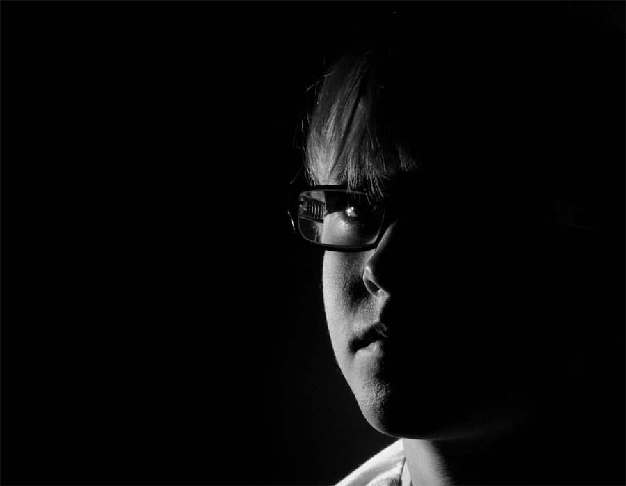
Tonight I took a photo of my Son with a single flash off camera, direct, to the left of his face. I then changed it to B&W.


week32dark by robertalexandershaw, on Flickr
 
Nice one Robert for dark, this is well lit. I particularly like your use of negative space and your sons glasses add an extra dimension to the effect.
Only one small crit, apologies but I find the collar of your sons shirt a bit bright, my eye is drawn to it. Other than that, top job (y) Iain
 
Missed your Lambretta shot and this works fine for contrast.
Dark - Great take on the theme. Lighting works well and just the right amount on the face. Will have to practice this type of shot sometime.
 
Hi Robert, I've been to Thiepval and seen the thousands of names on the monument walls so I totally get your interpretation of Contrast. It's always frustrating when you haven't got your normal camera equipment so you've done well to get this.

I like your second shot but I would maybe crop the white door out on the left.

Mineral, very clever lighting to get the salt white keeping the background black. I understand how to do but struggle to master it, flash usage is still a mystery to me!

Dark, very simple and effective. I agree about your sons t-shirt being a bit bright.
 
Thank you everyone, really appreciate the feedback.

Week 33 Time.

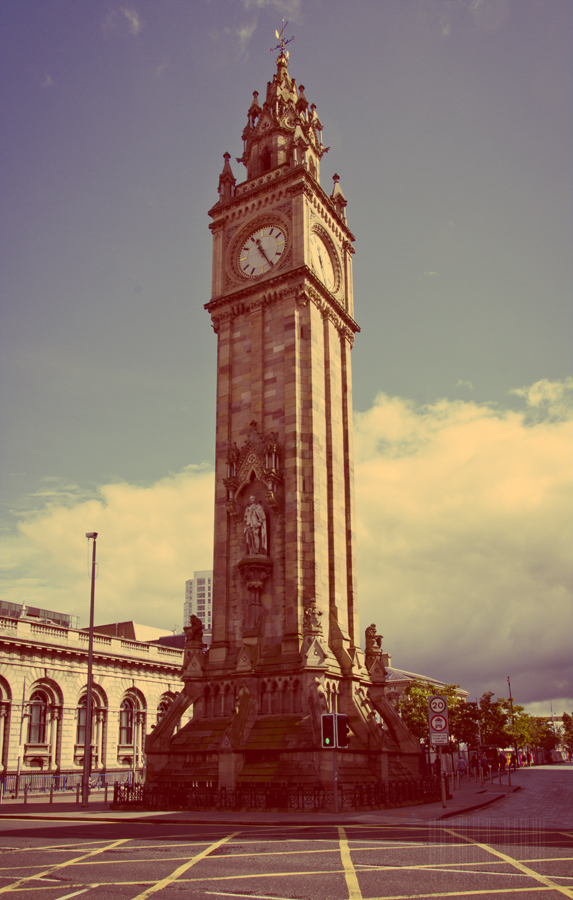
I wandered round Belfast lunchtime and this is my choice for time. The Albert Clock.

I added an ageing action in PS to add time to the image to give it time on two different fronts, if that makes sense? I don't know. It was the best I could come up with I'm afraid.


week33time by robertalexandershaw, on Flickr
 
On theme and your attempt to give an aged look works well. Going the whole hog to sepia could also work. Think cloning out the modern building at the back left would be my only criticism.
 
Hi Robert I like the processing too and like you say fits the theme on two fronts. I would say that it feels too central to me. I would possibly crop the foreground and the building/ lamp post on the left thus moving the clock away from the centre.

On to week 34 now :bonk: time is flying!
 
Hi Robert


for me your Dark image is just superb ...nuff said :clap::clap: ( at 1st glance I thought it was Gok Wan :LOL:) , oh , just a thought....next time without the shirt collar (y)

Time....love the pp on #1....a little too central , possibly crop the RHS a little but other than that I really like the feel to the image...time gone by :clap:
 
Hi

Why not take part in our annual TP Day coming up soon 9th September,as part of your 52, Where you take a photo on that day and post it on the forum, then all the Photos are made into a slideshow, Click the logo for more details, it's lots of fun to be a part of it(y)
 
Sorry it's brief - I'm lagging behind again! :(

Dark - Another one that's definitely dark! Lovely lighting.
Time - Lovely take on the theme, nicely framed and good sky. Quite like the PP too, though I had to think about it! I think you have a mark on the shot though from your lens or sensor - to the left of the clock in the sky, at about the bottom of the clock face. I think I prefer the B&W ones though - specifically the last one.
 
I like the b+w versions better than the colour not sure which one leaning towards the second although there is more detail on the first :thinking:
 
Robert,

Small - What a great, fun idea. I'm not normally a fan of adding text in PP but here it works really well.

Contrast - I have to say I prefer the Lambretta too. I think the colours are great and to me it's a much more interesting shot.

Mineral - I'm not sure about this. I guessed it was salt looking at it but it's not obvious (could be sugar, too). I don't know what to say other than that it appears to be lacking something.

Dark - Good lighting and comp.
 
Hi Robert

Lambretta for contrast is very good- good colours and contrast with the background

Mineral - simple shot pretty well done. Others have commented on shutter speed, comp etc.. I think a litle more of the salt cellar would have helped.

Dark - really good (y) Can't fault it apart from the issue of the shirt collar mentioned by others.

Time - I wasn't sure at first but on more consideration, I think that this is good. Perhaps cloning out the modern buiding would help, partic as you have gone for an older look with the pp.
 
Thank you everyone. Taking in everything that's said and it's greatly appreciated.

Week 34 Body

A huge struggle for me this week and as ever, right down to the last minute.

I had no idea what to do, all I could think of was one of the wooden artist dummies. So I popped into town today for one.

Lit direct by both sides with 2 flashes. I tried different ways but was really struggling. This has to be one of my weakest efforts, I'm struggling to keep the momentum going with this and most times, by now I would have packed it in, but something's keeping me going. One of those things is all your replies to my shots. That is a massive help.


week34body by robertalexandershaw, on Flickr
 
Back
Top