

You are using an out of date browser. It may not display this or other websites correctly.
You should upgrade or use an alternative browser.
You should upgrade or use an alternative browser.
weekly Summer's 52 - week 51 negative
- Thread starter sturisoma
- Start date
The goblin
<span class="poty">POTY Winner 2015</span></br>
- Messages
- 4,407
- Name
- Marsha
- Edit My Images
- Yes
Hi Summer, I'm a few weeks behind.
Mineral, I had a similar idea but couldn't locate my lump of Vesuvius! I agree with Lynne that a little crop is needed, but nice detail in the rock.
Dark, good idea, the sense of movement helps.
Time, I bet that place is really peaceful? I looked on your Flickr and can't decide which I prefer:bonk: Your human sundial is a very clever idea, maybe a triptych needed with the shadow in three different places")
Week 34 is here, Body???
Mineral, I had a similar idea but couldn't locate my lump of Vesuvius! I agree with Lynne that a little crop is needed, but nice detail in the rock.
Dark, good idea, the sense of movement helps.
Time, I bet that place is really peaceful? I looked on your Flickr and can't decide which I prefer:bonk: Your human sundial is a very clever idea, maybe a triptych needed with the shadow in three different places
Week 34 is here, Body???
OP
- Messages
- 2,908
- Name
- Summer
- Edit My Images
- Yes
thanks for the comments guys - I had several ideas for body - including drawing round my son with chalk on the road - but I settled on this - there are others on my flickr
body art

week 34 - body (art) by moominmama, on Flickr
body art
week 34 - body (art) by moominmama, on Flickr
- Messages
- 19,461
- Name
- Andy
- Edit My Images
- Yes
thanks for the comments guys - I had several ideas for body - including drawing round my son with chalk on the road - but I settled on this - there are others on my flickr
body art
Ink, never thought about INK! I have the odd tattoo and Jackie has a cracking half back tattoo....
Liking this one. Is it you? It's a cracker
Crit: BG's a bit distracting, leg's a bit hot
nono near the knee. But I can live with these for such a cracking tattoo 
Cheers.
- Messages
- 13,760
- Edit My Images
- Yes
Chalk on the road would have been superb 
Liking the Body Art alot, shows a tad blown on my monitor too, as for the background... there is a background is there
Liking the Body Art alot, shows a tad blown on my monitor too, as for the background... there is a background is there
- Messages
- 242
- Name
- Vicky
- Edit My Images
- No
Sorry it's brief - I'm lagging behind again!
Mineral - fab lighting, very sci-fi.
Dark - I like the idea but like you say it's a tricky one to get right.
Time - It wasn't obvious to me that it was a sundial! Nice composition.
Body - Love it, fabulous colours and composition and a nice interesting take on the theme.
Mineral - fab lighting, very sci-fi.
Dark - I like the idea but like you say it's a tricky one to get right.
Time - It wasn't obvious to me that it was a sundial! Nice composition.
Body - Love it, fabulous colours and composition and a nice interesting take on the theme.
OP
- Messages
- 2,908
- Name
- Summer
- Edit My Images
- Yes
I could have got someone else to take the pic but that would be defeating the object - it's real hard to get a photo of your own ink lol - I did take some 'point and press' with the tripod and remote trigger and these are on flickr. there's also some of my hubby's back piece. I thought daylight would be ok but the sun was too bright I only wish I had a studio and some lights so I could get some decent ones.
btw the robot was done by a very dear friend of mine called Debs who runs Armadillo Ink in Bassinbourne near Cambridge her own artwork too (she's very good artist)
I only wish I had a studio and some lights so I could get some decent ones. btw the robot was done by a very dear friend of mine called Debs who runs Armadillo Ink in Bassinbourne near Cambridge
her own artwork too (she's very good artist)blakester
Shine On Harvest Moon
- Messages
- 6,679
- Name
- Iain
- Edit My Images
- No
Bang on theme Summer
I particularly like the vibrant colours in your chosen image having looked on your flickr stream. The B&W ones are great too, just the background a little busy. A closer crop would tidy things up I think.
It adds something to the photograph in that it is a self portrait, and I admire the confidence of people who do sp's.
No real crit to add Summer, it only be nit picking if I did. Great work Iain
I particularly like the vibrant colours in your chosen image having looked on your flickr stream. The B&W ones are great too, just the background a little busy. A closer crop would tidy things up I think.
It adds something to the photograph in that it is a self portrait, and I admire the confidence of people who do sp's.
No real crit to add Summer, it only be nit picking if I did. Great work
Iain- Messages
- 1,513
- Name
- Alex
- Edit My Images
- Yes
Great take on the theme. Nice tattoo too, I've never fancied having one but always interested to see what other people have done!
Going to look at Flickr now too!
Going to look at Flickr now too!
- Messages
- 6,502
- Name
- Peter
- Edit My Images
- Yes
A self portrait without having to run around the front of the camera in time for the shutter being released . Certainly fits the theme. Like Alex I've never wanted one but am always impressed by the shear artistry that goes into some of them.
. Certainly fits the theme. Like Alex I've never wanted one but am always impressed by the shear artistry that goes into some of them.- Messages
- 14,766
- Name
- Michael
- Edit My Images
- No
Liking the tatoo shot for body - but I think I actally prefer the BW one called 'egypt' in your flickr photostream.
Cheers
Same here
- Messages
- 8,398
- Name
- Lynne
- Edit My Images
- Yes
HI Summer
Ouch....that makes me wince but then I'm a southern softie
Can't really ad to whats already been mentioned so I'll just say well done for braving a needle to have that work of art done
Ouch....that makes me wince but then I'm a southern softie
Can't really ad to whats already been mentioned so I'll just say well done for braving a needle to have that work of art done
OP
- Messages
- 2,908
- Name
- Summer
- Edit My Images
- Yes
love your comments guys - thank-you
encouraged and inspired by Blakester I tried to do a hand-in-water shot, but my tank wasn't deep enough (my attempts are on flickr) so I did this instead

52 weeks - liquid (week 35) by moominmama, on Flickr
encouraged and inspired by Blakester I tried to do a hand-in-water shot, but my tank wasn't deep enough (my attempts are on flickr) so I did this instead
52 weeks - liquid (week 35) by moominmama, on Flickr
- Messages
- 242
- Name
- Vicky
- Edit My Images
- No
I do love these shots. I could never do one myself (my water-loving cat would be far too involved for me to retain any semblance of control over the situation) but I do love the end result. This one in particular has created a wonderful shape with the water - the overall effect looks, to me, like a goldfish, with the orange (is it an orange?) making the body and the splash making a tailfin. Colour and tone are excellent, I think the only thing I would consider changing is the angle of the camera to the water so that the surface isn't visible.
blakester
Shine On Harvest Moon
- Messages
- 6,679
- Name
- Iain
- Edit My Images
- No
Nice one Summer
I do think the water in a fishtank has lots of photography opportunities and you've displayed that here. I do like the vivid colour of the orange into the water. Focussing, I think is always the issue with these type of shots but you've handled it well. Good lighting too.
I think a contrast boost would make this even more striking. Have you tried rotating it 90deg, I turned my laptop around and it makes for an interesting composition.
I do think the water in a fishtank has lots of photography opportunities and you've displayed that here. I do like the vivid colour of the orange into the water. Focussing, I think is always the issue with these type of shots but you've handled it well. Good lighting too.
I think a contrast boost would make this even more striking. Have you tried rotating it 90deg, I turned my laptop around
and it makes for an interesting composition.- Messages
- 4,828
- Name
- Alan
- Edit My Images
- Yes
Hi Summer
Trying to catch up
Dark - on theme. Probably cold do with a little less blur but very hard to get spot on and , as you say, it looks better with blur than withiout. Nice splash of colour , either a scarf or dog lead.
Tiem - really good idea and your attmepts without the wide angle thingy are better. But looks like a very difficult object to photograph
Body - Good colours on the tattoo. Background is a bit busy but striking purple on the fabric. Good selfie.
Liquid - good attempt, far better than i could do. Great effect - the bottom looks like the tomato is wrapped in tin foil
- Messages
- 6,502
- Name
- Peter
- Edit My Images
- Yes
I was also thinking orange I'd have liked to have seen a bit lower down but other than that, as Sarah says, it's a good attempt at something that is harder than it looks.
I'd have liked to have seen a bit lower down but other than that, as Sarah says, it's a good attempt at something that is harder than it looks.The goblin
<span class="poty">POTY Winner 2015</span></br>
- Messages
- 4,407
- Name
- Marsha
- Edit My Images
- Yes
Hi Summer
Body, oooo foxy lady baring your legs but very brave! Cracking art work too and fits the theme well. I agree about the slight blown bit on the knee,can that bit be tweaked in PP? I know I'm always abusing that recovery slider in camera RAW! Sorry I didn't get a chance to peak at the rest on Flickr.
Liquid, I though these were very good attempts and I'd love to have a go sometime as well. I agree with Iain about rotating it on it's side and increasing the contrast. I've had a little play on my phone and it works well, I'll upload it later if you want me too?
I have had a quick peak on Flickr at these, I like the fist ones but feel they just need to be brighter. I do think this is the better one
Body, oooo foxy lady baring your legs
but very brave! Cracking art work too and fits the theme well. I agree about the slight blown bit on the knee,can that bit be tweaked in PP? I know I'm always abusing that recovery slider in camera RAW! Sorry I didn't get a chance to peak at the rest on Flickr.Liquid, I though these were very good attempts and I'd love to have a go sometime as well. I agree with Iain about rotating it on it's side and increasing the contrast. I've had a little play on my phone and it works well, I'll upload it later if you want me too?
I have had a quick peak on Flickr at these, I like the fist ones but feel they just need to be brighter. I do think this is the better one
OP
- Messages
- 2,908
- Name
- Summer
- Edit My Images
- Yes
took this while I was out on the heath today - I wanted to get one of those tree-tops shots but it didn't look right with leaves - so I got this instead - see the lil aeroplane?
note - I have replaced the one on flickr with a straighter cropped version, you might have to click on the one below to see it in all its glory
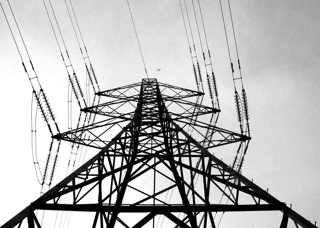
week 36 - UP by moominmama, on Flickr
note - I have replaced the one on flickr with a straighter cropped version, you might have to click on the one below to see it in all its glory
week 36 - UP by moominmama, on Flickr
Last edited:
- Messages
- 29
- Edit My Images
- No
I was in Suffolk visiting, when I look UP .
 [/URL][/IMG]
- Messages
- 29
- Edit My Images
- No
sturisoma said:I can see that you are new here - you need to put your 52 week's photos in your own dedicated thread
Thanks for letting me know. I will try again...
The goblin
<span class="poty">POTY Winner 2015</span></br>
- Messages
- 4,407
- Name
- Marsha
- Edit My Images
- Yes
Hi Summer,
Up, nice and quick this week I like the silhouette and the B&W. The lil plane really adds to the shot making you look up
My only crit, and it's really minor, I would crop a tiny bit off the RHS to make the base of the pylon equal.
Up, nice and quick this week
I like the silhouette and the B&W. The lil plane really adds to the shot making you look up My only crit, and it's really minor, I would crop a tiny bit off the RHS to make the base of the pylon equal.
- Messages
- 242
- Name
- Vicky
- Edit My Images
- No
Ooooooh. I like that a lot! B&W works really well and I don't think I'd have noticed the plane if you hadn't said, but it's so cute nestled in there! It doesn't quite look straight, but I think that adds to it (and from the looks of it it's just like that, nothing to do with your framing).
- Messages
- 4,828
- Name
- Alan
- Edit My Images
- Yes
Hi
Good shot, on theme. Would agree with other comments about a slight straighten to the base. All the other angles would remain so retaining the interest. Aeroplane is a bonus.
Good shot, on theme. Would agree with other comments about a slight straighten to the base. All the other angles would remain so retaining the interest. Aeroplane is a bonus.
OP
- Messages
- 2,908
- Name
- Summer
- Edit My Images
- Yes
thanks for your comments everyone - tbh I was sure I'd cropped it so that both legs were in the corners - perhaps I uploaded an earlier version? Or didn't save it? Or imagined doing it but didn't actually do it (I do that a lot - very worrying)?
so yeah I agree with you all, however I am being lazy so maybe I'll fix it later
okay, I done it already
so yeah I agree with you all, however I am being lazy so maybe I'll fix it later
okay, I done it already
Last edited:
- Messages
- 6,502
- Name
- Peter
- Edit My Images
- Yes
Up - I'm a bit partial to an electricity pylon or two although have easily resisted to join the Pylon Appreciation Society
Nice shot and the addition of the plane really adds to it. I spotted it and thought great stuff before reading your words mentioning it. I really must remember to read the words at just look at the pictures.
Nice shot and the addition of the plane really adds to it. I spotted it and thought great stuff before reading your words mentioning it. I really must remember to read the words at just look at the pictures.