weekly DK's 2012 '52' - UPDATED 28-12-12

I like it a lot :). The only issue for me is the fact that the nearest turbine has no movement and has it's blades in a different orientation to the others, which spoils the flow of the picture somewhat I think. Could you not have climbed up there and shoved it into position? You really do need to make the effort you know DK!!

Stunning sunset though, and great composition :).
 
I'm confused, you've done straight already???

Really nice, love the sky and I like turbines, there is something about them that I like.

I do not expect a submission from you next week until Sunday!
 
yep stright is a lovely shot :clap:
Thanks Summer :)

I like it a lot. The only issue for me is the fact that the nearest turbine has no movement and has it's blades in a different orientation to the others, which spoils the flow of the picture somewhat I think.
Hahaaaaaaa I have been waiting for somebody to say it :D

Could you not have climbed up there and shoved it into position? You really do need to make the effort you know DK!!
:LOL:

Stunning sunset though, and great composition :).
Thanks :)


I'm confused, you've done straight already???
Yeah I know... odd isn't it :D

Really nice, love the sky and I like turbines, there is something about them that I like.
Cheers Alex :)

I do not expect a submission from you next week until Sunday!
Yes Miss, Sorry Miss :sulk:
 
Good work Dean, you've captured the light well. Some lovely colour tones in there too. For man-made objects, I think the wind turbines are quite photogenic, endless photo opportunities in there with different light, pov or time of day.
My only small crit is that I feel the stationary turbine is a little too central but other than that (y)
Now where did I put that crown you handed me? ;)
 
That's a nice sunset. I bet this location would also work as a stormy long exposure!
I think it would Manda... I'm certainly going to make it a regular place to stop, the best thing about it is that it isn't a main road, so very few interruptions, also with the turbines being very small (one of the first wind farms in the country) you can get close and still fit them in frame...
 
Good work Dean, you've captured the light well. Some lovely colour tones in there too. For man-made objects, I think the wind turbines are quite photogenic, endless photo opportunities in there with different light, pov or time of day.
My only small crit is that I feel the stationary turbine is a little too central but other than that (y)
Now where did I put that crown you handed me? ;)
Cheers mate... I did try moving the sun in a bit closer so the turbine was to the left of center, but I kept burning my fingers... guess I should maybe put some 'Oven Gloves' in the boot for this sort of thing :geek:
 
HI Dean


liking your Small shot...great catch with the detail in the legs & irridescent colors in the wings...nice work even of it is a back shot (y)

Beautiful shot for Straight...great sky , little bit of motion in the blades & the sun beaming though...love it :clap:
 
HI Dean


liking your Small shot...great catch with the detail in the legs & irridescent colors in the wings...nice work even of it is a back shot (y)
Thanks Lynne :)

Beautiful shot for Straight...great sky , little bit of motion in the blades & the sun beaming though...love it :clap:
and Many thanks again :)

Hi Dk

Cracking sky - worth it just for that. (y)

Good spot for the theme although i agree with comments about the first turbine being still.
Cheers Alan... I hope to get the perfect combo of turbines all working, pointing in the same direction and a good sunset - I may be waiting a while though :D
 
Hello! Sorry I've not stopped by for ages, there is no excuse :D
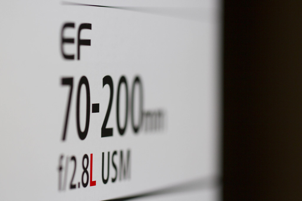
Letter - worked really well. Like the red L in it, makes the shot. Nice focus point and DOF

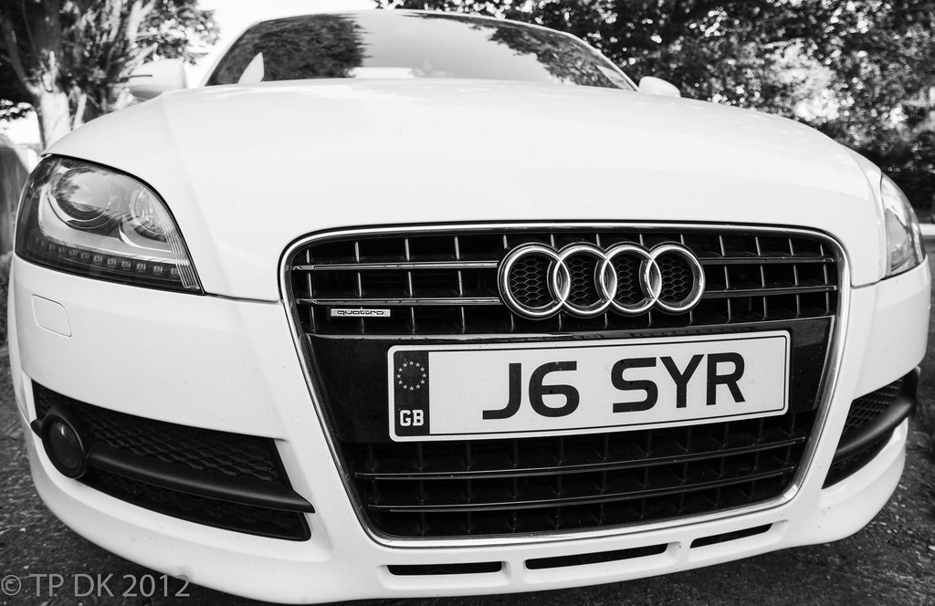
Contrast - like the angle this is taken from, works well for the theme. The detail is definitely still there.
 
Hello! Sorry I've not stopped by for ages, there is no excuse :D
Letter - worked really well. Like the red L in it, makes the shot. Nice focus point and DOF

Contrast - like the angle this is taken from, works well for the theme. The detail is definitely still there.
Hi Alex

Many thanks for popping in and for the comments... Appreciated :)
 
Welcome back Dean. We were beginning to miss you. Glad to see you’re up and running on the 52 again.

Letter – I do like this a lot even if it is a Canon box :LOL:. I like the fact that you focussed in on the red L. Well seen.

Contrast – Nice shot of a dirty (?) car. A little tight in the frame but I don’t mind the off centre approach. The blacks and whites are certainly contrasty without going overboard.
 
Nice to see you back

nicely highlighted L on the box and a little to tight on the car, as others have said, doesn't look dirty to me you should see the wife's car. :crying:
 
Welcome back Dean. We were beginning to miss you. Glad to see you’re up and running on the 52 again.
Beginning to miss me... only just BEGINNING :p

Cheers Peter :D

Letter – I do like this a lot even if it is a Canon box :LOL:. I like the fact that you focussed in on the red L. Well seen.
I was hoping you Pentaxians and Nikonholics would like it (y)

Contrast – Nice shot of a dirty (?) car. A little tight in the frame but I don’t mind the off centre approach. The blacks and whites are certainly contrasty without going overboard.
Dirty... very dirty, you should see the amount of spot removal I used to cover the biggest squashed flies !!!

Thanks Again

Nice to see you back[/quote

nicely highlighted L on the box and a little to tight on the car, as others have said, doesn't look dirty to me you should see the wife's car. :crying:
Hi Allan :)

Thanks mate... it does look a light grey in real life rather than white !!!!

Hi DK :wave:

Letter, very clever shot, it almost looks SC'd but I know it's not. The L really stands out.
Hi Marsha... Thanks, I was hoping to get the whole box in with the top red band, but struggled to get the dof small enough

Contrast, it definitely fits the theme. I like the tight crop. More importantly I don't see any dirt;)
Yay !!!! somebody with eyes like mine....... what ever you do don't zoom in :D
Glad to see you back :)[/QUOTE]Cheers... It's good to have some of my time back and be on here :)
 
Afternoon Dean and welxome back! Letter, very good. I like how much the red L stands out. Contrast, very nice car that. Pic is fine for me and Iike the tight crop.
Hi Michael... Cheers :)

The crop was a bit forced at the bottom due to straightening - so glad it passes :help:

THANKS for all the welcome Backs - it really makes me feel warm and fuzzy... or have I just peed my self :thinking:
 
Hi

Why not take part in our annual TP Day coming up soon 9th September,as part of your 52, Where you take a photo on that day and post it on the forum, then all the Photos are made into a slideshow, Click the logo for more details, it's lots of fun to be a part of it(y)
 
Hi Dean , glad to see you back round these parts :wave:

Letter....yup , works for me , great focus (y)

Contrast.....space round the car has been mentioned , but I still like the shot , clean , sharp & a belting car to boot (y)
Cheers Lynne - Thanks :)

Hi

Why not take part in our annual TP Day coming up soon 9th September,as part of your 52, Where you take a photo on that day and post it on the forum, then all the Photos are made into a slideshow, Click the logo for more details, it's lots of fun to be a part of it(y)
My god this man never gives in :D
 
Sorry it's brief - I'm lagging behind again! :(

Small - Wonderful focus and composition, though the colours are a little muted for my tastes.
Letter - DOF feels a little sharp to me and I'd be tempted by a letterbox crop, but it's definitely on theme.
Straight - Lovely silhouette, especially around the sun - the far-off tree is a beautiful detail.
Contrast - Now we're talking! Love that one, really excellent all-round.
 
Letter, an interesting take, well done, the letter is clear, and that's showing off... :D

Contrast, looks great, and pretty contrasty too
 
Sorry it's brief - I'm lagging behind again! :(
You and me Both...:)

Small - Wonderful focus and composition, though the colours are a little muted for my tastes.
Letter - DOF feels a little sharp to me and I'd be tempted by a letterbox crop, but it's definitely on theme.
Straight - Lovely silhouette, especially around the sun - the far-off tree is a beautiful detail.
Contrast - Now we're talking! Love that one, really excellent all-round.
Thanks Vicky :)... The Colours may be a bit muted, to be honest I'm not entirely sure, I am waiting for my monitor to be Calibrated as they seem to look good in Lightroom but a bit dull by the time they get on Flickr... not sure which is the true image now :(

Letter, an interesting take, well done, the letter is clear, and that's showing off... :D

Contrast, looks great, and pretty contrasty too
Hi John - Cheers Matey :)

Hi Dk

Letter - just perfect for me - can't think of any useful crit

Contrast - very contrasty and well captured. A tighter crop on the bonnet and grill might work better but still v good.
Hey Alan :)

Thanks very much again (y)
 
Well... Catch up time still, the weather in Scotland wasn't the best last week, but I'm still trying to 'Squeeze' something out of the pics (Knew I should have got a new bag that would hold my Tri-pod :bang:

Not in any order

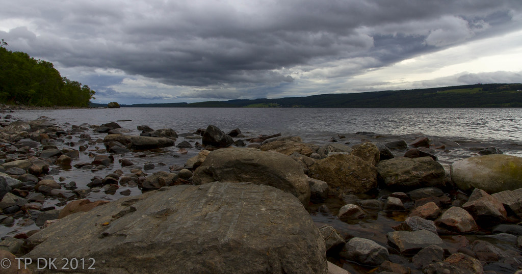
Week 34 - Loch Ness - a vast 'Body' of water :D


Wk 34 - 'Body' by TP DK..., on Flickr
 
After a whole week of wet evenings and Nights, finally on the last day a good clear sky and the time for a couple of hours playing in the 'Dark'


Week 32 - Fort William's 'Ben Nevis Skyline' in the 'Dark' under moonlight


Wk 32 - 'Dark' by TP DK..., on Flickr
 
Well done with the catch up Dean. Looks like you had a good holiday up there.

Body – I get the theme although I think the lighting wasn’t kind to you that day as it’s turned out a bit flat. Compositionally pleasing though.

Dark – A lovely shot. Again nice composition with some great reflections and a lovely starburst effect of the moon.

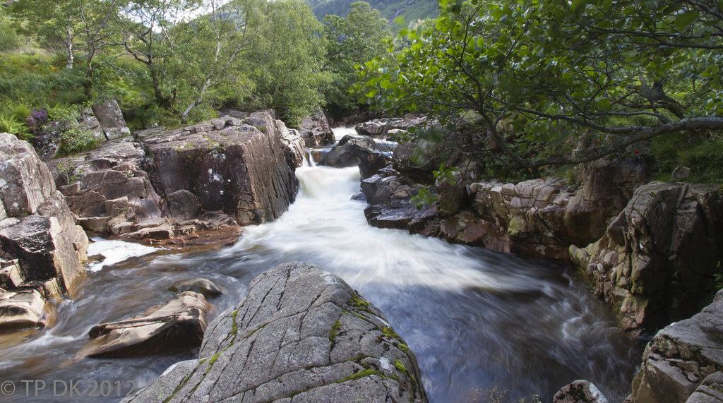
Liquid – I like these type of shots. Is it me or is it leaning. It’s probably the rocks on the left though.

Liquid alternative – loving this one. We’ve captured this really well with almost a misty feel to parts of the shot which helps the liquid theme.
 
Whoo, new pics!!

I have to say that I love both of the liquid shots - as you say, both great for very different reasons. I do prefer the second shot, though. The water is really nicely done and that lighting is to die for. Don't get me wrong, the first shot is lovely too - but there's something about the second one that oozes atmosphere.

Dark is wonderful too. Reflections are great and that burst on the moon is fabulous. I'd be tempted to lighten it just a little to get a little more detail in the sky and sea - but not much.

Body is really nicely framed and I like the interpretation of the theme. I think the colour could be better though - it looks a little flat to me.

Great catch-up!
 
Last edited:
Well done with the catch up Dean. Looks like you had a good holiday up there.
Hi Peter... Yep we sure did :)

Body – I get the theme although I think the lighting wasn’t kind to you that day as it’s turned out a bit flat. Compositionally pleasing though.
I agree mate... the weather was not kind at all, I took quite a few from different locations, on the shore, from a boat, from a castle... can't get anything from it

Having to catch up I felt I had to put one up - Any Suggestions to lien it up a bit ??
Dark – A lovely shot. Again nice composition with some great reflections and a lovely starburst effect of the moon.
Thanks

Liquid – I like these type of shots. Is it me or is it leaning. It’s probably the rocks on the left though.
Ha Ha... I wasn't sure so put it up to see if anybody says anything, and here you go first post :LOL:

Liquid alternative – loving this one. We’ve captured this really well with almost a misty feel to parts of the shot which helps the liquid theme.
Thanks again :)
 
Whoo, new pics!!
Hey Vicky :)

I have to say that I love both of the liquid shots - as you say, both great for very different reasons. I do prefer the second shot, though. The water is really nicely done and that lighting is to die for. Don't get me wrong, the first shot is lovely too - but there's something about the second one that oozes atmosphere.
Ooo Thanks :)

Dark is wonderful too. Reflections are great and that burst on the moon is fabulous. I'd be tempted to lighten it just a little to get a little more detail in the sky and sea - but not much.
I will do that... in fact I have several variants already :D

Body is really nicely framed and I like the interpretation of the theme. I think the colour could be better though - it looks a little flat to me.
Thanks too... any suggestions, a bit more vibrance maybe??

Great catch-up!
Thanks... I'm Trying :D
 
any suggestions, a bit more vibrance maybe??

We-ell... if it was me...

...I'd slightly under-expose the sky and up the contrast to bring out some drama. With the green hills down the back I'd lighten a little. The water is what feels a little flat; I might go so far as to paint in some colour, a little blue-green perhaps. The foreground just needs a little bit of punch, which I'd probably do to the whole image.

Bet you regret asking now!! :LOL:
Sounds great to me - Thanks :)

Problem is I have not sussed selective editing at all yet :LOL: :thinking: :bonk:
 
I do 99% of my PP in LightRoom - it's really easy for things like this. You just "paint" over the area you want to change, then fiddle with the sliders until it looks right. It's easy to change it later, too. I've always found PS a little hard to use for things like this, maybe give it a try? I think you can download a trial/demo/beta.
 
Back
Top