

You are using an out of date browser. It may not display this or other websites correctly.
You should upgrade or use an alternative browser.
You should upgrade or use an alternative browser.
weekly Bilko's 52 for 2012 - Week 48 Shadow Added
- Thread starter Bilko
- Start date
The goblin
<span class="poty">POTY Winner 2015</span></br>
- Messages
- 4,407
- Name
- Marsha
- Edit My Images
- Yes
Hi Robert, I don't know why but your natural shot makes me want to start singing the Telly Tubby song  Lovely colours, you can't believe that weather with the grey damp mist we have just now!
Age, nice composition and the concept fits the theme perfectly. I like the processing but I'm not sure on the sepia tone, your fingers look a little grey on the ends, but then I am looking on my phone!
Lovely colours, you can't believe that weather with the grey damp mist we have just now!Age, nice composition and the concept fits the theme perfectly. I like the processing but I'm not sure on the sepia tone, your fingers look a little grey on the ends, but then I am looking on my phone!
- Messages
- 6,502
- Name
- Peter
- Edit My Images
- Yes
Good take on the theme. I agree with Lynne having spotted the fingers but it a good attempt to give some grit to the image.
- Messages
- 13,760
- Edit My Images
- Yes
Noise as mentioned, but a great image and idea still, I like the lighting and the black background ")
- Messages
- 4,827
- Name
- Alan
- Edit My Images
- Yes
Hi Robert
Age - good idea, nice comp of the diagonals and good pp. IMO perhaps a bit tightly cropped at top and not sure of the grittiness as it kind of detracts from the contrast that you are trying to show between the ages of the hands.
Age - good idea, nice comp of the diagonals and good pp. IMO perhaps a bit tightly cropped at top and not sure of the grittiness as it kind of detracts from the contrast that you are trying to show between the ages of the hands.
OP
- Messages
- 989
- Name
- Robert
- Edit My Images
- Yes
Thanks everyone.
Week 43 Spread.
A day late. Had some bad news yesterday and the shot was on hold.
Lost my inspiration.
A cracker and butter.
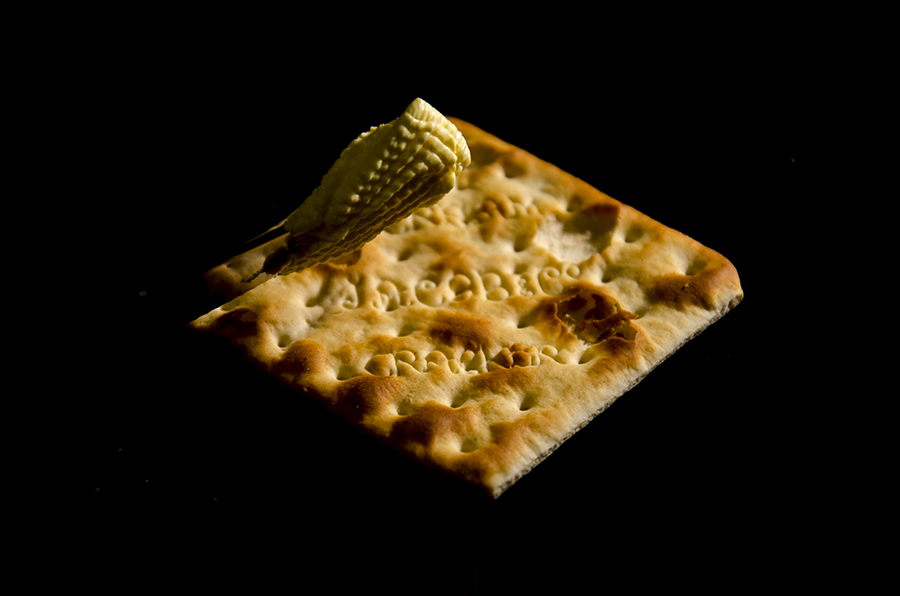
week43spread by robertalexandershaw, on Flickr
Week 43 Spread.
A day late. Had some bad news yesterday and the shot was on hold.
Lost my inspiration.
A cracker and butter.
week43spread by robertalexandershaw, on Flickr
- Messages
- 8,398
- Name
- Lynne
- Edit My Images
- Yes
Hi Robert
sorry to hear you've had bad news , hope you're ok & sending you a big
Liking you image for spread a lot...fab black BG, lovely lighting on the cracker & good DOF, little more light maybe on the butter but that's just my thought . Great picture none the less
sorry to hear you've had bad news , hope you're ok & sending you a big
Liking you image for spread a lot...fab black BG, lovely lighting on the cracker & good DOF, little more light maybe on the butter but that's just my thought . Great picture none the less
- Messages
- 4,827
- Name
- Alan
- Edit My Images
- Yes
Hi Robert
Hope that you are Ok
Spread - good image .
Exc black b/g and lovely colours and shadows in the cracker - good focus and dof. Like the ripples in the butter but would prefer to have a little more light on it and, partic, the knife blade and handle. But minor crits.
Hope that you are Ok
Spread - good image .
Exc black b/g and lovely colours and shadows in the cracker - good focus and dof. Like the ripples in the butter but would prefer to have a little more light on it and, partic, the knife blade and handle. But minor crits.
The goblin
<span class="poty">POTY Winner 2015</span></br>
- Messages
- 4,407
- Name
- Marsha
- Edit My Images
- Yes
Hi Robert, sorry to hear you've had bad news, hugs to you and your family.
Nice detail on the cracker and the black background really works. The butter looks a little suspended in mid air though as the knife handle looks odd!
Well done for getting a shot in though.
Nice detail on the cracker and the black background really works. The butter looks a little suspended in mid air though as the knife handle looks odd!
Well done for getting a shot in though.
- Messages
- 13,760
- Edit My Images
- Yes
Liking that Michael, a little more light on the knife for me would be good, great colour and texture to the 'Jacobs'
- Messages
- 6,502
- Name
- Peter
- Edit My Images
- Yes
The lighting on the butter/marg has been mentioned. How did you take the picture? Is the cracker lying directly on the black background or suspended mid air with the black background behind?
OP
- Messages
- 989
- Name
- Robert
- Edit My Images
- Yes
Thanks everyone.
Appreciate your kind words on what's been a tough time. Hardest thing has been having nobody to talk to. Never mind. Chin up and all that.
Last weeks shot was just shot on a black plate. I just increased the black in PS. Instead of using a flash, I used a basic lamp. One of two I bought from Ikea. Very basic, but they have clamps and I wanted to try and experiment with continuous light.
I got this weeks shot today while spending some precious time with my two Sons.
Just looking there, I think it's not level. I'll look again tomorrow.
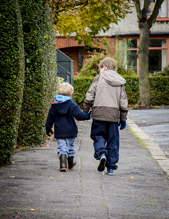
Week 44 Together by robertalexandershaw, on Flickr
Appreciate your kind words on what's been a tough time. Hardest thing has been having nobody to talk to. Never mind. Chin up and all that.
Last weeks shot was just shot on a black plate. I just increased the black in PS. Instead of using a flash, I used a basic lamp. One of two I bought from Ikea. Very basic, but they have clamps and I wanted to try and experiment with continuous light.
I got this weeks shot today while spending some precious time with my two Sons.
Just looking there, I think it's not level. I'll look again tomorrow.
Week 44 Together by robertalexandershaw, on Flickr
*Sarah*
Peel Me!
- Messages
- 1,873
- Name
- Sarah
- Edit My Images
- Yes
Hi Robert, I'm sorry to hear that thing have been difficult for you recently.
I was hoping to get a shot of 2 people walking hand in hand and failed miserably. This is a lovely shot showing the love that brothers can have. I want to be walking with them so that I can hear what the eldest is saying to the youngest! We're lucky if our 2 teenage sons do more thank a grunt to each other!!
I was hoping to get a shot of 2 people walking hand in hand and failed miserably. This is a lovely shot showing the love that brothers can have. I want to be walking with them so that I can hear what the eldest is saying to the youngest! We're lucky if our 2 teenage sons do more thank a grunt to each other!!
- Messages
- 4,827
- Name
- Alan
- Edit My Images
- Yes
Good shot Robert - bang on theme. Really good colours and you have caught the look of the older boy to the younger imparting knowledge or info or kindness or reassurance - lovely.
As to straightness, perhaps slightly out although there are lots of 'sloping' elemnts in there: trees, footpath, hedge. Probably a straighten of the verticals of the window and the horizontal between brick and render would do it
As to straightness, perhaps slightly out although there are lots of 'sloping' elemnts in there: trees, footpath, hedge. Probably a straighten of the verticals of the window and the horizontal between brick and render would do it
- Messages
- 6,502
- Name
- Peter
- Edit My Images
- Yes
I like the idea of the two lads together. I'd probably recommend a smaller DoF to take away the distraction of the background. I also think the two boys walking away probably works far better than them walking towards you.
- Messages
- 8,398
- Name
- Lynne
- Edit My Images
- Yes
Hi Robert
Glad you're still hanging on in here mister
Thats a lovely shot for Together , lots of horizontal lines to check straightness if you wanted to but my eye goes straight to the models so not noticed if it's on the squiff
Glad you're still hanging on in here mister
Thats a lovely shot for Together , lots of horizontal lines to check straightness if you wanted to but my eye goes straight to the models so not noticed if it's on the squiff
The goblin
<span class="poty">POTY Winner 2015</span></br>
- Messages
- 4,407
- Name
- Marsha
- Edit My Images
- Yes
Hi Robert, lovely shot that I agree with Peter about a lower DOF to separate them from the background a bit. The yellow graffiti merging into the younger boys blonde hair bothers me a little, a lower shooting angle would have helped. But if I know children this was probably the only chance you got!
I agree with Peter about a lower DOF to separate them from the background a bit. The yellow graffiti merging into the younger boys blonde hair bothers me a little, a lower shooting angle would have helped. But if I know children this was probably the only chance you got!
OP
- Messages
- 989
- Name
- Robert
- Edit My Images
- Yes
Thanks everyone. Appreciate your kind words.
I had the DOF as low as it could go (kit lens). Maybe try and see if I can get a 50mm after Christmas.
Week 45 Pack.
Late and in my opinion a poor effort. I couldn't come up with anything and so I just put a carrier bag on the table and took 4 shots of my hands with apples in different places, packing the bag.
I used layer masks in Photoshop to bring my four hands into the photo and brightened up the shots which were shot with a flash throught a brolly across from the table.
week45pack by robertalexandershaw, on Flickr
- Messages
- 19,461
- Name
- Andy
- Edit My Images
- Yes
Hi, Robert, Together is a cracker, especially how oyur older son is looking caringly at the younger one. As Michael sai, a tad off the bottom would draw the eye quicker to the main focus points.
Pack, I haven't done multiplicity for a while and do like them. Nice clean photograph. I'd like a bit more depth and perhaps your hand holding the apples differently.
Regards.
Pack, I haven't done multiplicity for a while and do like them. Nice clean photograph. I'd like a bit more depth and perhaps your hand holding the apples differently.
Regards.
- Messages
- 13,760
- Edit My Images
- Yes
Hi Robert
Pack - Apart from the bright patch of light on the table, I like it, good pp skills and a good idea
Pack - Apart from the bright patch of light on the table, I like it, good pp skills and a good idea
- Messages
- 6,502
- Name
- Peter
- Edit My Images
- Yes
I don't think it's a poor attempt at all. It's a great idea which has been well executed.
OP
- Messages
- 989
- Name
- Robert
- Edit My Images
- Yes
Thanks. Appreciate your time.
Week 46 Art
Beacon of Hope.
I wanted to get this in the evening, but didn't get a chance, hopefully for a reshoot.
It's 20 metres tall and made from steel and bronze and reminds me of Iains (Blakester) wire work that he's used in his 52 for 2012.

week46art-s by robertalexandershaw, on Flickr
Week 46 Art
Beacon of Hope.
I wanted to get this in the evening, but didn't get a chance, hopefully for a reshoot.
It's 20 metres tall and made from steel and bronze and reminds me of Iains (Blakester) wire work that he's used in his 52 for 2012.
week46art-s by robertalexandershaw, on Flickr
The goblin
<span class="poty">POTY Winner 2015</span></br>
- Messages
- 4,407
- Name
- Marsha
- Edit My Images
- Yes
Hi Robert,
Pack, very clever PP skills although around the edges of the edited hands some are a little transparent in places
I agree with Andy about maybe having the hands in different positions I don't think it's a poor effort at all.
Art, I really like this, it's a sculpture and fits the theme with lovely blue sky My only crit would be to clone out the two little pointy things (technical term) bottom left.
Pack, very clever PP skills
although around the edges of the edited hands some are a little transparent in places I agree with Andy about maybe having the hands in different positions
I don't think it's a poor effort at all. Art, I really like this, it's a sculpture and fits the theme with lovely blue sky
My only crit would be to clone out the two little pointy things (technical term) bottom left.- Messages
- 2,820
- Name
- Mark
- Edit My Images
- Yes
Hi Robert, catch up time!
Age is lovely; so simple yet so effective.
Spread is one of the best versions of the obvious interpretation I've seen.
Together; Wonderful! I like the angle of the larger lad's head that you've managed to capture.
Pack I'm not sure about. I mean it's very nicely taken shot, but it just looks a little contrived to me.
Art is a lovely shot with fantastic exposure, but I keep seeing it as a bird! I think a slightly different angle would have avoided that and shown it as what it really is. Still, even as a bird it's a lovely photo!
- Messages
- 6,408
- Edit My Images
- No
Hi Robert,
Apologies for not commenting sooner
Age - very nice skin tones and bang on theme, combination of nice lighting and processing too.
Pack - I like your strong composition, four hands one from each corner of the frame makes a very strong composition. Again, nice lighting too.
Art - Bang on theme, not too harsh natural lighting and a pleasing sky make for a nice image.
- Messages
- 8,398
- Name
- Lynne
- Edit My Images
- Yes
Hi Robert 
hope things are picking up for you mister
& stop doubting your work ! Pack may have been a desperation shot but you've pulled off it really well....great pp , great focus on all the apples & hands , good skin tones only wee niggle from me is the lighter patch on the table rhs...still a million times better than I'd ever manage though
ART...beautiful subject & really well shot ,good exposure , great detail in the sculpture , good work mister Clone the pointy things out on the bottom edge & you've got a wall pring for sure
hope things are picking up for you mister
& stop doubting your work ! Pack may have been a desperation shot but you've pulled off it really well....great pp , great focus on all the apples & hands , good skin tones
only wee niggle from me is the lighter patch on the table rhs...still a million times better than I'd ever manage though ART...beautiful subject & really well shot ,good exposure , great detail in the sculpture , good work mister
Clone the pointy things out on the bottom edge & you've got a wall pring for sure - Messages
- 13,760
- Edit My Images
- Yes
Hi Robert
Art - Love that, the spikes in the bottom is very nit picky crit, other than that great pov, nice sky and shine to the metal
Art - Love that, the spikes in the bottom is very nit picky crit, other than that great pov, nice sky and shine to the metal