

You are using an out of date browser. It may not display this or other websites correctly.
You should upgrade or use an alternative browser.
You should upgrade or use an alternative browser.
weekly Reanimated 52 - Fit/Water added... 2013 done.
- Thread starter HWest
- Start date
First doodle on the idea of Wild.
In case anyone's not worked out my workflow yet, I basically do sketches while I'm thinking through my ideas. For example, I'm pretty sure this one will take some stuff from mythology so I've started kicking round a few concepts and this has helped me crystallise some of them. So these first shots I put up aren't generally very good, they're just the equivalent of my sketchbook.

Wild Woods by DrHWest, on Flickr
In case anyone's not worked out my workflow yet, I basically do sketches while I'm thinking through my ideas. For example, I'm pretty sure this one will take some stuff from mythology so I've started kicking round a few concepts and this has helped me crystallise some of them. So these first shots I put up aren't generally very good, they're just the equivalent of my sketchbook.
Wild Woods by DrHWest, on Flickr
Last edited:
- Messages
- 8,398
- Name
- Lynne
- Edit My Images
- Yes
Hi Tony.....I seem to have missed a few of yours...sorry 
gravity.....not sure which Image I prefer....like the 1st one as very convincing , not sure about the focus though do like the motion
the 2nd one....looks a little to cut n pasted for me ( not that I could do any better !)not so keen on the color cast of the bg either so guess my vote goes to #1
Love those Blue Balls....
Season ( 2nd image)...not gonna crit as think it's wonderfull as is
Liking the look of your thought train for wild...very arty , very dark
Ok, first of the proper Wild shots. There will be two more to follow, possibly three if I can find a good tree.
It's a weird situation to be in when it's easier to find models than a frickin' tree.
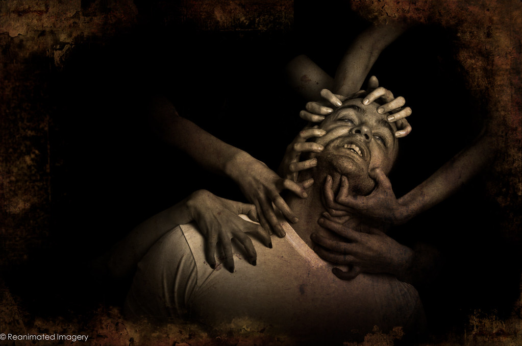
Orpheus and the Maenads by DrHWest, on Flickr
Or, for those who prefer things a little more on the nose, here's the version with the blood:

Orpheus and the Maenads by DrHWest, on Flickr
It's a weird situation to be in when it's easier to find models than a frickin' tree.
Orpheus and the Maenads by DrHWest, on Flickr
Or, for those who prefer things a little more on the nose, here's the version with the blood:
Orpheus and the Maenads by DrHWest, on Flickr
Last edited:
Is it not a little too pink? I also find the hand second from the left too relaxed. I much prefer his face in the second shot as I think the pain is more evident, but I prefer the composition of the first.
Be interesting to hear what other people think; I know most of the models agree with you.
Be interesting to hear what other people think; I know most of the models agree with you.
- Messages
- 6,293
- Name
- John
- Edit My Images
- Yes
The relaxed hand isn't as noticeable in the second edit, yes I do think its a bit pink and the original colours would work better when I come to take a second look, if you can get the colours from edit 1 onto 2 then with the expression and crop you;re onto a real winner.
Still having trouble finding a tree; I'm guessing that the third Wild shot will be late.
In the meantime, we have some wild faeries and a bit of Shakespeare. Having difficulty choosing between the two, so I'll put both here and see what you think:

"Shaping Fantasies" - Wild Fantasies I by DrHWest, on Flickr

"Lovers and Madmen" - Wild Fantasies II by DrHWest, on Flickr
In the meantime, we have some wild faeries and a bit of Shakespeare. Having difficulty choosing between the two, so I'll put both here and see what you think:
"Shaping Fantasies" - Wild Fantasies I by DrHWest, on Flickr
"Lovers and Madmen" - Wild Fantasies II by DrHWest, on Flickr
I haven't commented on any of your entries so far, but I like them all and admire your creativity. For this week the 2nd Orpheus image is my preferred one as I think it works better as a close up. Only change I would make is maybe cropping a little off the top.
Thanks all, you are all very kind.
Wild 3 will be coming later - I've been so ill I can't leave the house - or, indeed the bed - for most of the last week, so that'll have to wait until I can get out to find the tree I want.
I've also barely been able to think about Space, so the first of this week is a little weak. I have other idea to try if i can get out at all tomorrow.
On the plus side: NEW CAMERA.
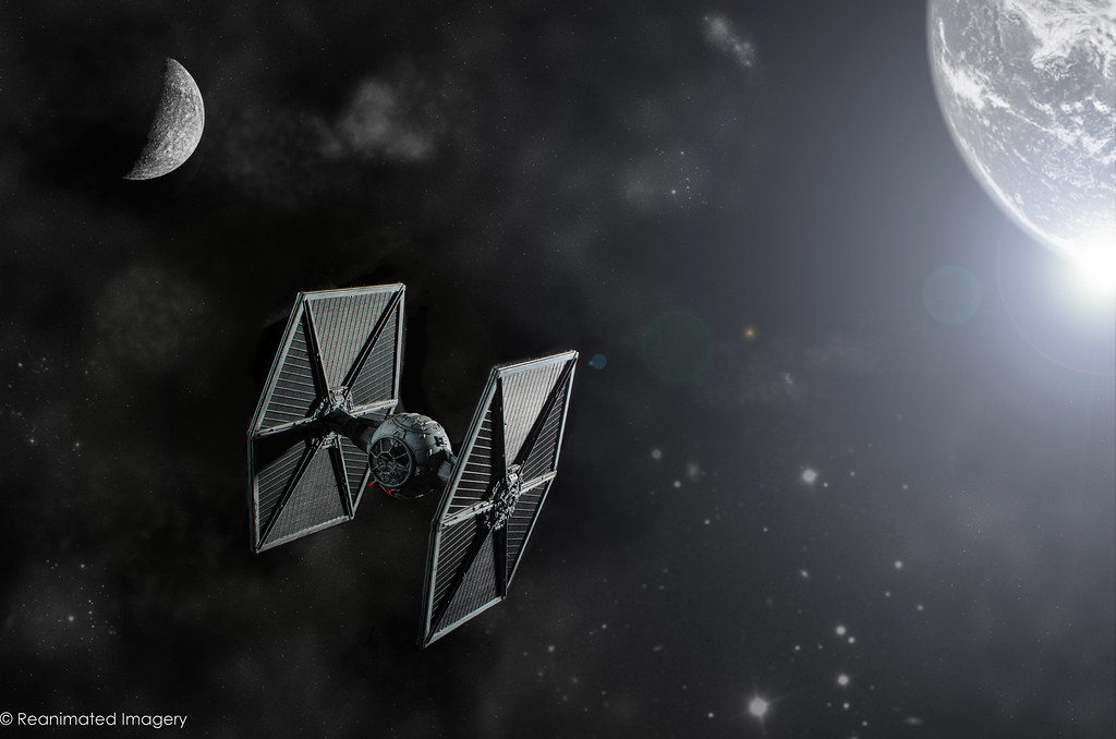
Space 1 by DrHWest, on Flickr
Wild 3 will be coming later - I've been so ill I can't leave the house - or, indeed the bed - for most of the last week, so that'll have to wait until I can get out to find the tree I want.
I've also barely been able to think about Space, so the first of this week is a little weak. I have other idea to try if i can get out at all tomorrow.
On the plus side: NEW CAMERA.
Space 1 by DrHWest, on Flickr
Last edited:


Only had really one idea for this week, although I went through a few different versions, with text and without.
Any ways, here's Work:

The Myth of Sisyphus by DrHWest, on Flickr
For anyone interested, this one was one of the more involved shots - first, I had to sculpt my Sisyphus:
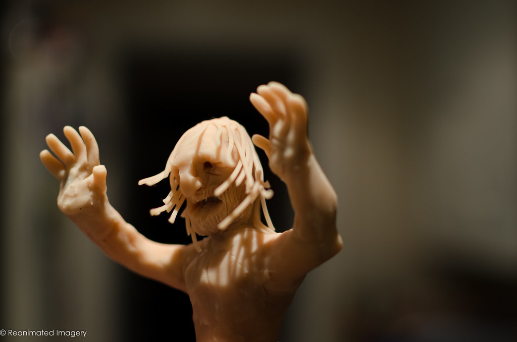
Sculpt by DrHWest, on Flickr
Then set up for the shot - note the use of a snooted flash to get the shadow on the 'sky':

Set up by DrHWest, on Flickr
And then the final shot ready for PP:

Sisyphus base shot by DrHWest, on Flickr
Any ways, here's Work:
The Myth of Sisyphus by DrHWest, on Flickr
For anyone interested, this one was one of the more involved shots - first, I had to sculpt my Sisyphus:
Sculpt by DrHWest, on Flickr
Then set up for the shot - note the use of a snooted flash to get the shadow on the 'sky':
Set up by DrHWest, on Flickr
And then the final shot ready for PP:
Sisyphus base shot by DrHWest, on Flickr
- Messages
- 19,461
- Name
- Andy
- Edit My Images
- Yes
Hi, Tony, I had to Google The Meaning of Sisyphus and this was in the section I read: "man's futile search for meaning, unity, and clarity in the face of an unintelligible world devoid of God and eternal truths or values.". Well that cheered me up
Anyway, cracking image there, and set up. Plenty of effort and it's paid off. Great shadows, detail and the muted colours work really well.
Looks a tad noisy unless that was intended?
Cheers and great sculpture
Anyway, cracking image there, and set up. Plenty of effort and it's paid off. Great shadows, detail and the muted colours work really well.
Looks a tad noisy unless that was intended?
Cheers and great sculpture
Cheers Andy; yes, I added the grain afterwards. I had a texture applied to the sky but wanted the block of colour against the detail of the ground so removed it. I still didn't like the flatness so put in some grain.
I'll post the graininess version for comparison this evening, but you can get a sense from the base shot.
I'll post the graininess version for comparison this evening, but you can get a sense from the base shot.
- Messages
- 4,088
- Name
- Graham
- Edit My Images
- Yes
Now, once again that is truly awesome - huge amount of work it looks like in there. :claps:
Looks like the little fella's made of cheese, with cheese-string hair
Really appreciate the set-up shots as well. Thanks for that.
-------------
edit - looking again I notice the details you've put into his mouth, nose, eyes, beard, surely knowing they would be hidden in the final shot.
Looks like the little fella's made of cheese, with cheese-string hair
Really appreciate the set-up shots as well. Thanks for that.
-------------
edit - looking again I notice the details you've put into his mouth, nose, eyes, beard, surely knowing they would be hidden in the final shot.
Last edited:
- Messages
- 6,293
- Name
- John
- Edit My Images
- Yes
Nice shot, I think I'd have processed differently myself as I think the grain was overdone - or it may just be the border - love the shot and idea though - it blows mine out of the water (when I do the damn thing!)
BTW that must be at work - you can never draw as well as the pics in the background!
BTW that must be at work - you can never draw as well as the pics in the background!
Thanks, Dave.
As several people have suggested that the grain is a little too much, here's the version without any grain:

The Myth of Sisyphus by DrHWest, on Flickr
And, for the purposes of comparison, here's the version with text but which also shows the texture I had on the sky for a couple of versions:

Sisyphus text by DrHWest, on Flickr
I was never happy enough with the text to finish the work on it, so it's not been blended in properly and is just sitting there. In the end, I decided the image was strong enough without any words.
For anyone wondering about the text, it's from the absurdist philosopher Camus, who used the myth of Sisypus to point out that if life has no meaning, then the work we do because we choose to do it gives life meaning - in short, Sisyphus is smiling.
"I leave Sisyphus at the foot of the mountain! One always finds one's burden again. But Sisyphus teaches the higher fidelity that negates the gods and raises rocks. He too concludes that all is well. This universe henceforth without a master seems to him neither sterile nor futile. Each atom of that stone, each mineral flake of that night filled mountain, in itself forms a world. The struggle itself toward the heights is enough to fill a man's heart. One must imagine Sisyphus happy."
-Albert Camus, The Myth of Sisyphus, 1942
As several people have suggested that the grain is a little too much, here's the version without any grain:
The Myth of Sisyphus by DrHWest, on Flickr
And, for the purposes of comparison, here's the version with text but which also shows the texture I had on the sky for a couple of versions:
Sisyphus text by DrHWest, on Flickr
I was never happy enough with the text to finish the work on it, so it's not been blended in properly and is just sitting there. In the end, I decided the image was strong enough without any words.
For anyone wondering about the text, it's from the absurdist philosopher Camus, who used the myth of Sisypus to point out that if life has no meaning, then the work we do because we choose to do it gives life meaning - in short, Sisyphus is smiling.
"I leave Sisyphus at the foot of the mountain! One always finds one's burden again. But Sisyphus teaches the higher fidelity that negates the gods and raises rocks. He too concludes that all is well. This universe henceforth without a master seems to him neither sterile nor futile. Each atom of that stone, each mineral flake of that night filled mountain, in itself forms a world. The struggle itself toward the heights is enough to fill a man's heart. One must imagine Sisyphus happy."
-Albert Camus, The Myth of Sisyphus, 1942
Last edited:
- Messages
- 532
- Name
- Ray
- Edit My Images
- Yes
Fantastic job on "work" there, and pleasantly surprised to see a Sisyphus reference. That guy symbolises my daily grind at work.
Great photo, great idea, great processing, and great sculpting!
Great photo, great idea, great processing, and great sculpting!
- Messages
- 213
- Name
- Everton
- Edit My Images
- Yes
Hi Tony, looking at the set up to get th shot very sharp and love the colours
very sharp and love the colours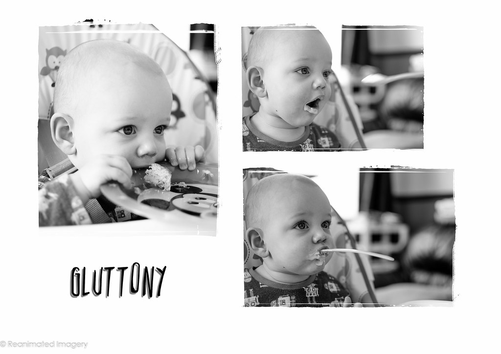
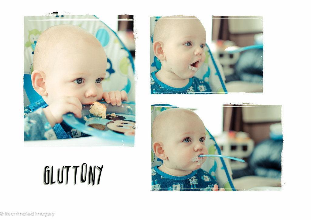
Aye, I've played quite significantly with the tones on it. The original shot was very vibrant due to the clothes and stuff in the background, so I just wanted to cool the whole thing down and give it some unity of colour by emphasising the blue of the top, eyes, chair trim, spoon and plate.
Damn that was quite - for me the colour one by a mile.
Yeah, I'm happier with that 'vintage' toned one than the original colour one as well.
- Messages
- 8,398
- Name
- Lynne
- Edit My Images
- Yes
OMG...I have no idea where to start with your thread !
Wild....the one with the hands on the face...prefering the 1st image , better color for me
The Wild images....should be book/DVD covers ...the only thing that bugs me is the word Comprehend.....my addled brain is confused as I can't see the P in it ? Is that deliberate ?
Space ....Space 2 is , I think my fave shot...but I also really like the clouds & the path leading your eye in to the distance in Open space
Work....my god , you sure put some work in to that shot
Gluttony...not a portait person but the MONO version for me
Wild....the one with the hands on the face...prefering the 1st image , better color for me
The Wild images....should be book/DVD covers
...the only thing that bugs me is the word Comprehend.....my addled brain is confused as I can't see the P in it ? Is that deliberate ?Space ....Space 2 is , I think my fave shot...but I also really like the clouds & the path leading your eye in to the distance in Open space
Work....my god , you sure put some work in to that shot
Gluttony...not a portait person but the MONO version for me
- Messages
- 532
- Name
- Ray
- Edit My Images
- Yes
Quick off the mark and a great job too. The colour version is by far the best of the two.

- Messages
- 13,760
- Edit My Images
- Yes
Hi Tony
Wild - Love your first 'sketch'... out of the two proper shots, the first has my vote, lots of energy given off and that bottom Claw looking hand - Oochie
Good background used too - like the work you put into your shots
Space - Really like the first one, but doesn't seem like a photo but more excellent editing/pp work so not for me (would love to be proven wrong) - The one I choose is the last image, liking the starry sky merging into the blue cloudiness
Work - Fantastic... thanks for sharing how you set this up, very clever, love the detail
Gluttony - Awweeeee that's excellent too, a great set of photo's
Last edited: