weekly DK's 52 in 2013 - Wk 47, 50, 51 & 52 added - FINISHED !!!

I like your take on space. Its clean and well focussed. The perspective is excellent although I think it may have been worthwhile to blur the signs a bit more to enable the 'space to let' to stand out more. Nevertheless, well in theme and a well executed.

I prefer your second take of work and can see the link to the topic of not working. Nice detail. Nearly there in catching up, well done. Crack on!
 
hey'up mister...I feel your pain with work( what you do not the photo for the theme :LOL: )

Space...wonderfull...your eye is dranw to the sign...fab use of DOf & a beautiuflly angles shot....really like this one...B&W convert maybe :thinking:

Work....1st shot for me...not bothered about the cropped legs on the sign asI know they're there , good DOf & nice sharp sign :)
 
Space is very nice; the colours and shape repetition are great. Weirdly, the chalk board out the front seems very important to me; something breking up the regularity may be? Like it!

I think Work 1 is better; Work-alt is too chaotic for me and I don't see any thing there to make the eye linger. I had a feeling that Work 1 might have been slightly better shot slightly to the right; the sign is very crowded up to the edge, and the most prominent tree is more towards the middle, leaving a lot of not very much at the left. Nice how the tree-needle line curves around, though.
 
Don't care much for work #2, but I love the simplicity of the composition in #1. I like Work a lot too, my eye can't help but follow from left to right. Good stuff!
 
Really like the space, good to see you got the space to let rather than to let.

Nice clean lines as well.
 
Another vote for #1 work Dean, I find it quite quirky the sign against the wooded background. Not sure if that was your intention but I like it all the same. :D
Keep going with your catch up, you're nearly there ;)
 
Really like your space image.

Both work shots work and clearly show the theme!
 
Like the space shot a bit of a different take. Not keen on the second work shot a bit too busy for me. Like the first one though agree with blakester that the wood makes it a bit more interesting.
 
I like your take on space. Its clean and well focussed. The perspective is excellent although I think it may have been worthwhile to blur the signs a bit more to enable the 'space to let' to stand out more. Nevertheless, well in theme and a well executed.
Thanks Dave :)

I was in fact hoping the DoF would be much slimmer... was using f2.8 but guess The sign was too far away :thinking:

I prefer your second take of work and can see the link to the topic of not working. Nice detail. Nearly there in catching up, well done. Crack on!
Thanks Again :)

hey'up mister...I feel your pain with work( what you do not the photo for the theme :LOL: )
Thanks Lynne :)

Space...wonderfull...your eye is dranw to the sign...fab use of DOf & a beautiuflly angles shot....really like this one...B&W convert maybe :thinking:
Ooooo not tried that - shall do though :)

[/quote]Work....1st shot for me...not bothered about the cropped legs on the sign asI know they're there , good DOf & nice sharp sign :)[/QUOTE]YAY !!!! your the first :D

Space is very nice; the colours and shape repetition are great. Weirdly, the chalk board out the front seems very important to me; something breking up the regularity may be? Like it!
Cheers Chris :)

I think Work 1 is better; Work-alt is too chaotic for me and I don't see any thing there to make the eye linger. I had a feeling that Work 1 might have been slightly better shot slightly to the right; the sign is very crowded up to the edge, and the most prominent tree is more towards the middle, leaving a lot of not very much at the left. Nice how the tree-needle line curves around, though.
Hadn't spotted that ... will maybe try a wider crop - Thanks (y)
 
Don't care much for work #2, but I love the simplicity of the composition in #1. I like Work a lot too, my eye can't help but follow from left to right. Good stuff!
Cheers Nick :)

Really like the space, good to see you got the space to let rather than to let.

Nice clean lines as well.
Thanks Mark... they sure are few and far between... there were dozens of closed shops and none were better placed than this one :)

Another vote for #1 work Dean, I find it quite quirky the sign against the wooded background. Not sure if that was your intention but I like it all the same.
Keep going with your catch up, you're nearly there
Cheers Buddy... I nearlly believe you :LOL:

Really like your space image.

Both work shots work and clearly show the theme!
Thanks Lisa :)

Like the space shot a bit of a different take. Not keen on the second work shot a bit too busy for me. Like the first one though agree with blakester that the wood makes it a bit more interesting.
Thanks Jon... I may try a few different crops tomorrow night if I don't get a shot done :)

Thanks for popping in and commenting all - really appreciated (y)
 
And on to the next...

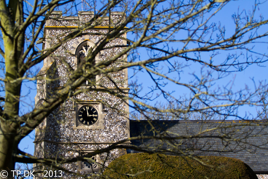
My initial thoughts were of my watch , long exposure of the sweeping second hand for 5 seconds, by the time I had spent the day clearing my room/skip last Saturday, in the evening while updating the sheet I spotted several shots like that already, so have been trying to catch something different all week (still not got my room/lights sorted) so due to working late all week again it was left to this weekend to get a day time shot...

Wk 8 - 'Time'


Wk 8 - 'Time' by TP DK..., on Flickr
 
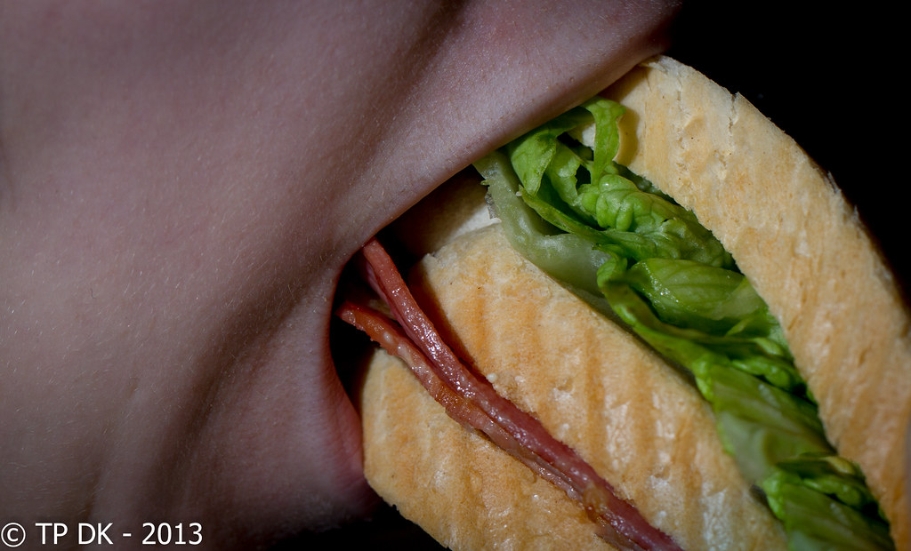
Gluttony works really well - great idea, and composition is great. I think you're right, a little sauce might be good but it doesn't especially need it.

Nice and different for time. Undecided on the tree - half like it, half don't. Maybe there's just a little too much of it? It does frame the clock well though. :)
Many Thanks Ray :)

I did do a couple without the tree, but the image then just looked like a church, rather than concentrate the eye on the clock :)
 
And the last one for this weekend...

I had a good afternoon walking about and got loads of shots, but having got back I am very disappointed with the results, so I have gone for this which was not even a contender at first, will be keeping an eye open for getting a second image seems I have one in on time...

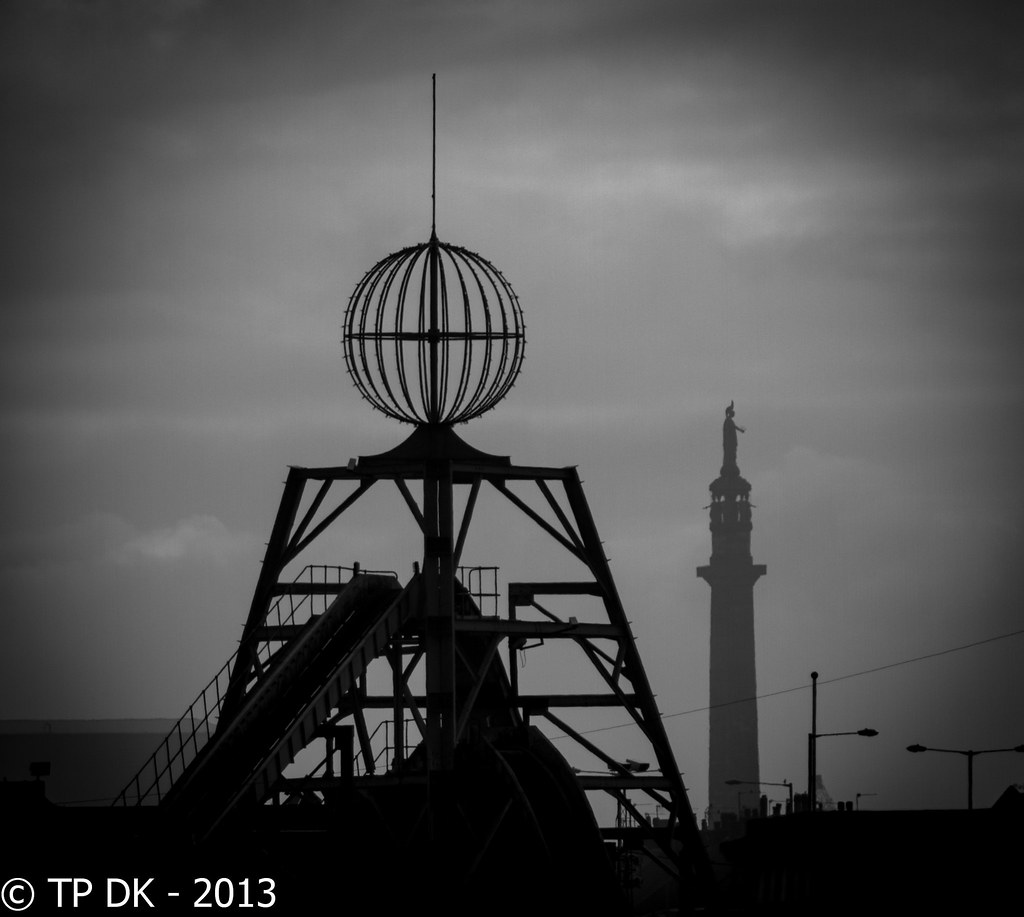
Wk 9 - 'Juxtaposition'


Wk 9 - 'Juxtaposition' by TP DK..., on Flickr

What are the two structures in this shot?
 
Three in a row!!

Since when has a lettuce sandwich with a bit of bacon been considered Gluttonous?? :LOL:

Liking the clock, good use of trees and DOF to bring attention to the clock itself. (y)

Loving your juxtathingy one too. Despite the heavy vignette. Two really interesting and contrasting structures, well presented. I can live with the lamp-posts, but the cable running across could be worth attempting to make disappear?
 
Blimey, like waiting at a bus stop and them 3 come along - so fast in fact thet the title bar has not kept pace.:D

Gluttony - disturbingly clear. Just can't get out of my mind the two types of flesh in the picture. On theme, good colour, partic on bun etc. Agree with yuo about a bit of ooze.

Time - I like this type of picture, I quiote like trees framng shots - not to every one's taste I now. At my club, shots like this often bring the cry of 'chainsaw', but generally I disagree. Super focus on clock, beautiful colours throughout., partic of the Norfolk flint. Also evokes time to me cos of bare tree, blue sky and hint of spring coming.

Juxtaposition - good idea indeed . pPerhaps a little more light on the flume would make it a bit clearer as to what it is. Also agree with Graham re lighta and wire. Good comp with the contrast between the sizes of the structures, their functions and the light.
 
Juxtaposition works really well, nice shot.
 
I like the silhouette in juxtaposition, though overall it may be a bit dark.
 
Gluttony: Great shot, agree some sauce would add a little something.

Time: Nicely caught. I like how the clock is framed by the branches.

Juxtaposition: I really like this, b&w works well. I agree about the wire on the right being removed.
 
well caught up :clap:

gluttony where is the sauce and get rid of the lettuce nice idea about stuffing your face (y)
time everything has already been said
juxtaposition would prefer it if the log flume was to the side maybe but i do like the different shades of shadow on the main objects :clap:
 
The one in the foreground is a 'Log Flume' type ride and the one in the distance is 'Nelson's Column'

Great Yarmouth's one not London's :)
Heh, I thought it was something industrial rather than part of a theme park! :)

I'd be tempted to crop out a chunk of the right and a little of the left, and I think the vignette is a bit too strong. I think the watermark is a bit distracting too.

But that said, I like the weight of the darkness in it, I think that's why I thought it was industrial. I also like the difference in tone between foreground and background. It's an interesting image. (y)
 
Hi dean....good catch up there mister :)

Gluttony...nah...thats nowhere near messy enough though with 3 slices of bread it kinda does meet the theme :D....get some mayo or ketchup or both ooziung out & it's a corker .Focus is good, looks sharp enough to reach out & pick it off the screen(y)
Time....liking that , clock focus spot on , I like the way the tree frames the focus point as well , really nice light & blue sky...well spotted & taken (y) I might just be tempted to crop the lhs a smidge so as to lose the slither of blue ?

Juxtaposition....definately has an industrial feel to it helped by the dark processing...works for the theme...vignette a touch heavy for me though ( personal taste etc) , agree about trying to clone the wire thingy out just to make cleaner space between the 2 objects (y)
 
Gluttony's a cracker for me... great colours and comp, just really nicely done.

The tree gets in the way a bit in Time, pulling my eye around a bit, but I do like the way the clock is sharp and pretty much clear.

Juxtaposition is really nice too, the tones really work, and I like the composition in the square crop. Maybe the cable is surplus to requirements, but it's not intrusive enough to spoil it for me.
 
Three in a row!!

Since when has a lettuce sandwich with a bit of bacon been considered Gluttonous?? :LOL:
Yep there is that :D

My daughter wasn't very adventurous, but that for her IS very large :LOL:

Liking the clock, good use of trees and DOF to bring attention to the clock itself. (y)
Cheers mate :)

Loving your juxtathingy one too. Despite the heavy vignette. Two really interesting and contrasting structures, well presented. I can live with the lamp-posts, but the cable running across could be worth attempting to make disappear?
Ahhhh yeah good thinking.... may try that now :)

Blimey, like waiting at a bus stop and them 3 come along - so fast in fact thet the title bar has not kept pace.:D
oh yeah :LOL:

Gluttony - disturbingly clear. Just can't get out of my mind the two types of flesh in the picture. On theme, good colour, partic on bun etc. Agree with yuo about a bit of ooze.
:)

Time - I like this type of picture, I quiote like trees framng shots - not to every one's taste I now. At my club, shots like this often bring the cry of 'chainsaw', but generally I disagree. Super focus on clock, beautiful colours throughout., partic of the Norfolk flint. Also evokes time to me cos of bare tree, blue sky and hint of spring coming.
Cheers Alan... keep thinking of trying top find a club around here, but wonder if I'd ever get there :)

Juxtaposition - good idea indeed . pPerhaps a little more light on the flume would make it a bit clearer as to what it is. Also agree with Graham re lighta and wire. Good comp with the contrast between the sizes of the structures, their functions and the light.
Thanks again :)
 
Juxtaposition works really well, nice shot.
Thanks Martin :)

I like the silhouette in juxtaposition, though overall it may be a bit dark.
Cheers Jim... there is reasoning behind that... shooting in to the sun, sea mist rolling in and very poor light so dulled it loads :D

Gluttony: Great shot, agree some sauce would add a little something.

Time: Nicely caught. I like how the clock is framed by the branches.

Juxtaposition: I really like this, b&w works well. I agree about the wire on the right being removed.
Thanks Lisa :)

That wire really has to go doesn't it !!!!

well caught up :clap:
Thanks Allan :)

gluttony where is the sauce and get rid of the lettuce nice idea about stuffing your face (y)
time everything has already been said
juxtaposition would prefer it if the log flume was to the side maybe but i do like the different shades of shadow on the main objects :clap:
Cheers buddy :)

Heh, I thought it was something industrial rather than part of a theme park! :)

I'd be tempted to crop out a chunk of the right and a little of the left, and I think the vignette is a bit too strong. I think the watermark is a bit distracting too.

But that said, I like the weight of the darkness in it, I think that's why I thought it was industrial. I also like the difference in tone between foreground and background. It's an interesting image. (y)
Many Thanks :)

I'll try a different crop too when I take the wire out
 
Hi dean....good catch up there mister :)
Cheers Lynne :)

Gluttony...nah...thats nowhere near messy enough though with 3 slices of bread it kinda does meet the theme :D....get some mayo or ketchup or both ooziung out & it's a corker .Focus is good, looks sharp enough to reach out & pick it off the screen(y)
Next time I better make it for her :LOL:
Time....liking that , clock focus spot on , I like the way the tree frames the focus point as well , really nice light & blue sky...well spotted & taken (y) I might just be tempted to crop the lhs a smidge so as to lose the slither of blue ?
Oooo didn't spot that - Thanks :)

Juxtaposition....definately has an industrial feel to it helped by the dark processing...works for the theme...vignette a touch heavy for me though ( personal taste etc) , agree about trying to clone the wire thingy out just to make cleaner space between the 2 objects (y)
Consider the wire GONE :D

Gluttony's a cracker for me... great colours and comp, just really nicely done.

The tree gets in the way a bit in Time, pulling my eye around a bit, but I do like the way the clock is sharp and pretty much clear.
Thanks Nick, there were a LOT of attempts to try and get it totally clear... nearly got ran over twice while squatting in the road

Juxtaposition is really nice too, the tones really work, and I like the composition in the square crop. Maybe the cable is surplus to requirements, but it's not intrusive enough to spoil it for me.
and thanks again :)

After all the comments, really appreciated, the wire will go :)
 
'ello, Gluttony, really pops, great colours and detail. Tad off the left for me.

Juxtaposition, I wasn't sure at first so came back a few days later. It's grown on me. B&W was the only way IMO. Sometimes these aren't easy to compose. Vignette works well. Crit, I'd like to to see it a tad cleaner with the lights and wire on the RHS removed.

Time, on theme and I see where you were going with framing the clock, but I find the tree quite distracting.

Good catch up (y)
 
Hi DK

Gluttony , its a cracker, the detail and and tone of the face is spoton the green of the lettuce stands out well

Time - Tree spoils it for me im afraid can see what you were trying to do but its not for my liking :(

Juxtaposition - has got me I dont like it but I do like it weird cant explain (great help hey )
 
Hey Dean, get you all caught up and all ;)

Time, my vote goes to keeping the tree, I feel it adds to the scene with your composition choice of framing the clock with the branches a good decision. Nice lighting in there too with lots of detail to hold the viewers eye.

Juxtaposition, on first looking at this, I thought the log flume was one of those structures you see at the top of a minehead but with Nelsons Column in the background that just threw that idea out the window :LOL:
The wire and lampost doesn't really distract my eye, I like the contrast of the log flume against the sky with NC receding into the background.

Good catch up, now you get to pass the lastminutedotcom crown onto someone else..........I think Marsha should have it :LOL: (just saying Marsha if you read this ;))
 
Holy crap I’ve missed LOADS of yours DK!

Space, great DOF, the line of shops really draw your eye to the sharp ‘space’ sign. The sandwich board in the background is a bit distracting, I would maybe have tried to move it for a brief moment!!!

Work, I would like to see the legs on the sign as well :thinking:

Alternative work, wow you have some clutter in your old home office! I hope you’ve made room now?

Gluttony, nope I don’t see how that’s gluttony, it looks very tasty! :coat:

Time, again the DOF really draws your eye to the bit that matters. Lovely blue sky too.

Juxtathingy, I’m not sure on the vignette :thinking: but I like the two contrasting structures. The cable going through the RHS is a little annoying, I may have tried to clone that out.

It was brief, but a quick catch up!

Good catch up, now you get to pass the lastminutedotcom crown onto someone else..........I think Marsha should have it :LOL: (just saying Marsha if you read this ;))

How very dare you :dummy: :coat:
 
Hi DK,
Gluttony, well executed with good colour contrast.
Time, Nice idea but I find the tree distracting, maybe if the clock face was a little larger in filling the gap between the branches?
Juxtaposition, a good idea that is well in theme. I would prefer to see it in colour but can understand that B&W is probably the better option inkeeping with the theme.
 
'ello, Gluttony, really pops, great colours and detail. Tad off the left for me.
Hi mate... can live with that :)

Juxtaposition, I wasn't sure at first so came back a few days later. It's grown on me. B&W was the only way IMO. Sometimes these aren't easy to compose. Vignette works well. Crit, I'd like to to see it a tad cleaner with the lights and wire on the RHS removed.
Know what you mean, sometimes I want to remove the wire and stuff, sometimes I don't, to make it more 'Juxtapositiony' I guess I should

Time, on theme and I see where you were going with framing the clock, but I find the tree quite distracting.
Don't be so silly... it would be just a church without it :p

Good catch up (y)
Cheers Buddy :)

Hi DK

Gluttony , its a cracker, the detail and and tone of the face is spoton the green of the lettuce stands out well
Hi Craig, thanks :)

Time - Tree spoils it for me im afraid can see what you were trying to do but its not for my liking :(
Oh dear... well as above, I tried without the tree and no way did it say 'Time' it just said Church as The focus was bang on all over it... so the tree was just focusing the eye on the clock... made sense to me :D

Juxtaposition - has got me I dont like it but I do like it weird cant explain (great help hey )
Probably because they are not close together... not a true Juxtaposition i don't think :thinking:

Thanks Anyway :)
 
Hey Dean, get you all caught up and all ;)
Miracle isn't it mate... don't worry it won't last :(

Time, my vote goes to keeping the tree, I feel it adds to the scene with your composition choice of framing the clock with the branches a good decision. Nice lighting in there too with lots of detail to hold the viewers eye.
Yay !!! you can visit again :D

Juxtaposition, on first looking at this, I thought the log flume was one of those structures you see at the top of a minehead but with Nelsons Column in the background that just threw that idea out the window :LOL:
The wire and lampost doesn't really distract my eye, I like the contrast of the log flume against the sky with NC receding into the background.
Cheers Iain :)

Good catch up, now you get to pass the lastminutedotcom crown onto someone else..........I think Marsha should have it :LOL: (just saying Marsha if you read this ;))
Oh YES !!!! perfect choice :LOL:
 
Holy crap I’ve missed LOADS of yours DK!
You's a busy girl lately Marsha - so I forgive you (y)

Space, great DOF, the line of shops really draw your eye to the sharp ‘space’ sign. The sandwich board in the background is a bit distracting, I would maybe have tried to move it for a brief moment!!!
Thanks :)

Work, I would like to see the legs on the sign as well :thinking:
So would I... was a dashboard and bonnet in the way :LOL:

Alternative work, wow you have some clutter in your old home office! I hope you’ve made room now?
I did have quite a bit yes.. Used to have a company, closed it down and brought all the stuff home, its everywhere!!!!

Gluttony, nope I don’t see how that’s gluttony, it looks very tasty! :coat:
I certainly see what your saying :)

Time, again the DOF really draws your eye to the bit that matters. Lovely blue sky too.
You can come again too m'lady (y)

Juxtathingy, I’m not sure on the vignette :thinking: but I like the two contrasting structures. The cable going through the RHS is a little annoying, I may have tried to clone that out.
Hmmmm sound like I really must try to get rid of that bugger...

It was brief, but a quick catch up!
Plenty good enough for me - Thanks for the visit :)

How very dare you :dummy: :coat:
It's yours if you want it ;)
 
Hi DK,
Gluttony, well executed with good colour contrast.
Thanks Dave :)
Time, Nice idea but I find the tree distracting, maybe if the clock face was a little larger in filling the gap between the branches?
Hmmmmm :thinking: I'll go have a look, Thanks :)
Juxtaposition, a good idea that is well in theme. I would prefer to see it in colour but can understand that B&W is probably the better option inkeeping with the theme.
The light was very poor and colour was washed out - so may be worth a re-visit :)

Love th dark moodiness of the juxtaposition shot; and the atmospheric haze daring out the column is a great capture. Big fan of that one.
Yay... Thanks :)

And you're right about Gluttony - definitely needs sauce dripping down the chin.
Cheers Tony it sure does :)
 
Back
Top