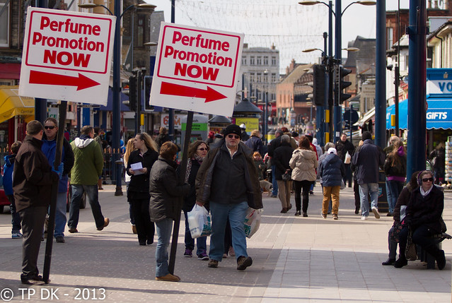
Nice idea for the Letter theme. ")
I had an idea to take a pic of a car badge, but the one on the outside, which frankly looked a bit meh when I looked at it on the pc.
Photographing the badge on the steering wheel and having the lighted console as background adds some great colour to the picture and makes it infinitely more interesting. I never would have thought of that!
Liking it.


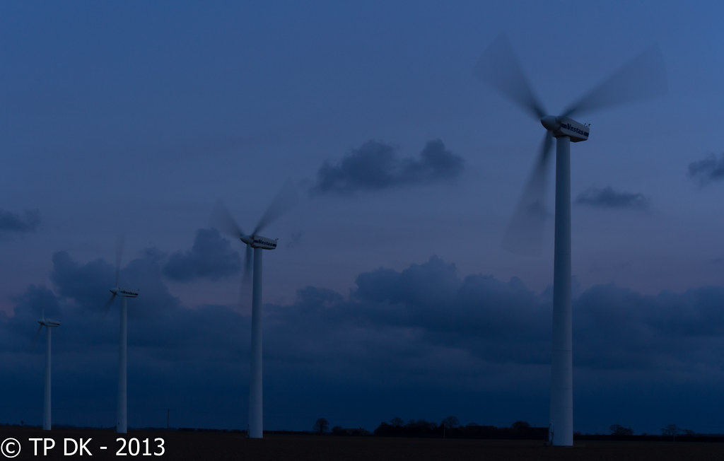

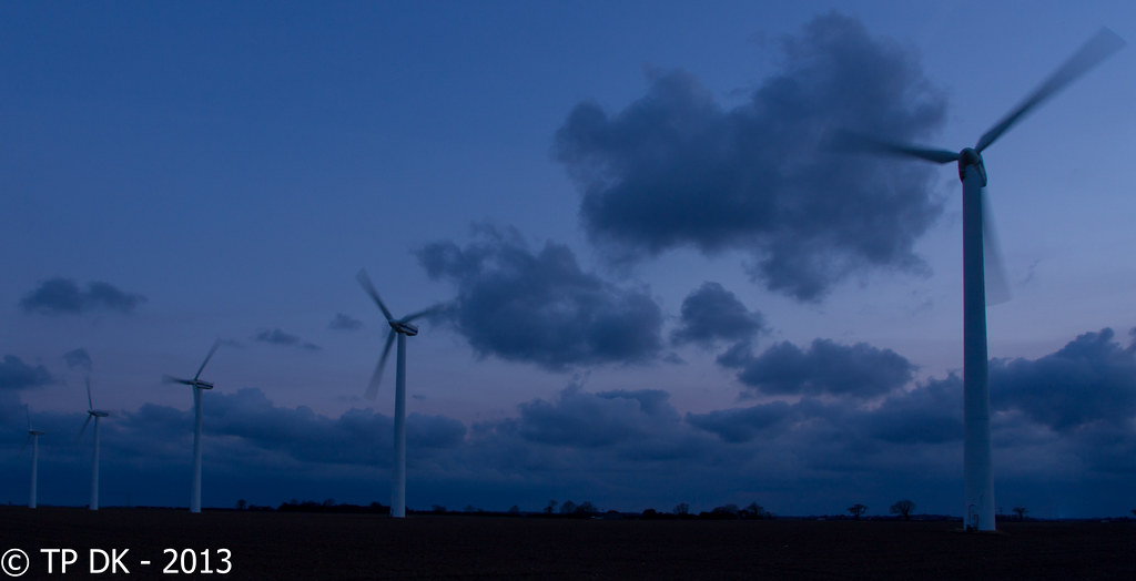


 Interesting how slow you actually have to shoot to get motion blur in these things!!