weekly DK's 52 in 2013 - Wk 47, 50, 51 & 52 added - FINISHED !!!

I'm way behind again in commenting, sorry about that, but at least I can see the reshoots!

Pattern: I really like the dandelion, specially in the square crop. Great depth of field; I like the way the seed "wings" (or whatever the proper term is) are in focus in the front, but dreamy round the edges, and you can still clearly see the actual seeds themselves in the centre. The eye I'm not so keen on, as I find that little red vein slightly disturbing! But the squer crop eye is definitely the best for me...

Movement: really nice idea and well done. I like how the main part of the pic is all movement blur, but the mirrored part is much sharper and appears stationary.

Below: great idea here, and works pretty well. The sun star is a major point of interest, and I wondered if it might work better with some kind of leading line from there up towards the top left. Pretty hard to see how you could achieve it, though!

Size: excellent macro shots here, again plenty of depth of field, quite often hard to get. I prefer the second one as it's the only one where you get the whole bumble!

Process: Hmmm... nice square crop and lovely monochrome tones, and I like the circles and lines. I found this a really hard theme as a process extends in time, I guess this shot does as well as most, but it doesn't really resonate with me. But as I said, lots to like here.
Thanks Chris... really appreciate the in depth comments (y)
 
Its def on theme, didnt know what it was till i read it. Maybe a colour version would have helped?
 
Hi...sorry its taken me a while to comment. Trying to catch up now

Pattern:Loving the lighting of the dandelion, it glows :clap:

Movement:like the contrast between the two 'halves', movement & stillness

Below:not too sure about this, like starburst and colours

Size:Great bee photos...especially last one :clap:
 
Its def on theme, didnt know what it was till i read it. Maybe a colour version would have helped?
Hi Lisa :)

Well to be honest... no I don't think it would help :LOL:

Hi...sorry its taken me a while to comment. Trying to catch up now
Hi Anita... no problem at all :)

Pattern:Loving the lighting of the dandelion, it glows :clap:
Thanks :)

Movement:like the contrast between the two 'halves', movement & stillness
Annnnnd thanks again :)

Below:not too sure about this, like starburst and colours
Glad you like some of it :)

Size:Great bee photos...especially last one :clap:
Cheers :)
 
Hi ya Dean


2 perfectly on theme & quickly posted shots...this is becoming a habit mister :LOL:

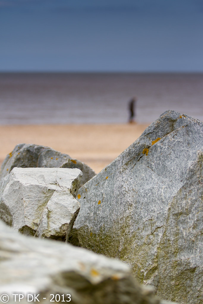
Liked the 1st one as soon as I saw it with the use of DOF to lose the bg but still keep it so it's obvious what it is (y) I would be tempted to crop out the off rock at the bottom though , it just seems to jar a bit ?

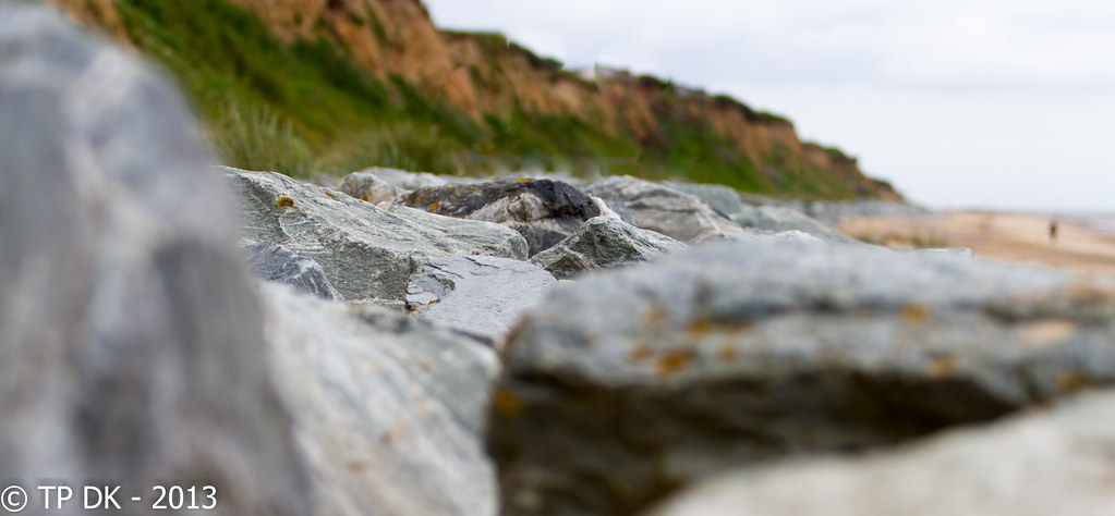
Like the idea of the 2nd image , the focus is is spot on as is the low POV...but again..I'd be tempted to crop the oof rock to the lhs...maybe just me though:)
 
Hi DK

Process - lots of detail and contrast in the materials. Just a tad tight, but not overly so and I dont have the benefit of seeing the c*** that you have cropped so I trust your judgement. The detail in the pellet thingys is excellent

Rock - I wondered why you had posted #2 after I had seen #1. That #1 is soooo good IMO. Good detail in the texture and colours of the rock and the b/g is top quality with the figure in a good position for the comp. :clap:
 
No1 for me too, the figure really adds something, there is something quite interesting, mysterious maybe about the composition :clap:
 
Last edited:
loving teh first for rocks, I'm getting a feeling of being a sniper though, and the figure just needs crosshairs on them. :eek:

second one has too much OOF foreground for me and the blown sky sort of works for me a bit, but overall doesn't.
 
Hi ya Dean


2 perfectly on theme & quickly posted shots...this is becoming a habit mister :LOL:
I KNOW... I'm going to have to stop this, it's bad for my rep :LOL:

Liked the 1st one as soon as I saw it with the use of DOF to lose the bg but still keep it so it's obvious what it is (y) I would be tempted to crop out the off rock at the bottom though , it just seems to jar a bit ?
Thanks Lynne... I may try that tonight (meant to be working but looks like remote server is down)

Like the idea of the 2nd image , the focus is is spot on as is the low POV...but again..I'd be tempted to crop the oof rock to the lhs...maybe just me though:)
Yay :) I may try that too - appreciated

Hi DK

Process - lots of detail and contrast in the materials. Just a tad tight, but not overly so and I dont have the benefit of seeing the c*** that you have cropped so I trust your judgement. The detail in the pellet thingys is excellent
Thanks Alan :)

Rock - I wondered why you had posted #2 after I had seen #1. That #1 is soooo good IMO. Good detail in the texture and colours of the rock and the b/g is top quality with the figure in a good position for the comp. :clap:
Cheers mate :)

No1 for me too, the figure really adds something, there is something quite interesting, mysterious maybe about the composition :clap:

Yes that's the feeling I got without expressing it so well.
Oooo I was honestly not sure, goes to show what our own thoughts on our own shots is sometimes clouded :thinking:
 
loving teh first for rocks, I'm getting a feeling of being a sniper though, and the figure just needs crosshairs on them. :eek:
Hahaaa Graham see what you mean :D

second one has too much OOF foreground for me and the blown sky sort of works for me a bit, but overall doesn't.
Cheers mate appreciate your thoughts... I may play with that in mind too (y)
 
Last edited:
Another vote for #1 here Dean, but just ever so slightly :D

I like the layer effect in #1 starting with the rocks, sand, sea and sky. The colours are particularly appealing too.

I do like the composition of both, the low pov really draws the viewers eye in and through each frame.

Good work Mister (as Lynne would say ;))
Cheers Mister :LOL:
 
Rock, I like 'em both. I "think" I might have moved the person to the left in No. 1 - to balance the composition but a minor point.

Very inventive. Top marks. (y)
 
Yeah, Rock #1 for me - the lonely chap, suspect he's walking to the pub :D, really adds to it. The OOF lower rock distracts a tad, but I do like this one.

Cheers.
 
Rock, I like 'em both. I "think" I might have moved the person to the left in No. 1 - to balance the composition but a minor point.

Very inventive. Top marks. (y)

Brianeese :LOL:

Thanks Brian... Good point about moving him slightly
 
Yeah, Rock #1 for me - the lonely chap, suspect he's walking to the pub :D, really adds to it. The OOF lower rock distracts a tad, but I do like this one.

Cheers.

Cheers Andy :)

I actually like the oof lower rock... I'll do a crop and see how it looks though :)
 
Another vote for no.1.

The focal point in the second is just a little too far into the frame for me, although I do like the greenery in the bg on that one.

First one is judged perfectly though and a nice touch with the person in the background.
Thanks Sarah :)

Seems the first is a landslide winner :)
 
Last edited:
Right... here we go...

Was unsure what to do this week, have been busy at work so decided to have another play in my little studio... be gentle :D

4 to choose from, just different angles and crops, I prefer the 1st but family like various - Thanks for looking

What I have learn't I need the lights a bit brighter or a faster shutter speed as not all pin sharp, some were very sharp but not the best of poses so these are the better poses... must play lots with these, only my 4th play and 1 hour just isn't enough :D

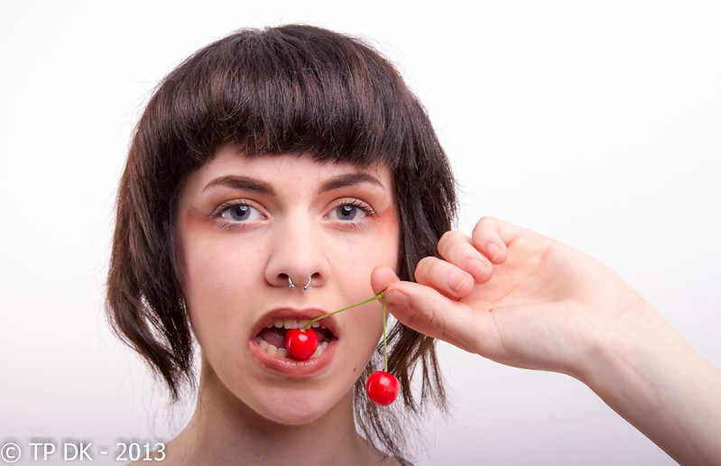
Wk 26 a 'Pair' of cherries


Wk 26 - 'Pair' by TP DK, on Flickr


Wk 26 - 'Pair' 2 by TP DK, on Flickr


Wk 25 - 'Pair' 3 by TP DK, on Flickr


Wk 25 - 'Pair' 4 by TP DK, on Flickr
 
First one for me also, excellent, nice comp and the reds are really good looks like some kind of advertising campaign, works really well cant really crit it, very good :clap:
 
first for me too - these have come out really well..... the colour in the cherries and the eyes really pops, skin looks lovely and smooth.

catchlights in the eyes in the third come over a bit big?? Do you need to move further back and use more power. (Don;t ask me - I ain;t got a clue). Missed focus on the third too maybe?? Hair on fringe looks sharper than eyes??

Overall - good set and learning is obviously good.....

And what's with everyone getting new camera's too?? 2 not enough for you? ;)
 
The first one for me too! Great composition :clap:

I see a little "banding" on her cheeks when I look at your Flickr stream... Can't work out if it's caused by your lights or PP.
 
first for me too - these have come out really well..... the colour in the cherries and the eyes really pops, skin looks lovely and smooth.
Cheers Graham :)

catchlights in the eyes in the third come over a bit big?? Do you need to move further back and use more power. (Don;t ask me - I ain;t got a clue). Missed focus on the third too maybe?? Hair on fringe looks sharper than eyes??
Yes they are too big mate, to be honest there isn't much room to move back unless the gym gear is moved too :LOL:

My octobox is also too big for the room, I should try and swap it really in classifieds for one that's smaller

Loving having a play with them though, could do it all day :)

Overall - good set and learning is obviously good.....
Thanks again and Yup :)

And what's with everyone getting new camera's too?? 2 not enough for you? ;)
Arrrrr yes :D

My daughter uses my 40d now and my son has just taken up photography as at school, my initial thoughts were to get him a camera off of the classifieds for his birthday, but seems I have been drooling over full frame and the 5d3 in particular, final straw I was the last one with the crop 7d after Marsha got hers :D I have 'Lent' my 7d to him and I can get my 'Final' camera, I was going to wait a few years but I'm not getting any younger and you can't take it with you can ya :)

The first one for me too! Great composition :clap:

I see a little "banding" on her cheeks when I look at your Flickr stream... Can't work out if it's caused by your lights or PP.
Really :cautious:

hahaaaaa I'll have a look, there should be no PP on her face :thinking:
 
'ello, #1 for me....:naughty:

I like the composition and the read really pops.

Wonder what it would it would look like without the hair?

Cheers.
 
Yup, first one for me as well. Cracking shot. What does it look like if you crop in really tight on the mouth and maybe up the saturation on the lips as well? As someone said it looks like an advertising campaign and I wonder if you could push it more down the graphic art route? The skin tones you've created with your lighting would definitely work brilliantly in mono so possibly selective colour might be an avenue worth exploring?

In any case, lovely.
 
Brian I love the first shot

soon as I saw it I thought oh ~~~~ thats so good. The comp is great but the crop really lifts it into another league.

Was this your first week with the new baby... Drolls fron a nikon guy
 
The portrait rock is really nice, I think it's the single figure that makes the difference. Nice DOF and lovely muted tones... Good job!

Pair number one for me. The crop works really well. Can't really offer crit, as I wouldn't even know where to start lighting a shot like that. I just like it!
 
'ello, #1 for me....:naughty:
I should have guessed you'd think that :nono:

I like the composition and the read really pops.

Wonder what it would it would look like without the hair?

Cheers.
Cheers Andy... I'll give that one a go in a bit :)

Yup, first one for me as well. Cracking shot. What does it look like if you crop in really tight on the mouth and maybe up the saturation on the lips as well? As someone said it looks like an advertising campaign and I wonder if you could push it more down the graphic art route? The skin tones you've created with your lighting would definitely work brilliantly in mono so possibly selective colour might be an avenue worth exploring?

In any case, lovely.
Cheers Tony... some great ideas there thanks, Maybe my re-shoot will be a re-edit (y)

What - the camera? sure you can. :)
Oh yeah... very true :LOL:


I'll have to look at home as well, it could be my work monitor. sorry if I caused panic!
You did a bit mate, I didn't spot anything did you ???

Hey Lynne :)

#1 for me as well........great focus , great reds and great lighting :clap:...enough greats in there for you...... I'm also guessing that without the hair it wold really pop
Hmmmmm another saying the same... ok great, Thanks Lynne :)

Brian I love the first shot

soon as I saw it I thought oh ~~~~ thats so good. The comp is great but the crop really lifts it into another league.

Was this your first week with the new baby... Drolls fron a nikon guy
Cheers Carl... no infact that is my 7d, with decent light its a cracking camera (y)

Next week will be my new baby shot :D
 
The portrait rock is really nice, I think it's the single figure that makes the difference. Nice DOF and lovely muted tones... Good job!
Cheers Nick :)

Pair number one for me. The crop works really well. Can't really offer crit, as I wouldn't even know where to start lighting a shot like that. I just like it!
Cool... thanks :)

#1 for me. Great colours and well lit. (y)
Cheers Allie :)
 
Hi Dean,
Another vote for #1 from me (y)
Just to echo whats been said above Dean, this could easily be an advertisement. I like how your daughter's nose piercing echoes the cherries.

Good work matey (y)
 
Back
Top