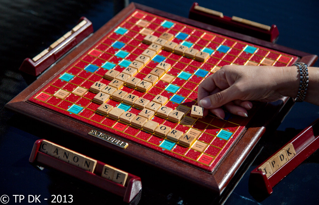
Brian_of_Bozeat
Jeff
- Messages
- 3,235
- Name
- Brian (not Jeff)
- Edit My Images
- No
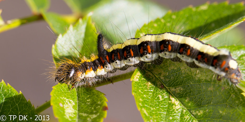
Yuk - Creepy...
Number 2 for me. Good subject for mono and I like the composition, if I didn't know what size it was from the other pics I wouldn't be able to tell. "sizeless" perhaps?
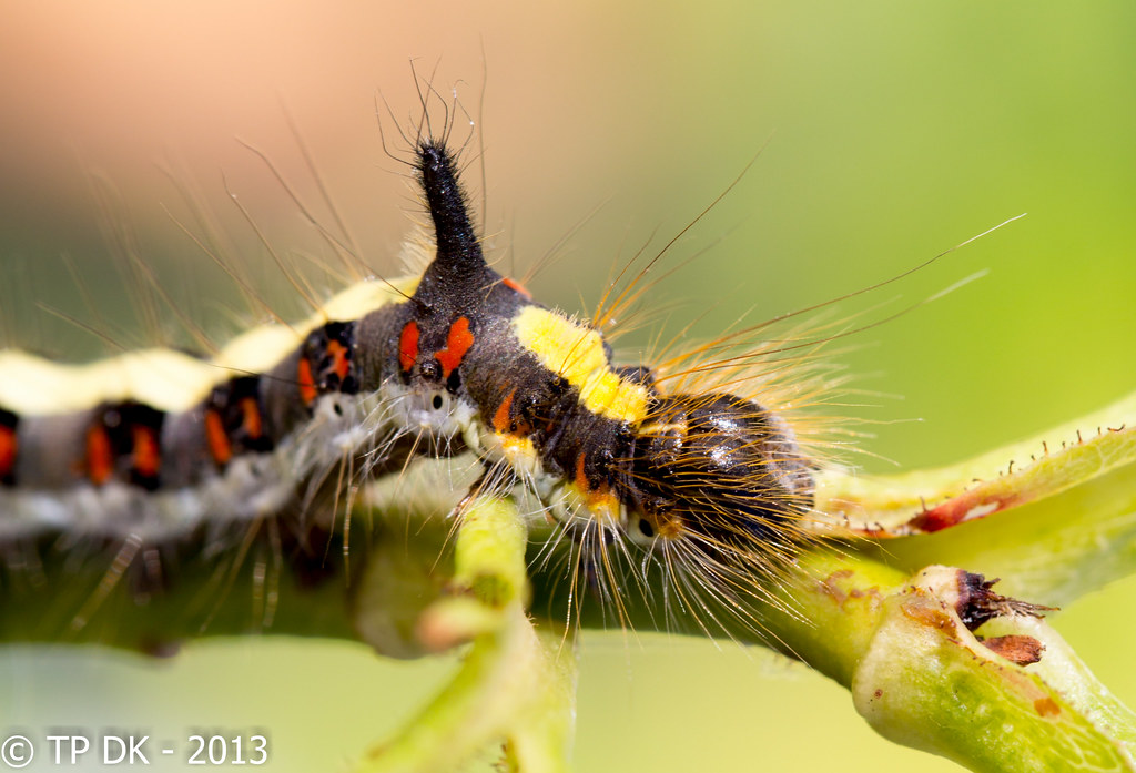
Nice one.
Number 2 for me. Good subject for mono and I like the composition, if I didn't know what size it was from the other pics I wouldn't be able to tell. "sizeless" perhaps?
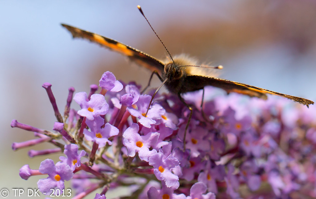
Nice one.
")

 (Marsha watch out


 Great composition too.