weekly Southdowns' 52/2012 - Week 52 - Busy SP Posted. Thank You, and Goodnight :)

Great work Mark, a very creative take on the theme.
Your edit after Dades suggestion gets my vote. (y)
I like the crop and the border doesn't bother me, my attention is drawn to your sad faced model :LOL:
iain
 
Hi Mark


what a fab shot for Vice... & a great looking model - priceless expression (y) Love it :clap:
 
Again, thanks for your comments everyone. It really is very useful and encouraging. I see everyone else improving (with a few exceptions who were perfect already!!), so hope I am too; I think so :)
 
Entrance. Had a day out at Furzey Gardens specifically for this theme. It's a fantastic place, which I highly recommend, especially if you have fairy loving children!

Here are just 3 of the 40 or so fairy entrances rumoured to be hidden in the gardens, hope you like them, and that it works as a triptych. As before, the black background is just to show off the white border; for best results view it BIG and on a black background :)


W14 - Fairy Entrances.jpg by MarkBerry1963, on Flickr
 
Lovely work Mark. The triptych really tells the story. I like the earthy colour tones in the photographs, they do look especially good against the black background. A creative take on what I think will be a week where the theme is taken quite literally by most. A small niggle is the oof area to the right on the centre image. It draws my eye a little, how would it look with a crop? Iain
 
Great offering, I like the way you have done that and I especially like the middle image with its DOF
 
Cheers guys!

Iain, I did try a crop on the middle image, but getting rid of the right hand side unbalances it IMO, unless I also crop off the left side, which loses the sun coming through the background; a feature I really like!

What it really needed was a spade to remove the vegetation right foreground, but I thought the fairies might get cross, and I had already pushed it out of the way as much as possible.
 
As I said Mark it was a small niggle, not worth crossing the fairies for :LOL:
 
ooooo I love em, especially the 1st one with the wellies, now this place must be near me? will google it :clap:
 
Summer, just click my link :)

Cheers Michael, glad you like it.

Iain, you're right. They may be small, but there's lots of them!
 
Hi Mark,

I love your image for vice, my vote goes with the edited version, it's brilliant. Well done.(y)

Entrance great idea, good call with the triptych it's a really nice way of presenting the images.

Carol
 
Thanks Darren, Carol :)

Here's an edited version in an attempt to get rid of the oof area Iain mentioned. I honestly don't know which one works best :(

Also below are other candidates for the centre image. Again I really can't decide whether any of them would be better than the one I have? I'm leaning toward sticking with my original decision, but would welcome thoughts :)


W14 - Fairy Entrances 2.jpg by MarkBerry1963, on Flickr


20120401-143234.jpg by MarkBerry1963, on Flickr


20120401-152744.jpg by MarkBerry1963, on Flickr


20120401-135942.jpg by MarkBerry1963, on Flickr


20120401-140612.jpg by MarkBerry1963, on Flickr
 
Last edited:
Cheers Simon. I definitely want a triptych as my submission for this one; just wanted to post the others to see if anyone thought any of them would work well instead of the centre one I've used.
 
Cheers Michael :)

We were there for about 4 hours, and got to every area, but didn't see anything like all of the fairy entrances. You could easily spend all day there if you took it easy and let your daughter hunt high and low, perhaps with a picnic (though they do have a tea room), or could do most of it in a couple of hours if you didn't dawdle.

The gardens are definitely worth a visit even without the fairies, but they do add interest for kids who you maybe wouldn't take to a garden otherwise. I think they've got it spot on; they've managed to cater for kids without turning it into a theme park!!

It's on the edge of the New Forest though, so there's loads to see and do if you did find you'd finished at the gardens quicker than you expected :) I recon if you're coming from Derbyshire, make a weekend of it and maybe camp in one of the New Forest sites?
 
Last edited:
nice set all on theme too 2nd triptych is better and i think you should stick with the original decision
 
Hi mark, Vice is lovely and what a good lad laid there looking at it, am afraid the spanners would have destroyed that box and all.

Entrance just love thiptych, this looks like my kind of place to visit
 
Now Mark you are just showing off - getting two themes in one triptych - magical and entrance!!:LOL::LOL:

I prefer your first Triptych, the DOF doesnt bother me at all. The 3 pics go well together as well! It looks like a dream place for little girls to visit!:)
 
Dade, Simon, Allan, Liz and Peter, thanks a lot; glad you like it :)

Sarah, thanks. I'm now favouring the second triptych, because once Iain mentioned it I couldn't stop noticing the blurred leaf on the right of the middle shot. Don't worry though, I'll get him back one day!!

It is a great place for little girls. My 8 year old just loved it, but then so did her 8 year old boyfriend (don't tell her I called him that, but that's them together in one of the shots!). That said, I don't know many places that genuinely do have something for all ages as well as Furzey do. I can't think of many people who wouldn't enjoy a day there.
 
Last edited:
Hi Mark


now that looks a really interesting place to visit , not heard of it before but now added to my list of "want to go there "

Of your Triptych's I think I prefer the 2nd version & of the images in them the centre one is spot on for me...edited version works really well ( neat bit of editing there mister ):clap:

I also like the last image you posted...Entrance to the tunnel (y)
 
Doggy Vice: Fantastic shot. I love dogs, so I can almost "feel" this photo

Entrance. I really like them all, but the first minture batch are great and well put together. Brilliant.
 
How forlorn does that dog look? Great shot though, but a touch on the dark side for me. I agree that a slight lift in the whites may help.

I really like the look of those gardens. They're only a few hours south of me. I reckon a long weekend in my caravan could see a visit there!

I like the edited triptytch, the little boots on the left shot are brilliant, they really say entrance, but shoes off first(y)
 
Cheers Paul, Marsha and Robert :)
 
So here goes "Soft" :)

With all the recent talk of honest feedback, I think I'm being quite brave posting this, as it's a new departure so unlikely to be a step forward compared with my previous efforts. So, please be honest, but also take account of the fact that this is a complete first for me!

First ever street photography, first attempt at a "serious" shot with my iPhone, and in fact first shot of the challenge that's not set up or shot with my DSLR.

I'd have liked more emphasis on the guy, and possibly should have shot it with his face in view (I'm not brave enough for that yet!), but I do like it because I think the composition works, and like the foreground stuff, so here goes.

Soft Job; soft products, and cushy number sitting outdoors reading the paper!


W15 - Soft Job.jpg by MarkBerry1963, on Flickr
 
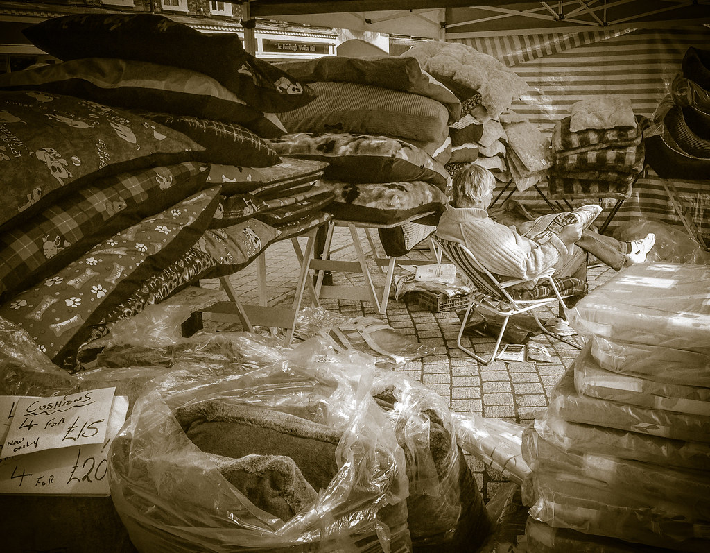
Honest feedback Mark,
First up, it is certainly on theme.
I think you have answered some questions already with your back story to the image. You said you would have liked the guy to be facing you but found it difficult, I think this would have given the image more impact.
Compositionally, it suffers because of this I think. The guy looking out towards the RH edge of frame I dont think works.
Can I ask about your choice of processing, the cushions and soft stuff within the image would appear to have lots of vibrant colours, why did you choose sepia?
These are my observations at first glance and in the spirit of more feedback being given, this was my initial reaction on seeing your image.
Well done on getting out and about today to try something you haven't attempted before it is all part of the learning curve we are on. Iain
 
Mark i can't believe thats an i phone. for me theres a crop in there somewhere to put more emphasis on the man i understand what you're saying about the foreground interest, but he does get a bit lost in there, I think if it were me i would try cropping the just to the left of that upright post on the stall to make it more portrait, when i covered it up the stack of cushions and the plastic covered ones formed a nice v that along with the lines in the cobbles leads my eye straight to him
 
Hi, like it: well processed and well lit.

I actually like that he's on the RH side, goes against the 'rule' but works for me.

I think eye contact would detract...he's in a world of his own and if he's looked up, he would have been distracted.

Only minor issue for me...I'd like to see you move left slightly so his foot wasn't clipped...minor point.

Cheers and :clap: for posting a decent photograph so fast.
 
Back
Top