

You are using an out of date browser. It may not display this or other websites correctly.
You should upgrade or use an alternative browser.
You should upgrade or use an alternative browser.
weekly Southdowns' 52/2012 - Week 52 - Busy SP Posted. Thank You, and Goodnight :)
- Thread starter Southdowns
- Start date
- Messages
- 4,827
- Name
- Alan
- Edit My Images
- Yes
hi
A bit of catch up here.
Entrance - what a very good idea. The tryptych works well on the toytown nature of the shot. To me the first is the best even with the veg at the side, because the scale of the shots suit each other. The shot of the 2 children is good too. I like the composition and the lighting
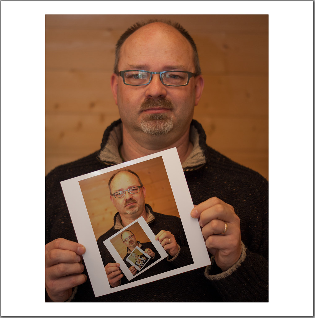
Soft - not keen on the bunny but the bloke in the soft furnishings is very good. Good spot and the square crop is excellent. Good use of the mono or sepia in order to reduce the 'busy -ness' of the shot. Really good that he is looking away and only interested in his paper.
Pride - Clever shot. I agree with the comments made about the specs and the knuckles but well lit otherwise and well executed")
A bit of catch up here.
Entrance - what a very good idea. The tryptych works well on the toytown nature of the shot. To me the first is the best even with the veg at the side, because the scale of the shots suit each other. The shot of the 2 children is good too. I like the composition and the lighting
Soft - not keen on the bunny but the bloke in the soft furnishings is very good. Good spot and the square crop is excellent. Good use of the mono or sepia in order to reduce the 'busy -ness' of the shot. Really good that he is looking away and only interested in his paper.
Pride - Clever shot. I agree with the comments made about the specs and the knuckles but well lit otherwise and well executed
OP
- Messages
- 2,820
- Name
- Mark
- Edit My Images
- Yes
Thanks all I've managed to tone down the reflections in my specs a little, though it doesn't remove the distraction entirely. I guess it could be done by someone skilled with the clone tool, but that's not me!!!
W16 - Proud of my Pride 2.jpg by MarkBerry1963, on Flickr
I've managed to tone down the reflections in my specs a little, though it doesn't remove the distraction entirely. I guess it could be done by someone skilled with the clone tool, but that's not me!!!W16 - Proud of my Pride 2.jpg by MarkBerry1963, on Flickr
- Messages
- 8,398
- Name
- Lynne
- Edit My Images
- Yes
Hi Mark
nothing to say except.......bloomin great no idea how you did it but it works a treat ,even the bits that other's have mentioned don't niggle me....fab pice of creativity mister
nothing to say except.......bloomin great
no idea how you did it but it works a treat ,even the bits that other's have mentioned don't niggle me....fab pice of creativity mister
OP
- Messages
- 2,820
- Name
- Mark
- Edit My Images
- Yes
Cheers Lynne!!!!
The method is pretty straightforward really. I'm sure there are more "correct" ways to do it, but this is what I did. I used Pixelmator, but I'm sure it'd be very simillar in Photoshop.
- Take a photo with me holding a blank piece of photo paper.
- Adjust the photo in Lightroom to correct WB etc, as I normally would.
- Open a copy in Pixelmator.
- Select all, copy, then paste to create a new layer.
- Resize and rotate the new (top) layer to fit on the paper I'm holding.
- Choose a blending mode that retains the texture and slight reflections on the paper (you can see this if you zoom in on the full res image), and makes the pasted image look a bit printed. I had to do this by trial and (lots of) error, because I know nothing at all about blending modes.
- Merge the layers, then repeat the whole process, this time positioning the new top layer on the photo within the photo (i.e the next size down).
- Repeat until you reach a size that means you can't see what's in the image within an image within an image anymore.
- Merge all layers, then add a border the same proportions as the "printed" picture.
I did have to go back afterwards and select a rectangle around each picture, then reduce the exposure by about 20%, because they looked brighter than the original and so unrealistic, but if I'd thought I'd have done that to the layers before I merged them; would have been much easier!
Easy peasy!
Last edited:
- Messages
- 8,398
- Name
- Lynne
- Edit My Images
- Yes
Cheers Lynne!!!!
The method is pretty straightforward really. I'm sure there are more "correct" ways to do it, but this is what I did. I used Pixelmator, but I'm sure it'd be very simillar in Photoshop.
- Take a photo with me holding a blank piece of photo paper.
- Adjust the photo in Lightroom to correct WB etc, as I normally would.
- Open a copy in Pixelmator.
- Select all, copy, then paste to create a new layer.
- Resize and rotate the new (top) layer to fit on the paper I'm holding.
- Choose a blending mode that retains the texture and slight reflections on the paper (you can see this if you zoom in on the full res image), and makes the pasted image look a bit printed. I had to do this by trial and (lots of) error, because I know nothing at all about blending modes.
- Merge the layers, then repeat the whole process, this time positioning the new top layer on the photo within the photo (i.e the next size down).
- Repeat until you reach a size that means you can't see what's in the image within an image within an image anymore.
- Merge all layers, then add a border the same proportions as the "printed" picture.
I did have to go back afterwards and select a rectangle around each picture, then reduce the exposure by about 20%, because they looked brighter than the original and so unrealistic, but if I'd thought I'd have done that to the layers before I merged them; would have been much easier!
Easy peasy!
....OMG.....way above my skill level but you make it sound so easy....off to google pixelmator...
OP
- Messages
- 2,820
- Name
- Mark
- Edit My Images
- Yes
Sadly, for the underprivileged few who run Windows, Pixelmator is a Mac only application. Sadder still for those people, it costs only $29, and while it doesn't have everything that Photoshop does, it has an awfull lot of it, including all of the basics.
Basically, if I want to do most "mainstream" things with an image, all I have to do is find a Photoshop tutorial, and then I'll be able to do it in Pixelmator
Basically, if I want to do most "mainstream" things with an image, all I have to do is find a Photoshop tutorial, and then I'll be able to do it in Pixelmator
OP
- Messages
- 2,820
- Name
- Mark
- Edit My Images
- Yes
Thanks Mandy and Liz
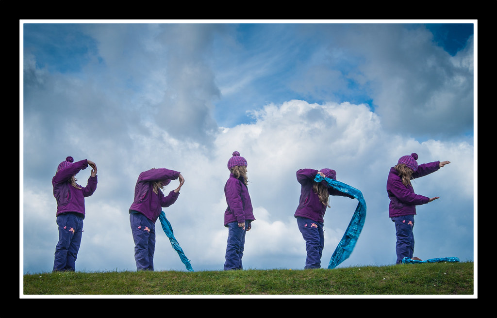
Here's the other one I had in mind; I think it's turned out quite well. There are benefits to having quintuplets!
W16 - Pride 3.jpg by MarkBerry1963, on Flickr
Here's the other one I had in mind; I think it's turned out quite well. There are benefits to having quintuplets!
W16 - Pride 3.jpg by MarkBerry1963, on Flickr
Hi Mark,
Loving the creativity that's coming through in your photography.
Soft, I like the atmosphere you've caught with the guy on the market stall... life is sweet....he's on a break and enjoying very second of it The final b&w edit is my favourite
The soft target is brilliant, a great idea well excuted and composed....can say no more I love it
Pride, great take on a self portrait, I like the idea very much.... there are a couple of minor points that have already been mentioned but as the eye is drawn to the photograph in your hand those little niggles don't matter that much at all. Well done.
Pride II, love this one, you didn't half make your model work! Did you try a shot with "i" looking at the camera? I think it would be great to see the model (your daughter?) looking at the camera with a cheeky grin! But maybe that wouldn't work? Other than that I can't fault this one. Love the colours and that beautiful sky.
Carol
Loving the creativity that's coming through in your photography.
Soft, I like the atmosphere you've caught with the guy on the market stall... life is sweet....he's on a break and enjoying very second of it
The final b&w edit is my favouriteThe soft target is brilliant, a great idea well excuted and composed....can say no more I love it
Pride, great take on a self portrait, I like the idea very much.... there are a couple of minor points that have already been mentioned but as the eye is drawn to the photograph in your hand those little niggles don't matter that much at all. Well done.
Pride II, love this one, you didn't half make your model work! Did you try a shot with "i" looking at the camera? I think it would be great to see the model (your daughter?) looking at the camera with a cheeky grin! But maybe that wouldn't work? Other than that I can't fault this one. Love the colours and that beautiful sky
.Carol
- Messages
- 1,513
- Name
- Alex
- Edit My Images
- Yes
Soft - I still prefer the first idea you had but I do like the bunny, and credit to you for the time put in.
Pride - I saw your #2 on Flickr and decided then that I love it. Simple idea but really great. The colours, the sky and the letter formation is all great.
Pride - I saw your #2 on Flickr and decided then that I love it. Simple idea but really great. The colours, the sky and the letter formation is all great.
The goblin
<span class="poty">POTY Winner 2015</span></br>
- Messages
- 4,407
- Name
- Marsha
- Edit My Images
- Yes
Hi Mark, I love your second pride shot its very clever Lovely colours. I'll just say it needs a teeny straighten as it goes up hill slightly.
Is this five shots merged? If not can I ask how did you do it?
Lovely colours. I'll just say it needs a teeny straighten as it goes up hill slightly. Is this five shots merged? If not can I ask how did you do it?
OP
- Messages
- 2,820
- Name
- Mark
- Edit My Images
- Yes
Thanks Carol, Alex and Marsha
It is my daughter Isabelle, yes, and she did very very well!
Carol, I did think about whether I should have tried having her looking at the camera for the "I", but not until after the shoot! Looking at it now, I think it might distract from the word, but it could have looked good.
We didn't get a lot of time. I've learned that the most important thing with these composite pictures is to get the lighting exactly the same in each shot, and with the sun going in and out of the clouds, that proved to be very very hard: basically we got one take.
Marsha, yes, it's a composite of 5 shots. I adjusted the WB etc of one in LR, then copied the settings to the other 4, so that they all had exactly the same tones etc, then I opened all 5 in Pixelmator. I then selected each image in turn, copied and pasted it as a layer, then erased all of the new layer except for Izzy using a nicely feathered brush. I could have just selected her and copied/pasted the selection, but copying the whole image automatically aligned it for me when I pasted it.
I wondered about a straighten, but the ground actually does slope up to the right, and I didn't want Izzy to look like she was leaning. I might try it later though.
Last edited:
The goblin
<span class="poty">POTY Winner 2015</span></br>
- Messages
- 4,407
- Name
- Marsha
- Edit My Images
- Yes
Southdowns said:I wondered about a straighten, but the ground actually does slope up to the right, and I didn't want Izzy to look like she was leaning. I might try it later though.
Straightening isn't needed if it was actually a hill!
blakester
Shine On Harvest Moon
- Messages
- 6,679
- Name
- Iain
- Edit My Images
- No
Great work on #1 Pride Mark, the little tutorial to how it was done is good too, thanks for that, my pp skills are a little lacking so thats a big help if I try this
#2 for Pride gets my vote between the two. You've a great little model there, double pride as your daughter formed the word pride.
There is nothing i would change about this, its perfect IMHO. Love the colour tones in there, you've balanced the lighting well too. Iain
#2 for Pride gets my vote between the two. You've a great little model there, double pride as your daughter formed the word pride.
There is nothing i would change about this, its perfect IMHO. Love the colour tones in there, you've balanced the lighting well too. Iain
- Messages
- 6,502
- Name
- Peter
- Edit My Images
- Yes
Pride #1 - Very very clever. I've seen these done before and I think you've done really well and cracked it.
OP
- Messages
- 2,820
- Name
- Mark
- Edit My Images
- Yes
Thanks Marsha, Iain, Andy and Peter. I'm really pleased that you like it, because it's one of the few I've done that's turned out exactly as I saw it in my head
Mattd85 has asked for a little tutorial; it's relatively basic, and I know there are several ways to achieve the same thing, but this is what I did:
1) Practice the poses, and mark the position of each on the floor (dandelion heads are handy for this!), so that there's no overlap and so that you can work quickly to avoid changing light and not have the clouds move too far!
2) Shoot the 5 shots using a tripod to keep the camera in exactly the same place for all 5. I set the exposure and focussed manually, because it's very very important that nothing changes between shots.
3) Buy your daughter some sweets for doing so well and so she'll help next time!
4) Once the five shots are on your computer, if you make any adjustments to the first one, make the exact same adjustment to all 5. DON'T crop or straighten at this stage because it'll make alignment harder.
5) Open all 5 images in your editing app of choice, in my case Pixelmator.
6) In my case, decide that "P" will be the base image. Switch to the "R" image, and select all (Cmd A on a Mac, Ctrl A if you're silly enough to be using Windows), then copy.
7) Switch back to the "P" image, and paste. Because the two images are the same size (you didn't crop, right?), the "R" will be on top as a new layer, and will be perfectly aligned with the "P" image below.
8) Choose the eraser tool, and a brush with a nice feathered edge. Use this to brush away most of the top ("R") layer to reveal the one below, leaving only your model in her pose. It can be difficult to see where you've been with the brush, so once you're happy that everything's aligned properly, turn the bottom layer off so you can see where the top layer has become transparent.
9) You should now have an image with P and R on it (as long as you've turned the bottom layer back on). If you're completely happy with it so far, merge the two layers to keep the clutter to a minimum in the layers palette.
10) Repeat for the remaining letters.
11) Once you have the finished composite, nows the time to crop and/or straighten, and add any other adjustments you want such as vignettes and borders.
12) Save it or you'll be very very cross!
There is a very good tutorial here showing another way to do it using the clone tool, with some much better examples than mine
Last edited:
OP
- Messages
- 2,820
- Name
- Mark
- Edit My Images
- Yes
Cheers Gramps.
So, first my fail for this week. Posting it in the hope that someone can tell me what's gone wrong, because I know it's crap but can't work out why. Grrrrrrrr :shake: :shrug: :shake:
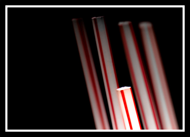
W17 - Short Straw fail.jpg by MarkBerry1963, on Flickr
Here's the set up; was trying to get the straws to glow:
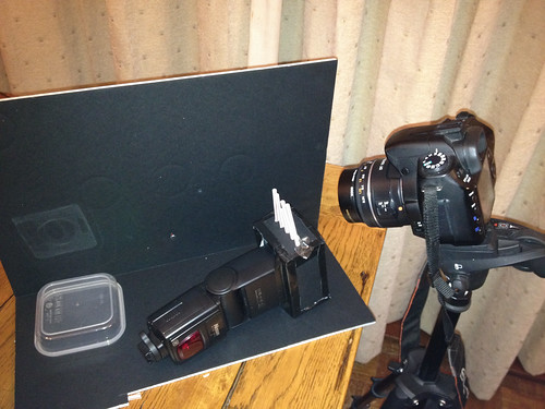
W17 - Fail Setup.jpg by MarkBerry1963, on Flickr
So I gave up on that as a poor show, and did this instead; Thick as………
Much simpler, but I like it a lot.
By the way, I seem to be using these white borders on black backgrounds a lot; is that me being unimaginative, or me developing a style?!!!!! I do think they work quite well.
C&C away please
W17 - Thick as Two…….jpg by MarkBerry1963, on Flickr
So, first my fail for this week. Posting it in the hope that someone can tell me what's gone wrong, because I know it's crap but can't work out why. Grrrrrrrr :shake: :shrug: :shake:
W17 - Short Straw fail.jpg by MarkBerry1963, on Flickr
Here's the set up; was trying to get the straws to glow:
W17 - Fail Setup.jpg by MarkBerry1963, on Flickr
So I gave up on that as a poor show, and did this instead; Thick as………
Much simpler, but I like it a lot.
By the way, I seem to be using these white borders on black backgrounds a lot; is that me being unimaginative, or me developing a style?!!!!! I do think they work quite well.
C&C away please
W17 - Thick as Two…….jpg by MarkBerry1963, on Flickr
Last edited:
- Messages
- 8,398
- Name
- Lynne
- Edit My Images
- Yes
Hi Mark
Pride....fab image & really well shot & processed...def one to be Proud of
Cheers for the write up as well....I tied myself in knots trying to merge just 2 images :bang:
Short....maybe I should've done the planks....thats me to a tee
As for your "fail" ...not quite sure...looks to me like just needed a bit more light....if I'm wrong I refer you to the planks
*Sarah*
Peel Me!
- Messages
- 1,873
- Name
- Sarah
- Edit My Images
- Yes
Another good week for you!!
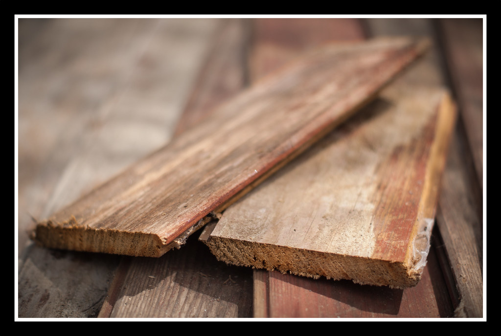
I love your use of DOF on the plank one, lighting spot on and really dood detail in the wood.
Straw - not sure how else to light the straws to give the glow effect that you're after. I don't know if using a lightbox would help. I like the idea, why don't you put the pic onto the creative thread there are plenty of lighting experts on there who might be able to help as well!
The goblin
<span class="poty">POTY Winner 2015</span></br>
- Messages
- 4,407
- Name
- Marsha
- Edit My Images
- Yes
Hi Mark. I'm rubbish with flash/ fake lighting so can't help here!
However I think your planks idea is excellent! I'm so thick it took me a minute or two to get it:nuts: It made me laugh though, nice DOF and colour of the wood.
As for the frames, I think it's whatever you like that counts! I like them, but they don't always work so it's knowing when they do and don't work, something I can never figure out!!!
- Messages
- 2,908
- Name
- Summer
- Edit My Images
- Yes
I think with the straws it might look a tad better if they weren't in line, maybe more random - which is how they would look if someone was holding them (cos people hold them when you draw the short straw lol) but I don't know what you mean about making them glow sorry
as i said on flickr i love your pride shot, the angle and colours and your model's clothing, all perfect, i really love it
so the planks, yep can see that works too :0)
as i said on flickr i love your pride shot, the angle and colours and your model's clothing, all perfect, i really love it
so the planks, yep can see that works too :0)
- Messages
- 889
- Name
- John
- Edit My Images
- Yes
Hi Mark
You're really doing well with some good interpretations of the theme.
Pride with your daughter as model is lovely, only thing I can crit is the missing feet but no big deal.
Short
Regards the lighting of the straws, just a few thoughts. Triggering the flash off camera, is it delivering full power as ettl may be lowering output and duration if using this. I would use manual. Also shutter speed may need to be slower. Use of the wide flash adapter may help as would a mirror in the box. Be a shame to give this idea up.
- Messages
- 6,408
- Edit My Images
- No
'Pride' - I like your 2nd version. Looks like a lot of work in PP but it has paid off. good skills I wouldn't know where to start Mark.
'Short' - Again a lot of thought has gone into your straws image. Thank you for sharing your set-up shot, very ingenious. I really like this and think it works well.
Nice work,
Nick
'Short' - Again a lot of thought has gone into your straws image. Thank you for sharing your set-up shot, very ingenious. I really like this and think it works well.
Nice work,
Nick
OP
- Messages
- 2,820
- Name
- Mark
- Edit My Images
- Yes
Thanks everyone for your positive comments, especially on Pride 2 as that's one of my favourites so far
I'm really really sorry I've not commented on many shorts and some prides yet. A combination of a busy week (new niece amongst other things, with loads of photo's to PP, print, frame, upload etc etc etc!!!), and a late submission of my own short shot (don't like to look at others until I've done mine), means I've failed dismally. Unforgivable, but I promise to make a start on redeeming myself tonight
Re the straws, I think the issue is all of the above! I don't think there's one specific failing with it, instead there are several things that are just a little out, which put together make it a fail; it's a little out of focus, a little poorly composed, and a little not lit as I wanted Oh well, I've learned from it, which IS after all the whole point
Yes, you're right. I think I'm OK at seeing when it does work and when it doesn't; just need to learn how to make some other frames! Similar again below, but adjusted; again I think it works really well.
I'm really really sorry I've not commented on many shorts and some prides yet. A combination of a busy week (new niece amongst other things, with loads of photo's to PP, print, frame, upload etc etc etc!!!), and a late submission of my own short shot (don't like to look at others until I've done mine), means I've failed dismally. Unforgivable, but I promise to make a start on redeeming myself tonight
As for your "fail" ...not quite sure...looks to me like just needed a bit more light....if I'm wrong I refer you to the planks
Another good week for you!!
Straw - not sure how else to light the straws to give the glow effect that you're after. I don't know if using a lightbox would help. I like the idea, why don't you put the pic onto the creative thread there are plenty of lighting experts on there who might be able to help as well!
Hi Mark. I'm rubbish with flash/ fake lighting so can't help here!
I think with the straws it might look a tad better if they weren't in line, maybe more random - which is how they would look if someone was holding them (cos people hold them when you draw the short straw lol) but I don't know what you mean about making them glow sorry
Regards the lighting of the straws, just a few thoughts. Triggering the flash off camera, is it delivering full power as ettl may be lowering output and duration if using this. I would use manual. Also shutter speed may need to be slower. Use of the wide flash adapter may help as would a mirror in the box. Be a shame to give this idea up.
Hi Mark, I like the idea of the straws, not sure why the lighting isn't very even, looks interesting and I might give this ago myself.
'Short' - Again a lot of thought has gone into your straws image. Thank you for sharing your set-up shot, very ingenious. I really like this and think it works well.
Re the straws, I think the issue is all of the above! I don't think there's one specific failing with it, instead there are several things that are just a little out, which put together make it a fail; it's a little out of focus, a little poorly composed, and a little not lit as I wanted
Oh well, I've learned from it, which IS after all the whole point As for the frames, I think it's whatever you like that counts! I like them, but they don't always work so it's knowing when they do and don't work, something I can never figure out!!!
Yes, you're right. I think I'm OK at seeing when it does work and when it doesn't; just need to learn how to make some other frames! Similar again below, but adjusted; again I think it works really well.
OP
- Messages
- 2,820
- Name
- Mark
- Edit My Images
- Yes
Flight
I wanted to do a flight of stairs, and spent a fun hour in the rain in Portsmouth's Guildhall square shooting the impressive steps up to the Guildhall itself, and some other less impressive flights. I also wanted to do shots with a small aperture, because I feel that a lot of mine have featured shallow DoF so far.
This shot was originally going to be part of a triptych, which I have completed, but it stood out head and shoulders above the other two in the set, so here it is standalone. This is my submission, and I'm very pleased with it as again it's a pretty close match, after PP, to what I had in my head
Looks WAY better displayed as big as possible; go on, you know you want to!!!!!
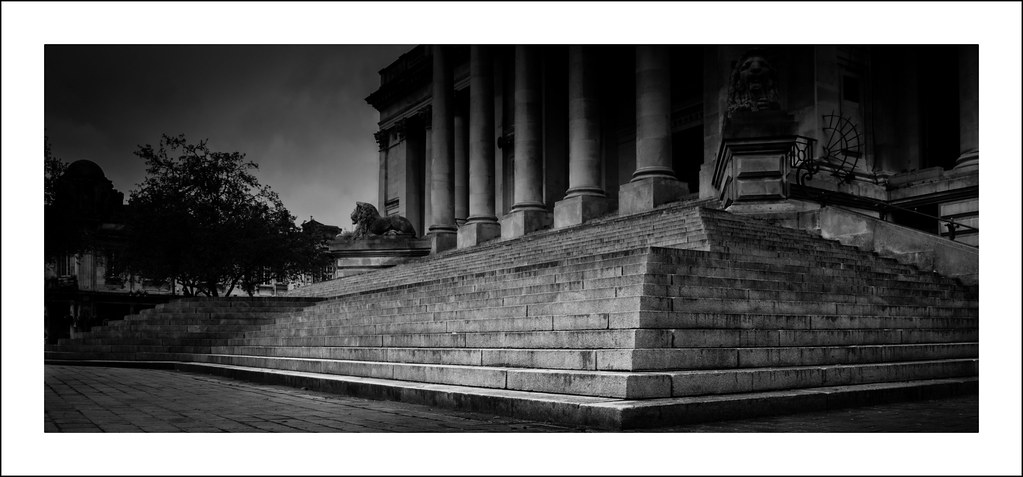
W18 - Flight of Steps.jpg by MarkBerry1963, on Flickr
Just for fun though, here's a reserve shot. I think it's probably a Marmite photo, but it makes a nice comparison to the main one so here goes nothing!!!
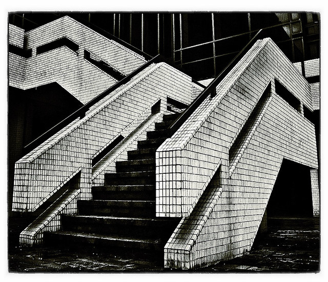
W18 Reserve - Flight of Steps 2.jpg by MarkBerry1963, on Flickr
I wanted to do a flight of stairs, and spent a fun hour in the rain in Portsmouth's Guildhall square shooting the impressive steps up to the Guildhall itself, and some other less impressive flights. I also wanted to do shots with a small aperture, because I feel that a lot of mine have featured shallow DoF so far.
This shot was originally going to be part of a triptych, which I have completed, but it stood out head and shoulders above the other two in the set, so here it is standalone. This is my submission, and I'm very pleased with it as again it's a pretty close match, after PP, to what I had in my head
Looks WAY better displayed as big as possible; go on, you know you want to!!!!!
W18 - Flight of Steps.jpg by MarkBerry1963, on Flickr
Just for fun though, here's a reserve shot. I think it's probably a Marmite photo, but it makes a nice comparison to the main one so here goes nothing!!!
W18 Reserve - Flight of Steps 2.jpg by MarkBerry1963, on Flickr
Last edited:
- Messages
- 13,760
- Edit My Images
- Yes
Hi Mark
God... looks like i'm miles behind
Pride II - That's a great image, really well set up, great PP, good sky too - no negative's from me at all on it !!!
Short - Fail looks like just poor lighting to me too... 2 planks, like that, Nice DOF add to a simple image that makes it very effective
Flight - Of the 2 I certainly prefer the 1st one, the PP certainly makes the steps the main focus, a great idea well executed !!!
- Messages
- 6,502
- Name
- Peter
- Edit My Images
- Yes
Of the two I prefer #1. Nice shot and made even better if it's turned out the way you planned it. Well done.
- Messages
- 6,502
- Name
- Peter
- Edit My Images
- Yes
Whoops I just realised I hadn't commented on Short.
I definitely like your planks shot. The natural lighting and shallow DoF really compliments the textures in the wood.
I definitely like your planks shot. The natural lighting and shallow DoF really compliments the textures in the wood.
- Messages
- 255
- Name
- neil
- Edit My Images
- No
Hi Mark, 2 good shots, #2 gets my vote, as Mike said.....not sure why just is....defo marmite
OP
- Messages
- 2,820
- Name
- Mark
- Edit My Images
- Yes
Thanks everyone! I still like number one best, in fact so much that I've ordered a 2' print! I actually rarely like photos on the wall, as I tend to get bored with them in time no matter how good they are, but this ones different Sorry, not trying to blow my own trumpet, just illustrating how pleased I am with it .
Number two I like (or I wouldn't have posted it!), and again it's what I wanted when I saw the steps, but the PP was a bit too "easy" for me to love it. It was started with a preset on my iPad, which I then tweaked a little and added a stock border to. Because of that it feels a bit like a cheat, though I'm really happy that others like it so much. For me, "if you like it that's all that counts" isn't good enough
Summer you're right that a lot of number one is lost in shadow, but that's what I was after, partly to highlight the steps, and partly because what I wanted was "dark and foreboding". I must admit though that I can't see where it's soft, unless you mean the overall feel apart from the foreground steps? I'd be disappointed if it was oof anywhere, because one goal was to use a deep DoF in contrast to a lot of my other shots.
I guess it could be slightly low res, as it's both cropped and from a camera with "only" 10 MP, though I'm not seeing any ill effects from that on my quite large screen, and when I ordered the print the software reported that it'd be good quality I'll let you know how it turns out!
Sorry, not trying to blow my own trumpet, just illustrating how pleased I am with it .Number two I like (or I wouldn't have posted it!), and again it's what I wanted when I saw the steps, but the PP was a bit too "easy" for me to love it. It was started with a preset on my iPad, which I then tweaked a little and added a stock border to. Because of that it feels a bit like a cheat, though I'm really happy that others like it so much
. For me, "if you like it that's all that counts" isn't good enough Summer you're right that a lot of number one is lost in shadow, but that's what I was after, partly to highlight the steps, and partly because what I wanted was "dark and foreboding". I must admit though that I can't see where it's soft, unless you mean the overall feel apart from the foreground steps? I'd be disappointed if it was oof anywhere, because one goal was to use a deep DoF in contrast to a lot of my other shots.
I guess it could be slightly low res, as it's both cropped and from a camera with "only" 10 MP, though I'm not seeing any ill effects from that on my quite large screen, and when I ordered the print the software reported that it'd be good quality
I'll let you know how it turns out!
Last edited:
- Messages
- 19,461
- Name
- Andy
- Edit My Images
- Yes
Hi, mark, not an easy choice...
#1, like the low angle and B&W. Nice lines and I really like the lettrerbox composition. Just the upper right inch is a bit dark.
#2, saw this on Flickr whilst at work... and liked the contrast. I like the patterns on the stairs. I quite like the angle, but any looking up the stairway?
Cheers.
#1, like the low angle and B&W. Nice lines and I really like the lettrerbox composition. Just the upper right inch is a bit dark.
#2, saw this on Flickr whilst at work...
and liked the contrast. I like the patterns on the stairs. I quite like the angle, but any looking up the stairway?Cheers.