

You are using an out of date browser. It may not display this or other websites correctly.
You should upgrade or use an alternative browser.
You should upgrade or use an alternative browser.
weekly Southdowns' 52/2012 - Week 52 - Busy SP Posted. Thank You, and Goodnight :)
- Thread starter Southdowns
- Start date
OP
- Messages
- 2,820
- Name
- Mark
- Edit My Images
- Yes
WOW...seriously loving that shot Mark
Not gonna offer any crit cos I couldn't have done 1/2 as good job in taking that shot...exposure & focus look spot on & great imagination
I bet you could have done just as well if not better; I've seen your stuff remember
") .
.Thanks for the nice comment
I agree with Lynne
It's usually best to I've been told
Thanks.
Cracking shot Mark, can't see how you could improve it tbh. Top marks and well done.
Cheers Michael, glad you like it
Temperature - A take brilliant week on this weeks theme and an outstanding effort. I like it a lot, great balance of extreme temperatures. The directional and angled lighting is really good. You had to work very quickly with that shot or the ice would of melted in these temperatures. Spot on focusing too !
Best interpretation of this weeks theme so fa and one to be proud of
Nick
Thank you! The ice wasn't so much of a problem because I shot it early this morning before it got hot, but the flames did mean I had to work very fast. The plant itself refused to burn, so I dowsed it in lighter fuel. However, that burned so fast that I only had a window of a few seconds to get the shot before it went out.
I set it all up before and did some test shots to get the exposure, light pattern and focus I wanted, then set the self timer to 10 seconds, and lit the flames at about 7! I had to fire my pop up flash because that's the only way I have to trigger my off camera flash, but it was throwing some nasty shadows, so I had to hold a DVD cover in front of it while juggling the flames, so that the slave flash still saw it, but it didn't light the subject! God knows how the house is still standing!
Nice lighting on your random shot & a great shot for temperature. really well done.
Thanks mate
- Messages
- 13,760
- Edit My Images
- Yes
Hi Mark
Temperature - Now that is a cracking image,what a great idea, nicely staged and well executed
Temperature - Now that is a cracking image,what a great idea, nicely staged and well executed
D
Deleted member 3428
Guest
Excellent thinking and studio type shot Mark.
- Messages
- 6,502
- Name
- Peter
- Edit My Images
- Yes
Random – Brilliant. The colours, slight motion blur and composition is spot on. Well done.
Temperature – An inspirational shot. Really well thought out and executed.
Temperature – An inspirational shot. Really well thought out and executed.
- Messages
- 19,461
- Name
- Andy
- Edit My Images
- Yes
Mark, Temperature...I have to say one of the all time TP52 2012 favourites for me...and I'm very picky you know
It would not have worked with a shorter plant. Great detail and colour in the flames. I wasn't sure about the closeness top and bottom but after looking at it for a while it works a treat.
Good show
It would not have worked with a shorter plant. Great detail and colour in the flames. I wasn't sure about the closeness top and bottom but after looking at it for a while it works a treat.
Good show
- Messages
- 255
- Name
- neil
- Edit My Images
- No
Excellent shot Mark, have to agree with Andy, one of the best I've seen thus far
- Messages
- 1,513
- Name
- Alex
- Edit My Images
- Yes
Some really excellent shots over the last few weeks. You are really nailling them.
Particularly like Leave, nice ideas for both random and temperature. Great interpretations and delivery.
Well done!
Particularly like Leave, nice ideas for both random and temperature. Great interpretations and delivery.
Well done!
OP
- Messages
- 2,820
- Name
- Mark
- Edit My Images
- Yes
Wow, thanks everyone!
Andy, Neil, I can't agree that it's one of the best so far, as there have been some real crackers, shots I can only dream of getting, but it's very kind of you to say that.
Summer, the plant started it
Andy, Neil, I can't agree that it's one of the best so far, as there have been some real crackers, shots I can only dream of getting, but it's very kind of you to say that.
Summer, the plant started it
The goblin
<span class="poty">POTY Winner 2015</span></br>
- Messages
- 4,407
- Name
- Marsha
- Edit My Images
- Yes
Hi Mark, I'm a little behind!
Leave, nice exposed and fits the theme.
Random, it made me laugh! I like the rose and the warm tint.
Temperature is just superb, VERY clever idea.
Leave, nice exposed and fits the theme.
Random,
it made me laugh! I like the rose and the warm tint. Temperature is just superb, VERY clever idea.
OP
- Messages
- 2,820
- Name
- Mark
- Edit My Images
- Yes
That's OK Marsha, there's nothing wrong with little behinds
(What? Oh, OK, I see what she meant now)
Thanks for the lovely comments
(What? Oh, OK, I see what she meant now)
Thanks for the lovely comments
OP
- Messages
- 2,820
- Name
- Mark
- Edit My Images
- Yes
So here we have abstract.
Abstract on two counts I recon: It's an abstract image despite the recognisable shape, but also abstract in that I regard religious belief as abstract; "thought of apart from concrete realities, specific objects, or actual instances". It's something I feel quite passionate about, but I hope you can enjoy the image even if you don't share my atheistic view, just for what it is.
Essentially as shot, except for a rotation and then paste of a small part of a second image on top to create the cross.
BTS shot below the main one.

W23 - Abstract Concept or The Gate to Hell.jpg by MarkBerry1963, on Flickr
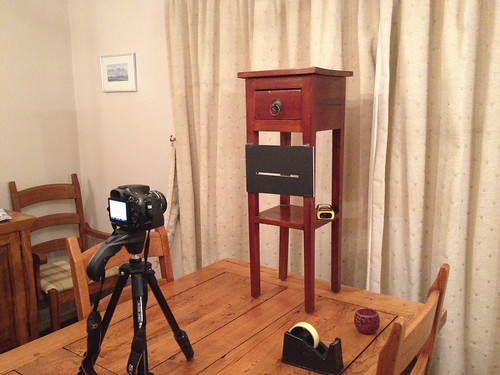
W23 BTS.jpg by MarkBerry1963, on Flickr
Abstract on two counts I recon: It's an abstract image despite the recognisable shape, but also abstract in that I regard religious belief as abstract; "thought of apart from concrete realities, specific objects, or actual instances". It's something I feel quite passionate about, but I hope you can enjoy the image even if you don't share my atheistic view, just for what it is.
Essentially as shot, except for a rotation and then paste of a small part of a second image on top to create the cross.
BTS shot below the main one.
W23 - Abstract Concept or The Gate to Hell.jpg by MarkBerry1963, on Flickr
W23 BTS.jpg by MarkBerry1963, on Flickr
Last edited:
D
Deleted member 3428
Guest
Looks like an evil eye looking through the crucifix on the left. Lots of PP has gone into this one and it works I think.
OP
- Messages
- 2,820
- Name
- Mark
- Edit My Images
- Yes
Cheers Alby. Actually there was very little PP beyond pasting the cross bar in. A little vividness boost, sharpening, and cloning out a couple of small stray bits of light, and that was about it.
- Messages
- 6,408
- Edit My Images
- No
Abstract - Nice image mark, I think the cross looks a bit like molten metal, not a bad thing, the vibrant red background works well, not sure if it it is meant to symbolise' the blood' but I think it works, I could see this image being used in christian shops on cards etc. I don't think of it as an abstract though IMO.
OP
- Messages
- 2,820
- Name
- Mark
- Edit My Images
- Yes
Thanks Michael, glad you like it
Nick, thanks. I know what you mean about abstract, but no-one said the theme had to be met with abstract images; it can be a non-abstract image of something abstract (in this case; religion). That said, I do think the red background is pretty abstract, in that it's not a picture of anything in particular.
Now, having the image used on cards in a Christian bookshop? Hmm? Not sure how to react to that (though I'm flattered you think it's good enough)! I could be delighted because of the irony of an atheist's image being used by Christians, or feel that I've got one over on them, or dismayed at the misinterpretation, or simply not care so long as I was making money from it!
- Messages
- 6,502
- Name
- Peter
- Edit My Images
- Yes
I'm assuming the template is cardboard as you can see some frays which have really helped pick up the highlights and makes the image's "burning" effect even more prevalent. Great stuff and some good thinking to create a unique image
OP
- Messages
- 2,820
- Name
- Mark
- Edit My Images
- Yes
Thanks everyone, glad you like it
Peter, the template was foam board, and although the paper outer skins cut cleanly, my knife was too blunt to do the same with the foam. I agree that it does add to the effect I wish I could say I'd done it deliberately, but the truth is it just happened that way!
Peter, the template was foam board, and although the paper outer skins cut cleanly, my knife was too blunt to do the same with the foam. I agree that it does add to the effect
I wish I could say I'd done it deliberately, but the truth is it just happened that way!- Messages
- 6,502
- Name
- Peter
- Edit My Images
- Yes
Nothing wrong with that. It has definitely worked in this case,Thanks everyone, glad you like it
Peter, the template was foam board, and although the paper outer skins cut cleanly, my knife was too blunt to do the same with the foam. I agree that it does add to the effect
- Messages
- 889
- Name
- John
- Edit My Images
- Yes
Hi Mark, catching up as usual
So sorry to hear about Rosie. Always a difficult time, just a pet but so much a part of family life.
Random - Like the idea and great lighting. Not sure if the flowers add or detract.
Temperature - Can't make any comment except brilliant.
Abstract - fits the theme for me.
So sorry to hear about Rosie. Always a difficult time, just a pet but so much a part of family life.
Random - Like the idea and great lighting. Not sure if the flowers add or detract.
Temperature - Can't make any comment except brilliant.
Abstract - fits the theme for me.
The goblin
<span class="poty">POTY Winner 2015</span></br>
- Messages
- 4,407
- Name
- Marsha
- Edit My Images
- Yes
Abstract looks very devilish to me! Not quite sure it fits the them but as a shot I think it's very clever
OP
- Messages
- 2,820
- Name
- Mark
- Edit My Images
- Yes
Thanks Alan, John, Marsha.
It's one of those ones that fits the theme, and then some, for me, but not necessarily for others unless they share my interpretation. For me it's abstract because what it represents (religion) is abstract, i.e. not real, AND because it is an abstract shot in the sense that nothing in it is real or even designed to look real, except the cross itself; there's no real flames, blood, smoke or eyes (?) anywhere to be seen. Those were all made up in your mind, not mine! It's representational. Plus, I think it has some abstract patterns in it anyway
It's one of those ones that fits the theme, and then some, for me, but not necessarily for others unless they share my interpretation. For me it's abstract because what it represents (religion) is abstract, i.e. not real, AND because it is an abstract shot in the sense that nothing in it is real or even designed to look real, except the cross itself; there's no real flames, blood, smoke or eyes (?) anywhere to be seen. Those were all made up in your mind, not mine
! It's representational. Plus, I think it has some abstract patterns in it anyway The goblin
<span class="poty">POTY Winner 2015</span></br>
- Messages
- 4,407
- Name
- Marsha
- Edit My Images
- Yes
Southdowns said:It's one of those ones that fits the theme, and then some, for me, but not necessarily for others unless they share my interpretation. For me it's abstract because what it represents (religion) is abstract, i.e. not real, AND because it is an abstract shot in the sense that nothing in it is real or even designed to look real, except the cross itself; there's no real flames, blood, smoke or eyes (?) anywhere to be seen. Those were all made up in your mind, not mine
Shoe horned it in to the theme, but I get it now!
OP
- Messages
- 2,820
- Name
- Mark
- Edit My Images
- Yes
Last edited:
- Messages
- 1,513
- Name
- Alex
- Edit My Images
- Yes
Interesting take on abstract, good though and good to see another shot thats completely different.
I love the colour, the redness of it all works well.
I love the colour, the redness of it all works well.
- Messages
- 8,398
- Name
- Lynne
- Edit My Images
- Yes
"It's one of those ones that fits the theme, and then some, for me, but not necessarily for others unless they share my interpretation. For me it's abstract because what it represents (religion) is abstract, i.e. not real, AND because it is an abstract shot in the sense that nothing in it is real or even designed to look real, except the cross itself; there's no real flames, blood, smoke or eyes (?) anywhere to be seen. Those were all made up in your mind, not mine ! It's representational "...............& breathe...omg....I think I need beer
Cracking image there Mark & good to see the set up , a truly unique image & very devilish
beer had , yup , I agree with your reasoning
Cracking image there Mark & good to see the set up , a truly unique image & very devilish
beer had , yup , I agree with your reasoning
OP
- Messages
- 2,820
- Name
- Mark
- Edit My Images
- Yes
Thanks Alex, Lynne! Lynne, I'll have to buy you a pint in Cumbria to make up for it!
OP
- Messages
- 2,820
- Name
- Mark
- Edit My Images
- Yes
Symmetry. Not sure about this attempt, so it's not my final submission, but I'd like to know what others think of it. It took a LOT of cleaning up in PP.
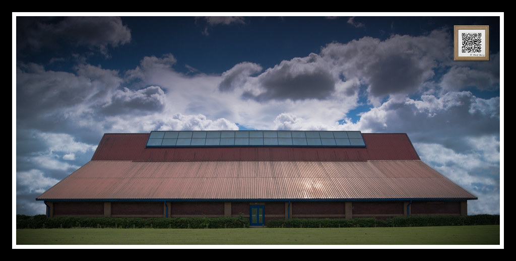
W24 - Symmetry.jpg by MarkBerry1963, on Flickr
Original shot, for comparison:

W24 from camera.jpg by MarkBerry1963, on Flickr
W24 - Symmetry.jpg by MarkBerry1963, on Flickr
Original shot, for comparison:
W24 from camera.jpg by MarkBerry1963, on Flickr
- Messages
- 19,461
- Name
- Andy
- Edit My Images
- Yes
Clouds aren't symmetrical...
Good show. I wouldn't have noticed the cloned buildings...
Looks a little bright on the roof where you removed the vent (?).
I'd like to see a bit more punch to it...looks a tad flat on my laptop.
You did well to hold back the sky.
Cheers.
Good show. I wouldn't have noticed the cloned buildings...
Looks a little bright on the roof where you removed the vent (?).
I'd like to see a bit more punch to it...looks a tad flat on my laptop.
You did well to hold back the sky.
Cheers.
- Messages
- 4,828
- Name
- Alan
- Edit My Images
- Yes
Hi Mark
Sorry for not being back sooner - trying to catch up with my own stuff and I am abit like you (in your comments) that I don't really like to comment on others until I have done my own - but that leaves its own complications.
Random - You have had lots of comments so will just say that i think a very original idea, wel carried out.
Temperature - excellent I like the background loghting- the way that it reflects in mono the change on temp from top to bottom. The way that it bleeds out of colour as the ice/cold part is reached. Super crop.
Abstract - well on theme for me and good colour rendition and exposure.
Symmetry - well done on spotting this and the creativity in the PP. Trouble with this topic is that on the face it is simple but we are all going to be commenting on any very minor non- symmetry. So the highlight on the roof where the vent used to be is distracting and the clouds will never be symmetrical. But having said all that, I think a very good shot for the theme.
Oh, and that thingy in the top RH corner is not symmetrical with the top LH corner :thumbsdown:
Sorry for not being back sooner - trying to catch up with my own stuff and I am abit like you (in your comments) that I don't really like to comment on others until I have done my own - but that leaves its own complications.
Random - You have had lots of comments so will just say that i think a very original idea, wel carried out.
Temperature - excellent
I like the background loghting- the way that it reflects in mono the change on temp from top to bottom. The way that it bleeds out of colour as the ice/cold part is reached. Super crop.Abstract - well on theme for me and good colour rendition and exposure.
Symmetry - well done on spotting this and the creativity in the PP. Trouble with this topic is that on the face it is simple but we are all going to be commenting on any very minor non- symmetry. So the highlight on the roof where the vent used to be is distracting and the clouds will never be symmetrical. But having said all that, I think a very good shot for the theme.
Oh, and that thingy in the top RH corner is not symmetrical with the top LH corner :thumbsdown: