weekly Southdowns' 52/2012 - Week 52 - Busy SP Posted. Thank You, and Goodnight :)

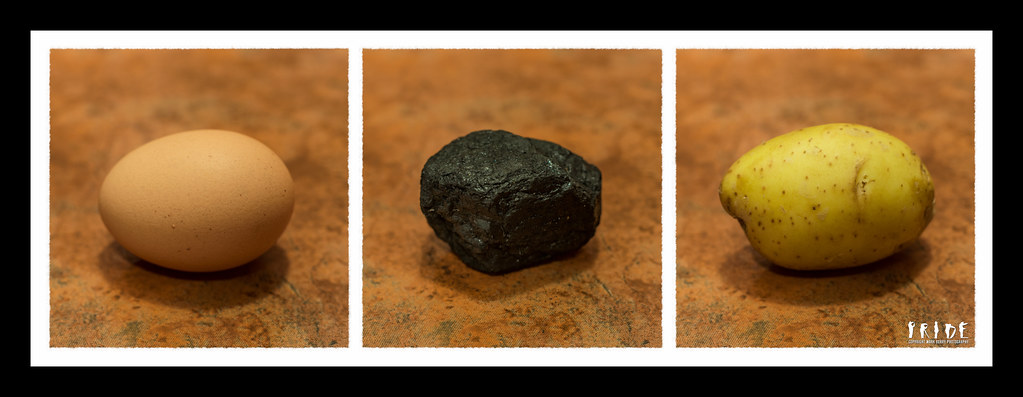
Hmm, shared prize I think! Marsha got the missing post first, and Iain spotted the drop shadow; somehow I just felt that was essential with this image :shrug:

How on earth am I going to split a half pint of shandy between Essex and Oxford? If you can each PM me your email addresses, I'll wizz it over to you!

Thanks for the comments. I'm really glad you like this one as its probably my favourite so far :)
 
Southdowns said:
and Iain spotted the drop shadow; somehow I just felt that was essential with this image :shrug:

Ok, so I must be stupid because even though you've told me I can't see a difference in the shadow:thinking:

Southdowns said:
How on earth am I going to split a half pint of shandy between Essex and Oxford?

I'll have the lemonade Iain can have the beer!
 
Letter – Great idea which has been well composed and executed. The darker blood on the edit works better for me

Contrast - Fantastic image. I saw an old car on Saturday and thought about something like this. I'm glad I didn't because it would have been totally outshone by this one. Great processing. Loving the sky and the shine of the metalwork.
 
your 2nd letter pic is much better with the edit :clap:

contrast - really like this, sky is good, cars are good, it could be a magazine shot :clap:
 
Letter - like the theme and the edit is far better. Still think the blood could go a tad deeper in colour.
Contrast - I can see the idea using the sky which seems to stand out better in #2 but for#1 the cars are my preference. Nice low angle. Well thought out and shot.
 
Desperately playing catch up, so sorry it's brief!

Straight - Beautiful, particularly the re-colouring.
Letter - Great shot, but I do think blood should be really, really red.
Contrast - Lovely, though I desperately want to nudge them a little bit closer together!
 
Hi Mark

I'm liking both your contrast images.....in fact I'm loving them (y)

Cracking sky , lovely shine on the newer mini especially the blue version , great low angle , fab processing ...to my mind the blue version is magazine quality ...excellent image matey :clap::clap:

Gotta ask....set up or right place right time ?
 
Thanks all :)

Lynne, it was right place right time :). I nearly didn't get it either; I'd tried several angles using my nifty fifty, then inspiration struck and I got the kit lens out, which I hardly ever use, and lay down in the road opposite the cars. The zoom let me get the composition spot on without actually having to lie under a bus!

Vicky, yes, I know what you mean about them being closer together, but I do quite like the space between them. I think it gives it space to breath, if you know what I mean!

BTW, there's a great place to hire lenses for Sony's if you ever want to try something different; http://www.hireanalphalens.co.uk/. Great service, and cheaper by a big margin than the only other place I've found offering them.
 
Last edited:
I do like it Mark. The fact that you've purposely chosen all three subjects to be similar shapes really adds to the overall image.

Agree. Very interesting interpretation, well composed and nice triptych. Not so keen on the thickness of the black border and, for me the shadows :thinking::thinking::thinking: can't decide :thinking::thinking::thinking: they add depth but not sure....aaarrgggghhhh!!!

Anyway, one of my favourites on this week so far :clap:

Cheers.
 
Clever, and works very well.
 
Hi Mark

Letter - Damn that is dark :D the edit sure improves the image, nice original idea

Contrast - Liking the Old and New aspect to the shot, but have to say the Red edit is my preference, Nice One (y)

Mineral - Again a great idea, well executed, like the way you have sat the subject in exactly the same place, and the similar shapes & sizes work real well
 
Thanks for all the comments on Mineral :)

Sorry I've not commented on everyone's posts, but it's been a very busy couple of weeks. I'm going to call my first joker on Dark, even though I have the idea for it; just not the time :(. I may well shoot it if I get the opportunity.

Anyway, things have settled down a bit now, so I'll get up to date with everyone's submissions :)
 
So on to Time. Here we have "Time Lapse". I hope it works, because this was my second attempt, and I had great fun with both goes; it's just that the first didn't turn out as I'd hoped.


W33 - Time Lapse-2.jpg by MarkBerry1963, on Flickr
 
Last edited:
Time, mahooosive :clap: best one of this year's TP52 for a while.

Well presented. Great timing and just cracking idea :clap:

I did a timelapse - star trail , on one of the clearest sky's me and Jackie have ever on the Isle of Sky, but I forgot to focus and well, one for the bin :bonk:

Cheers.
 
Wow, thanks guys!

It's been really bugging me that I got the blood so wrong on my Letter shot, so I've spent a while trying to find a technique to replace the colour without messing up the rest of the image. I think I've cracked it now, so here it is. It scares me, so it must be at least partly OK!!!


W29 - Dear John Letter 2.jpg by MarkBerry1963, on Flickr
 
Last edited:
Wow, thanks guys!

It's been really bugging me that I got the blood so wrong on my Letter shot, so I've spent a while trying to find a technique to replace the colour without messing up the rest of the image. I think I've cracked it now, so here it is. It scares me, so it must be at least partly OK!!!


W29 - Dear John Letter 2.jpg by MarkBerry1963, on Flickr

Thought you'd done Body already :D

Much, much better :clap:

Care to share your technique :help:
 
Thanks :)

Andy, I think giving instructions for that kind of thing is illegal in the UK. What? OH, the PP you mean? OK:

- I increased the saturation and luminance of the orange channel in LR, just to make the blood stand out from the rest ready for the next step. Fortunately it didn't mess up the wooden floor as I thought it might.

- I then opened it in Pixelmator, and selected loosely around all the orange blood so that I didn't replace any colour in the floor.

- Next, I opened the "replace colour" tool (PS must have the same), and used the eye dropper to choose the orange as the colour to replace. I increased the tolerance quite a lot so it would replace all of the orange, then chose quite a bright red as the colour to replace with.

- That was too bright though, so I decreased the "lightness" of the replacement colour in the same tool.

- Finally a little selective burning and blurring was needed so that the colour didn't look too painted on.

That's it :)

BTW, the Time presentation is all my own PP work too; meaning I didn't use any sort of template or preset. The frame, the perspective, the shadow and even the logo applied with perspective are all my own work. I'm really pleased with it, and it's this challenge and all the encouragement you people have provided that's given me the motivation to practice and learn how to do these things :)
 
Last edited:
Thanks :)

Andy, I think giving instructions for that kind of thing is illegal in the UK. What? OH, the PP you mean? OK:

- I increased the saturation and luminance of the orange channel in LR, just to make the blood stand out from the rest ready for the next step. Fortunately it didn't mess up the wooden floor as I thought it might.

- I then opened it in Pixelmator, and selected loosely around all the orange blood so that I didn't replace any colour in the floor.

- Next, I opened the "replace colour" tool (PS must have the same), and used the eye dropper to choose the orange as the colour to replace. I increased the tolerance quite a lot so it would replace all of the orange, then chose quite a bright red as the colour to replace with.

- That was too bright though, so I decreased the "lightness" of the replacement colour in the same tool.

- Finally a little selective burning and blurring was needed so that the colour didn't look too painted on.

That's it :)

BTW, the Time presentation is all my own PP work too; meaning I didn't use any sort of template or preset. The frame, the perspective, the shadow and even the logo applied with perspective are all my own work. I'm really pleased with it, and it's this challenge and all the encouragement you people have provided that's given me the motivation to practice and learn how to do these things :)

Nice one (y)

I often find loads of ideas by just clicking on this slider and increasing this/that/the other in Photoshop...

..apologies for the technical terminology...
 
Yeah, that's one of the limitations of Pixelmator. It has this and that, but not the other. At least not in the current version.
 
Think you've def cracked the problems with recreating blood for the letter theme. Just worried how much is going to be used for Body. I can arrange with the local blood transfusion unit for a couple of bags to be delivered if thats easier
 
Hi Mark, time is a cracking set of images. Your PP is superb, I've done a few triptych without using a template it's bloody hard work so a bow down to your patience as it looks superb!

The PP on your dear John letter is excellent. I had to add colour to my eye in my entrance reshoot, getting it looking natural is a challenge which you've achieved :clap:
 
Hi

Why not take part in our annual TP Day coming up soon 9th September, Where you take a photo on that day and post it on the forum, then all the Photos are made into a slideshow, Click the logo for more details, it's lots of fun to be a part of it(y)
 
Sorry it's brief - I'm lagging behind again! :(

Mineral - Gret idea and nicely executed. My only (tiny) criticism would be that the background is a little busy and I feel it pulls focus somewhat.
Time - Nice original take on the theme. Lovely colours. And there's so many of them!

Also wanted to say that the blood now looks very realistic. I'm quite glad you posted the originals so we know it's not real!
 
I missed your time - very good, I like it lots - your new letter is also very good, but I think it works for body too :clap:
 
Back
Top