

You are using an out of date browser. It may not display this or other websites correctly.
You should upgrade or use an alternative browser.
You should upgrade or use an alternative browser.
weekly Southdowns' 52/2012 - Week 52 - Busy SP Posted. Thank You, and Goodnight :)
- Thread starter Southdowns
- Start date
- Messages
- 531
- Edit My Images
- No
Hi Mark,
Time - Great idea, though as Allan points out I think it would work better if it was larger?
Letter - I like the edit; I think it really needed the red to work.
Contrast - There appears to be a bit of haloing but I still think it's a good take on the theme.
Time - Great idea, though as Allan points out I think it would work better if it was larger?
Letter - I like the edit; I think it really needed the red to work.
Contrast - There appears to be a bit of haloing but I still think it's a good take on the theme.
- Messages
- 4,831
- Name
- Alan
- Edit My Images
- Yes
Hi Mark
Mineral - well thought out and executed. Very careful with the uniformity of shape, size, colour and exposure> Not sure about the amount of shadow and whether it would have been better with less or none at all.
Time - is this a pic of a pic? It's just excellent. On theme, well executed and invokes a smile.
")
Mineral - well thought out and executed. Very careful with the uniformity of shape, size, colour and exposure> Not sure about the amount of shadow and whether it would have been better with less or none at all.
Time - is this a pic of a pic? It's just excellent.
On theme, well executed and invokes a smile.
OP
- Messages
- 2,820
- Name
- Mark
- Edit My Images
- Yes
Thanks everyone!
Nathalie, it is pretty big if you view it full size, but the forum won't accept bigger.
Alan no, it's not a picture of a picture, that effect is all done in PP. It's just an ordinary montage, with perspective, distortion and shadow added after it was created.
Nathalie, it is pretty big if you view it full size, but the forum won't accept bigger.
Alan no, it's not a picture of a picture, that effect is all done in PP. It's just an ordinary montage, with perspective, distortion and shadow added after it was created.
Last edited:
- Messages
- 6,502
- Name
- Peter
- Edit My Images
- Yes
Time - What a fantastic idea and great execution. One of my favourites so far.
OP
- Messages
- 2,820
- Name
- Mark
- Edit My Images
- Yes
Cheers Peter, but I still look at everyone else's and think "if only….."!
So here are two in an attempt to catch up:
The first is for Body; Body of Work, something I've never really had before!!
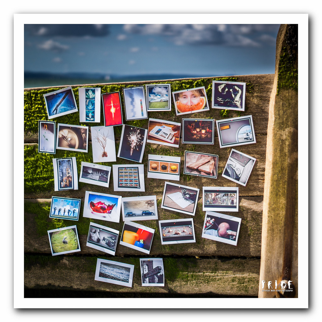
W34 - Body of Work.jpg by MarkBerry1963, on Flickr
So here are two in an attempt to catch up:
The first is for Body; Body of Work, something I've never really had before!!
W34 - Body of Work.jpg by MarkBerry1963, on Flickr
OP
- Messages
- 2,820
- Name
- Mark
- Edit My Images
- Yes
And next, liquid; Liquid Reflections. This is far simpler than I had in mind at first, but I was persuaded that pouring mercury on my daughter's face was a no-no
Actually, I'm glad, because I love this one. However, there is something about it that's not quite what it seems - can you spot it?
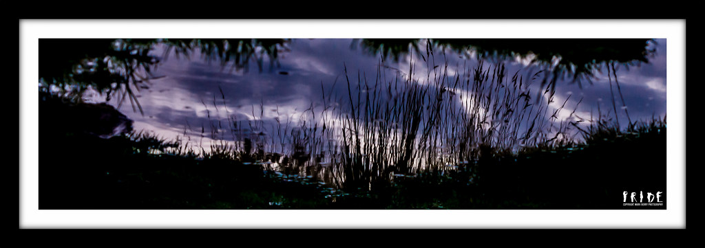
W35 - Liquid Reflections.jpg by MarkBerry1963, on Flickr
Actually, I'm glad, because I love this one. However, there is something about it that's not quite what it seems - can you spot it?
W35 - Liquid Reflections.jpg by MarkBerry1963, on Flickr
Last edited:
- Messages
- 242
- Name
- Vicky
- Edit My Images
- No
Body is fab - great interpretation, lovely composition and crop, fabulous colour (as always).
Liquid is interesting - I desperately want to see it much, much bigger! I love the colours, but I can't work out what's going on with the turquoise-y bits in the foreground. Is the "not what it seems" part that it's all a reflection, rather than the sky being a reflection and the foreground shadows being at the edge of the body of water?
Liquid is interesting - I desperately want to see it much, much bigger! I love the colours, but I can't work out what's going on with the turquoise-y bits in the foreground. Is the "not what it seems" part that it's all a reflection, rather than the sky being a reflection and the foreground shadows being at the edge of the body of water?
- Messages
- 4,831
- Name
- Alan
- Edit My Images
- Yes
Hi MArk
Body - very clever. You are so good at these montages. Like the light, giving a feeling of a bright sunny day at the beach.
Liquid - I'm not sure that i really get this for the theme because i keep seeing it as sky. Looks to me as if the bottom bit is as shot but the top bit is an upside down version of a shot - and then they have been moulded together. I find it a bit confusing.
Body - very clever. You are so good at these montages. Like the light, giving a feeling of a bright sunny day at the beach.
Liquid - I'm not sure that i really get this for the theme because i keep seeing it as sky.
Looks to me as if the bottom bit is as shot but the top bit is an upside down version of a shot - and then they have been moulded together. I find it a bit confusing.
OP
- Messages
- 2,820
- Name
- Mark
- Edit My Images
- Yes
Thanks all Interesting reaction to liquid; I think it's one of those images that's best when you don't look too deaply, and I've made you look by asking what's unusual about it!
Yep, it's mostly reflection, and yep, it's upside-down, mainly to get the long grass in the foreground the right way up. So yes it's confusing and odd, but I still like it
Alan, body isn't a montage in the way time was. It's a genuine shot of photos pinned up, not something created in PP. Here's another shot that shows that a bit more clearly:
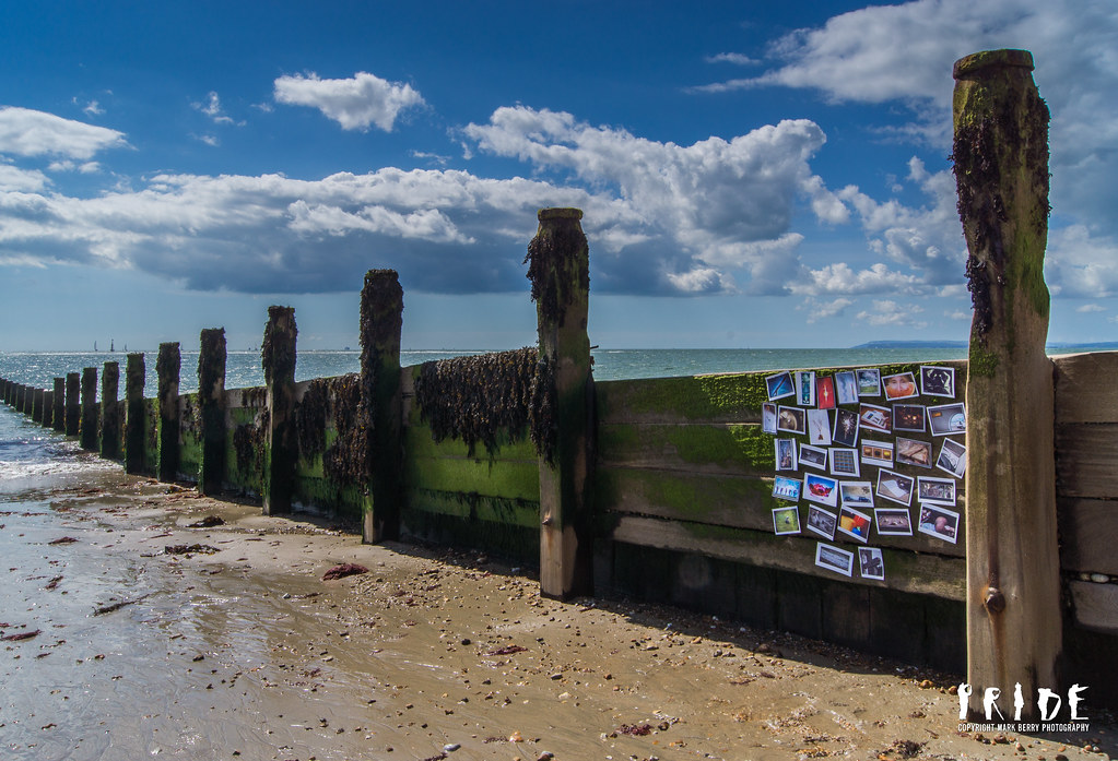
20120826-121759-2.jpg by MarkBerry1963, on Flickr
Interesting reaction to liquid; I think it's one of those images that's best when you don't look too deaply, and I've made you look by asking what's unusual about it!Yep, it's mostly reflection, and yep, it's upside-down, mainly to get the long grass in the foreground the right way up. So yes it's confusing and odd, but I still like it
Alan, body isn't a montage in the way time was. It's a genuine shot of photos pinned up, not something created in PP
. Here's another shot that shows that a bit more clearly:20120826-121759-2.jpg by MarkBerry1963, on Flickr
blakester
Shine On Harvest Moon
- Messages
- 6,679
- Name
- Iain
- Edit My Images
- No
Hi Mark, I am looking at your images on my phone which won't do them justice but from what I can see, both work well. I like the thinking behind liquid, it's a neat trick reversing the image as you have to good effect. I suspect this really needs to be seen large so I will take another look when at home.
Body I like this too, well worth a revisit when you complete the 52. I can only imagine what passersby must have thought to see you pinning those to a groyne
Body I like this too, well worth a revisit when you complete the 52. I can only imagine what passersby must have thought to see you pinning those to a groyne
jgs001
Brian Cox
- Messages
- 12,646
- Name
- John
- Edit My Images
- Yes
Time, an excellent idea, and very well implemented.. it works great
Reshoot, much improved on the originals, the blood looks more... well bloody
Body, an interesting interpretation, I like it
Liquid, I really like this, the colours, reflection and ripples all work nicely for me.
Reshoot, much improved on the originals, the blood looks more... well bloody
Body, an interesting interpretation, I like it
Liquid, I really like this, the colours, reflection and ripples all work nicely for me.
- Messages
- 6,502
- Name
- Peter
- Edit My Images
- Yes
Body – Another fabulous idea. Loving the colours. I prefer the first version of this.
Liquid – Love it. The tones and crops are great.
Liquid – Love it. The tones and crops are great.
The goblin
<span class="poty">POTY Winner 2015</span></br>
- Messages
- 4,407
- Name
- Marsha
- Edit My Images
- Yes
Hi Mark,
Body, very clever. I liked looking through your shots in one and thinking how far we've all come
Liquid, good idea to shoot the reflection and rotate it
Well done for getting so far
Body, very clever. I liked looking through your shots in one and thinking how far we've all come
Liquid, good idea to shoot the reflection and rotate it
Well done for getting so far
- Messages
- 8,398
- Name
- Lynne
- Edit My Images
- Yes
Hi Mark
neat idea for Body....good way to confirm how far you've come....but I must say I actually prefer the the original shot that you took the crop from......shows the body of work & your eye is led to the body of water that is the sea
Liquid....yup,did a similar shot whilst in cumbria earlier this year,like the tones & the idea
OP
- Messages
- 2,820
- Name
- Mark
- Edit My Images
- Yes
Thanks!
Summer, I'm not sure what you mean by small? It looks very big on this 27" monitor here
Lynne, I know what you mean about the second shot, but it was only a record shot, and I don't think it works for the theme because unless you already know (because you've seen it closer up), you can't tell that the things pinned to the groin are my "body of work".
My submission is not a crop from the second one though; it was shot that way
OP
- Messages
- 2,820
- Name
- Mark
- Edit My Images
- Yes
Here's "Up". As soon as the theme was announced, and I knew I was off to Shoreham airshow the same day, I knew where this weeks shot had to come from! However, I didn't want it to be the obvious shot, so I settled on these three as a tryptic. I love the shots, but am not 100% convinced the presentation works this week. It does need to be viewed BIG!
Wasn't sure what to call it; they're definitely "up" there, and I think the angles emphasise them being up above, but there's not really a title that fits perfectly.
One thing learned; do NOT use burst mode, especially if your camera can do 10 shots a second! I ended up with 50 Gb of shots!
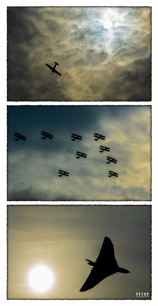
W36 - Up Above.jpg by MarkBerry1963, on Flickr
Wasn't sure what to call it; they're definitely "up" there, and I think the angles emphasise them being up above, but there's not really a title that fits perfectly.
One thing learned; do NOT use burst mode, especially if your camera can do 10 shots a second! I ended up with 50 Gb of shots!
W36 - Up Above.jpg by MarkBerry1963, on Flickr
Last edited:
- Messages
- 19,461
- Name
- Andy
- Edit My Images
- Yes
Hi, Mark, Up, even though it's a triptych, for me it's #1, #2 and then #3 with #1 head and shoulders above the others. Not keen on the triptych, mainly due to the different textures in the sky.
#1, though has a cracking sky and the placement of the plane is great.
50GB.....how the hell did you manage to carry such weight around
Cheers.
#1, though has a cracking sky and the placement of the plane is great.
50GB.....how the hell did you manage to carry such weight around
Cheers.
OP
- Messages
- 2,820
- Name
- Mark
- Edit My Images
- Yes
Yep, I think you're right Andy. I think I'll probably just submit the top image now I look at it again. I thought they'd work together because the skies have similar tones, but you're spot on that the textures are different.
50 GB wasn't so bad; it was made out of lightweight aircraft alloys!
50 GB wasn't so bad; it was made out of lightweight aircraft alloys!
- Messages
- 14,766
- Name
- Michael
- Edit My Images
- No
That 3rd shot is awesome! I'm not totally sure if the triptych works on this occasion
It would be great on its own and on a wall. I got to photograph the Red Arrows on Saturday, burst mode too, nearly 600 pics! My thinking was I haven't seen these in ages, so I don't want to miss anything. Goodness what will happen when I get to an airshow
It would be great on its own and on a wall. I got to photograph the Red Arrows on Saturday, burst mode too, nearly 600 pics! My thinking was I haven't seen these in ages, so I don't want to miss anything. Goodness what will happen when I get to an airshow
OP
- Messages
- 2,820
- Name
- Mark
- Edit My Images
- Yes
OK, so I messed up doing this as a triptych. However, I can't decide between the two lone airplane shots, so am posting both below for voting please
For me, the first one is better composed with the sun and plane diagonally opposite each other, but the second has such a striking and iconic silhouette that I can't ignore it!
#1
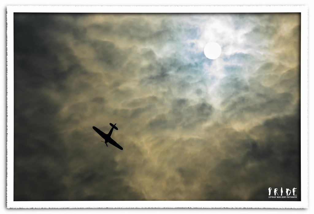
W36 - Up There 2.jpg by MarkBerry1963, on Flickr
#2
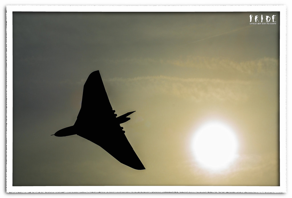
W36 - Up There 3.jpg by MarkBerry1963, on Flickr
For me, the first one is better composed with the sun and plane diagonally opposite each other, but the second has such a striking and iconic silhouette that I can't ignore it!
#1
W36 - Up There 2.jpg by MarkBerry1963, on Flickr
#2
W36 - Up There 3.jpg by MarkBerry1963, on Flickr
- Messages
- 242
- Name
- Vicky
- Edit My Images
- No
I can't choose between all three of them - I think they're all great shots, both individually and as a triptych. Though perhaps having them horizontally rather than vertically would work better? I'm not sure. Absolutely in love with the PP on these though!
The goblin
<span class="poty">POTY Winner 2015</span></br>
- Messages
- 4,407
- Name
- Marsha
- Edit My Images
- Yes
Hi Mark, I don't mind the triptych, but I think individually they're all good shots ESPECIALLY the Vulcan spvcxffcbv vg -/"pq🐶⛄⛄🌙⚡🌀🐺🐧
spvcxffcbv vg -/"pq🐶⛄⛄🌙⚡🌀🐺🐧The goblin
<span class="poty">POTY Winner 2015</span></br>
- Messages
- 4,407
- Name
- Marsha
- Edit My Images
- Yes
🔞
OP
- Messages
- 2,820
- Name
- Mark
- Edit My Images
- Yes
Marsha, have you finally lost it? I understood up to the (deeply appreciated) worship, but after that I have no idea what on earth you're on about!!!!
But thank you anyway
Cheers Vicky and Mike
But thank you anyway
Cheers Vicky and Mike
- Messages
- 4,831
- Name
- Alan
- Edit My Images
- Yes
Hi Mark
Very good shots. Up to your usual high standard. i would be happy with any of them.
To me the best is #1 as enlarged. I looked at this first on your flickr before i saw your 2 photo submission and the larger size improves it because propellor is obviuosly that, whereas in the smaller shot, it could be taken for an imperfection in the photo. The sky is beautiful and , finally, that shot seems more like we are looking 'up', whereas with the Vulcan i think that i ma looking into a lowering sun and therefore less'up'. So #1 is more on theme foe me. Hope that makes sense.
OP
- Messages
- 2,820
- Name
- Mark
- Edit My Images
- Yes
Cheers Alan , yes, it makes sense.
The prop worried me a little, because technically you're meant to have some movement blur in propellers, but as you can imagine, a slow shutter speed was impossible shooting into the sun like this. I could have closed the aperture to f32 (it was f8), but I'd still have been at 1/250s without an ND filter. I only had about 5 seconds to prepare for the shot once I realised where the plane was headed!
In this context, I think it actually looks quite good with a stationary prop.
, yes, it makes sense.The prop worried me a little, because technically you're meant to have some movement blur in propellers, but as you can imagine, a slow shutter speed was impossible shooting into the sun like this. I could have closed the aperture to f32 (it was f8), but I'd still have been at 1/250s without an ND filter. I only had about 5 seconds to prepare for the shot once I realised where the plane was headed!
In this context, I think it actually looks quite good with a stationary prop
.- Messages
- 6,502
- Name
- Peter
- Edit My Images
- Yes
I like the triptych and I'm not worried about the less traditional vertical format. However the mottled sky in Up There 2 wins the day for me. Nice one.
- Messages
- 13,760
- Edit My Images
- Yes
Hi Mark
Still trying to catch up.... sorry for not getting about !!!!
Time - Excellent idea, well executed and I love the way you have set it out
Letter edit - Agree, much netter colour for the blood, how on earth did you do that ??
Body - Again good imagination, loads of good colours, liking the point of view and the way you have set this up again, excellent timber/seaweed? detail
Liquid - Cant spot your question, the crop works very well, deep colours and framing also compliment very well
How did you do the border/mount ??
Body wider shot - Liking that too, great sky and the sea, well... where on earth was that taken, certainly not Norfolk
Up - Oooo tough choice.... going for 1, the pp with the clouds, sun and position of the plane just stands out for me, looks like you had a good day
OP
- Messages
- 2,820
- Name
- Mark
- Edit My Images
- Yes
Cheers Guys
DK, the blood is done using "replace colour" in Pixelmator. There's more detail just after the image. If you mean overall how did I do the shot, then it's my hand, plus ketchup, plus a low temperature WB brushed onto my hand to give it that blue "been dead a while" look!!!
The border/frame:
- Increase the canvas size to accommodate the frame all around.
- Fill the new frame with white (It'll be transparent to start with).
- Select the frame using the magic wand tool, then paste it twice as two new layers, both above the original image (so thinking of it as a stack of papers, you have the image on the bottom, then a white cut out border, then another white cut out border).
- Select the middle layer, and fill the white with black. Turn the top layer off first if you want to see the middle one go black.
- Apply gaussian blur to the middle layer to create the shadow effect.
- Move the middle layer down/up/left/right a bit if you want it to look as if the light isn't from directly in front.
- Merge all layers.
Easy peasy eh?