weekly Southdowns' 52/2012 - Week 52 - Busy SP Posted. Thank You, and Goodnight :)

Hi Mark


god I envy your pp ability:p I've done a similar thing using flowers but nowhere near as good as this . The dead flower jumps out of the image...the faded newer one works really well as the BG...beautiful...get it framed mister :clap:
 
Very cleverly done Mark, fits the theme perfectly, and a wonderful bit of work.
 
Thank you everyone :)

I had an idea for "spread", which I might still do, but when I saw "together" straight afterwards, I couldn't resist this. I think the background is a little fussier than I'd have liked, but do like it, especially the antique treatment. Come on now everyone, jump: Spread>Together>Spread>Together :)


W43 and 44 - Sread - Together.jpg by MarkBerry1963, on Flickr
 
Hi ya


that works well for the pair of themes..2 in 1..good idea mister (y) Like the pp treatment you've given it & a lovely expression on the face of the lh little lady . Backgrounds ok , I don't think it's that fussy, in fact I think it suits the image . 2 little niggles for me...think the vignette is just a touch heavy & given your pp ability , maybe clone out that dark line from left to right ?
 
Southdowns said:
Thanks everyone :)

It's been manic at work, so I've not been around much :(

I'm going to call a joker on Natural for now, but will try to get it shot before the end of the year. I'm also going to make a concerted effort to get some commenting done over the next couple of days, but in the meantime, here goes Age. My idea was an aged flower, with a faded memory of youth in the background.

Comments very very welcome please :)

'Ello.

Age, liked it a s soon as I saw it. Great border and It does have a great aged feel to it. Some great detail in the flower head. Now I k ow the head is the focal point but I'd like to see the petals in the BG a tad brighter. Also, think I'd like to see the head a MM or so higher.

Cheers.
 
Southdowns said:
Thank you everyone :)

I had an idea for "spread", which I might still do, but when I saw "together" straight afterwards, I couldn't resist this. I think the background is a little fussier than I'd have liked, but do like it, especially the antique treatment. Come on now everyone, jump: Spread>Together>Spread>Together :)

Good idea...I wouldn't have made the connection without the above...but, hey, who cares!

Great expression on your daughter's face and you've really frozen the motion. The horizontal line cold be removed, if you're inclined to do so and it does have an action feel to it so I'd like to see some more color.

Cheers.
 
Hi Mark,

Age is fabulous :clap: I see what Iain is saying though and if the BG was brighter (like Andy suggested) I think it would be a tad busy, but I like it as it is.

Now come on share how you pp'd it? I'm very interested as to how you achieved this, especially the border/ frame and drop shadow!

Spread/ together is very clever. Yet again your pp skills have done a superb job. I agree about removing the long thin shadow, the link in the middle bothers my OCD!

Well done for more ingenious ideas.
 
I think that's great and a brilliant idea to combine the two. I didn't even notice the line so no worries there from me, and the shadows of your daughter are spot on too, very good :clap:
 
Very clever, superb bit of PP, a pair of great expressions, and a pair in the air together, hitting two themes with one image... The background isn't a problem for me.
 
Spread / Together - Now that's just cheating :LOL:. Hats off to you for a great idea though. Well done for capturing the motion. How many clicks did take to get both shots just right?
 
Hi Mark,

Spread and together in one shot - well done!

As usual you have done really well with the processing and a good original idea. Do you hire out your model the 2 moody teenagers here won't model anymore!!:(:LOL:
 
Hi Mark, sorry it's been a while but TP has taken a back seat for C&C due to family problems.

Body – An unusual interpretation and with the explanation gives it true meaning. Good lighting and colour, given the time of day.
Liquid – I like the way you have created something not immediately obvious. The framing and letterbox effect makes this one for the wall.
Up – All work well but I have to agree the 1st edited shot is the winner. As you say, iconic, like ownership of the skies
Duo – Can’t fault. Well worn boots in a great context.
Flow – Superb image and excellent colour.
Change – Prefer second edit. Good colour and a little touch of movement. I feel top and bottom RH corners could do with cloning out.
Friendship – Second is a great shot with meaning
Age – Lovely shot, nicely lit and even the border adds something to the effect.
Spread and Together – one grand shot for both themes. Not sure the colour interpretation works though. More suited with B/W maybe
 
Like that idea for the two themes in one.

I imagine it's one of those multiplicity creations. :clap:

I have been trying to get my head around these recently using Gimp. No luck so far as subtle changes in light makes it possible to see where one shot has been pasted onto the other. :bonk:
 
Hi Mark - Spread / Together. Very effective! Go on then - spill the beans - how did you do that?

PS
Just noticed your Age. Brilliant - who would have ever thought of photographing an old flower. Really interesting and I love the lighting and DOF.
 
Last edited:
Cheers all :)

Yes the line in Spread/together is a bit of a problem, but I couldn't PP it out to my satisfaction. Lesson learned; look harder at what's in the shot before taking it!

Yes it is a combination of two shots. The key steps are to photograph with a tripod and the same lighting, then paste one photo over the other as two layers, then "rub out" ("mask") the top one leaving only the parts you want to keep. The hardest bit was around the shadow near her feat.
 
Last edited:
So, now that I've caught up on comments (please let me know if I've missed you out; I'm bound to have missed someone!), I can post the shots I have for the last three weeks.

Pack

This is from an antique shop in Portsmouth, where he really packs his stock in! This is not a store room; this is his sales display!! I think (hope) the picture draws you in in the same way the actual room begs you to rummage!


W45 - Pack.jpg by MarkBerry1963, on Flickr
 
Last edited:
Art

I like that this combines three types of art; the sculpture which is modern, the window which is ancient religious art, and the architecture which is art equal to any IMHO. It was taken in Salisbury Cathedral, and is NOT HDR :)


W46 - Art.jpg by MarkBerry1963, on Flickr
 
Hi Mark,

Pack, OMG when I first saw this I thought it was a garage, can anyone actually get in that shop? The shot definitely draws you in, unfortunately the bright light at the top of the shot draws my eye along with the rounded shadow to the left of it!

Art, Superb :clap: Love everything about it, the angle, the star bursts on the lights and the amazing detail throughout. There are so many artistic elements in it from the architecture to the sculptures to the stained glass windows, cracking shot (y)

Colour, is there no end to your PP skills? I think on their own the colourful houses might look a tad boring, but the five frames put together and then framed look amazing :clap:
How did you do it?
 
Thanks Allan, glad you like them :)

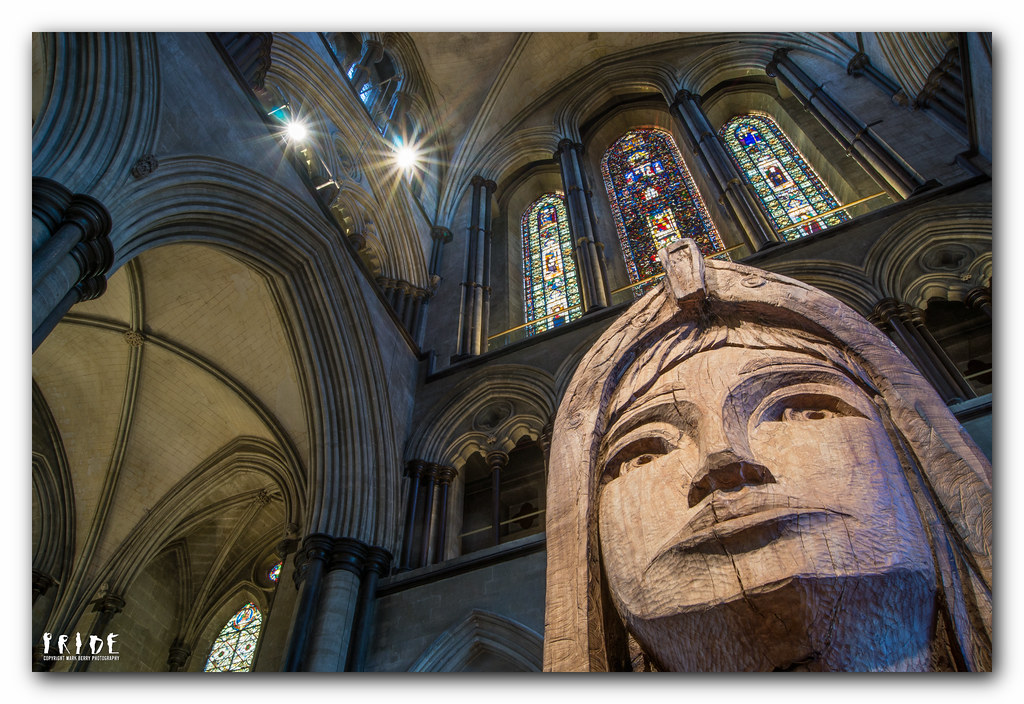
Marsha you're absolutely right about the light and shadow in pack, but I couldn't clone them out because its too complex (see, there IS and end to my PP skills!), and cropping the shot destroyed it because you could no longer tell it was a room. This is one of nine rooms in his shop, all of which you can get in, just! The front room is more conventional, though still incredibly cluttered. It's certainly a fascinating place.

I'm glad you like Art. I had a nice afternoon there, chatting to several people about photography including one of the guides who became more and more fascinated the more she saw me on the floor with the tripod in strange configurations!

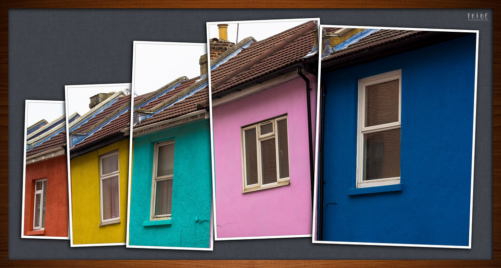
Yes, the houses ARE boring on their own, but that's kind of the point; it shows what colour can do, as its the ONLY thing that causes you to even notice that they're there. I presented them like this because even with the colour, the shot was still snappy; this was the only angle I could get as its a narrow street with parked cars. I don't like PP that's the only good thing about a shot, but hope that this takes a boring subject and emphasises the only interesting thing about it; the colour.

How I did it would take pages to write as it took ages, but here's the principal:

It's all about layers. To get your head around layers, you have to think of them as pieces of paper (you can do more with layers than with paper, but in this shot I've used none of the really clever stuff). I'll use the paper metaphor here.

Start with the original shot, and cut it into 5 rectangles so you have 5 smaller pieces of paper (5 layers).

Add a border to each piece, then lay them out on another piece of paper (the background, which is just a photo of some fabric pasted in as a new layer). Rotate and position them so they look good.

Cut out five pieces of black paper the same size as the pictures, and put them underneath each shot (five new layers), but offset by a millimetre or so to the bottom and left.

(Can't do this bit with paper) blur each black layer to make it look like a shadow.

Cut out a frame from a photo of a sheet of wood, and then cut out the same shape from a piece of black paper.

Lay the wood frame on top of the black frame, then on top of the picture.

Blur and offset the black frame layer to look like a shadow.

Glue all the pieces of paper in place (merge the layers).

Easy peasy!!!!
 
Last edited:
Hi Mark,

Apologies for the delay in responding I have not had much time to myself since i've been back ashore.

Natural - Outstanding image. i really like your in-the-corner composition and fine focus detailing the hairs(?) on the petal. Lovely processing too.

Pack - Wow, thats a really busy image but fits the theme. I find the blown lightbulb a little distracting but thats just a minor crit.

Art - Again, I like your main subject in the corner of the photograph. Bit of a recurring style there which is a good thing in my opinion. Great focus and POV. Works well.

Art - It looks like you have spent quite a bit of time on this. I think it fits the theme well. The jaunty angle of the frames is brought to order by the continuum of the diagonal line of the facia boards. The consistent exposures also help to bond it.
 
Hi ya :wave:


ART

love that cathedral interior....excellent range of tones & colors given that it's not HDr :clap:

Pack...says more jumble to me , I don't now where to look 1st

Color....fabway to present the colorful houses...interesting image of a mundane subject...love how you've laid them out & chuckled as I read your description of " how to do this "...still can't suss layers after reading it though :bonk:
 
Hi Mark,

Well done for catching up!

Pack - I think I'd be afraid of touching anything in those piles, for fear of being buried! A different take but definitely on theme. The light bulbs are a little bright for me, but that's the only crit I can think of.

Art - I love this. Perfect just the way it is.

Colour - I think it's great that you've cut the individual houses out and the colours are really strong too. Not so keen on the wood frame, but that's a very minor thing.
 
Hi Mark

Pack - I agree with Lynne that it looks more like jumble. Perhaps because there is no shop front or walls in the shot to show how the stuff is packed in.

Art- excellent.:clap: Good spot for the theme and the pov really makes it a quality image. Really good colours.

Colour - I am in awe of your skills. Having read your explanation, I fear that i would never be able to do that - but I might have a play in the dark nights that are to come. Fits the theme well and is an image which retains interest een tho just houses.
 
Pack - I love shops like this. So much more interesting than M&S. It's a really busy photo so it's captured the subject well.

Art - I do like this. Churches are notorious for being difficult to shot exposure wise so you've done really well.

Colour - What a great idea to get away from some boring house shots. The framing works for me.
 
Thanks everyone :)

Pack was a bit of a grab shot, but it does look better big. That way, you get the full effect of the DoF giving it some, umm, depth, and the lights become less distracting.

Nat, you wouldn't believe how many alternatives I tried before settling on the wooden frame for colour! It definitely needs a frame to bring it all together, but white didn't work, black got lost, using one of the house colours unbalanced it, and a gradient with ALL the house colours just looked silly. In the end I thought the wood worked quite well, but anything like that will always be a matter of taste.
 
Hi Mark

pack is wonderful tho as Marsha says the lightbulb is a little distracting

art - love the pov and the starburst, the windows behind, everything. maybe a teeny bit more of the neck in the crop? tho I'd have to actually see it to know if it helped lol

colour, love love love it :clap:
 
Cheers Summer :) Art is actually uncropped from the camera. It was taken at 18mm (the widest my lens will go), and with the camera on the tripod and virtually on the floor, so I couldn't get any more of the neck in without losing some of the window above!
 
Pack - love these type of shops, everything packed in yet the owner still knows where to look! Well spotted and looks better when viewed large.
Art - Plenty to look at, great angle and on theme
Colour - Brilliant idea putting them into a frame within a frame. Thanks for the explanation as well.
 
Thanks John, glad you like them :)
 
Back
Top