weekly Southdowns' 52/2012 - Week 52 - Busy SP Posted. Thank You, and Goodnight :)

So here we have a reshoot for Pack; Ice Pack

It may be a little early to reshoot Pack, but the original was a bit of a grab shot so I thought it was worth a go.

Hope you like it :)


W47 Reshoot - Ice Pack.jpg by MarkBerry1963, on Flickr
 
Last edited:
Eeekkkk, missed a few; and there's me thinking I had caught up :bonk:

Ok, what have we got....

Pack, packed in indeed:wacky: you've captured the theme very well and really filleted the frame. There seems to be a few vivid blue patches, especially he window, any idea what caused this?

Art, oh, yeah, liking this one. Great angle, great depth, nice and sharp. Cracking star bursts, not HDR, :clap:. For me thought, the tones in the brickwork that really make the photograph. Crit, well I always try to leave constructive crit :D, I'd like to see a tad more neck on the sculpture. May not have been possible with the equipment you had. Nice juxtaposition of Arts as well.

Colour, niiiiiccceeeeee. Has a real Ikea feel to it (take his in the spirit is was meant (y)) great flow of colours, well composed, nice frame and the grey BG compliments the colours. Not sure how you feel about removing things, but I'd have either shifted to exclude the chimney of 'shopped it out.

Pack reshoot, clever, how long did it take to set up?

Caught up.....:D
 
Cheers Andy :)

Not sure about the blue in Pack; could be the white balance being confused by the differing light sources?

It didn't even occur to me to remove the chimney in colour! I have no compunction about removing stuff (there's already a ground floor window in the recycle bin!), and I probably should have removed the chimney too.

Pack reshoot didn't take too long to set up. Three cans of baked beans in the bottom to weigh the bag down, bag of ice cubes from Asda, one LED light behind the bag and another shoved inside it, then 4 second exposure while painting with the red light :)
 
Last edited:
Hi Mark,

Pack re-shoot: I'd never know how to set something like this up! I think it's a cool shot -- very different. A question for you though; would it have been possible to make the light inside the pack a bit more directional, to keep the sides of the backpack dark whilst still lighting the cubes at the top?
 
Hi Ya mister :wave:

reshoot of Pack.....so , you put a light ( which runs on electrickery in some form ) inside a bag with Ice on top if it.........:wacky:

Like the idea , more on theme than your original shot( nothing wrong with the original one but this is better) , good bit of light painting & nice strong colors plus I like the angle (y) Theonly niggle is the color of the ice in the bag..has a blue tint but maybe this is what you wanted ? Whats the granite effect ledge thing to the lower left...outside step ?
 
A question for you though; would it have been possible to make the light inside the pack a bit more directional, to keep the sides of the backpack dark whilst still lighting the cubes at the top?

Hi Nat, yes it would have been possible to do that, but not with the kit I've got! I can see myself owning hundreds of torches before too long! I do think it would have been better as you suggest.

Theonly niggle is the color of the ice in the bag..has a blue tint but maybe this is what you wanted ? Whats the granite effect ledge thing to the lower left...outside step ?

Cheers Lynne. The blue tinge was deliberate as white it looked too warm; I wanted to make it clear it's ice, though maybe I went too far?

The "granite effect" is just a textured PVC sheet I used for the background.

I quite like that Mark. Light painting looks good as does the composition. The light inside the bag gives it a great dimension and I like the different colours of the ice too. I would like to see it without the black stap and clip in view.

Thanks Mike. Yes I wondered about the strap! I thought it made it clearer what you were looking at, but it may be redundant.
 
Well, that's a cracker Mark! Can't fault it!

Cheers Michael!

Hi Mark
Agree with Michael that it is hard to fault. Nice shot.

Thank you!

Yup, Shadow, is a good un.

Great idea and well executed, composed.

Crit, uneven shadow?

Cheers.

Thanks Andy. I'm not sure how to control the evenness of a shadow, except with studio lights of the sort what I ain't got! It was quite difficult to get it the right size and position, as well as well enough defined! Getting the "femail dancer" positioned correctly was even tougher!
 
Last edited:
Agree with everyone else nice shot well thought out and executed shadows fine on it
 
Reshoot - Very very nice. I definitely like this the lighting is superb for me. The use of the reds the cool bluey whites work well.

Shadow - Brilliant - Well done. That's another great shot which appears to have been well lit. What are you using on these two?
 
hmmm, there's something a bit fishy about that shadow *scratches head* or am I imagining it? lol, seriously, does the shadow match the subject? Maybe I'm losing it :banana: but joking aside, very good image :clap:
 
Hi Mark,

Pack reshoot is excellent :clap:

Shadow, yet another :clap: I did wonder about an even shadow throughout but that would be nit picking a great shot, it works great as it is (y)

Thanks Marsha!

Agree with everyone else nice shot well thought out and executed shadows fine on it

Cheers Allan :)

Reshoot - Very very nice. I definitely like this the lighting is superb for me. The use of the reds the cool bluey whites work well.

Shadow - Brilliant - Well done. That's another great shot which appears to have been well lit. What are you using on these two?

Thanks Peter. Lighting was very basic really; for the reshoot I used two LED torches for the white light, and a red one for the, umm, red! Shadow was lit with a standard halogen desk lamp, positioned to the right. I have a BTS shot that I'll post later.

hmmm, there's something a bit fishy about that shadow *scratches head* or am I imagining it? lol, seriously, does the shadow match the subject? Maybe I'm losing it :banana: but joking aside, very good image :clap:

Hi Summer. The shadow isn't meant to match the subject; the shadow is the male dancer, supporting the female subject in a ballet lift :) it is a genuine shadow of a mannequin that's out of shot. Glad you like it though.
 
Pack reshoot - Well thought out and colourful image, certainly works for me.
Shadow - Can't fault this image. The uneven lighting is how many shadows turn out making it more life like IMO.
 
Thanks John, glad you like them :)

Here's the BTS shot I promised, minus the male dancer. The key thing was that the camera and light source needed to be at 90 degrees to each other, in turn at 45 degrees to the background. And yes, I genuinely did get a set square out!

The light above was used only to suspend the female dancer in mid air, not for light.


Shadow Setup.jpg by MarkBerry1963, on Flickr
 
Last edited:
Nice work on shadow Mark, I can imagine it took quite a bit of setting up.
I like your creative thinking behind the image.
It did take me a wee while to work out the photograph but in a good way. It holds the viewers eye in the frame to study the composition.
The uneven shadow works for me as it is more realistic (well as realistic as a wooden mannequin being held up by a shadow can be :LOL:) IYSWIM
 
Thank you Iain and Mike :)
 
Week 49 - Glow

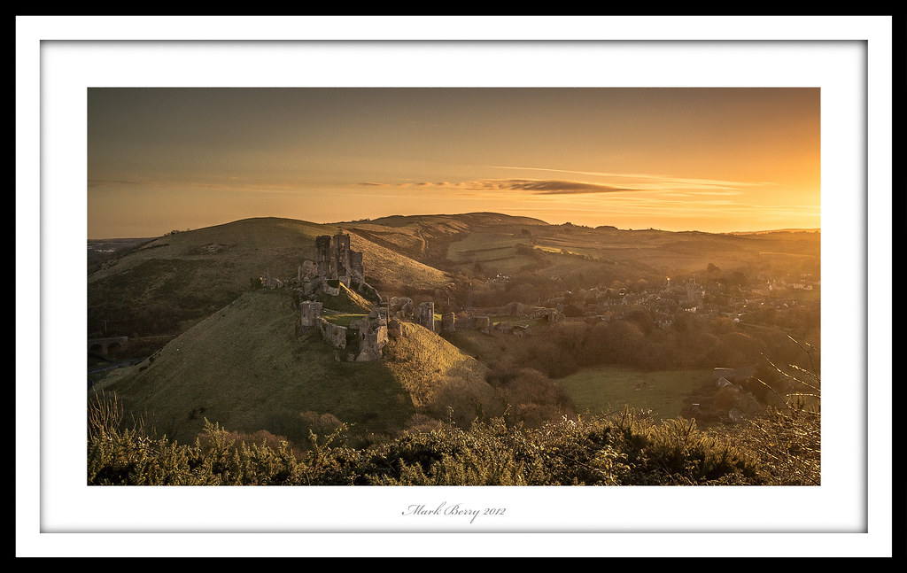
"The First Glow of Morning"

There's a story to this one, which I'm going to tell you whether you want to hear it or not!!

I've wanted to get a sunrise shot of Corfe Castle from West Hill for quite some time, with the castle standing proud above the mist sitting in the valley. It's a classic, perhaps clichéd shot, but so beautiful I have to get it one day.

Anyway, The theme was announced, there was mist on Saturday morning, more forecast for Sunday, and the ephemeris said the sun would rise in the perfect position, so it looked like it just had to be done.

Only problem; we had guests on Saturday night, and Corfe is a two hour drive from home plus 45 minutes to climb the hill. I didn't fancy a 3.30 am start, so told our guests I had to leave at 10 to camp - handy, because these people tend to outstay their welcome anyway!!!!

So I left at 10, drove to Corfe, climbed the hill, and set up camp for the night, setting my alarm for 6.30am.

(this is not my submission, just some context for you!)
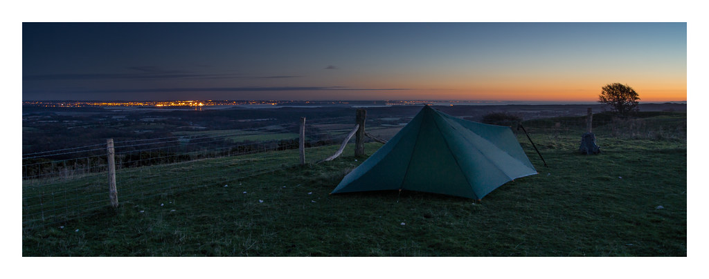

W49 - Camping.jpg by MarkBerry1963, on Flickr

Lovely morning, but not a touch of mist (plus Mandy texted me to say the guests didn't leave 'till nearly midnight anyway!) :(

Anyway, I managed to get this shot (view it BIG for max impact), which I'm quite pleased with, despite no mist, and I had fun camping!! Hope you like it :)


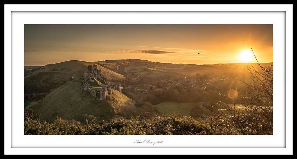
W49 - Morning Glow.jpg by MarkBerry1963, on Flickr

Self crit; there's too much noise, resulting from having to bring the shadows up quite a lot on the foreground. I had ND grads on, but they didn't hold the sky back enough, and I didn't want to do HDR. I think I need some good hard ND's.
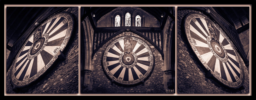
 
Last edited:
lovely shot, boys are so lucky that they can go wild camping on their own :(

have to say though that I think the 1st shot also fits the theme with the glow from the town (is it Poole?).

corfe is on my list :LOL:
 
Thanks Summer :)

I do know several women who go wild camping alone, though it has to be said they only do it in quite remote areas. You might think you'd be safer near civilisation, but in the depths of the Lake District etc, you never see anyone!

Yes, that's Poole in the first shot :)
 
Last edited:
Lucky sod ;)

I've seen this place a few times and you've done really well here. I can almost feel the warmth!

Cracking lighting and overall I like the composition.

Nice bird as well.....no trickery I assume ;)

Crit....well, I cropped out he sun and rather liked it. Reason? Well, I know the sun is there and it dominates the photograph....in that it rally competes for my attention with the castle.

I really must get some planning done and do something similar. Hopefully, I'll be going on next Sunday's meet.

Cheers and you really need to drop some hints to your visitors :)
 
Hi ya :wave:

Shadow.....no crit just a mahooooosive...LOVE IT !:clap:(y)

Glow.......& another...thats stunning Mark & really deserves to be framed :clap: If I had to be mega mega picky ? The little spot of sun light reflection ( or what ever it is) on the rhs draws my eye a touch .... but then again maybe it's in keeping...superb whatever....LOVE it (y)
 
Nice bird as well.....no trickery I assume ;)

Crit....well, I cropped out he sun and rather liked it. Reason? Well, I know the sun is there and it dominates the photograph....in that it rally competes for my attention with the castle.

Cheers Andy :)

No trickery on my part with the bird, but it is a trick! It's actually a model plane someone was flying, shaped as a hawk. It was very realistic; it wasn't until I noticed it wasn't flapping its wings that I realised it wasn't real, and a flock of small birds were mobbing it at one point!

I see what you mean about the sun, but I think perhaps it unbalances it without, and I'd lose the bush on the right, which I really like. Not sure, I'll try it on a bigger screen.

Shadow.....no crit just a mahooooosive...LOVE IT !:clap:(y)

Glow.......& another...thats stunning Mark & really deserves to be framed :clap: If I had to be mega mega picky ? The little spot of sun light reflection ( or what ever it is) on the rhs draws my eye a touch .... but then again maybe it's in keeping...superb whatever....LOVE it (y)

Hi Lynne :)

I did wonder about the flare, but I wouldn't know how to get rid of it in PP, and I quite like it; as you say, I think it's in keeping :)
 
Last edited:
Here's a version with Andy's suggested crop, which also gets rid of the flare. I rather like this version, though I think it's a shame it loses the bush on the right.

EDIT: I've also removed the bird-plane, and a bright halo line from the horizon :)

What do you all think?


W49 - Morning Glow Edit.jpg by MarkBerry1963, on Flickr
 
Last edited:
Hi Mark
Glow- Super photos and impressed by your dedication on these cold nights.
Certainly fits the theme.

As to the crop, i saw the original when you posted it but did not have time to comment but I must admit that I did not see the castle immediately because of the sun and that flare.

The crop has the plus points of a more subtle colour palette, the loss of the flare, the more prominent and eye catching position of the castle and the glow of the sun rather than the rays of the sun. The negative point is the loss of the tree (which I agree helps to frame the pic, but I know a few people who would murmur 'chain saw' when they saw it - I rather like that kind of thing), but to me that is minor compared with the benefits that have now come out.

Also I really like the comp and crop of the tent shot.
 
Thanks Alan; I really like Andy's idea now that I've tried it! It's amazing just how less can be more :)
 
edit is much better the sun was very distracting in the first one the castle stands out now the colour and the light is fantastic :clap:
 
Thanks Alan, Peter and Allan, glad you like it :) I definitely think Andy's idea was a good'un!
 
Another vote for the second version too Mark, as much as I liked the more panaromic composition the sun was drawing my eye away from the main subject.
I particularly liked the back story to this Mark and the image with your tent. A creative take on the theme, good work (y)
 
Cheers Iain :)

BTW, my tent isn't a tent, it's a tarp I made myself. I call it Pauline, so that each morning when I get up and it's kept me dry, I can say; "Ta Pauline" (geddit?)
 
Soooo, Round :)

I have two submissions, both of which I'm very happy with for different reasons, PLUS a tribute to the late great Sir Patrick Moore, just for fun:

Round Table

The theme fit is obvious (this is King Arther's Round Table in the Great Hall in Winchester). My biggest problem was making it NOT look like a repeat of my cathedral shot for Art. I think the triptych and the PP treatment (which I like not just because it's different) achieve that.


W50 - Round Table.jpg by MarkBerry1963, on Flickr

Reflections in the Round

This one was my original idea, but I didn't think I'd have daylight hours to do it. Fortunately today I got a spare hour between meetings, with some nice light :). I like how it's not only got the obvious round ripples, but also has given the reflections a fisheye look that's not there when the water is still.


W50 - Reflections in the Round.jpg by MarkBerry1963, on Flickr

And finally, not a submission but based on the above, a planet I discovered last night having been inspired to look deep into the Sky at Night by Sir Patrick; Baffin Planet:


W50 - Baffin.jpg by MarkBerry1963, on Flickr
 
Hi, Mark, #1 is good: well composed and processed.

But, it's #2 for me. Loving the simplicity, and especially the colours which work really well together. It has a real 3D feel to it, almost as if I could fall into the hole.

Cheers.
 
Back
Top