- Messages
- 263
- Name
- Lee
- Edit My Images
- Yes
Hi,
Id just like to say im really looking forwards to doing this challenge this year. I feel this is what i need to do to make me think outside the box with regards to the pictures im taking.
Ive just purchased some flash equipment for my 580ex ii so hopefully ill get plenty of use of that in my shots.
I look forwards to seeing the rest of the 52 Challenge unfold and your critique.
Many Thanks Lee
Week 1 : Sin
Week 2 : Season
Week 3 : Gravity
Week 4 : Wild
Week 5 : Space
Week 6 : Work
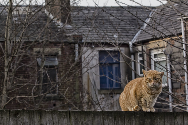
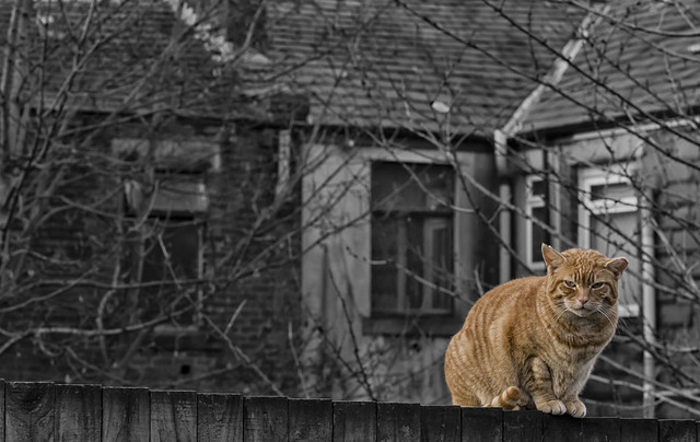
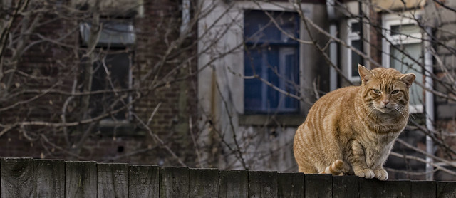
Week 7 : Gluttony
Week 8 :
Week 9 :
Week 10 :
Week 11 :
Week 12 :
Week 13 :
Week 14 :
Week 15 :
Week 16 :
Week 17 :
Week18 :
Week 19 :
Week 20 :
Week 21 :
Week 22 :
Week 23 :
Week 24 :
Week 25 :
Week 26 :
Week 27 :
Week 28 :
Week 29 :
Week 30 :
Week 31 :
Week 32 :
Week 33 :
Week 34 :
Week 35 :
Week 36 :
Week 37 :
Week 38 :
Week 39 :
Week 40 :
Week 41 :
Week 42 :
Week 43 :
Week 44 :
Week 45 :
Week 46 :
Week 47 :
Week 48 :
Week 49 :
Week 50 :
Week 51 :
Week 52 :
Id just like to say im really looking forwards to doing this challenge this year. I feel this is what i need to do to make me think outside the box with regards to the pictures im taking.
Ive just purchased some flash equipment for my 580ex ii so hopefully ill get plenty of use of that in my shots.
I look forwards to seeing the rest of the 52 Challenge unfold and your critique.
Many Thanks Lee
Week 1 : Sin
Week 2 : Season
Week 3 : Gravity
Week 4 : Wild
Week 5 : Space
Week 6 : Work
Week 7 : Gluttony
Week 8 :
Week 9 :
Week 10 :
Week 11 :
Week 12 :
Week 13 :
Week 14 :
Week 15 :
Week 16 :
Week 17 :
Week18 :
Week 19 :
Week 20 :
Week 21 :
Week 22 :
Week 23 :
Week 24 :
Week 25 :
Week 26 :
Week 27 :
Week 28 :
Week 29 :
Week 30 :
Week 31 :
Week 32 :
Week 33 :
Week 34 :
Week 35 :
Week 36 :
Week 37 :
Week 38 :
Week 39 :
Week 40 :
Week 41 :
Week 42 :
Week 43 :
Week 44 :
Week 45 :
Week 46 :
Week 47 :
Week 48 :
Week 49 :
Week 50 :
Week 51 :
Week 52 :
Last edited:


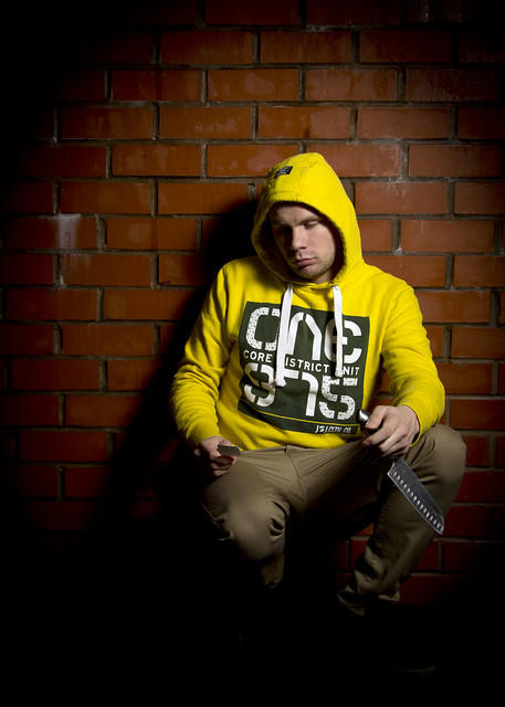
 dont think I would have got it without the explanation but that is not a bad thing. weel done for thinking a little outside the box