weekly overbez's 52 for 2013.... ** COMPLETE **

Gluttony.......Have you been watching my daughter make a cup of tea:D to be fair I used to have my tea very sweet many years ago but stopped suddenly and only have it now for the morning after the night before :D NIce shot and bang on theme.

Time........I think for your shot it needs to be bang on centre and perfectly straight and this is just a tiny bit out. Nicely lit though and good movement on the second hand.

(y)
 
Last edited:
Not sure if it was possible but I feel the leaves on the ground cause too much busyness in the background. Perhaps a shallower dof my have lessened this. As I said, it may not have been possible to do so. Iain

Cheers Iain, the stump was felled pretty close to the ground, I did take a shot at f/1.8 but of the 2 I preferred this one. The leaves were'nt really noticeably more blurred in that one either from memory.

Hi Graham
I knew there was something odd about that clock but didn't see it till I read your words..

Thanks Lynne, you're right about the brain, there's that sentence with only the first and last letter of each word correct - the others are jumbled but you can still read it perfectly well.
 
Right - week 9 already! I'm going to jump in with juxtaposition... been thinking all weekend about what to do with this one... until I came down this morning and it jumped out at me.

2 things placed close together for contrasting effect......

 
The daffodil may be a bit bright and a bit soft, but a good juxtaposition none the less.
 
Yes it's very clean as ever but maybe just to clean.
 
Excellent idea (I wish I'd thought of it :(), and the shot looks good on my screen. (y)
 
Hi Graham

Time - Both great shots, with both very fitting to the theme, the tree is the one for me
which shows the true meaning of time

Juxtaposition - Very clear, love the colour of the flowers set against the white back ground
 
cant add anything to the above comments nice BG looks good to me
 
I like your juxtaposition a lot. Good idea, nicely lit, good use of space. Very fresh and clean. (y)
 
Hi Graham


beautiful shots of the daffs....fab lighting , super focus , nice composition & a great White BG......love it :clap:

Gotta ask...is it 1 shot or 2 combined ? Everytine I try this sort of shot I end with focus DOF issues...can't seem to get both items as sharp as you've managed :crying:
 
That is nice!(y)

The simplicity of the composition, the colours and the sharpness are great. I like the way the angle of the flower and the bud from their stems is almost exactly the same too.
 
I like the way the angle of the flower and the bud from their stems is almost exactly the same too.

Shush - everyone else was kind enough not to point that out. :LOL: 
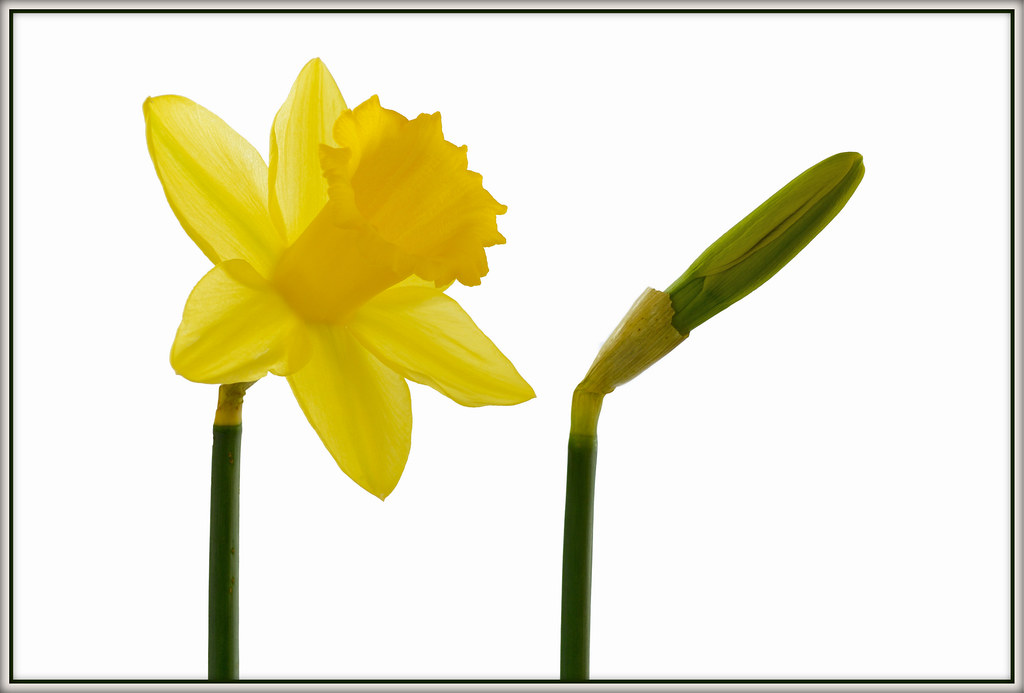
I agree the closed bud could come a tiny bit clockwise viewed from above.

Gotta ask...is it 1 shot or 2 combined ? Everytine I try this sort of shot I end with focus DOF issues...can't seem to get both items as sharp as you've managed :crying:

Single shot Lynne - actually the quickest one I've done to date. White paper sellotaped to kitchen wall, two daffs held in my third hand soldering stand.
Camera sat on a cardboard box :puke:, LED light shining on the background paper.
30mm @ f/8 about 40-50 cm distance = DOF about 8cm so no DOF issues.
Just processed, for a bright daffodil, selected the white / grey background in PS, inverted selection and then dodged to white.
The border colour is sampled off the stem of the daff's to blend better.

Here's the jpg SOOC.....
dsc2216d.jpg


Thanks for all the kind comments... (y)
 
Last edited:
Another (y) from me Graham.
A simple but effective take on this weeks theme.
I particularly like your processing on this, it has a lightness to it which really suits the subject.
Good work (y)
 
Time 1 - nicely lit shot and an interesting perspective too. Nice motion on the second hand as well. Echoing the comment above, I think a square crop would work well! (y) I think I prefer this shot over your follow up! (Didn't see your second until I'd commented on the first!)

Juxtaposition - Nicely shot (nice to see a 'how you did it' also!), good take on the theme too. Like it!
 
Last edited:
Hi, Juxtaposition is on theme, really pops and over well lit. Crit, I'd like to see them swapped around...I'd like to see a tad more light on the flowers, especially the RH one as it's a but dark.

Cheers.
 
Thought I'd have a bit of a change this week, as a few others have found - indoor shots can be easier to go for than outside ones.. So even in the cold I set out to try to capture ALL the letters ;), took me two dogwalks round the local area to get them all, and a few from indoors too.


Not all the individual images are great, all shot in jpg with minimal PP. But there is 26 of them there, and I think they work rather well together. I'd have loved to create each individual letter from the 26 shots, and then montage them into an alphabet on a single image... But I really don't think I have the time. :(
 
A friend of mine has created village signs based on letters from house names in that local village.
 
excellent pic I had a similar idea but didn't have the time to do it and wouldn't have done it justice i really like it :clap:
 
Cheers Guys,

Is that the new Nikon D5 :D

D5100 sadly - but more than enough for me at the moment!

Simple shots, nothing fancy, tried to keep enough of the surrounding to give some of the letters context, like with the D, and the N. Part of my reason for this weeks was to get out and try to be less inhibited taking shots in public spaces. Still wimped out of a few, like people's house signs. And I should have got closer to the R of the Range Rover.

And I also tried to have variety, and only take one letter from each "thing". Could have had them all from car number plates if I'd wanted!
 
Just to echo what everyone else has said Graham, your montage of images works well together. Nice vivid colours in there with a variety of context.

Good effort in getting out and about too. (y)
 
Great idea Graham, top marks. (y)

I have an ongoing project where I snap all the signs (well, the interesting ones) I see when I'm out and about with my camera, I don't know what I will do with them yet, but your collage reminded me of them...
 
A cleverly thought out idea Graham. Good contrast in colour range and well presented
 
Cheers everyone (y)


On to ELECTRIC..... Had to be pylons for me, the weather didn't look like playing with my limited times that I can get out, until a slight break yesterday evening. Left it a little late TBH, and took a wrong turn in the lanes which didn't help me either. :bonk: Really could do with a tripod too.

I have my favourite of the two I ended up with, here you go.......


and a bit of HDR.... as I wanted to catch some of the "electric" in the sky too.

 
Last edited:
Good work Graham, I like the composition and the processing skills there mate, especially on the second one. (the dark one may be a tad too dark?) (y)


I'm beginning to think that we have some kind of psychic connection... I've got LOADS of pylon shots in my collection but still I went and took some more, click through to my flickr and you will see the shots I took yesterday and how similar they are to yours. I ended up with SIX to choose from!
 
Back on form Brain.

I like the comp of the dark one but the overall feel of the HDR.

What hdr app do you use, ?
 
Seems like there were a few of us chasing pylons yesterday :)
I took some as well but couldnt get anything I liked. Well done on yours. I like the second one .....the light in the sky echoes the cables and the curves in the field add extra interest.
 
Hi Graham,
On your electric images I am going to have to be different here and say a combination of the two. The composition from #1 coupled with the sky from #2. I feel that #1 is too dark and #2 the composition isn't quite working for me. Not sure if that is because they are a little to central in the frame.
 
Hi Graham :)

Quick catch up....

Time - Nice clock that with the red second hand, really helps capture the movement of the time, liking the angle and lighting too :)

As for the trunk/rings... again a great idea, liking the colours and real nice detail :)

Juxtaposition - That works really well, nice clean background, sharp, well lit and good colour - Nice One (y)

Letter - Oh Yes... I love that, such a good variety of letters, I like how they are also not singular in each frame - a cracking image :clap:

Electric - I like them... of the 2 I prefer the first, would have been nice to see more red in the shot, but hey, that is asking a bit much :D
 
The first just looks too dark for me, could easily be my laptop though. A pity as the composition really works for me. I like the colours in the second shot a lot. The comp of the first and the tones of the second would be fantastic!
 
I'm beginning to think that we have some kind of psychic connection...

You could be right Brian, great minds do think alike. :LOL:

Back on form Brain.

Brain? Or Brian? Or Graham? :shrug: Not sure either Brian or myself have ever been Off form... :p

What hdr app do you use, ?

Have previously used Dynamic Photo HDR, but more recently using SNS-HDR. Both have free trials. Downside of HDR (especially when processed from a single RAW file rather than 3 seperate exposures) is noise. I really need to get a decent tripod, which will let me shoot at lower ISO, and also bracket three exposures to give the cleanest shots to start with.

I rather thought the HDR might divide opinion, but the HDR sunset is my favourite of the two. I'd have loved the sunset to be at the end of the run of pylons, but they run north - south, so was never going to happen.

Had a good play with the first one, and have posted three versions below. First is SOOC JPG, second is lightly HDR'd, and third is a single exposure, developed for the sky - hopefully a bit more red in there now too. And a bit brighter.


Cheers,
 
Back
Top