

You are using an out of date browser. It may not display this or other websites correctly.
You should upgrade or use an alternative browser.
You should upgrade or use an alternative browser.
weekly overbez's 52 for 2013.... ** COMPLETE **
- Thread starter overbez
- Start date
The goblin
<span class="poty">POTY Winner 2015</span></br>
- Messages
- 4,407
- Name
- Marsha
- Edit My Images
- Yes
Hi Graham,
Gluttony, I have a serious sweet tooth so can relate to sugar in tea/ coffee! I like the motion with the sugar bouncing off the side. I think the kettle needs to be all in or not at all
Time, again I like the motion of the seconds ticking by Not sure on the edge thats lit, again maybe the whole edge needs to be highlighted or none of it. And the backwards numbers REALLY mess with my head :bonk:
The rings on the tree stump are lovely and sharp, the added contrast really helps.
Juxtaposition, Very simple and clean, its amazing what can be achieved with some relatively simple PP 
Letter, very clever idea to shoot them all separately") Im still struggling with one letter let alone 26 :bonk:
Im still struggling with one letter let alone 26 :bonk:
Electric, I like the edited version of number one, love the colour and detail in the sky
All caught up again! I am rubbish this year at commenting!
Gluttony, I have a serious sweet tooth so can relate to sugar in tea/ coffee! I like the motion with the sugar bouncing off the side. I think the kettle needs to be all in or not at all
Time, again I like the motion of the seconds ticking by
Not sure on the edge thats lit, again maybe the whole edge needs to be highlighted or none of it. And the backwards numbers REALLY mess with my head :bonk:The rings on the tree stump are lovely and sharp, the added contrast really helps.
Juxtaposition, Very simple and clean, its amazing what can be achieved with some relatively simple PP 
Letter, very clever idea to shoot them all separately
Im still struggling with one letter let alone 26 :bonk:Electric, I like the edited version of number one, love the colour and detail in the sky
All caught up again! I am rubbish this year at commenting!
- Messages
- 8,398
- Name
- Lynne
- Edit My Images
- Yes
hi Graham
oooh, I do quite like pylon shots...especially when coupled with a good sunset
Just to be awakward I'd have #1 with the sky from #2 but then again I quite like the tyre trqacks in #2...sort of lead you round the pylon ! Really struggling to choose from the last 3 you posted up...think that would be the middle shot
Good work mister & a nice set
- Messages
- 19,461
- Name
- Andy
- Edit My Images
- Yes
Hi, I almost missed your link then
#1 for me. Well composed and good detail.
Pity you couldn't get a tad more colour in the sky. I'd like to see a little detail in the FG as well.
There is something about pylons that also appeals to me.
Cheers.
#1 for me. Well composed and good detail.
Pity you couldn't get a tad more colour in the sky. I'd like to see a little detail in the FG as well.
There is something about pylons that also appeals to me.
Cheers.
- Messages
- 4,828
- Name
- Alan
- Edit My Images
- Yes
Hi Graham
Letter - great idea - just love the samples that you have included - the old AA badge made me smile right away. Excellent shot all round
Electric - lots of views on comp from others and so i will just choose the one I like best - and that is #3 of the edited lot. Good sky, like the way that the pylons recede into the distance and into the dark. Hint of bright light to the right gives a feeling of hope in the gloom.
OP
- Messages
- 4,088
- Name
- Graham
- Edit My Images
- Yes
Hi Graham
Letter - great idea - just love the samples that you have included - the old AA badge made me smile right away. Excellent shot all round
Cheers alan, just for you... is an old lantern light type thing someone has on the front of their house's garage....

And I don't think I've tried processing an image more than this blimmin' pylon one.... last one. layered and painted through some foreground.
Just need to find a plylon run that goes east-west now!!

- Messages
- 4,828
- Name
- Alan
- Edit My Images
- Yes
Hi Graham - made me  at the thought of a garage being certified as a hotel by AA.
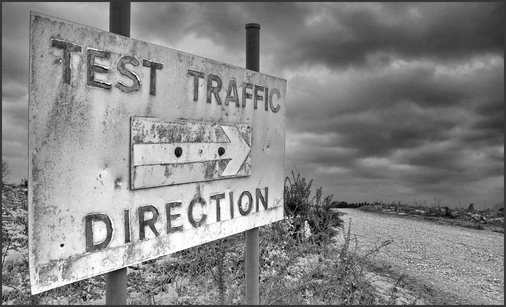
Direction - I like the bleakness of that. The combination of the arrow pointing one way, the road rising the other way, the doom laden clouds, the age and the message on the sign all lead me to think of this being the way to the end of the world Nce use of 'grey' mono to add to the atmsphere. Only minor bugbear for me is the bush in the middle which kind of stops me seeing the end of the road falling off a precipice (the flights of the imagination!)
at the thought of a garage being certified as a hotel by AA.Direction - I like the bleakness of that. The combination of the arrow pointing one way, the road rising the other way, the doom laden clouds, the age and the message on the sign all lead me to think of this being the way to the end of the world
Nce use of 'grey' mono to add to the atmsphere. Only minor bugbear for me is the bush in the middle which kind of stops me seeing the end of the road falling off a precipice (the flights of the imagination!)- Messages
- 13,760
- Edit My Images
- Yes
Excellent Graham, really like that, great composition, nice and sharp and love the sky - no crit from me
The goblin
<span class="poty">POTY Winner 2015</span></br>
- Messages
- 4,407
- Name
- Marsha
- Edit My Images
- Yes
Hi Graham. Really like your direction shot, great composition, the sign draws your eye nicely to the road and you keep on following it into the distance The mono conversion works too.
The mono conversion works too.blakester
Shine On Harvest Moon
- Messages
- 6,679
- Name
- Iain
- Edit My Images
- No
Chris above hit the nail on the head for me on this one Graham, he says very atmospheric, I agree.
I take it this is HDR? I am a fan of the technique and you have handled this well. The mono conversion suits the subject, bang on theme, good work all round for me.
I take it this is HDR? I am a fan of the technique and you have handled this well. The mono conversion suits the subject, bang on theme, good work all round for me.
OP
- Messages
- 4,088
- Name
- Graham
- Edit My Images
- Yes
Cheers everyone...
Tried raising the contrast a bit after your suggestion Matt, but there's already bright spots at the bottom of the sign, and increasing the blacks just made the clouds a bit too dirty. I wanted a silver grey effect to it - and played with the channel mixer for quite a while before it suddenly popped for me!
It is indeed a mono conversion of a HDR image. 3 exposures taken from a single RAW and merged. Well spotted Iain.
Just for fun - here's the SOOC jpg, with a straight B&W button press in Picasa..
Last edited:
- Messages
- 8,398
- Name
- Lynne
- Edit My Images
- Yes
Hi Graham
Liking the Direction shot a lot...really jumps out at you , B&W works just fab , nicely done with the HDR , moody sky...has a slightly creepy sinister feel to it...good work mister
Liking the Direction shot a lot...really jumps out at you , B&W works just fab , nicely done with the HDR , moody sky...has a slightly creepy sinister feel to it...good work mister
- Messages
- 5,787
- Name
- Storm Trooper
- Edit My Images
- Yes
Juxtaposition....simple idea for a theme most went
Letter.....Nice idea, the overall image is what's important rather than each one separately although I can't really see any weak ones.
Elextric....First one is too dark for me but I like the composition, the second has the great sky. If you could have had the second sky in the first shot
Direction...This one is great, lots of detail in the aging old sign and a real moody sky as the back drop. It could almost be from the start of a film showing a post apocalyptic England.
OP
- Messages
- 4,088
- Name
- Graham
- Edit My Images
- Yes
Cheers all - only posted up the SOOC of my Direction shot to show what I started from. The composition is the same but it has none of the drama, and depth or atmosphere of the processed version.
---------------------
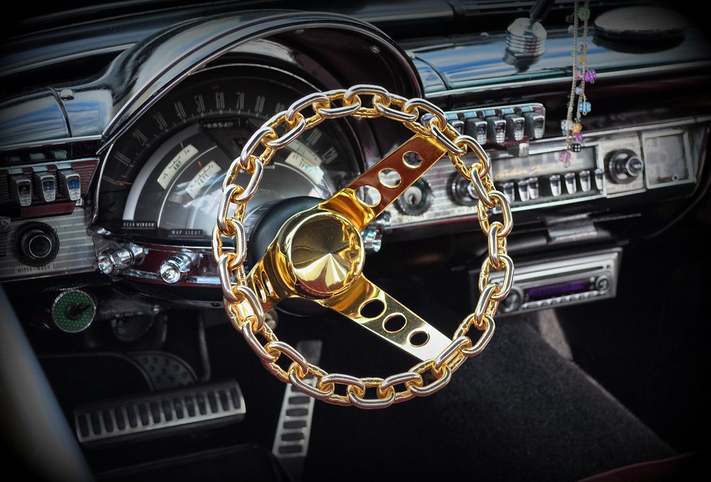
Wondered where I was going to go with "Tacky", until we visited an American / hot rodders car show on Good Fridaythumbs: for the early theme release ).
Hope this doesn't offend anyone... I'm sure the owner doesn't see it as tacky, but I'm afraid I do - along with the coffin and spiders and vampires that were in the boot of this hearse!
---------------------
Wondered where I was going to go with "Tacky", until we visited an American / hot rodders car show on Good Friday
thumbs: for the early theme release ).Hope this doesn't offend anyone... I'm sure the owner doesn't see it as tacky, but I'm afraid I do - along with the coffin and spiders and vampires that were in the boot of this hearse!
Last edited:
- Messages
- 4,828
- Name
- Alan
- Edit My Images
- Yes
Hi Graham
I am with you on the judgement of tacky - also must hurt hands to drive it. Good PP to make the gold really stand out from a muted b/g. - but for some reason my eye keeps beng drawn to the speedo area - it must be that large cowl I suppose. - but that is what you had to work with.
I am with you on the judgement of tacky - also must hurt hands to drive it. Good PP to make the gold really stand out from a muted b/g. - but for some reason my eye keeps beng drawn to the speedo area - it must be that large cowl I suppose. - but that is what you had to work with.
- Messages
- 19,461
- Name
- Andy
- Edit My Images
- Yes
Hope this doesn't offend anyone...
that's what I thought when I saw this theme. Beauty is in the eye of the beholder, as they say.I actually like the wheel, tackiness and all
the lower left draws my eye away a tad as does the green whateveritis Direction works really well for me. Has a real post apocalyptic feel to it. The sky is wonderfully grim and the arrow really stands out.
Cheers.
OP
- Messages
- 4,088
- Name
- Graham
- Edit My Images
- Yes
Cheers Andy - you're right about the green circle round the switch - I was actually in the process of de-saturating that as you posted. The line is the top of the window glass - which was only open about 2 inches.
Post above edited rather than re-post now.
The line is the top of the window glass - which was only open about 2 inches. Post above edited rather than re-post now.
Brian_of_Bozeat
Jeff
- Messages
- 3,235
- Name
- Brian (not Jeff)
- Edit My Images
- No
Superb take on the theme Graham and very well processed too. A cracker mate
M
Mad Hatter
Guest
Hi Graham 
Electricity: I really like your Pylon shot. Parallel pylons, great sky & ground blends well with the darkness of the pylons. The red sky adds impact to the background.
Letter: Very original. Like the different colours of brickwork from the garage and the background helps the impact of the lantern.
Direction: Like the mono version but I really like the HDR version, with the arrow to the shiny road and dark heavy cloud. A sinister test site..
Tacky: I'm not sure Graham, its within theme and colours help but think a slight 'blur' or plsay with 'dof' on the speedo and console may help? I'm no expert but too much detail that distracts from the wheel?
- Messages
- 2,156
- Name
- Nick
- Edit My Images
- Yes
Tacky indeed!
Love the processing in particular, it really works with the shot, helps the bling of the wheel stand out, and gives a lovely feel to the chrome. Nice comp, and the vignette works. The reflections in the speedo/column to the left of the wheel are a tiny distraction if I'm being picky, but it's a really nice image overall.
Love the processing in particular, it really works with the shot, helps the bling of the wheel stand out, and gives a lovely feel to the chrome. Nice comp, and the vignette works. The reflections in the speedo/column to the left of the wheel are a tiny distraction if I'm being picky, but it's a really nice image overall.
The goblin
<span class="poty">POTY Winner 2015</span></br>
- Messages
- 4,407
- Name
- Marsha
- Edit My Images
- Yes
Hi Graham. Now that is tacky, I know some people love their cars, but whoa this takes the biscuit. I'm not bothered about any of the reflections or buttons and things behind as it's a car and you probably didn't have much room to move. I would maybe crop clone the line thing bottom left that's it. I must add that I rather like the tacky chain of dice hanging in the background too, that just sets it off for me. This owner needs bling dice, not the furry kind