You are using an out of date browser. It may not display this or other websites correctly.
You should upgrade or use an alternative browser.
You should upgrade or use an alternative browser.
weekly overbez's 52 for 2013.... ** COMPLETE **
- Thread starter overbez
- Start date

Brian_of_Bozeat
Jeff
- Messages
- 3,235
- Name
- Brian (not Jeff)
- Edit My Images
- No
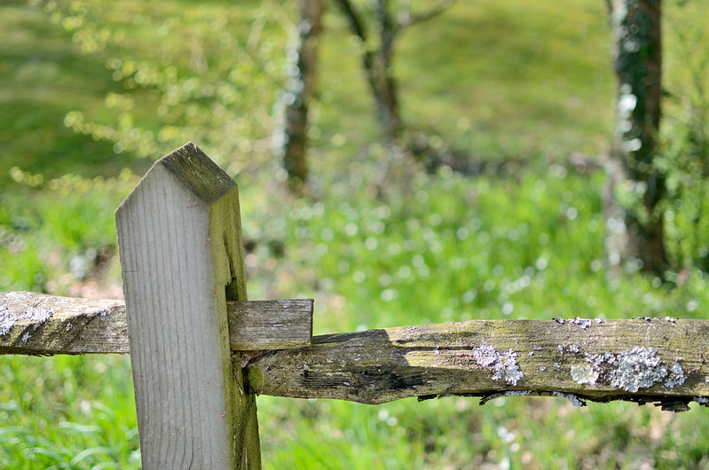
Rustic indeed, Nice Bokeh (or however you say it!) Like the lichen too! ")
- Messages
- 4,828
- Name
- Alan
- Edit My Images
- Yes
Hi Graham
Rustic - good idea, on theme, Like the composition and the light and shade across the fence. Rather like the contrast between old and new and the lichen - illustrates how timber often ages to grey rather than brown.
Good separation of the background but not sure sbout the inclusion of the RH tree but would not crop it out as the balance of the rail is just right IMO
- Messages
- 5,787
- Name
- Storm Trooper
- Edit My Images
- Yes
As already said, the post is a little too new in contrast to the very old rails, a closer shot without the post could be a better option.
OP
- Messages
- 4,088
- Name
- Graham
- Edit My Images
- Yes
The 2nd attempt at the Lego triangle works great, the only thing that annoys me is that I can't figure it out!
.
Angle: i like the lego, cant work out how you did it though, just been looking at it for a while too!
Thanks, I am rather pleased with it, I could tell you how it was done but that would ruin it for you.

For rustic, I rather like the trees, feeling they add depth to the shot, which considering the side on view of the fence, I felt it needed, I did try a few looking along the fence and the perspective shot, but preferred this one with the shimmery bokeh from the morning light on the grass behind.
OP
- Messages
- 4,088
- Name
- Graham
- Edit My Images
- Yes
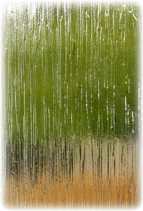
Week 18 - Kind....
a really theme from the moment I saw it... from a trip to a farm on the hot Bank Holiday Monday, the kindness of children to baby animals......
Think it turned out OK - given it was in midday sun, in a crowded farmyard with distractions to all sides, hence the tight framing (not a crop) leaving me no room to straighten it :bonk: But I like it, although I'm not sure where my youngest got his invisible chick from????
CLICK PIC FOR BIGGER, and again to zoom closer

a really
theme from the moment I saw it... from a trip to a farm on the hot Bank Holiday Monday, the kindness of children to baby animals......Think it turned out OK - given it was in midday sun, in a crowded farmyard with distractions to all sides, hence the tight framing (not a crop) leaving me no room to straighten it :bonk: But I like it, although I'm not sure where my youngest got his invisible chick from????
CLICK PIC FOR BIGGER, and again to zoom closer

Last edited:
- Messages
- 13,760
- Edit My Images
- Yes
Awwweeee bless look at him/her
Nice shallow DoF, nice feather detail, think it needs a tad of a straighten, but love the look on their faces
Angles - Damn... that's well done, very effective
Rustic - Simple but very suitable and a pleasing shot, again love the shallow DoF
Nice shallow DoF, nice feather detail, think it needs a tad of a straighten, but love the look on their faces
Angles - Damn... that's well done, very effective
Rustic - Simple but very suitable and a pleasing shot, again love the shallow DoF
Last edited:
- Messages
- 4,828
- Name
- Alan
- Edit My Images
- Yes
Hi Graham
Kind - fits the bill well. Good strong focus on the chick and the RH son. Good capture of expressions and the dof works well.
I am in Spain at the moment and i sympathise with your difficulty over the strong light. Good for vitamin D production but reduces the photo opps. But you have handled it well.
I agree with DK about the straightness and the area at the LH side is a bit distracting, but you are right that the tight framing leaves you no option, as otherwise you would lose the boy's hat and eyes.
Kind - fits the bill
well. Good strong focus on the chick and the RH son. Good capture of expressions and the dof works well.I am in Spain at the moment and i sympathise with your difficulty over the strong light. Good for vitamin D production but reduces the photo opps. But you have handled it well.
I agree with DK about the straightness and the area at the LH side is a bit distracting, but you are right that the tight framing leaves you no option, as otherwise you would lose the boy's hat and eyes.
Brian_of_Bozeat
Jeff
- Messages
- 3,235
- Name
- Brian (not Jeff)
- Edit My Images
- No
Hi Graham, I LOVE how the boy in the background is waiting patiently for his turn. They both have kind faces so you're on theme as far as I'm concerned.
I can see why you went for a shallow depth of field but I can't help thinking that the little chap in the background deserves to be in focus too?
I can see why you went for a shallow depth of field but I can't help thinking that the little chap in the background deserves to be in focus too?
blakester
Shine On Harvest Moon
- Messages
- 6,679
- Name
- Iain
- Edit My Images
- No
Hi Graham,
Good work on kind, it has a strong composition with the triangle of the three subjects. You've held all the detail in the subjects in what looks like strong lighting, well done there.
I agree about the lad at the rear, maybe a little more dof to bring him into focus.
Good work on kind, it has a strong composition with the triangle of the three subjects. You've held all the detail in the subjects in what looks like strong lighting, well done there.
I agree about the lad at the rear, maybe a little more dof to bring him into focus.
- Messages
- 532
- Name
- Ray
- Edit My Images
- Yes
Well that's just lovely, isn't it.
OP
- Messages
- 4,088
- Name
- Graham
- Edit My Images
- Yes
........il, think it needs a tad of a straighten,.
You're too kind, needs more than a tad!!
Having said that, the DOF really exaggerates the sharpness of the hands and the duckling.
I was actually quite impressed myself with the sharpness of the focal area. I've linked a larger version in the post above now too.
Cheers everyone,
Last edited:
- Messages
- 8,398
- Name
- Lynne
- Edit My Images
- Yes
Hi ya
Kind....hmmm...yup , love the sharpness of the fluffy one & the looks on the boys faces , given your restrictions I think it's turned out well
Vertical....can't ague with it being vertical , good DOf & like the minimal tonal range
Kind....hmmm...yup , love the sharpness of the fluffy one & the looks on the boys faces , given your restrictions I think it's turned out well
Vertical....can't ague with it being vertical , good DOf & like the minimal tonal range
- Messages
- 5,787
- Name
- Storm Trooper
- Edit My Images
- Yes
Kind, a big aaaawwwww thats so fluffy and cute!!!!!!
Vertical, well that's pretty much the theme straight up and no staging required. It's great to use something your doing for a theme.
Vertical, well that's pretty much the theme straight up and no staging required. It's great to use something your doing for a theme.
- Messages
- 13,760
- Edit My Images
- Yes
Hi Graham
Vertical - Now I really like that, my type of image, bang on theme, great colour, no crit at all from me
Vertical - Now I really like that, my type of image, bang on theme, great colour, no crit at all from me
OP
- Messages
- 4,088
- Name
- Graham
- Edit My Images
- Yes
Cheers all - I did have a go at a B&W after your suggestion Andy - but really could'nt get it to work....
And my re-shoot, waaaay back from week 7....... You all said......
Well here it is without the blimmin' kettle, and if anyone says that on reflection they prefer it in.............. :nono: As before - I took one shot to start with (got my remote release now), and then took a few tipping sugar into the mug, picked the best and layered it over the first, and painted out all the spilled grains to give a clean worksurface.

And my re-shoot, waaaay back from week 7....... You all said......
I'd prefer less clutter and may loose the kettle.
Only crit would be that I don't think the kettle adds anything to the shot!
, I feel would benefit from losing the kettle from the scene.
I think I'd agree with wanting to lose the kettle, .
agree about the kettle,
agree with majority as to losing the kettle,
although I agree that the kettle could be left out.
I'd also lose the kettle
but kettle is not needed.
Well here it is without the blimmin' kettle, and if anyone says that on reflection they prefer it in.............. :nono: As before - I took one shot to start with (got my remote release now), and then took a few tipping sugar into the mug, picked the best and layered it over the first, and painted out all the spilled grains to give a clean worksurface.
Last edited:

- Messages
- 13,760
- Edit My Images
- Yes
Yeah I like this too, again great sense of movement caught in the sugar, nicely lit, composition - and liking the tiles
- Messages
- 5,787
- Name
- Storm Trooper
- Edit My Images
- Yes
I do miss the kettle
apart from all that much better

- Messages
- 19,461
- Name
- Andy
- Edit My Images
- Yes
Ditto.
I'd like to see it a bit warmer, but nice motion blur. Cheers.
- Messages
- 4,828
- Name
- Alan
- Edit My Images
- Yes
Hi Graham
Vertical - spot on. Good colour , good focus on the bubble and super b/g with good symmetry
Reshoot - yes you do have a sweet tooth! Very clean and clear.
Vertical - spot on. Good colour , good focus on the bubble and super b/g with good symmetry
Reshoot - yes you do have a sweet tooth! Very clean and clear.
- Messages
- 8,398
- Name
- Lynne
- Edit My Images
- Yes
Hi Graham
nuffink to say about your reshoot....
nuffink to say about your reshoot....
Brian_of_Bozeat
Jeff
- Messages
- 3,235
- Name
- Brian (not Jeff)
- Edit My Images
- No
Vertical: Oh come on anyone can see that you photoshopped that bubble into the right place
Seriously though, what a great idea and you have shot & processed it to perfection, looks like a pamphlet shot for a "how to" from the DIY shop. 10 out of 10 mate.
Re-shoot. I just looked at the two side by side (old and new) and it's nice to see the improvements you have made since then. (and how much you have learned) Well done Graham.
anyone can see that you photoshopped that bubble into the right place Seriously though, what a great idea and you have shot & processed it to perfection, looks like a pamphlet shot for a "how to" from the DIY shop. 10 out of 10 mate.
Re-shoot. I just looked at the two side by side (old and new) and it's nice to see the improvements you have made since then. (and how much you have learned) Well done Graham.