weekly overbez's 52 for 2013.... ** COMPLETE **

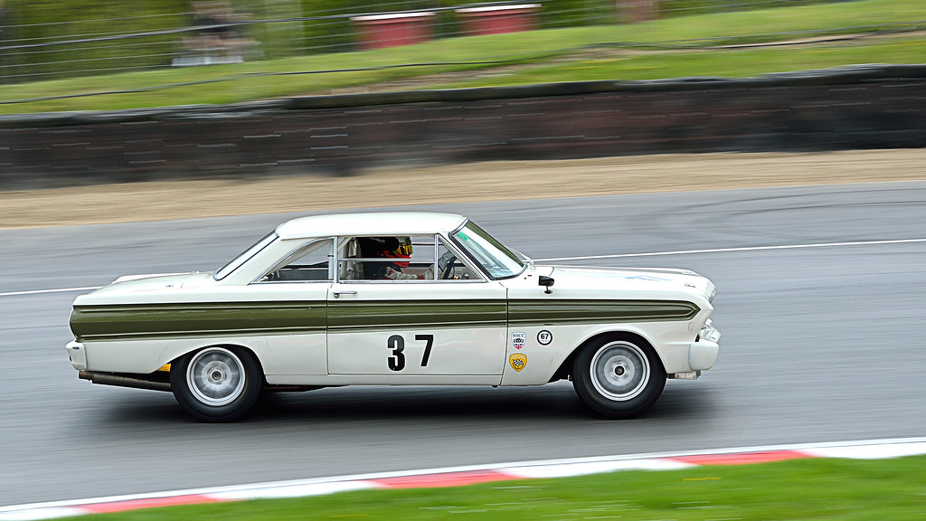
Someone has a sweet tooth! Nice sense of movement in the reshoot image.

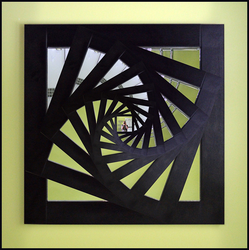
I came here to comment on the frosted glass image, I love it. The colours are really nice and it suits the border. I've tried this many times, especially on wet days when you also get the water drops. :)
 
Thanks, think that must be my first ever abstract shot. :eek:

How about a bonus SP pattern shot too? Could have continued further in - but the image in the centre would have been too small...


Few problems here - not enough light, managed 1/30th at ISO 1600. Also mirror is a rectangle so had to move the sides in to make it square before copy and paste to new layer and then rotating and resizing.
 
Last edited:
Have to say number 2 the frosted glass for me though I quite like the mirror pic also (y)
 
Graham, I've NO idea how you did it, but the second lego angle treatment is really excellent! Like Rustic too; lovely detail in the lichens etc, and nice sparkly oof background. Kind, yes, the look on those faces is very well captures. Vertical... well, it IS vertical, but not sure if the two horizontal lines of the fence aren't leading my eye out of frame.
 
Pattern: I'm surpriised at how much I liked your second shot, with the frosted glass. There's nothing there at all, but I really did enjoy it. But I really, really liked the spiralling mirror pattern. Very cleaver and well thought!
 
Hi Graham,
#2 for pattern gets my vote. Its a simple but very effective take on the theme. The processing works well with the subject, particularly the border? with the pattern gently fading out.

Your spiralling mirror is very effective too but feel the frame a little too dominating in the image. I feel that it takes a little away from your sp within the image IYSWIM. It takes nothing away from this clever piece of editing though (y)
 
For me your bonus Pattern shot works best. Really strong colours and swirl draws the eye into the self portrait. Great shot!
 
The SP bonus:

Sometimes when I view the picture thread to see what's new an image will jump out at me and I will think "wow, nice shot" or "oh, that's a clever idea".

This image did both for me. 10 out of 10, I Love it. (y)
 
The processing works well with the subject, particularly the border? with the pattern gently fading out.

Border is a white vignette applied a couple of times in Picasa. (y)

Cheers all, surprised the frosted glass got that much appreciation, its a fair way on from the original SOOC...

11dsc3465.jpg


shot at an angle with the on board flash to catch the highlights on the raised parts, f/8 to keep it all in focus. Then PP to boost the contrast and saturation (and crop).

Your spiralling mirror is very effective too but feel the frame a little too dominating in the image. I feel that it takes a little away from your sp within the image IYSWIM.:

Iain, did you mean the green background and black border -- or the actual black frame of the mirror? Did just try a crop without the green, and didn;t like it as much, and the frame of the mirror (only one of two in the house I realised!!) is what makes up the bulk of the pattern for me, the image in the centre was intended to be a small bonus - rather than the main part of the image.

All good fun though. Hoping for a theme I can shoehorn around racing cars or tents and beaches for this week. :nuts:
 
Last edited:
very much like the mirror pattern shot, been scratching my head as to how this was achieved!
I don't necessarily agree about the frame dominating too much - this is really the bulk of the pattern effect so that seems fine to me.
 
cheers chris, primary objective was "pattern", as you say. (y)

Pretty simple really, hardest part is getting the starting point, the (exactly) square mirror frame (from a rectangular miror :bonk:). Used the distort tool to pull the corners a slight amount.

Then, rectangle marquee select tool to select the mirror frame (holding down shift (i think) to constrain it to square), copy, paste, makes selection appear as new layer, transform 20º angle, resize to fit (holding down shift+alt to resize it about centre and constrain to square), paste again and repeat with 40º, 60º, etc angle. Finally rotate whole thing 180º.

:D
 
I preferred the cd, nice colour against the black background. The bonus image is just fantastic, no idea how its done but I love it (y)
 
Pattern, the bonus sp is the one I like the most. The photoshop trickery has provided a great pattern and your sp is small enough to keep you identity secret :D
 
WEEK 21 - Movement.......

Movement - simple. Brands Hatch, panning shots. Hmmm, not so simple really - not when you set yourself a high standard of acceptable sharpness. Got a few keepers, think this one shows most movement, stood on the inside of Druids hairpin, this chap powersliding round each lap.


Week 21 - Movement by overbez, on Flickr

And a couple of other contenders - the red one for sharpness, and the Escort for 1/30 sec @ 210mm. :D


1/50 sec, 86mm


1/30 sec @ 210mm

(And Photoshop skillz too - was going right to left - but I've got a real left to right OCD developing, so flip and sort out the signs and numbers too).
 
Last edited:
Love the pattern mirror shot, a great take on the self portrait, but the colours and abstract nature of #2 take it for me. Movement #3 has it IMO, the shots are all good, all pretty similar, but that combination of colours just works really well.
 
You're right Andy - I've not cropped any off the fronts... I did try moving my focus point over to the right for a few, thinking about it now, I should have maybe moved it left, and tracked the centre of the car with it - therefore giving more room ahead. :bonk:
 
As Andy said a bit more in front, but you have got them nice and sharp I quite like the last one for the BG its less cluttered, three very good shots though overall :clap:
 
Thanks. (y)

Onto below..... seem to be a few common themes developing here, so I'm going to get in before this one gets taken :LOL:

Gulfstream jet on approach to Farnborough airport. Was actually the first of three that come over the field in the 45 minutes I was there, and they all followed a different path. Obviously I wanted to be right below it for the shot, which I nearly am. (Although looking closer I think I am, just the plane is not quite level).

 
Last edited:
That's ace. :clap:

Great Idea and I love the processing too, drop shadow looks nice and suits the subject.

I wonder would it look even better with slightly more sky to the rear of the plane?
 
That's ace. :clap:

I wonder would it look even better with slightly more sky to the rear of the plane?

Cheers Brian - damn, more space needed at the front of my cars in "movement", and now more behind my plane :bang:

Can only give you a bit more, original post edited just for you, does work better like that too. (y)
 
That works really well really nice exposure and it looks like you are right under it to me :clap:
 
Thanks guys..This was the first that came over, only get one every 15-20 minutes, second one I got similar but had no markings / colour on the underside, and the third one I thought I was under till the last minute when I realised I was about 10 metres out.

Were you just looking up or flat on your back ??

It was coming straight towards me, picked my position and panned with it up and over my head till I couldn't lean back any further.

Well lit, did you use flash :)

Seriously?? :LOL: Was 2 miles from the runway - must have been 100-150 foot up, not sure my flash is going to carry that far. :)
 
The shots from Brands Hatch are great.

Below, excellent have your ears recovered yet?
 
Hi Graham

Pattern - good creative work on these. not keen on the cd as photos of them always seema bit fuzzy and for some reason the backwards word on the rear grabs my attention - and there you are talkingof your r to l OCD :thinking:

The mirror shot is clever but the glazing shot is my choice. good colours, graduation and lovely fal off to the edges.

Movement - good set and all work fof the theme. Ilike #1 mainly because of the way that the colours work well together.

Below - godd idea (y) good lighting and comp and very clear.
 
Cheers Brian - damn, more space needed at the front of my cars in "movement", and now more behind my plane :bang:

Can only give you a bit more, original post edited just for you, does work better like that too. (y)

Yes I think that's perfect now (y)
(a,hem content aware fill, cough)

Your panning shots are ace mate, you are getting pretty handy with that D5100... sorry I missed commenting on them last week.
 
The shots from Brands Hatch are great.

Below, excellent have your ears recovered yet?

Thanks Nicky - was only a little Gulfstream on landing - so not that noisy at all.

Pattern - good creative work on these. not keen on the cd as photos of them always seema bit fuzzy and for some reason the backwards word on the rear grabs my attention - and there you are talkingof your r to l OCD :thinking:

Cheers Alan, I did actually flip the CD to get the writing correct - but that then left the line of the pattern no longer going bottom left through to top right. :bonk:

Yes I think that's perfect now (y)
(a,hem content aware fill, cough)

Your panning shots are ace mate, you are getting pretty handy with that D5100... sorry I missed commenting on them last week.

Thanks Brian, no cloning or filling there - just slightly less of a crop. Original I did to match the distance from the wingtips to the edges.

(y)
 
Apologies Graham, never got to comment on your shots for movement during the week :(
The three panning images are fantastic, you've really captured the sense of movement whilst having critically sharp details on the cars.(y)

Below, again bang on theme, simple take but effective (y)
Maybe a boost in the colour of the sky to increase the contrast between the plane and the sky?

Good work (y)
 
Wow Graham !!!
That bonus pattern shot that you posted is absolutely spot on.
Really, really like that idea and you've executed it brilliantly.

Those panning shots are great too.
I'm always in awe of anyone who can pull that off well - I only ever tried it once with pretty disastrous consequences :LOL:
Looks like you've definitely mastered it.
 
Apologies Graham, never got to comment on your shots for movement during the week

Maybe a boost in the colour of the sky to increase the contrast between the plane and the sky?

No worried Iain.... I did play with the sky a fair bit, and contrast in general, before accepting that there is pretty much one colour in the sky, and one in the plane, and that's it!!Sometimes natural is best, my only extravagance here was the drop shadow, in the same direction as the highlights caused by the sun... (y)

Wow Graham !!!
That bonus pattern shot that you posted is absolutely spot on.
Really, really like that idea and you've executed it brilliantly.

Those panning shots are great too.
I'm always in awe of anyone who can pull that off well - I only ever tried it once with pretty disastrous consequences :LOL:
Looks like you've definitely mastered it.

Thanks very much Sarah... I feel strangely honoured to have had you visit my thread..

Can you please keep the "easy" theme's coming.. (y)
 
Thanks very much Sarah... I feel strangely honoured to have had you visit my thread..

Can you please keep the "easy" theme's coming.. (y)

:rules: Careful what you wish for.
Somebody asked Simon that in one of the early years of the 52 and "easy" ended up going into the bag as a theme :LOL:

I'm hoping some sanity will return to my life soon (work has been hell for the last few months) and I'll get to spend some more time actually commenting on these threads!
 
Pattern: Love the 2nd one, nice abstract.

Movement: My beloved Brands! Nice sharp shot.

Below: Fab idea. Nice details and exposure.
 
Back
Top