weekly overbez's 52 for 2013.... ** COMPLETE **

Cheers Guys, nice comments - always helps to hear why someone likes something, the leading lines was something I actually consciously included this time....

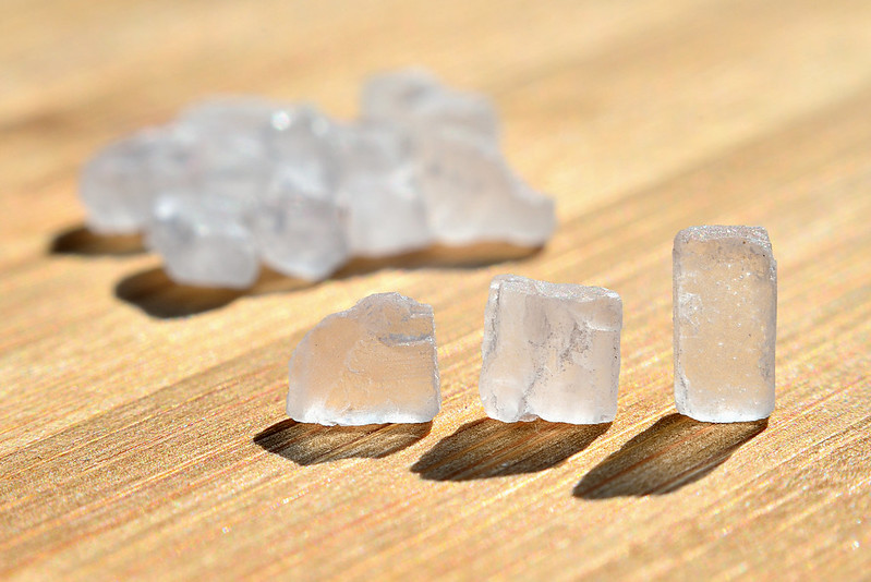
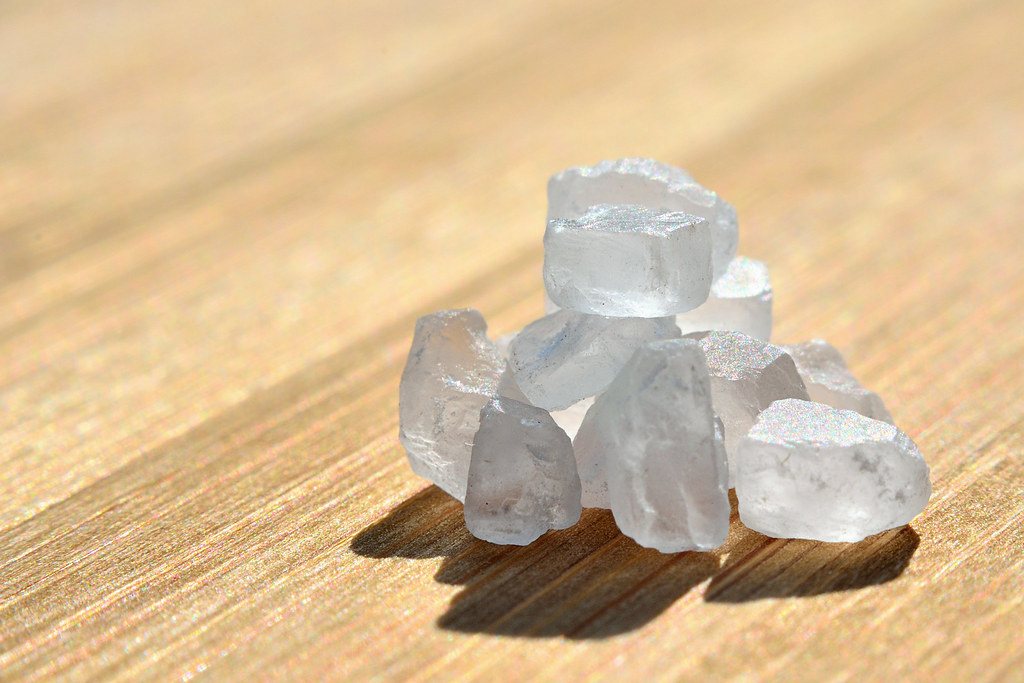
Are you teasing me DK?? It was hard enough trying to balance them up in a little pile, let alone trying to hoover tiny salt crystals, and as for trying to wash them :LOL:. (This is rock salt for putting on food, not for clearing snow off the driveway BTW)....

Here's another from the shoot - was really hard to choose between the two.

 
Hi Graham

think I'm with the other's on comments , great clarity , shadow,color & lead in lines.....(y)
 
Hi Graham,
I like your additional shot too and I can see why you had trouble choosing.

When I first looked at it, an idea immediately sprung to mind, to me it looks like a mini Stonehenge and think that stacking the rocksalt in a circle using the same light would be really effective.

The light shining through the crystals and casting those lovely shadows is a very appealing look.

Sorry for the rambling :LOL: just thinking 'out loud'
 
Thanks all, glad to see the first edit getting approval too...

Think the one you like is the soft focus (done in Picasa), I linked a full size version for Brian on the last page ( >>>> or also here <<<<)


And onto Rock, week 25 - nearly half way! :banana:

Rock salt.... tried a few shots inside, but found them very flat, so out to the garden to get some light behind the crystals.


Very nice idea and beautifully shot. To be honest I find the wood grain and colour distracting and take my eye away from the main image. Perhaps b/w would work better?
 
Graham IMO that rock crsytal shot is absolutely superb :notworthy:

Beautiful light and really well thought out.
Did you arrange all those crystals by hand or did you have to resort to tweezers?
I like the 2nd version, but I think you picked correctly with the one you chose. Well Done.
 
think I'm with the other's on comments , great clarity , shadow,color & lead in lines.....(y)

Thanks Lynne. (y)

............... to me it looks like a mini Stonehenge and think that stacking the rocksalt in a circle using the same light would be really effective.

hmmmmm - cheers Iain, I see your thinking and the potential there, also seeing a lot of frustration in finding the right size and shape pieces and actually getting them balanced.....

To be honest I find the wood grain and colour distracting and take my eye away from the main image. Perhaps b/w would work better?

Did try a couple of B&W conversions, but even on this one from the garden, I couldnt get a good pop of the crystals against the BG. All opnions welcome. (y)

Did you arrange all those crystals by hand or did you have to resort to tweezers?

Hi Sarah, thanks for looking in a gain, set out by hand, these are not that small, larger than table salt or sugar grains. A bit fiddly, but just manageable by hand.

Hi, Rock #1 for me. I did wonder whether something to show the scale may help, but, nah, works well as it is.

Good point Andy, suppose the only thing to imply scale is the woodgrain, but thats not definitive, maybe a salt grinder base in the BG could have worked, not somthing I thought of... :thinking:
 
Week 26 - Pair...... What was again, a seemingly easy theme, has proven to be not quite so simple........


Was trying to work something around a pair of hand carved elephant bookends, but struggled with backgrounds mostly, and we have builders in for the next three weeks, so in my change from a bag of donuts, I got a couple of shiny 10p coins........... looked freshly minted in my hand but are already showing a few scars.

 
Very good detail. (y) and spot on alignment, if I didn't know better (I can see the scratches) I might of thought you had copied one to become two in PP. :)

I'm not sure if my monitor is a little bit bright but there is a glow around each of the coins that is a little bit off putting... how did you light this?
 
Yeah, works for me. I wasn't sure about the BG and had a quick edit, making it white, but I prefer the light grey.

Composition is fine, but wonder what it would look like with them on the left, entering the frame?

Cracking shadows, though.

Cheers.
 
cheers guys - Brian, was lit purely by daylight - on a pretty overcast day so should have been a fairly light, even source fron the right side of the coins, sheet of photo paper (non shiny side up) under the coins and curved up behind them..... Wonder if the glow / halo light be a trick of the eye to some degree although brightness levels range from 225 in the BG up to about 230 closer to the coins so there is something there.. :shrug:

Thanks DK, was the shiny that made them jump out to me in the first place.

Andy, I'm a bit wary of going completely white for a bg in case it distances the object, hence why I wanted shadows and didn't up it to completey white.... Interesting how much "colour" is still in the coins, I did a B&W but found the shinyness disappeared.
Trying to fight my L to R developing OCD. :nuts: ;)
 
nice and sharp and really well aligned that must have been difficult, cant add anything to whats been said
 
Hi Graham,

Process, love the second shot with the nine differently processed shots (y) Not sure on the blurry one though, it just looks pushed a bit too far :thinking:

Rock, lovely detail in the rock salt itself. I like the grain of the wood leading in from the bottom left with the DOF tailing off towards the back of the shot (y) Just the right amount of shadow.
I like the second one, but I think I'd prefer the three salt pieces on their own without the little pile behind.

Pair, the grey background works here, as does the slight shadow under the coins.

Cheers.
 
Hi Graham


cracking pair of coins...love everything about it ( almost)......great even lighting , lovely shadows , really sharp with plenty of detail :clap: cos I'm awkward I really wanna see them closer to the lhs with more room on the rhs..
 
It's the first rock shot for me. DOF is spot on, nice comp and colours, and the shadow really gives it something.

I love the simplicity of pair. The lighting and composition are spot on.
 
nice and sharp and really well aligned that must have been difficult, cant add anything to whats been said

Thanks Allan, I lost count of the number of times I knocked them over trying to get the second one into place.. nearly gave up and went with Brians thought of just duplicating the one, but taht would give too perfect a pair!

Process, love the second shot with the nine differently processed shots (y) Not sure on the blurry one though, it just looks pushed a bit too far :thinking:

Given the theme, I thought I might get away with going a bit heavier on the processing than I might have normally done. ;)

I like the second one, but I think I'd prefer the three salt pieces on their own without the little pile behind.

Thanks Marsha, that was one of the other ideas I tried...... here it is, just for you....

faw8.jpg


Nice, Graham - I especially like the reverse light (if that makes sense) where the coins have reflected the darkness of the studio at the top and whiteness of the background at the bottom.

It's the first rock shot for me. DOF is spot on, nice comp and colours, and the shadow really gives it something.

I love the simplicity of pair. The lighting and composition are spot on.

Cheers Tony & Nick, nice to hear why someone likes something, much appreciated.

cracking pair of coins...love everything about it ( almost)......great even lighting , lovely shadows , really sharp with plenty of detail :clap: cos I'm awkward I really wanna see them closer to the lhs with more room on the rhs..

Like this?? (My old friend the horizontal flip, once for the image, and then individually on the two coins)..

qz87.jpg
 
Cheers Alan,

WEEK 27 - Shape....

Now I have struggled with this one A LOT!! Not sure if its the massive scope a theme like this yields, or making something like a simple 'shape' into something special........

How does it go Andy?? Post and be damned............

So this was on the floor (thin perspex type material), as I was walking the dog this morning - looking up, down, all around for inspiration. Sheet of white paper and a metal corrugated "in-tray" added too, and ta-da!

 
Post and be dammed indeed :)

Coin edit works for me.

Shape, I agree, it's those that have so many possibilities that are often harder.

Looks good to me but I'm on phone shop will comment tonight.

Cheers.
 
Post and be dammed indeed :)

Coin edit works for me.

Shape, I agree, it's those that have so many possibilities that are often harder.

Looks good to me but I'm on phone shop will comment tonight.

Cheers.

Yeah, now on laptop and this absolutely works for me. Minimal, of which I am a fan. Composition, works well. The contrast between the smoooootth curves of the oval shape and the, if you like, harsh, grid of the background is superb. The hint of shadow, yup.

I was a bit :thinking: about the lime green and tried a few different colours, but always came back the the green.

It's quite strange how a very simple, yet effective photographs sometimes just clicks.

Good show.
 
Really like the green works well on the silver in-tray background. I like how you just used stuff lying around to create this shot mate, something I am going to have to try. Experimenting with a few different things to create a nice image.
 
it stands out and catches your eye but i am not sure i like the BG (the tray) but it does have something in its simplicity maybe even more simplicity would work :thinking:
 
Thanks all - I think there were just too many options for shape.......

Week 28 - Plenty

The one thing we've had plenty of round here has been blue skies.......

So I've used 12 frames (shot landscape, 3 up, 4 across) to get a nice wide view of some blue sky. Was tempted to have just sky, but I thought a line of trees would add some scale to it. Saturation pushed a tiny bit higher than normal - nearly backed it off before upoloading... but didn't :D


Yay for flickr... if you click through you can see all 64 MegaPixels.. :eek:
 
Last edited:
Hi Graham, I already liked this on Flickr before I knew it was your '52 shot.
Glad you left the trees in as it really does help, it looks massive. (y)
 
Damn that is plenty!

I'll have to take a propper look when I get back home, but it looks great even at little phone size
 
The lighting on 'rock' is gorgeous as is pair (y), shape is very sharp and I love the colour which is nice and bright. Plenty, what can I say, we'll done (y)
 
I love the colours in Shape, and what the background does to my eyes, but the shape looks a little lost to me... maybe slightly bigger in the frame? I've no idea why I think that, by the way... it's just what keeps coming back to me.

Plenty looks particularly lovely on Flickr. Those big sky shots are so nice to look at. Can't fault it!
 
Hi Graham

Plenty - spot on theme - lovely colours - the oversat works fine in these circumstances. And it really does look better the bigger you see it. (y) Just something that troubles me about the tree to the right - don't know whether it would be better without it or with a bit more of it or whether that would make the scene too flat.
 
Great shot, and having the tree's helps show the size of the photo.
 
nice pic plenty of sky as you say, glad you left the trees in dont think it would of worked as well without
 
:bat: Remove the sky, remove the sky....:D

Cracker. Works really well in Flickr, loads of detail.

Crit, well, just the bright seciton on the RH side.

Nice bit of stitching :clap:
 
Back
Top