weekly overbez's 52 for 2013.... ** COMPLETE **

Cheers everyone - glad I was right to have the trees in too..

Andy - the bright bit is caused by the sun - pano's I tend to expose for the middle and lock this, (and WB and focus) to shoot them all and then process them the same.... I like HDR pano's but they just about kill my PC with the processsing involved!

Chris - it probably is oversaturated... but to draw attention to the blue sky I thought it worth a try!!
 
Good work Graham (y)

No crit to add, sorry but just to simply say I like the big sky :)
 
Hi :wave:

Shape:like the abstract feel, nice and sharp
Plenty:as has been said by others, there certainly is plenty of sky(y)
 
To catch up!

Pair - Really nice, lovely details and the shadows are nice touch too. There's something about them being over to the right that is driving my OCD mental though! ;)

Shape - Very abstract that one! :) It works though, and from a technical point of view I can't see much wrong IMO! :)

Plenty - There sure is! :D Nice panoramic shot there, nice work! If it was me, I'd have perhaps bumped the blue quite a bit more in PS - it does get a little pale over to the right, but you definitely made the right call leaving the tree line in! Nice one!
 
Thanks Iain and Anita.

There's something about them being over to the right that is driving my OCD mental though! ;)

Fight the OCD's..... Shot this on a windowsill, guess it just felt more natural to go to that end, and obv as the light was coming from outside, thats where the shadows fell so the coins ended up on the right...... There is a flipped version at the end of this post... ;)

Plenty - There sure is! :D Nice panoramic shot there, nice work! If it was me, I'd have perhaps bumped the blue quite a bit more in PS - it does get a little pale over to the right

hmmmm, felt I was pushing it with the saturation is it was..

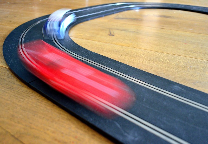
Struggling for time again, blocked drains in the garden atm, do have an idea for speed... involving a scalextric track and rear curtain flash, and as the boys are off school from now on, I might just have to drag it down from atop the wardrobe. :nuts:
 
Speeeeeedddd.......

Pushed for time, but determined to get each weeks in and not get behind.

Idea was for light-trails round the track, with fill flash at the end to catch the car and track, but couldn't get the room dark enought to pick up the trails, so, slow shutter speed and timing, 100 shots, about 40% with no cars in, 30% with 1 car, and about 10% with both cars fully in shot!!


Or an alternate, which is actually 3 shots from 3 different laps, works quite well I think! And thanks to my boys for their sterling efforts at precision driving.. (y) (And yes, the track has scratches, dust and dog hair on it, ;))

 
Hi Graham

Sounds difficult but you got there in the end, I prefer the single shot, not sure about the composition though too much dead space top right which adds nothing to the pic for me.

:clap: for your perseverance
 
Works fine for me. A good sense of speed, and the triptych gives a nice sense of racing too.
 
Hi Graham,
The single image works best for me (y)

You've captured a great sense of speed and movement in the cars.

I think the composition could have worked a little better had you caught the cars earlier on the track giving them space to drive into.

I appreciate the difficulties in capturing these so thats a very minor observation.
 
Hi ya :wave:

Speed tryptich works really well....cracking shot & great perseverance on your side to get the shots just right :clap:

Plenty.....jeepers...how on theme is that ...super shot , would look great on a full wall size poster in a bright room.......fab detail in the flickr one :clap:
 
Cheers all, composing the speed shot was the hardest part, wanted a low angle but this brought the settee and telly into the shot, wanted a lead of the track, but also wanted the blur to be fairly large in the frame.... It's never easy is it . :bonk:

Week 30 - STEPS

Two I'm afraid, can't pick between them.....

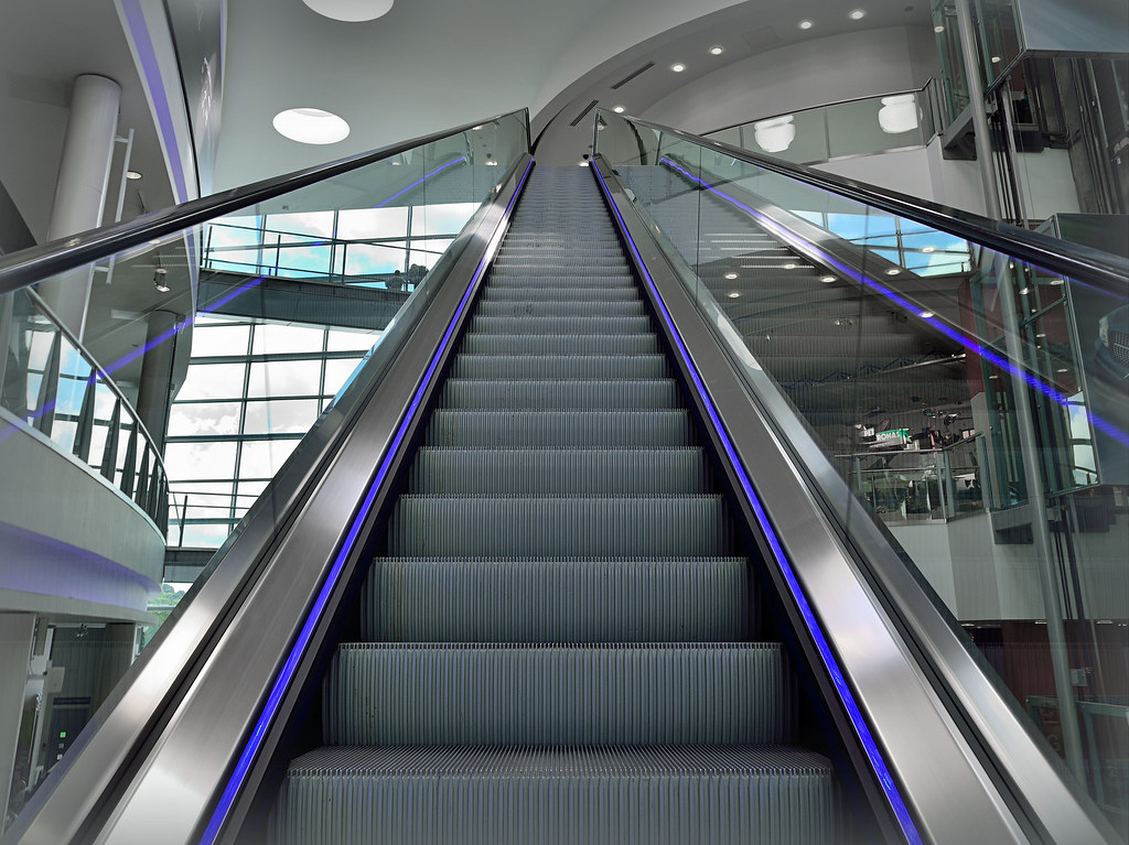
Going up.........


Or Going down....... (View on black in flickr)...


Both from Mercedes-Benz World in Weybridge. (y)
 
Hi Graham :)

Hmmmm a good couple here !!!

For me, I like the warmth of the second and the curve of the rails, the only thing that messes it up for me is the wall bottom right, nothing you could do with that though

So the Top one for me too, Love the Stainless/White & LED look of it, good composition too... tough to crit at all... but a tiny bit off the top to remove the clipped skylight and that's being very OCD - Great Image still (y)
 
Cheers Michael and DK - hmmm, I did try a crop without the top half skylight - (after you mentioned it), and thought it made the single one stand out more... :thinking:


Managed a third one that fits this week too.....

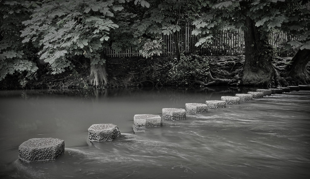
Stepping Stones!


Handheld at 1.6 seconds too. :eek:
 
Last edited:
Well it was going to be #1 for me... right until #3 came along!

Lovely composition, and quite a feat for handheld, how did you manage to keep the rocks that defined?... Braced against something?

B&W works really well too.
 
Cheers Nick. Obviously a fair bit of luck. Had it in AV and stopped down all the way... remember thinking there was a long gap between the first and second click... but it then got too busy to try another.

I was just crouched down low with elbows and arms tucked in. Tiny bbit of colour in the b&w too....
 
First one for me Graham (I already faved it on flickr). Really top comp. 10/10

Now, this skylight thing, if it really bothers you - what with you being a top PP'er - surely that's a candidate for content aware fill if ever I saw one?

btw: hand held for 1.6 seconds? - I cant hold my breath that long! :LOL:
 
Hi graham
Escalator shot for me love the grays with that blue stripe very eye catching
The stepping stone pic is also very good nice diagonal line of steps (y)
 
'ello, Steps #1 for me. Nice perspective and good overall lighting. B&W would be interesting, as would a bit of motion blur, just in the steps.

Cheers.
 
#1 for me too - the going up shot is spot on theme and very well executed, leading lines, clean - what more could you want (y)
 
Another vote for #1 from me Graham.
It has lovely sharp, clean lines to it. The composition draws the viewer in to the scene.
Works for me (y)

I do like #3 too, good skills on your camera technique (y)
It does feel a little too much grey for me, could it have a contrast boost to help it along? :thinking:
 
Cheers guys. Escalator seems to be the fave. One shot, just desaturated a few colours and exaggerated the vertical perspective distortion.

Iain. Been called before on a lack of contrast after I've done a spot of HDR. under the trees was black yet the tops of the stones were blown. I'll bear it in mind.

Brian. I could have cloned the half skylight....... but I added a light grey vignette which made it harder. Spot the flaw in my workflow. :bonk:

Andy. I did play with motion blur.. but on the background rather than the steps.. maybe should have tried the opposite.
 
Last edited:
Catchup mode again, sorry! One post per page...

Rock: yes, I like those crystals, simple composition but good light coming through giving them texture and structure. Maybe the suddenness of the OoF transition just behind them is a bit odd, but it's a very minor quibble...

Pair, very nice, and I do prefer the second version, with the coins to the left.
 
I prefer the first speed, it gives a greater sense of movement.

Escalator shot is brill, the strong purple lines lead in nicely.
 
Second try, sorry. I'm a bit of a party-pooper on Plenty: yes, plenty of sky and yes, some interest there with the vapour trails, but overall despite the impressive statistics of the shot, it's just lots of sky and some trees and not particularly interesting. Plus, the bright area to the right is quite distracting; would it be better with that cropped out?

Speed no 1 for me. Maybe a slightly faster shutter speed to try to get a bit more definition in the blue and red fuzzy bits that are presumably the cars?

Sorry to be a bit on the negative side here...
 
Steps no 1 for me; it just has an extra bit of magic. Steps no 2 is a very nice shot as well, but it doesn't fizz in my brain nearly as much. Steps no 3, not so much... although I do like the leading line of the stones, and the contrast in water textures to left and right. Somehow it's just missing a little something? But no 1 is the... number 1!
 
Hi Graham

Speed - all shots work for me and convey the theme. Like the 'length' of the blurred cars which comes out well in #1

Steps - #1 - really good comp. Good subtle colours and the curve of the steps adds some intrigue as to where they are heading.
#2 - modern, clean, bright scene and well handled. Just that some of the reflections add to the shot and some detract so bit of a compromise for me.
#3 - good technique, good comp but for me very grey and underwhelming.

So the vote from the Fylde coast jury is for #1 :)
 
Step(s): First for me too, nice and clean. I also really like the stepping stones one.
 
Pair, very nice, and I do prefer the second version, with the coins to the left.

Cheers Chris - sometimes doing things the other way round works, sometimes not - was not a conscious decision to get them on the right

Second try, sorry. I'm a bit of a party-pooper on Plenty: yes, plenty of sky and yes, some interest there with the vapour trails, but overall despite the impressive statistics of the shot, it's just lots of sky and some trees and not particularly interesting. Plus, the bright area to the right is quite distracting; would it be better with that cropped out?

Far enough - but there is plenty of sky though, after taking and stitching a load of shots - it just feels wrong to crop bits out!!

Speed no 1 for me. Maybe a slightly faster shutter speed to try to get a bit more definition in the blue and red fuzzy bits that are presumably the cars?
Sorry to be a bit on the negative side here...

Yep - they are the cars, purposely went slow on the shutter, maybe too slow. :thinking:

Steps no 1 for me; it just has an extra bit of magic. Steps no 2 is a very nice shot as well, but it doesn't fizz in my brain nearly as much. Steps no 3, not so much... although I do like the leading line of the stones, and the contrast in water textures to left and right. Somehow it's just missing a little something? But no 1 is the... number 1!

I prefer the first speed, it gives a greater sense of movement.

Escalator shot is brill, the strong purple lines lead in nicely.

Thanks Chris (again) and Mark - I like this one too, and I'm glad I enhanced the vertical perspective rather than correcting it here!

Speed - all shots work for me and convey the theme. Like the 'length' of the blurred cars which comes out well in #1

Steps - #1 - really good comp. Good subtle colours and the curve of the steps adds some intrigue as to where they are heading.
#2 - modern, clean, bright scene and well handled. Just that some of the reflections add to the shot and some detract so bit of a compromise for me.
#3 - good technique, good comp but for me very grey and underwhelming.

So the vote from the Fylde coast jury is for #1 :)

Thinking your #1 and #2 are mixed up but great concise crit (y)

The stones were pretty grey - and the water brown.... so it had to be desaturated somehow, and I think I killed the contrast through HDR.

Step(s): First for me too, nice and clean. I also really like the stepping stones one.

Thanks Lisa. (y)
 
After three weeks of builders and two weeks of holiday (one of those spent fitting windows and fixing blocked drains). We managed to get away for a spot of camping to Brighton.

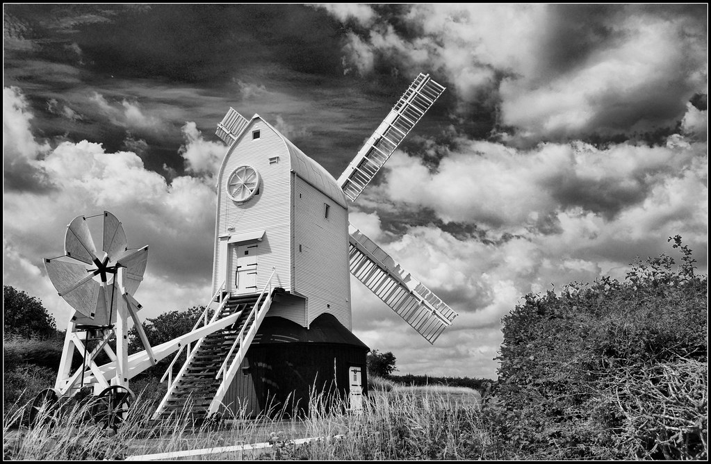
Was on the lookout for shots that would suit a B&W conversion, so here goes.......

Possibly a little heavy on the processing, but my (small) grasp of B&W says you can get away with it a bit more than with colour.


Up on the South Downs Way


Restored windmill Jill


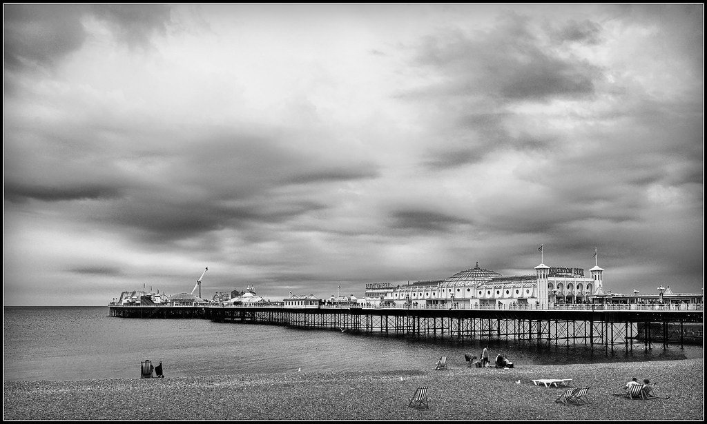
And Brighton Pier


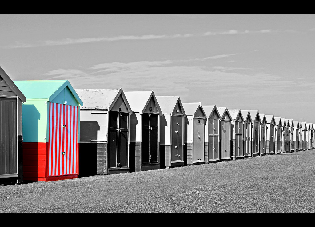
And I couldn't resist........... :nuts:
 
Last edited:
For me the clouds, lovely range.
 
Windmill gets my vote Graham (y)

I think it's the low pov that adds such a great sense of scale which does it.
 
Hi Graham windmill shot is a cracker and the sky on South downs too both work for me, not keen on selective colour and the pier lacks a bit of impact
the other 2 I really like :clap:
 
I think the first two are perfect.

The pier one is also very very good, the people & deckchairs give good scale, I think I would ahem "move" the left side people in a bit for better balance.

Theres something wrong with the last one, looks to me like you forgot to process the whole thing? :thinking: :LOL:
 
Hi Graham

how many shots for mono :nuts:


1st shot for me with a slice off the bottom to really emphasize that cracking sky ....lovely pp :clap:
liking the sc'd one as well , just a shame it wasn't one solid color...pp maybe ?

Steps.....1st one for me again...striking contrast between the electric blue & all that shiny stuff , nicely central , perfectly sharp (y)

The wooden stairs I really want to be my fave but for some reason I want to see it going up rather than down :thinking:
 
Cheers all,

Brian, moving the people - consider it done..... as for my SC beach huts ... :razz:

Thanks Lynne, they were all one colour apart from the stripy one that caught my eye, sky wasn't worth doing the heavy B&W conversion so I thought.. :thinking: bit of SC....

I've dropped the original SOOC jpegs below if anyones interested in the shots pre-processing!! (y)

South Downs

Windmill

Brighton Pier

Beach Huts
 
Back
Top