weekly overbez's 52 for 2013.... ** COMPLETE **

Thanks Lynne, you are absolutely right..... it would benefit from a bit more on the right, and I could have probably swung myself round, but it was pretty much first shot of the day, straight after opening time, we went straight there and she (I presume) came out the cave, stood in the entrance for a couple of seconds, and then went up on the rock pretty much out of sight. So I'm happy with what I got!

Cheers Andy, both feet eh?? Must confess I didn't ask her to pose... :naughty:
 
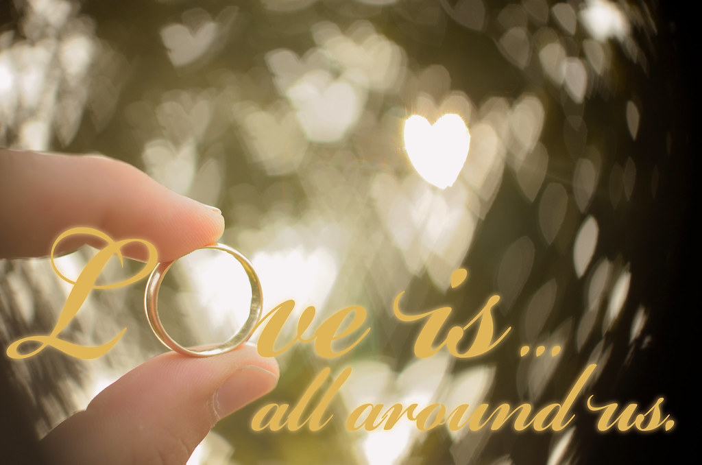
Toughie this week.... had absolutely no idea where to go with this, so I had one idea I wanted to try, and it kind of went along from there....

 
Excellent!

Shaped Bokeh!

you really pulled the stops out here graham, love it! :clap:
 
Hi Graham
nicely executed image, shaped bokeh really makes it :clap:
You soppy git :LOL:
 
Beautiful Graham......just beautiful :clap:

love everything about it , the bokeh ( would love to know how you did this ) ,the muted colors & the writing....works really really well :clap::clap:
 
you really pulled the stops out here graham, love it! :clap:

Thanks Brian - thought it suited the theme, along with a bit of a dreamy feel to the processing! (Which was actually very little..... highlight and shadow protection, lower the contrast, warming filter, sharpening. text, (smaple colour off ring), duplicate text, blur lower text layer, change colour and lightness slightly).

You soppy git :LOL:

:LOL:... saying that, it;s my 10th wedding anniversary in a couple of months, so I may try a few more shots and make the ring become the 0 of the 10...

Lovely bokeh. Is that from the light source or a mask on the lens?

Cheers Tony... both.. (see below!)

Beautiful Graham......just beautiful :clap:

love everything about it , the bokeh ( would love to know how you did this ) ,the muted colors & the writing....works really really well :clap::clap:

Thanks Lynne, see below!

This. Bokeh is great. Dd you put a heart shape on front of your lens?

Andy got it. (y)

I too look forward to finding out how you have done this !!!

Cereal box cut out to circle, cut out shape in centre , tape a ring around this so it slips over the lens.

svde.jpg


I (manually) focussed as close as poss and aperture to 1.8 to maximise bokeh. Wierd thing is the shape isn't really that pronounced when looking through the viewfinder, but only appears in the shot once taken.. :thinking:

The large bright heart is from the sun, which was behind a leafy tree.

Glad you all liked it, lets hope we don't get another theme like this one - although if it gets us thinking, and doing something we wouldn't have done otherwise... it can;t be all bad. (y)
 
Last edited:
Shoehorn or not ('or not'... who am I kidding), I like still a lot. Lovely and sharp on the eyes, nice composition, and what a beautiful expression. The muted colours work really well.

Whimsical - Didn't we have 'tacky' back in week 13?:D

Nicely done, the heart bokeh works really well, and the tones and composition are spot on. I fully expect to see this plastered all over the walls of my sadder Facebook acquaintances within the week though!
 
Bit of a comment catch-up I'm afraid Graham.

Still, whats a little shoehorn/crowbar amongst friends?
It is a great image though as has been said above. Technically very good, it shows this magnificent beast in all its glory.

Whimsical, you old romantic you :LOL:
I enjoyed your backstory/how to as well, very blue peter ;)

Good work Graham (y)
 
Brilliant: :clap::clap::clap:

(y)

I fully expect to see this plastered all over the walls of my sadder Facebook acquaintances within the week though!

I'll take that as a compliment, cheers. ;)

Thought you might have done it like that. Nice to see someone else addicted to the 35 1.8 :)

TBH I don;t use it as often as I'd like - I take my hat off to siblingchris who's doing his 52 solely with this lens! I often find I need wider, could get into the habit of taking a few steps back... but I do love it!

Still, .............
It is a great image though as has been said above. Technically very good, it shows this magnificent beast in all its glory.

Whimsical, you old romantic you :LOL:
I enjoyed your backstory/how to as well, very blue peter ;)

Cheers Iain, surprised how easy it was, and at the same time how hard it was. Sometimes the hearts were too closely spaced, too many, too few, add into the mix I had to hold the ring and get it in focus by moving my hand fore and back, and then hold the camera one handed!!! :eek:
 
....


Wierd how the tops of the arches curves, look a bit blurred in the middle.... but on the full res they aren't... or is it just my eyes??

.
 
Last edited:
Hi Graham
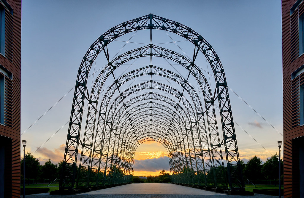
Thats really nice, what a fantastic structure, what is it?
Very symmetrical I think you could probably get away with cropping the buildings left and right out but I do see why you have left them in.
Other than that cant really fault it :clap:
 
Hi Graham
Thats really nice, what a fantastic structure, what is it?
Very symmetrical I think you could probably get away with cropping the buildings left and right out but I do see why you have left them in.
Other than that cant really fault it :clap:

It's is what I was going to say. I had a quick edit in Snapseed and cropped in left and right and worked for me.

Either way, I like it. Cracking detail bridge and nice colour in the sunset.

Cheers
 
Hi Graham
Thats really nice, what a fantastic structure, what is it?

'Tis an old airship hangar... apparently built in 1910 or 1912, and reassembled / moved to current location just outside the airport in the 2004. Now forms part of the new business park being developed there.

Cracking detail bridge and nice colour in the sunset.

Airship hangar....... ;)

Great symmetry, a good looking sky with the best bit of the sunset in the right place, and wonderful curves, what a great structure!!!!

Cheers Dean, fantastic piece of luck with the position of the sun, beyond my ability to move either the hangar or the sun!!!

Regards the crop or the buildings, I left them in to give a sense of scale to the structure, oh and as a reconstructed a bit of the bottom of one of them after I lost it through vertical perspective correction, I was a bit loathed to then crop it out.

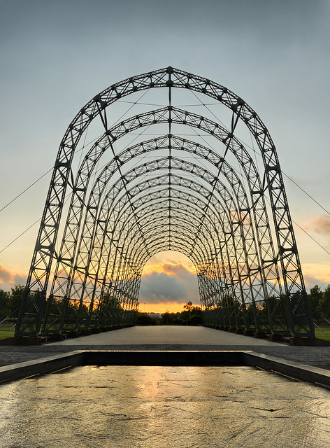
Took another from a bit further back, with a bit of foreground water feature and no buildings. But felt this lost the scale of it.

 
Last edited:
Hi Graham,

I am not really sure which one I prefer :thinking:

I think I will sit on the fence as I like them both for differing reasons.

The landscape one does as you say give a sense of perspective with having the buildings included, which also frame the structure quite nicely too. I'd maybe lose the lamp-posts though.

The portrait one has a cleaner feel to it as Andy mentioned but loses that sense of scale.

They are both technically very good, you've balanced the light well, nice glow to the sky, a sunset shot with some cracking foreground interest ;)

Good work, from a fence-sitter :LOL:
 
Hi Graham


Perfect shot Curve.....my ocd loves the perfect symmetry , the buildings frame the hangar just right & the sunset finishes the image off perfectly ( wondering how many more times I could have got the word Perfect in there !):clap:
 
Hi Graham

Still - very much on theme - cats just have that natural ability to be 'still' yet alert. like the muted colours and the framing by the rocks

Whimsical - so cute :puke::D Very imaginative - heart bokeh, gold ring, nice fingers, gold text. You young romantic. Oh and 10th anniversary ??? Novice.:)

Curve - cracking shot. Lovely late sunshine adds such a lot to the scene. Excellent symmetry. I don't mind the buildings and would probably have done as you did, yet that second version does have a clean abstract quality with the added benefit of the water. Although sense of scale is diminished, I think that is the better of 2 really good shots. (y)
 
I prefer the first one. Can't offer any suggestions, that's about as good as they get.(y)
 
Thanks Andy, a wider lens and I could've had the best of both worlds....

Iain, gonna get splinters somewhere :nuts:

Lynne, I think I still prefer the first with the buildings, just to give the sense of scale, the hangar rises above the 5 storey building beside it.

Thanks Alan, whimiscal is pretty cute, was a nice thing to do. shame my arm wasn;t longer and I could have gotten the ring smaller to fit the lettering of LOve better. But no-one noticed that. :LOL:

Thanks Brian, First was my pic of the two too.

Which leads us onto week 37

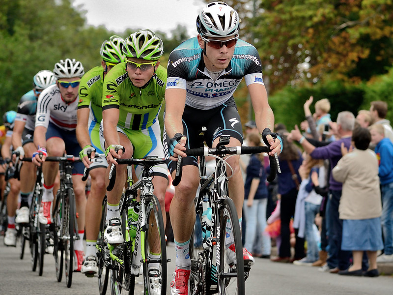
Was in two minds whether to hold this theme over to tomorrow when the Tour of Britain passes near us, and "Pedal Power" would work without too much trouble...

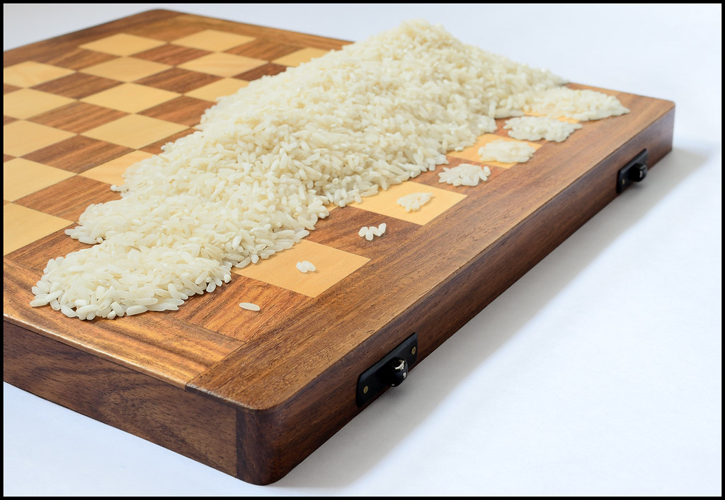
But I've gone with a mathematical twist on power...... Was thinking shallow DOF, but shot up to f/11 to see the differences, wish I'd taken a few with even greater DOF but I'm not counting them all out again. :bonk:


It's one of those things that until you look into it, you don't realise the magnitude of it!!!

And yes, I did count the grains out.... (At least for the first 7 squares anyway.) :naughty:

Interesting take on the theme and I demand a full recount.

Lighting look fine and DOF had to be wide to get all the rice in.

I might have been tempted to photograph from the side with looking over the low number rice squares, IYSWIM?

Cheers and I must find when the Tour passes me so I can crowbar it is :D
 
Hi Graham
Interesting indeed :thinking: not sure its working for me either compositionally or just the image itself, will have another look later (y)
 
Hi Graham, I got your thinking on this one before reading your explanation, so for me, its bang on theme (y)

But, there's always a but isn't there?

I am not sure its working overall for me, I think its the composition, it starts well on the lower squares but just seems to blend into a large mass at the back of the image and loses a little of its impact.

Maybe if there was a little more separation on the piles of rice at the back it may help.

Sorry for being a little negative :(
 
I prefer the edit of Curve, I think the trees still give it the sense of scale. The way the arches pull you back to the lovely sunset colours in the sky is pretty special.

Power is a clever take on the theme, but I'm struggling with DOF (or I think that's what I'm struggling with). The definition around the first couple of squares kind of hold my eyes there. No idea why. I need to look at this some more.
 
Cheers guys - not an easy one for you to decide on it seems....

insufficient DOF I already hold my hands up to..... I could have also (thinking about it now) focused further in (rather than on the single grain square) to take advantage of sharpness either side of focal point.

The massiveness of the pile as you get further in is kind of the point... each square actually has to have more than the TOTAL amount on ALL the squares before it..

There are some massive numbers involved here.. If each grain were stacked on top of each other... the height of the tower on the last square would be 1 light year tall (or so I read...).
 
Hi Graham

Thought I'd start with you to get me back in on this commenting lark :) Due to a HUGE catch up needed everywhere I'll only comment on the latest.

I'll start with power.

Initially I looked at this and thought 'what the hell?' but I soon got your thinking. Now I really hope you sat and counted EVERY single grain :bonk: I like the idea but i too am not entirely sure about the composition, maybe lower and closer :thinking: But it's a greatt idea for the theme (y) and I bet you got some funny looks setting it up!

Curves, loving that shot! But I can't decide which version. The lovely blue sky is better in the first but I like the closer crop of the second :bonk: Either way the colours in the sunset and the cloud look lovely.

Whimsical, awwww how cute is the heart shaped bokeh :clap: Even though you've shown how you did it I still have no clue! Very clever shot indeed. I'm not sure on the dark RHS though, I would maybe have tried to crop that out :thinking:
 
Thanks Marsha, the dark RHS on the heart bokeh for whimsical is I think from the mask on the lens, possibly the heart was not 100% central and I picked up a bit of a vignette from that.

Cheers Tony, glad you liked it. (y)

Maybe I should have waited for Saturday's outing and gone with Pedal Power...

This is probably the shot I would have gone with...


A couple more here..
 
Hi Graham :)

Power - for me the cycling wins it by a mile !!!!

The riche/board is a great idea, but for me it's the POV that isn't working, where as the cycling shot is bang on, great perspective, love the crowd to the right, they really bring the lead into focus :clap:
 
Power - for me the cycling wins it by a mile !!!!

Pedal power wins by a mile for ...

Hmmmm....... should have waited a day.

Week 38 - Solitude......

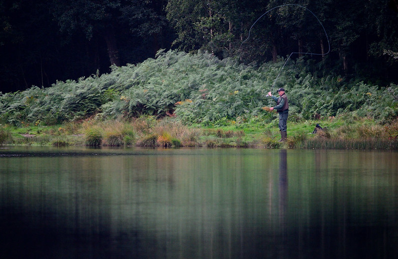
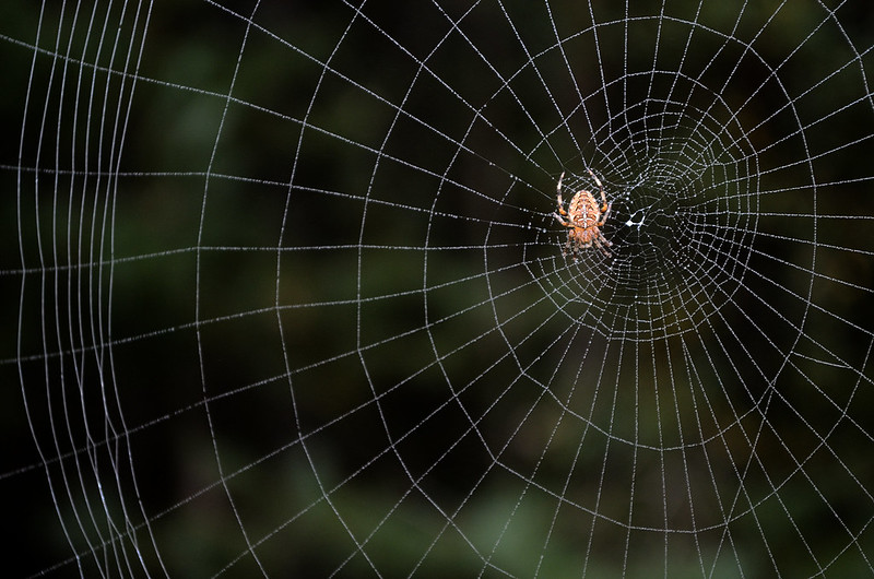
Not going to pretend that either of these are great shots, was on a very misty morning, but at least they both are on theme. :)


Shot from the opposite side of the reservoir - and therefore at full 300mm.
"Vignette" is all natural by the way, formed I think from the shadow in the trees either side behind the fisherman, and the reflection of the same.


Kit lens, with a burst of in-built on camera flash to catch the web.
 
Both bang on theme as you say Graham (y)

When compared like this, my vote would go to #1.

The natural vignette really concentrates the viewers eye on the subject, the fisherman, where you have captured the arc of the line wonderfully.

I particularly like the colour tones in here, the green/blue look to it is very pleasing.

#1 I like too, compositionally very strong, but I find the spider a little 'lost' in the web, not sure how you could highlight it more.

Good work though Graham, two very worthy submissions (y)
 
I like the pedal power shot a lot. The really nice gradual falloff of focus stands out. Good colours, and I like the space in front of the lead rider.

I really like the fishing shot, misty or not. It really puts across that self imposed solitude of early mornings on the bankside. There's a peace to the shot, the muted colours and the reflections, broken only by the arc of the line. Nice!(y)
 
Pedal power: worth y of Rouleur. Nicely done. :)

Solitude, I think the fisherman is more on theme but can't help liking the spider more. You did a great job there Graham. Another good week for you. (y)
 
Back
Top