A Square Waterfall

Messages
16,290
Name
Andy Grant
Edit My Images
Yes
I posted this in the f&c section but I would like a little critique if possible.

It's originally a colour shot but I wanted to go for an aged look and a feeling of a fairy glen kinda thing.


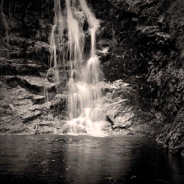
Moss-Force-Waterfall1-b&w by andysnapper1, on Flickr

Taken on a Mamiya C330f with 55mm lens on Kodak Portra 100 and processed in Topaz b&w Efex.

Any thoughts or suggestions most welcome.

Cheers

Andy
 
I like it, being very picky not sure the cropping of the top of the waterfall is the way I'd shoot it as a opposed to getting further back, but I wasn't there...
 
Hi Andy,

I haven't commented much in the Photos from Film section, but I thought I'd try to make an effort to participate in this area of the forum. I certainly don't consider myself an expert, so feel free to take anything I say with a grain of salt :).

I like the exposure with regard to the movement in the water, but I'm not sure how I feel about the framing of the waterfall itself. I kind of like it on the one hand, but I am left wondering if there was something up above the frame that I might have wanted to see.

You wouldn't happen to have a colour version of the photo handy, would you? I must confess I do rather like the palette of Portra 160, so it'd be interesting to see how the black and white and colour versions compare.
 
Thanks for the comments guys. Problem with the framing was that I couldn't get any further back and still be straight on to the waterfall. Also I said I used the 55m but now I think about it it was the 80mm, forgot to take the 55mm which would have been perfect.

Here's the colour version


Moss-Force-Waterfall1 by andysnapper1, on Flickr

Which I do quite like.

I think I need to go back and have another go at this as the waterfall is perfect for the shot I have in my mind.

Flicrk seems to be oversharpening today....

Cheers

Andy
 
Thanks for the comments guys. Problem with the framing was that I couldn't get any further back and still be straight on to the waterfall.

Could you have just tilted the camera upward a bit? Because there aren't any straight lines, unlike in a photo including buildings, I would think that this would limit any perceived perspective distortion.

Here's the colour version

Which I do quite like.

Oh, I definitely prefer the colour version.

Somehow I think the colour version makes better use of the whole frame, because you can see more detail just under the surface of the water, especially at the bottom right, than in the B&W version. I also think that a little bit of highlight detail was lost in the waterfall in the B&W conversion, as I can see more detail in the spray in the colour photo.
 
Last edited:
I like the colour image best.

Nice to see another film user still fighting the good fight.
 
Could you have just tilted the camera upward a bit? Because there aren't any straight lines, unlike in a photo including buildings, I would think that this would limit any perceived perspective distortion.


Oh, I definitely prefer the colour version.

Somehow I think the colour version makes better use of the whole frame, because you can see more detail just under the surface of the water, especially at the bottom right, than in the B&W version. I also think that a little bit of highlight detail was lost in the waterfall in the B&W conversion, as I can see more detail in the spray in the colour photo.

Thanks RJ, a good point. I could quite possibly have got a bit lower and looked up....doh

I like the colour image best.

Nice to see another film user still fighting the good fight.

Thank you, if you pop over to the film and conventional forum you'll find quite a few of us still using the real gear. (y)

very nice i like the 2nd shot in colour the best thumbs up from me

Thanks, the colour one is growing on me more every time I look at it.

Andy
 
Too much blue for me..

Not quite sure what you mean there David, I presume you mean the colour shot which was shot on film and scanned, the blue is natural as far as I'm aware, no editing done to this apart from a straighten and some dust spots removed.
But thanks for your time and comment. (y)

Andy
 
Not quite sure what you mean there David, I presume you mean the colour shot which was shot on film and scanned, the blue is natural as far as I'm aware, no editing done to this apart from a straighten and some dust spots removed.
But thanks for your time and comment. (y)

Andy

Well, at some point during the scanning process there would have been some sort of colour balancing, whether it was performed automatically by the software or manually after scanning.

Was the waterfall in a shaded area?

I believe outdoor shadow areas are naturally bluish, but our eyes automatically adjust for this, which is why we don't really notice it during everyday life, but it is more noticeable when it's captured on film (for instance, Ektar has a habit of really enhancing the blue in shadows because it's such a saturated film).

Perhaps you could try adjusting the white balance by picking a grey spot on some of the rocks by the falls and see how that affects the colours in the photo?
 
Good point RJ, my problem is colour-blindness so I very rarely notice any nuances in colour images. Probably why I prefer good old b&w.
 
Good point RJ, my problem is colour-blindness so I very rarely notice any nuances in colour images. Probably why I prefer good old b&w.

I'm not colour blind, but I still myself find colour balancing tedious and time consuming, so I've stopped scanning my own and have been letting UK Film Lab do the heavy lifting instead.

This leaves me more time to shoot. :)

I'm still doing my own black and white though, as colour balancing problems obviously aren't a factor there. ;)
 
Last edited:
I just had the b & w version printed on museum archival paper at dscl......wow. Its a slightly textured paper and it gives it a fantastic 3D look and brings out the texture of the rocks really nicely. Very impressed with the printing as well, a lovely range of tones.

Andy
 
I just had the b & w version printed on museum archival paper at dscl......wow. Its a slightly textured paper and it gives it a fantastic 3D look and brings out the texture of the rocks really nicely. Very impressed with the printing as well, a lovely range of tones. Andy

Ahh, how I love the printed photograph. Enjoying the photo the way it is meant to be seen.

I've got a backlog of photos to print myself...
 
Andy, I too think that little from the top would have helped in this. It's interesting that several folk preferred the colour version; it's noticeably lighter in tone. Did you try a lighter version of the mono one?

What made you pick DSCL for printing? I've just had a few shots printed by Peak; I like the result, but there's a definite darker note in the prints than on my screen. Did your print come out darker than you expected?
 
Hi Chris, yes I did try many different versions and a lighter one was amongst them, in fact that was the one I had printed as I know from experience that I need to lighten/brighten my image before having it printed at DSCL, I assume the same is true of other printers as well.
I'm definitely going to go back to this spot, I feel that the image I want is still there, just need to work out how to get it.

Andy
 
Square? what is that then? see two question marks in the first sentence.;)

Right Andy, you want fairy and you have by long exposure almost achieved that.

The stair rods of the water gives that futuristic feeling and the high exposure of the rocks is something that can leave the imagination to go were it wishes ,but,with the overall frame it does not work.

I took the water out to the little stone on the RH about two inches from water's meet and for me it gets the grotto feeling much,much more, you try and see.

You are left with the falling water the great work on the rocks and the imagination then just trips in. Fairies,grottoes,Peter Pan the whole works.

Needs a little bit of work to create a brilliant shot.
 
Thank you Marcus.

And thanks Richard, I shall have a go at that crop later.

Andy
 
The b&w version works best for me, I find the colour version distracting and a bit unnatural looking (I know that makes no sense).

Would like to see an uncropped mono version.
 
Thanks Nick, as good as the print turned out I still need to go back, there's a shot there that I've missed.
 
Out of the two versions, I prefer the first .....If it's possible to frame the falls to include the complete drop from top to bottom, then i believe it would produce a better result compositionally.....Perhaps square format won't offer the correct framing :shrug:
 
Thanks Asha, but squares are always the correct format:D:D
 
Back
Top