
You are using an out of date browser. It may not display this or other websites correctly.
You should upgrade or use an alternative browser.
You should upgrade or use an alternative browser.
Iona, In studio (More images added down page)
- Thread starter John Lindsay
- Start date


- Messages
- 757
- Name
- Daniel
- Edit My Images
- No
I think number 4 for me ") Look at the lovely ringflash
Look at the lovely ringflash
I'm not sure about the first two, might just be my taste... Great shots though!
Look at the lovely ringflash I'm not sure about the first two, might just be my taste... Great shots though!
D
Deleted member 11790
Guest
5 for me. think the expression is fantastic
OP
- Messages
- 126
- Name
- John Lindsay
- Edit My Images
- Yes
Thanks for the comments so far guys.
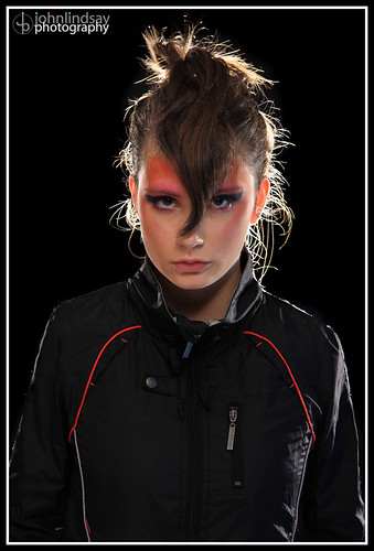
It's a college project for a magazine cover for the "Dazed & Confused" magazine, the cover image is usually a bit out there in terms of style.
Just realised I haven't added my personal favourite to this thread, it's on my 52 but not here.
Here it is:
7. (For reference)
Larger
This is the one which I think best fits the brief, but I think some of the more natural ones are gorgeous too, and thought it was too good an opportunity to get some pictures she would like too.
John
Last edited:
- Messages
- 111
- Name
- Steve
- Edit My Images
- Yes
Nice set John, 4 and 6 for me - and the last one is very good also.
OP
- Messages
- 126
- Name
- John Lindsay
- Edit My Images
- Yes
The beauty dish gives lovely light. This was done without the diffuser panel on the front aswell.
However, I think you're talking about the ringflash? The beauty dish was used in the ones with the funky makeup. Ringflash in the more natural ones. Giving the nice catchlight in the eyes.
Thanks for the nice comments guys.
John
However, I think you're talking about the ringflash? The beauty dish was used in the ones with the funky makeup. Ringflash in the more natural ones. Giving the nice catchlight in the eyes.
Thanks for the nice comments guys.
John
Last edited:
OP
- Messages
- 126
- Name
- John Lindsay
- Edit My Images
- Yes
I also really like the ringflash catchlight. I wanted to get in much closer to shoot. Making the ringflash bigger in the eyes, but the ringflash is so powerful I needed a smaller aperture than f22 which I couldn't get
Cheers for the comments so far folks.
I personally like the natural ones, as well as the more funky ones. I have just sent them to print.
If anyone's interested here are my 2 favourites on the magazine layout.


John
Cheers for the comments so far folks.
I personally like the natural ones, as well as the more funky ones. I have just sent them to print.
If anyone's interested here are my 2 favourites on the magazine layout.
John
Last edited:
SimonTALM
Linford Christie
- Messages
- 3,268
- Name
- Simon
- Edit My Images
- Yes
Just followed the link from your 52, I love number 2 and personally prefer that to the one in your 52 (I think the lack of the backlight helps hide the hairs I find distracting). I also love image 5&6 and I think the colour one has the slight edge as I like the contrast between the monochrome coat and the face.
Out of the covers I personally prefer the B&W cover but I think that's because I expect the masthead to be visible rather than it actually being better. Perhaps that's because I'm not quite with the time with regards to "high fashion"
Out of the covers I personally prefer the B&W cover but I think that's because I expect the masthead to be visible rather than it actually being better. Perhaps that's because I'm not quite with the time with regards to "high fashion"
- Messages
- 1,381
- Name
- Darren
- Edit My Images
- Yes
I actually found number 1 the most interesting to look at, not technically perfect, but kind of has the sort Dance cd cover look, that seems to be going around at the moment. Maybe use of a coloured gel may have made it less harsh, and add some atmosphere.
The others are very good and love the magazine covers.
The others are very good and love the magazine covers.