Fooly's 52 for 2010 - Week 5 - Speed (cop out)

Messages
245
Name
Simon
Edit My Images
Yes
Right, time to start my 52......

[Edited to add my Rules and introduce myself a bit]

About me

I've had my camera for about 18 months, and have a bit of 'All the gear and no idea'. This 52 is going to be all about improving my composition and PP techiques, since I tend to do very little of either (or far too much PP without knowing what I'm doing). I've got another couple of Photography Courses planned at Bournemouth Uni during the year, so will be interesting to see what I pick up from there and apply here.

Rules (Shamelessly stolen from Sarah)

1) New images will be presented each week specifically for the theme, and only one shot will be selected as the entry for the week.
2) I may show other shots taken in the week but if I do I will explain why I selected the shot that I did.
3) I will share what I have learnt each week and how I might approach it differently next time (or if I had more time)
4) I will limit myself to 2 JOKERS during the entire year, which will allow me to do anything of my choosing - even if it doesn't conform to the rules that I've set.
5) I will not look at any other 52 threads for a given week until I've completed my shot.
6) I will try and provide honest and constructive C&C to my fellow 52ers, along with encouragement and support when it's needed.
7) I will limit the amount of PP I am doing to RAW convertion and some very basic Lightroom treatments - all PP will be detailed in the post for the Shot along with EXIF

52 for 2010 Album

Original sizes of all photos are stored on Picasa in the following Album;

Fooly's 52 for 2010 Album on Picasa

[End of Edit]


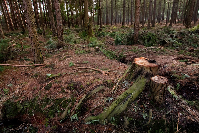
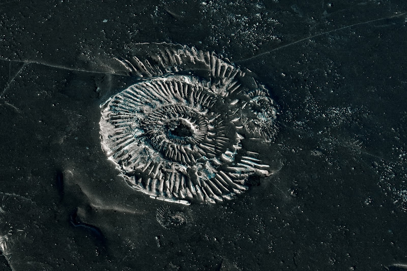
Bit of a spur of the moment shot while out doing some landscapes earlier, not come out very well, so I may well change it before the week is up....

IMG_4302.jpg
 
Last edited:
Yeah, there are loads scattered in the rock face and the ground along the coast at Kimmeridge, went down there to try and capture the Waterfall and nearly tripped over this one :
 
I also really like this one, it has a lot of interest and keeps you looking for more detail. It just pulls you in :clap:
 
Yeah, there are loads scattered in the rock face and the ground along the coast at Kimmeridge, went down there to try and capture the Waterfall and nearly tripped over this one :

Should be back up there in the next few weeks so merc can try out his new D700, will look out for it and add it to my collection, Thanks m8
 
really like this!! very on theme too. great detail.
 
Great Shot Simon, really like this, looks like there should be a 52er meet for down this way, there seems to be a fair few of us.:)
 
(y)

Will have to organise one for one of the really difficult weeks :)

I am intending to try and get out doing landscapes every weekend if I can - really want to test out my new kit, might even have a few people from my Camera course coming along in between terms
 
(y) Well spotted and bang on theme.
So many curves! And all those little fossils around the edges add to it too.
This would also have been a great shot for the last week of 2009's 52 (texture). I almost want to reach into the shot and touch it :LOL:

In terms of composition there's something not sitting quite right with me on this, but I can't put my finger on it or suggest any improvement. I shall think on it and see if I come up with something a bit more constructive :thinking:
 
Cheers Sarah - just read your thread as well, and shamelessly nicked some (ok, all) of your rules, as its something I was going to add, but hadnt got round to yesterday, and yours seemed pretty complete :D

Thanks for the C&C, and I know what you mean about the composition, I'm not sure what it is about the photo but there is something that just doesnt feel right about it, will try a few more things with it and may well change it before the week is out...

Thanks to everyone else for the positive comments :)
 
I may well change it before the week is up...

Well I like it and vote you keep it. Suffers a bit from 'plonk it in the centre of the viewfinder and shoot', but a nice find and very in keeping with the theme. (y)
 
I really like this and the white and black works well for me, and it’s a good example of the subject. As for composition I think I may have cropped it a bit tighter, to remove the small one on the far left and the white flecks on the far right. The two lines at the top do attempt to lead you out of the picture but there’s not a lot you can do about them. But there again that’s being a bit picky and it's only my opinion - great shot though.
 
Thanks for all the comments and feedback so far - I've re-cropped it as suggested, and I actually much prefer this version, let me know what you think.

Processing

Cropped
LR Preset - Creative - Cold
LR Preset - Sharpen - Landscape
LR Preset - Tone Curve - Strong Contrast

IMG_4302-1.jpg
 
Last edited:
Thanks for all the comments and feedback so far - I've re-cropped it as suggested, and I actually much prefer this version, let me know what you think.

Yep. That resolves the "I couldn't quite put my finger on it" niggle with the composition. Have you upped the contrast on this one too? it definitely has more impact.
 
I keep coming back to this one
looks like your second attempt has settled me now :clap:
looks a lot more abstract - the first was a little lacking in punch
 
I prefer the crop of the edit but find the contrast a bit too much personally!
 
Simon, good find, and well done. I too prefer the crop.
 
Week 2 - Poem / Poetry

Now I know the square root of **** all about Poetry, so this one had me stumped as to how I was going to approach it. Some of the advice was to take a picture and find a poem to fit the picture, but I wanted to do it the other way, find some poetry and figure out some way to get a picture to fit the Poem. I quickly gave up on that, and decided that instead of Poetry, I would use some Prose, as I quite like Shakespeare, and the language is quite poetic (look, thats my excuse and I'm sticking to it :D )

I selected the well known 'Rose by any other name' dialogue from Romeo and Juliet and did a set up shot in my Kitchen (which is a first for me).

I really enjoyed doing this, as it let me be creative (and messy, which I really should tidy up...)

I found the actual Prose, and printed it in a nice Caligraphy font, and then aged the paper using cold tea bags and the oven (like being back at school :) ) then got a rose and posed it in the frame and played with my 50mm 1.4 to get a really shallow DOF on it, I quite like the outcome, but please give me some C&C

Processing
Dropped the temperature a bit
Auto Tone
Sharpened

EXIF
ISO: 200
Exposure: 1/60 sec
Aperture: 1.4142135
Focal Length: 50mm
Flash Used: No

IMG_4383.jpg
 
That one hits all the buttons, spot on. Plus I reckon you can call that bit of Shakespear a poem anyway. The rose looks great, thats the second one I've seen with a rose and both have made me wanna go and shoot flowers, you guys are definitely doing something right :D Perfect font too, struggling to find fault here. Softer lighting is the only thing coming to mind that might improve it a nats, but then equally it might kill it.

Meh, thumbs up from me, good job :clap:
 
Week 1 fits in well with the theme, very interesting shot

Week 2 plenty of effort, paid off with a professional looking shot
 
Excellent result for week 2 (y)
 
very nice processing there
especially the tea-bags/oven stuff
I like this!
 
Looks really good. I like the fact that you printed the poem first then reshot it with the rose on it.

It seems to lift the picture more than just adding the words into a text box on this shot.
 
Your updated ammonite is a really great picture, and a good start to a 52! :)

I find the poetry picture quite sad and moody, but that's not to say I don't like it. Lovely subtle colours and shades. Well done. :)
 
this is a great photo, i like it. So with weeks 1 and 2 under your belt and very well done looking forward to seeing what others you produce, Good luck

Thanks very much, am really enjoying it so far :)

Week 1 fits in well with the theme, very interesting shot

Week 2 plenty of effort, paid off with a professional looking shot

Thanks a lot. It was my first attempt at a Studio type shot, so very happy with the results

Excellent result for week 2 (y)

Thanks :)

very nice processing there
especially the tea-bags/oven stuff
I like this!

I think the aging was one of my favourite bits of this, reminded me of school :D

Looks really good. I like the fact that you printed the poem first then reshot it with the rose on it.

It seems to lift the picture more than just adding the words into a text box on this shot.

Thanks, I was stuck for inspiration and thought printing it and aging it would be a bit contrived originally, but very please with the end result

Your updated ammonite is a really great picture, and a good start to a 52! :)

I find the poetry picture quite sad and moody, but that's not to say I don't like it. Lovely subtle colours and shades. Well done. :)

Thanks very much :)
 
:clap: That's worked really well Simon.
I'm amazed by how much effort people have put into this for poetry.
The ageing of the paper has come out perfectly, and I love the DOF and composition. The idea of printing the text and using it as a prop for the photo adds another dimension to it too.

The Rose looks just a touch dark on my monitor . . . only very slightly. It could just be the light in this room at the moment though, since nobody else has mentioned it :shrug:

p.s. I reckon that definitely counts as poetry, so bang on theme for me too.
 
I really, really love this shot well done!

Thanks very much :)

:clap: That's worked really well Simon.
I'm amazed by how much effort people have put into this for poetry.
The ageing of the paper has come out perfectly, and I love the DOF and composition. The idea of printing the text and using it as a prop for the photo adds another dimension to it too.

The Rose looks just a touch dark on my monitor . . . only very slightly. It could just be the light in this room at the moment though, since nobody else has mentioned it :shrug:

p.s. I reckon that definitely counts as poetry, so bang on theme for me too.

Thanks for the comments Sarah :)

It looks quite dark on my monitor, but I was going for 'moody' (my excuse and I'm sticking to it)
 
Right, time for this weeks submission, had the idea to go round the local forest near me as they have been logging, and was going to get a shot of the decimated field with all the stumps left over, when I came round the corner and found all the trees neatly piled up and took this shot

Processing
Tweaked the curves a little
Increased Vibrance
Thats it :)

EXIF
ISO: 200
Exposure: 1/20 sec
Aperture: 16.0
Focal Length: 22mm
Flash Used: No

IMG_4467.jpg
 
Great shot! Love the colours you got on the first chopped one!! :)
 
Back
Top