Lasagne's 52 for 2010 - Week 2 - Poem

Messages
956
Name
Andy
Edit My Images
Yes
Weeks 5,6 and 7 here

Week Three here

Week Two :

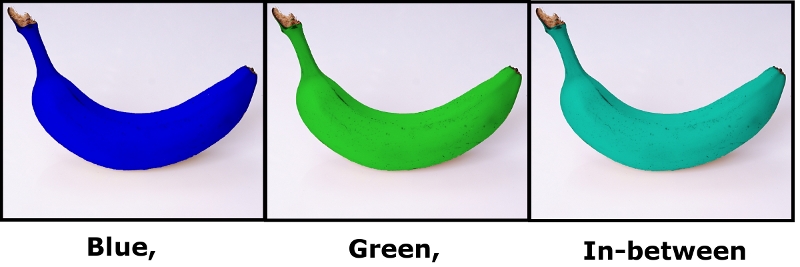
This idea just came into my head so I thought I'd try it.

4259914980_e3064185c8_o.jpg


Week One :

4247769738_e88e4273d7_o.jpg


OK, not a great start, but I'm just happy to have taken a picture and be up and running !

I'm really hoping this challenge will get me motivated to get out and use my camera this year (y)
 
Last edited:
Super super idea, love it. Image looks a little too saturated though, mono conversion may also look good ;)
 
Nice idea. :) I'd probably clone out the stand and mess in the bottom right corner though.
 
I agree with the above comments...

You need to get rid of the stand and lower the saturation! Also, I think the strings should be parrallel to the frame...they look a little out to me :thinking: All minor, very easy fixes...

On the plus side, I love the composition and it fits the curved theme very well indeed!!

I think you're off to a great start!!:clap:
 
nice one (y)
I nearly went the same way (well double bass) but same idea

I agree with the small tidy up at the bottom of the picture
 
I was going to shoot my guitar for this as well, but decided against it. Great subject. What make is it btw?

As to the shot itself, it's a great interpretation of the theme, and the partial shot of the soundboard is a nice touch. I like the saturation, but may be in a minority!

I agree with 23rdman in some respects. I'd try and clone out the stand, and probably properly halve the guitar (3 strings showing).

And that's my 2p.

Ian.
 
Love the idea but a slight straighten and mono would do it for me even more.
 
Hi Andy.

Now what do you mean "not a great start" ? :bat:
It may not be in the written rules, but no putting yourself down is allowed in here :rules:

I agree with the comments on saturation and a bit of straightening, but this really is an inspired interpretation of the theme.
Black background works well, and there's some lovely texture in the wood. Would really love to see a re-edit with those couple of niggles ironed out.
 
great start i'd say!

can only echo whats been said.. would also like to see it in B+W :)
 
Thanks for all your comments guys - very useful to learn from.

Harlequin - it's a Yamaha - I think the model is AES502 or 520. I've owned it for about 15 years and done loads of gigs with it. It's my favourite guitar I've ever owned.
 
I like the saturation myself :shrug: I am in agreement about straightening a touch and also removing the stand. Not too sure about a mono to be honest and spot on with the theme of course (y)
 
Would like to see a mono converion also, lovely shape and a great start to your 52.:)
 
Agree it's a little oversaturated for my liking. Clone out the stand and give it a little cw rotation so the strings are vertical. There seems to be some strange pixelation evident on some of the white trim too.
 
great photo i recommend you try it in Black & White at high ISO so its got that lovely grainy effect

nice guitar as well :)
 
I like that :)

I agree with the comments about straightening and tidying up the background a little but I like the colours. And it looks like a good start to me (y)
 
Nice one Andy, very original. (y)

waiting for week 3............:puke:
 
Re : Week 2

:LOL: You really were gagging for it weren't you? :p
At this rate you'd have finished your 52 by the end of January if Simon had posted all the themes in advance.

I shouldn't be looking at this because I've absolutely no idea what I'm going to do yet, but that's very creative and original (y)
Good use of PP too, that's something I still haven't worked out how to do yet.

I'd quite like to see the black bits on the banana being a bit more obvious though - particularly on the blue one.
 
Last edited:
jeez, your eager!! great shot, but i dont understand the connection to the theme! :( silly me
 
Re : Week 2

I'd quite like to see the black bits on the banana being a bit more obvious though - particularly on the blue one.

Hi Sarah. Yes I agree with you about the black bits on the blue banana. I think I should probably have made it a lighter blue.

I should probably take more time on my pp work, but I don't have much patience I'm afraid :|
 
Back
Top