Project 52 is a personal challenge to take one (considered) photo each week, for 52 weeks.
Each Sunday evening a new theme is published and I then have a week to shoot, edit & publish an image in relation to that theme. No prizes, just fun (and pride).
Links below:
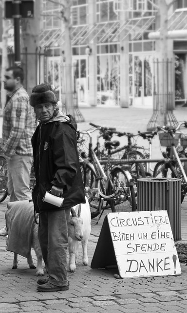
Week 11 - RESHOOT: 'Delicate'
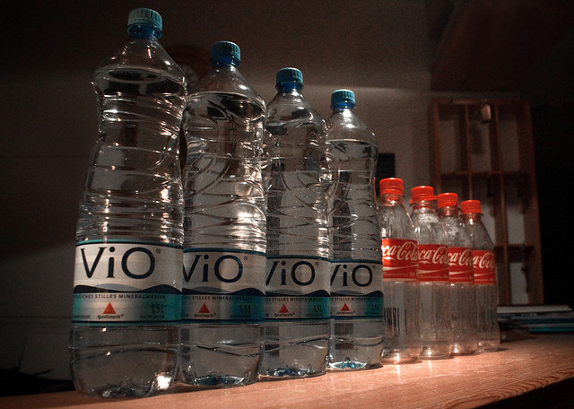
Week 10 - 'Trio'.
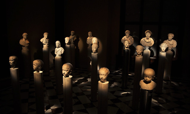
Week 9 - 'Finish'.
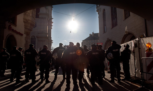
Week 8 - 'Chaos'.
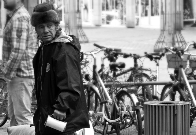
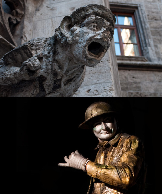
Week 7 - 'Delicate'.
Week 6 - 'Hard'.
Week 4 - 'Open'.
Week 3 - 'Fashion'.
Week 2 - 'New'.
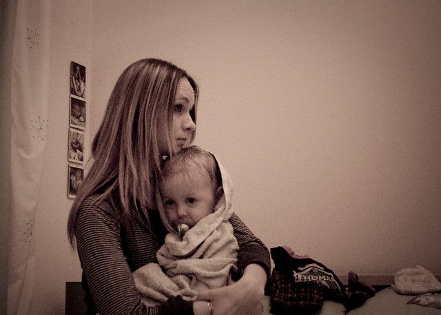
Week 1 - 'Accommodation'.
Each Sunday evening a new theme is published and I then have a week to shoot, edit & publish an image in relation to that theme. No prizes, just fun (and pride).
Links below:
Week 11 - RESHOOT: 'Delicate'
Week 10 - 'Trio'.
Week 9 - 'Finish'.
Week 8 - 'Chaos'.
Week 7 - 'Delicate'.
Week 6 - 'Hard'.
Week 4 - 'Open'.
Week 3 - 'Fashion'.
Week 2 - 'New'.
Week 1 - 'Accommodation'.
Last edited:
")


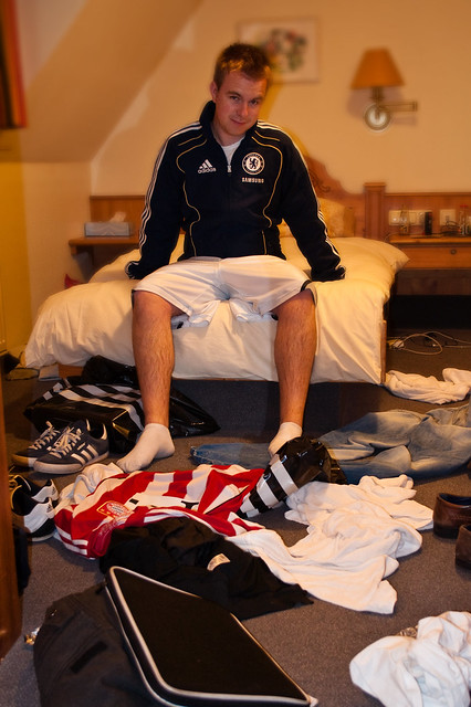
 a great take on the theme. Look forward to seeing more.
 I take it from what you are wearing and all the clutter you are into some kind of sport? BTW love the smug look on your face as though you are waiting for the room service to come and tidy up after you