weekly BobBCN 52 (Wk 52 - BUSY added)

Messages
2,837
Name
Bob
Edit My Images
Yes
Hello,

Hope I'm not too late to join in! I am currently doing a 366 but the thematic approach looks quite appealing. I was thinking about trying to catch up with a whole host of images to bring me up to date, but in the end I have settled on a selection of images that I would probably have posted had I been in from the start. And of course I will try not to overlap images from one challenge to another ........

I would set my level at 'approaching amateur' or thereabouts, but keen to learn!!

Here goes:

WEEK 4: Sweet


4.Sweet by BobBCN, on Flickr

WEEK 10: Win (or Pride?)

My daughter (the only one paying attention to me) after winning the Regional Spanish Championships representing Catalunya!


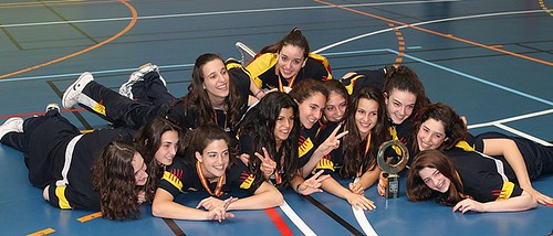
10.Win by BobBCN, on Flickr

WEEK 11: Shiny

Another bright idea from those IKEA designers ......


11.Shiny by BobBCN, on Flickr
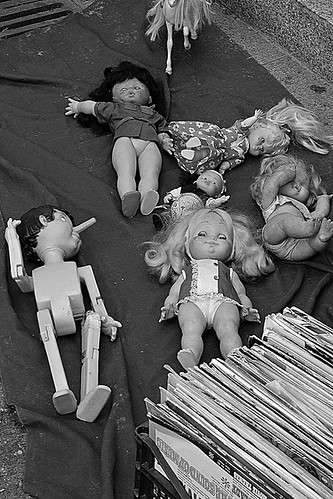
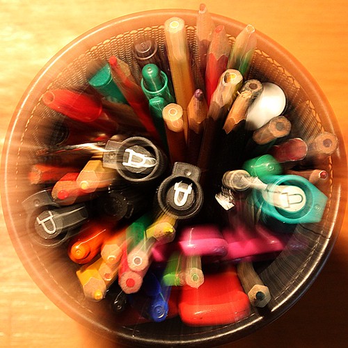
WEEK 13: Vice

As in English, the Spanish word 'vicio' can also mean bad habit, hence this very unoriginal visual pun. :bonk:


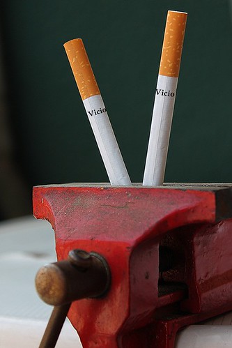
13.Vice by BobBCN, on Flickr
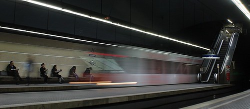
WEEK 14: Entrance

Yes, OK, so it's actually an 'exit' from this angle, but I really really wanted Desperate Dan in on the act.


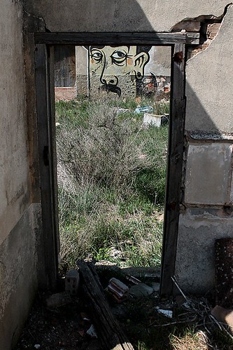
14.Entrance by BobBCN, on Flickr
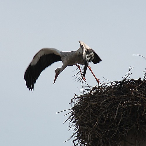
WEEK 18: Flight

As they usually don't even move, I was lucky to be actually ready to shoot as this stork decided to take off.


18.Flight by BobBCN, on Flickr​


My intention is to start from Week 19 as I have an idea for 'Authority'.

Cheers
 
Last edited:
I don't know if these dolls were dropped on the floor at random, or if the stallholder thought a little turn of Pinocchio's head would be amusing. (y)

Anyway, whatever, this seems to fit in with the random theme, unless of course Pinocchio moved all by himself, cos then the theme would really be 'intentional'. :bonk:

Enough said, personally one of my favourite images since I got my new camera, especially when I had to take it on the sly, the stallholders, judging by the looks I got, didn't seem too keen to have their wares photographed.


The Dolls by BobBCN, on Flickr​
 
Last edited:
Although shot in March this year, the aptly placed can/drink holder just in front of the air conditioning in my Seat Leon came in very handy.

Week 22: Temperature


22.Temperature by BobBCN, on Flickr​

So now I'm up to date, after a fashion. I believe the themes are announced on Saturdays, so then I'll be able to get out and do something new.
 
Hi Bob & welcome to the 52's madhouse...must say you're brave doing this along side a 366 :wacky:

Vice...liking the double meaning .... good angle & focus :)

Temperature....like your thinking , the can holder being in front of the airvent serves the theme so (y) Can't help wondering if you could've done a slightly wider shot to incorporate the AC control panel/button which would've really hit the theme bang on ?

Leave.....great image , love it ,bang on theme , great focus , light trail ,it's got it all (y)

Authority....great little models & well set out , for me , a tad more light from the front might help a little ?

Great start to your project , look forward to seeing more from you (y)

& yup , your'e right....themes are generally out around 8.30am saturday mornings :)
 
Thanks for the welcome and comments Lynne. Really appreciate that.
OK, well I'm in then, so let's see what the next theme brings!

You are right about the insanity of a 366 and now this 52 but, as I mentioned over on the 366, there's a lot of inspiration on this forum.

Cheers
 
Uumph!! My first real week and it had to be 'abstract!' :bang:

I read something about a departure from reality (gramps' thread #431) so how about the .... er ...... unfinished block of Swedish flats?


Unfinished.. by BobBCN, on Flickr​
 
Hi Bob - welcome to the 52 (y)

Will be a bit brief - but here we go

Sweet - A bit scary to me... like a chucky moment :D Joking... nice DOF for the doll

Pride - A great shot, them girls look well proud and happy

Shiny - Maybe a tighter crop to loose the desk edge & straighten, but nice exposure

Vice - Great shot, good dof, bang on theme !!!

Entrance - I'm liking that... not necessarily an exit. an entrance to the outside I would say :)

Flight - Not sure on the square crop, but a nice capture, a good feel of motion and a sharp head & body

Authority - A nice little shot that, the letterbox crop and lighting suite the subjects well

Leave - Nice one, really like that, a very ghostly image (y)

Random - Certainly is...

Temperature - A simple but effective shot that :)

Abstract - A nice set there.. for me I'm liking the last shot of the pens, the square crop works very well and love the colours and movement !!!!

Well done for joining so late - look forward to the rest of your work (y)
 
Wow, you have been busy! Too many to comment on but well done in getting such a good collection of shots to catch up on the project. I like the unfinished flats but the 'zooms' are more 'on theme' for me for 'abstract' (y)
 
Dark Knight and gramps: Thank you both for the comments. Very encouraging to get responses so early. I hope to visit other people's 52's and comment, albeit as someone relatively new to all of this. (y)

Cheers

Bob
 
Hi Bob, and welcome to the 52 club. :)

Because there's so many of them, I've selected a few to comment on:

Sweet - I think less depth of field would have helped here (according to the Flickr exif, it was shot at f18), as the background does not add to the picture.

Win (or indeed, Pride) - A good photo which shouts Win to me. I wonder if a lower PoV would have been better?

Shiny - Does not really say "Shiny" to me, but that doesn't mean a huge amount.

Vice - I like the PoV and composition.

Leave - For me, this is your best entry so far. I really like it and cannot find anything wrong with it.
 
Thanks for your comments Nathalie.
Agree totally on the doll!
With Win I would have had to get on the floor or crouch as it seems the other fella was doing judging by the direction the girls are looking.
Shiny was a weak attempt and didn't turn out as I thought it would.
Leave worked out well, after cropping anyway, as a quick half a second 'snap'.

Thanks again

Bob
 
Welcome aboard Bob, well caught up and looking forward to seeing what else you come up with in the following weeks. ;)
 
Hi Bob,

Welcome to the madness that is the '52' I can't believe you are starting this late on but i'm impressed that you have managed to catch up. Really too many to comment on but I'll make a start with Abstract...

Nice set I prefer no 1, looks good in monochrome and is very open to interpretation and bang on theme. Nick (y)
 
Great catch up Bob, I like them all.

Starting serious comment at abstract, I like the first one best. It's a great interpretation, and I think you've got the building like look of it spot on. Great shot :)
 
Thanks for the comments, now looking forward to the next theme!!

And hopefully I'll get time to look at everyone else's threads.

Cheers

Bob
 
Well, maybe 'mirrored symmetry' and maybe five past eleven would have been better!

One I took a while back and originaly posted in my 366.


24.Symmetry by BobBCN, on Flickr​

More to follow ...... hopefully. (y)
 
Last edited:
Hi Bob

like your Symetry image, mono works well & love the angle with the clock framed by the street lights (y) Not sure yet about the symetry bit...

I'm really liking Unfinished :clap:
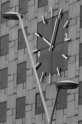
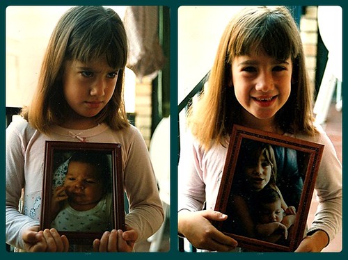
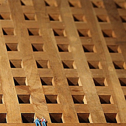
.....I keep going back to it trying to figure out if they are real people or toys ?

Look forward to seeing more of your project mister (y)
 
blondie606 - Thanks for the comments. The original description was 'unfinished block of Swedish flats' as the 'building' is an IKEA product! The toys are actually HO scale workmen from the world of model trains.

michael23 - Yes, when you look closely you can see that the same pattern in the bricks is repeated in the windows (at intervals anyway) and if they were inline with each other they would be symmetrical :cautious: It's actually the hotel Catalonia Plaza. (I knew it was a hotel but I had to google to get the name!!)

Cheers again

Bob
 
maybe five past eleven would have been better!

I think that is the case here, the photo doesn't look symmetrical and hence dubious to theme IMO ... look forward to seeing other options though :)
 
Two more efforts. The front of a modern church just down the road. Two images cos the first in B/W has a kind of surprised robot look about it. :wacky:
Having said that, so does the colour version. Anyway, it's symmetrical apart from the cable running up the righthand side ....


24.Symmetry2 by BobBCN, on Flickr


24.Symmetry3 by BobBCN, on Flickr​
 
Hi Bob. I like all of your symmetry shots, but think number 2 is best; I like the simplicity of it and the B&W treatment. I think it needs a slight straighten though.
 
Think you are right about the straightening Mark, must be the old eyesight letting me down!
Glad someone else saw the robot Sarah, or it might have been a case of the braincells letting me down!!!

Cheers
 
Must admit moody had me stumped, but whilst sorting I out some old photos I came across a couple that maybe fit with the theme. They're from a few years back but the scanning & processing with Photoscape was brand new! (y)

The eldest didn't want to have her photo taken with a photo of the youngest, but cheered up when I changed the photo for one she was in. Can't get more moody than that! (And she's still pretty much the same 13 years on!!)


moody by BobBCN, on Flickr​
 
Last edited:
Welcome Bob. Apologies for the short comments but need to catch up with your posts.

Sweet – Nice feel to it although the object on the left distracts a little
Win – It’s a pity not everyone is looking at you but congratulations to your daughter anyway
Shiny – Nice one – well exposed to give an atmospheric feel to it
Vice – Good interpretation on the theme
Entrance – I agree with you. It feels more of an exit
Flight – Well caught although a bit under exposed I feel
Authority – Nice idea although I’d have cropped out the dark line at the top
Leave – I really like this one. It’s well exposed and you’ve caught that train really nicely
Random – I’m afraid this one doesn’t work for me but understand= it must have been quickly snapped
Temperature – Maybe you have different shaped cans in Spain but it looks stretched to me. Some condensation on the can may have added to the sense of temperature
Abstract – I really like the idea of your first one. I find it too cropped on the bottom. Great thinking though
Symmetry – I agree with you about the time needing to mirror the lighting but well seen.
Moody – Kids. Don’t you just love them :LOL: The left hand side image definitely fits the moody theme
 
Nice moody shots, well processed. I'm not convinced about using old shots, but you've done work on them so I guess it's OK!
 
Here's my first offering for Joy.

I'm aware that technically it's weak - chopped fingers, very noisy etc but I think it captures the theme perfectly - explosion of joy on winning a game.

My lass is number 18 which is a pity! :shake:


GamePoint by BobBCN, on Flickr​
 
Last edited:
Back
Top