You are using an out of date browser. It may not display this or other websites correctly.
You should upgrade or use an alternative browser.
You should upgrade or use an alternative browser.
weekly d00d's 52 in 2014 ... Week 51 : Extravagant
- Thread starter d00d
- Start date
- Messages
- 4,182
- Name
- Paul
- Edit My Images
- Yes
Hi David
I like that, but also wonder what the background would have looked like. I realise I'm hardly one to talk, but is it oversimplified? (As I said, this can be levelled at me a lot of the time, too...)
However, your focus appears spot on - was the grad applied in post? One thing's for certain - it keeps me wanting to find out more, see hidden detail etc. Which is a good thing... Also bang on theme in a couple of ways.
- Messages
- 7,548
- Name
- susie
- Edit My Images
- Yes
Hi d00d....two shots in this week and I haven't done any yet 
First one ...I think the background is against it, maybe plainer would work
The second one, I love that one...the slightly spooky black against the old clock make it really atmospheric, for the theme maybe a tad more light to make half the face show, but well done you
First one ...I think the background is against it, maybe plainer would work
The second one, I love that one...the slightly spooky black against the old clock make it really atmospheric, for the theme maybe a tad more light to make half the face show, but well done you
- Messages
- 13,760
- Edit My Images
- Yes
Blimey... sorry mate miles behind on here, really tired so will pop back on tomorrow night to comment
- Messages
- 4,088
- Name
- Graham
- Edit My Images
- Yes
Lovely clean glass, needs a ACW rotate i think, and the highlights cloning out, but if you;re not happy with it there's little point spending the time.
take #2, I think the lighting works well, echoing the shape of the hands, nice and mysterious, I'd again say a slight ACW rotate, either that or I need to prop the right side of my screen, also I think it would take a crop off the bottom and right side.
Good work.
take #2, I think the lighting works well, echoing the shape of the hands, nice and mysterious, I'd again say a slight ACW rotate, either that or I need to prop the right side of my screen, also I think it would take a crop off the bottom and right side.
Good work.
Last edited:
- Messages
- 1,408
- Name
- Elaine
- Edit My Images
- Yes
Love half two! Very spooky looking, just like it can be at half two in the morning
- Messages
- 8,398
- Name
- Lynne
- Edit My Images
- Yes
Hi David
1st Half...neat idea but if you're not happy with it try another one...& you have done...
Very mysterious feel to it , like the lighting , the slight angle & the aged clock face Another that may need to tilt there screen a smidge....a mm ccw rotation is called for...
1st Half...neat idea but if you're not happy with it try another one...& you have done...
Very mysterious feel to it , like the lighting , the slight angle & the aged clock face
Another that may need to tilt there screen a smidge....a mm ccw rotation is called for...
OP
- Messages
- 9,075
- Name
- David
- Edit My Images
- Yes
Thanks for all the comments.
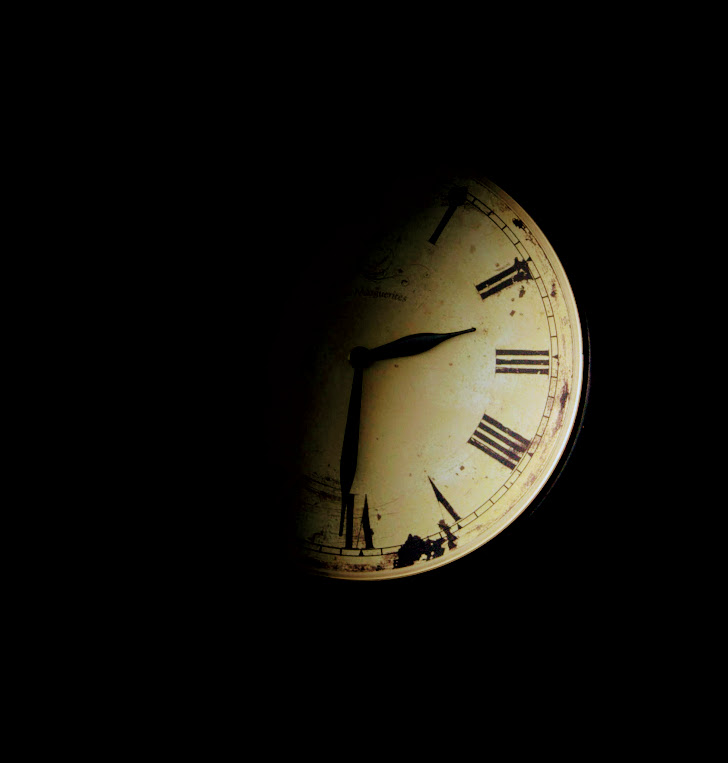
Illusions ... the clock is not old, it's got a fake distressed look, I took in down from the kitchen wall, removed the glass, photographed it lying on the floor. And the dark is created by a vignette tool.
It does look like it needs a mm ccw rotation (I don't know why).
I'm tempted to build on this ... maybe give it more BG on the right and add a distant door half open with light coming through.
- Messages
- 4,182
- Name
- Paul
- Edit My Images
- Yes
David
Really good take on the theme - I like it. Dual & contrasting architecture. Only tiny tiny crit is the building to the right looks very slightly OOF at the top? Maybe needs a tiny angle tweak but otherwise absolutely top notch. Clever take and well spotted! Don't you just hate it when you don't have your favoured camera on you??
Really good take on the theme - I like it. Dual & contrasting architecture. Only tiny tiny crit is the building to the right looks very slightly OOF at the top? Maybe needs a tiny angle tweak but otherwise absolutely top notch. Clever take and well spotted! Don't you just hate it when you don't have your favoured camera on you??
- Messages
- 1,408
- Name
- Elaine
- Edit My Images
- Yes
A clever concept well executed! An interesting architectural structure both in the raw and viewed through another architectural structure - or is the first one a reflection in the reeded glass rather than the view through it? Either way I like it (n)

- Messages
- 9,095
- Name
- Mandy
- Edit My Images
- Yes
Half - both images fit the theme, I think I prefer the first image. However I like the idea behind the second just feel it needs a little something not sure what tho.
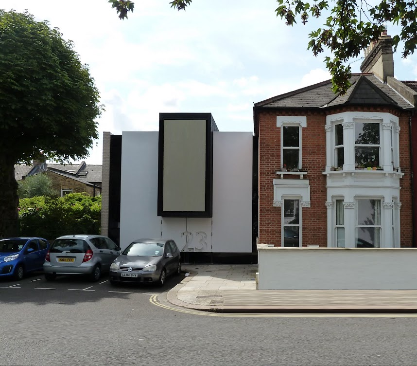
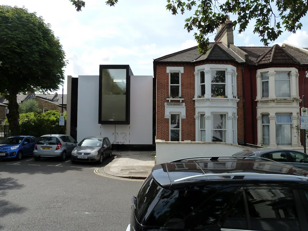
Architectural - two more good images, I think the first image would get my vote if it was a bit sharper. The second image is great the only thing that let's it down for me is the parked cars. But number 23 certainly looks very interesting.
Architectural - two more good images, I think the first image would get my vote if it was a bit sharper. The second image is great the only thing that let's it down for me is the parked cars. But number 23 certainly looks very interesting.
- Messages
- 4,182
- Name
- Paul
- Edit My Images
- Yes
Excellent concept for architectural with your second shot (I've already commented on the first one)... as Mandy says, a cleaner image without cars, trees etc. would be great but you had what you had when looking through the viewfinder. I think it's a very smart take on the theme  (precisely the type of architectural "look at me, look at me" I hate!)
(precisely the type of architectural "look at me, look at me" I hate!)
OP
- Messages
- 9,075
- Name
- David
- Edit My Images
- Yes
Half - both images fit the theme, I think I prefer the first image. However I like the idea behind the second just feel it needs a little something not sure what tho.
Architectural - two more good images, I think the first image would get my vote if it was a bit sharper. The second image is great the only thing that let's it down for me is the parked cars. But number 23 certainly looks very interesting.
Thanks Mandy babe ... I am listening
Last edited:
- Messages
- 1,406
- Name
- Carol
- Edit My Images
- Yes
Hi David sorry not got around to commenting on your 52s, new to this game and finding the time to comment on everyone's is a feat in itself!
Half - Works for me and if it had been me it would have been empty!
2nd Half - great idea love the simplicity of the photograph but would have prefered the light to be covering half the clock face from 12-6 lengthways.
Architectural - I prefer your first photograph, a different take on the theme but nonetheless spot on, great reflection!
- Messages
- 1,417
- Name
- Judi
- Edit My Images
- Yes
Hi David,
Yum... lovely image nice smile in his eyes too, like the crop, guess he enjoyed his yum whatever it was
Rich... I'm not a card player but i suspect you would be rich if it were money, good focus and i like the crop
Half... I think that I like the clock the best it is a little spooky in the dark and i would like to have seen the whole of the 12-6 half with a little more light but good one
Architecture...Lovely reflection in the first shot, thats my favourite
Promise...really love it, the composition is great, just a super shot
- Messages
- 13,760
- Edit My Images
- Yes
Well... finally got back
Rich - Liking this David, good focus, liking the inclusion of the matches, crit wise, think a TINY deeper DoF as the top of the A's are just dropping off, that being well picky, as a generally nice colorful image that is great for the theme
Half - A nice sharp image, slightly on the wonk with the wine line, and the background is a bit overpowering, but the glass lettering is is nice and clear and a good colour too
Half - Past two, again a nice original idea, I think it could even take a tighter crop, looks a nice old time piece too
Architecture - LOVE this one, great use of the reflection, really liking that you have the clipped side of the building full in the reflection, again nice and bright and liking the composition
Promise - Quite thought provoking, slightly oof hat thingy, but really liking your low point of view and the uncluttered scene as a whole
- Messages
- 4,831
- Name
- Alan
- Edit My Images
- Yes
Hi David
Half - #1 - b/g not the best and some distortion in the mortar pointing to the right. Glass not straight, but really good idea
#2 excellent idea and title. Like the comp and the lighting.
Architectural - #1 - Good spot. A bit soft and the juxtaposition of the buildings could be slightly better but an excellent idea to contrast the two types of architecture with the use of the reflection
#2 - another good spot and again the juxtaposition, but this relies more on the buildings rather than your eye which is the standout part of #1. tree to left and cars do detract - poss a tighter crop?
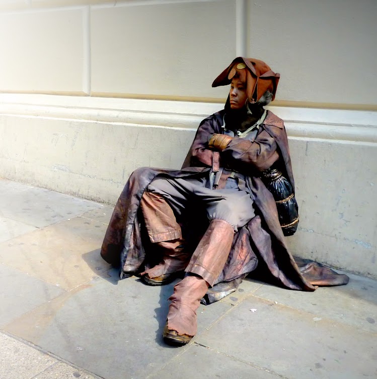
Promise - 3rd good spot in a row! good comp, pov, angle of lines, light and colour.
Half - #1 - b/g not the best and some distortion in the mortar pointing to the right. Glass not straight, but really good idea
#2 excellent idea and title. Like the comp and the lighting.
Architectural - #1 - Good spot. A bit soft and the juxtaposition of the buildings could be slightly better but an excellent idea to contrast the two types of architecture with the use of the reflection
#2 - another good spot and again the juxtaposition, but this relies more on the buildings rather than your eye which is the standout part of #1. tree to left and cars do detract - poss a tighter crop?
Promise - 3rd good spot in a row! good comp, pov, angle of lines, light and colour.
- Messages
- 1,159
- Name
- Simon
- Edit My Images
- Yes
Hi David,
Architecture - you've got some interesting images. I like the first one with the wavy/blocky/imperfect reflection.
Promise - like it for its comp. Agree with DK about the thought provoking nature of it, very apt for what's been on the news recently.
Architecture - you've got some interesting images. I like the first one with the wavy/blocky/imperfect reflection.
Promise - like it for its comp. Agree with DK about the thought provoking nature of it, very apt for what's been on the news recently.
- Messages
- 9,095
- Name
- Mandy
- Edit My Images
- Yes
Promise - a wonderful take on the theme zero crit from e as I love it as it is.
- Messages
- 4,182
- Name
- Paul
- Edit My Images
- Yes
David... well promise really is a smasher, isn't it?! Fantastic take on the theme (IMO the best so far this week) and topped off with a really good technical take. Only improvement for me would be eye contact, but otherwise it's super. Fan-bloomin'-tastic!
- Messages
- 1,408
- Name
- Elaine
- Edit My Images
- Yes
A very strong image d00d! Love the colours and a great fit for the theme
OP
- Messages
- 9,075
- Name
- David
- Edit My Images
- Yes
Thank you for all the feedback. The PROMISE image is going down well. Rather than reply to your comments individually, I'll explain what the picture is and what PP I did:-
Covent Garden - a place where actors, eccentrics, performers and non preforming human statues are found (some do it for money some for love) but no ordinary beggars are permitted. Sunday morning before the fun starts really I see this character round the side of the Royal Opera House (nice backdrop) in this surreal costume (a bit hot for August), a black man? wearing make-up? looking vacant but I do believe he might be watching me through the corner of his eye! Do we call him a human statue? I don't know.
The original image had more wall on the LHS ... following his apparent line of sight. I played with the idea of having him looking into a nothingness but eventually abandoned it and cropped to zoom, you can still see a little haziness on the LHS tho. Had to do a slight straighten and slight colour boost.
Last edited: