
- Messages
- 1,408
- Name
- Elaine
- Edit My Images
- Yes
Great composition and a striking image in b/w. Have to agree with others about the foreground, both the ace and the lower part of the 10, being oof is a bit of a distraction.

") still thinking about the angle
still thinking about the angle 

Thanks MandyRich - love the composition and a good take for the theme.
Cheers PaulNice shot Peter for Rich and great composition which works really well (and on theme). I agree with Andy & Alan re: OOF Ace being a slight (and really very minor) distraction. Super conversion - let's give you credit for that rather than Silver Efex! Love your DOF (apart from the Ace)... top job.
Thanks ElaineGreat composition and a striking image in b/w. Have to agree with others about the foreground, both the ace and the lower part of the 10, being oof is a bit of a distraction.
Thanks CraigHI Peter - Rich not crit from me think you have nailed this one angle is good, DOF spot on love the b&w conversion
Thanks for the comments Lynne. No problem with the late arrivalHi Peter
sorry for the late arrival.......
Rich....like the tight crop & use of DOF , nice n sharp & well lit
Loud.....top piece of kit ! Strangely I do like the angle on this , mono was a good choice & that sliver of DOF just perfect
 Blencathra Panorama by Delta Skies, on Flickr
 St Michael Church, Well by Delta Skies, on Flickr)... I know how difficult a job it can be depending on the scene. Obviously on theme as well. - It's a real fun shot, great colours and a DoF that works real well - It's a real fun shot, great colours and a DoF that works real well No crit other than it does appear to be gnats whisker on the squiff...just a mm ccw I think & that's being mega mega picky
Many thanks AllanHi Peter, two great shots there, what a great place to stay and what a view certainly a sense of space, very well stitched together a good even expose all around.
the church pic you have managed to get all the detail in there which I know is very difficult, there is a lot of light high up in churches and very little ground level
certainly paid off to take multiple exposures, excellent work
Thanks ColinTwo great images Peter... The church certainly is a skill and as you say when you look at the age of said architecture its amazing how these buildings have stood the test of time & weather etc...
Thanks SusieHi Peter...I love the panorama...a fabulous view and you put a lot of hard work into it which has paid off. I like the choice for skill...it is fascinating isn't it how talented they were without all our modern gizmo's that we take for granted, nice to see it all in focus and a good choice for the theme.
Many thanks Graham. Interesting that you mentioned keeping the colour in the windows. I actually masked those areas to reduce the saturation as the reds where a bit too brightTwo really well executed uses of multiple images to generate the image that you see with your eyes there peter.
The pano works well, the smaller trees going up the hill show the scale and the computer has done a fine job of stitching then together.
And I think the church interior is another brilliant use of multiple exposures to cover the huge dynamic range you had to fight against. You have certainly won that fight keeping colour in the stained glass and detail in the roof and pews without it looking hdr'd. Really natural, very nicely done.
Good work.
Wow thanks for the detailed feedback Paul. Unfortunately the Blencathra pano is lacking some lovely morning or evening light - it was taken around midday. Photoshop did a good job in stitching it together although two areas of the mountain ridge needed manually adding back in. It took a bit of doing but I got there. Again PS merged the different exposures for the Skill shot pretty well although I had to do a fair bit of playing with exposures and contrast to give it a more realistic feelHi Peter - a couple of good shots (and for the panorama, I think you've done very well as it's a hard skill).
So reshoot of Space: I like the picture and it's perfectly on theme. I'll be completely honest and say it's lacking a slight "wow" factor for me, which doesn't take away from the fact it's a very good and accomplished photo - and a very well-executed stitch job! I am out on the hills pretty frequently so it might just be familiarity with this type of scene, but I like to see really breathtaking light being cast on the hills for me to stop and think "this needs a photo". Alternatively, something (other than a hill!) which makes you want to stop and take the picture. Funnily enough, your very own Wensleydale picture (it was the final version you posted) is precisely what I mean... the rolling green field, the hut etc. all work well. Had you had a morning or evening sky and that shot would have been utter perfection for me. This might also be brought more "alive" with the right light but it also needs some more foreground for me. Perhaps shooting from further to the right to get more of the fence as a lead-in?
In terms of the technicals, it's all bang on for me and you really have done a great job on the stitching (although the devil is always in the detail and we can't see that
Skill: nice take, on theme and technically a very good shot in difficult circumstances: the verticals are, DOF extends from front to back (I think) and exposure is absolutely spot on despite the challenging light conditions. I have to say, this shot is probably the perfect of example of when HDR does work. You've skillfully (ha, geddit?) blended multiple exposures to extract the right detail whilst retaining a natural look. It probably resembles roughly what our eyes could see given their much greater dynamic range. I have to say, an absolutely top technical shot and well done!
Many thanks for the catch up Dean. You are right about the staggered pews. Just when you want a symmetrical image you find the church isn't laid out perfectlyHi Peter
Apologies for not getting around again lately... been a bit manic to say the least
Vertical - A wonderfully colourful shot, great detail and just enough off centre composition wise, super DoF too
Yum - Now that is an excellent idea, not sure what is happening to the background, hang on just read you kept it there
Loud - Ooooo a Marshall Amp... Nice !!! - Perfect DoF on the volume button, liking the quirky angle and the inclusion of the branding - Nice oNe
Rich - Nice one, The chips in the background work well, the odd angle but full inclusion of the entire stacks, great focus on the cards too, just wonder what the colour image was like
Re-Shoot Sense - A lovely landscape, I like the fence line leading down the rh side, really well stitched together and a wonderful looking spot to stay
Skill - A nice looking old church that, again real good PP with the blending, something else I'd like to have a go at but not sure how too yet... Nicely symmetrical with the arches, lamps etc, just not sure how the benches aren't too, I guess they are staggered slightly
I will try and keep up a bit better once caught up with everybody
Thanks Andy. Yes as above the church wasn't truly symmetricalHi, Peter, racking pano thre. I've been up there a few times and the places always amazes me. You've done well with the technical aspects, the exposure works really well, especially in the sky. Maybe my work's PC but I'd like a little more colour
Skill, again, I'm awalys amazed at the craftmanship in such places. The blending of the photographs is bang on with good highlight and shadow detail the windows have been handled really well. I suspect the symmetry issues were due to the age of the building.
IMO, rather than install speakers the blooming vicar should talk louder
Cheers.
Thanks Lynne. I'll take another look for the ccw.Hi Peter
Cracking pano shot , plenty of detail , great work on the joining , no crit to offer as looks just fine & dandy to me
Skill....amazing blending there Peter , perfectly exposing the darks & lights to reveal the beauty of this interior
 Half Time by Delta Skies, on Flickr). It obviously got upset in being taken off my 30+ year old trusty Manfrotto.
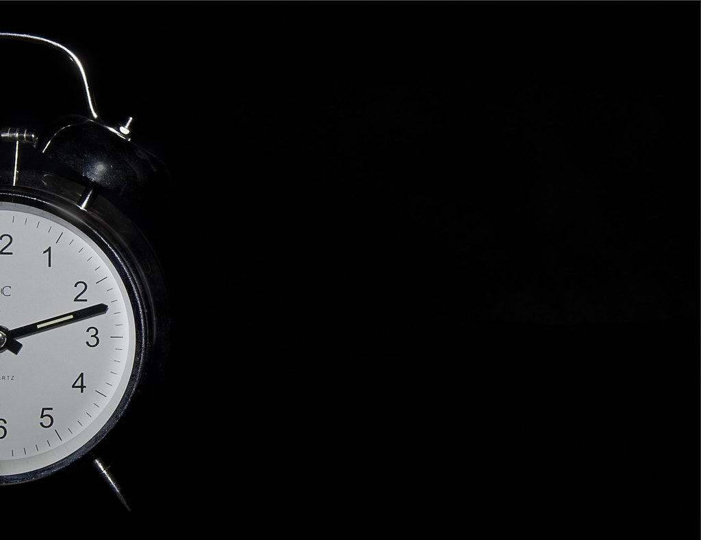
Thanks Graham. I did wonder whether to have more negative space by putting the clock on the vertical third but felt that that would make the clock too small in the frame. Time wise my immediate thought was to set the clock at around 10:10 or 1:50 to give the standard smily face look. I see what you mean though.Blacks, whites, focus, sharpness all spot on.
Feeling maybe a touch too much empty space to the right, but see that to get less would put you to close to square, or have to lose some of the vertical height too.
Half past an hour (probably best at either half one or half two) would have been the obvious choice of time, ( for me anyway), with the minute hand straight down, sliced in half by the crop..
Many thanks Paul. No need to apologise for re-imagining the photo. That's exactly what feedback is about. My next shot for architecture hopefully (I'm about to get the camera out) is planned to be on a white surface with a shadow.Hi Peter - that's a nice take on the theme and a nice photo. I like the composition a lot. Well executed photography, too.
I'll agree with Graham's thought regarding the time itself - half past would certainly make logical sense, but aside from that (and even allowing for that, as it is no more than a suggestion), I think the interpretation is excellent: witty and thoughtful.
My only very small crit on the image would be I'd personally prefer a touch more "bang" - it's effectively a monochrome image, so I'd like the lighting to be slightly flatter (difficult to manage the specular highlights, I know) so that you can up the contrast/exposure and get the white of the face really white and bright. I really do like it a lot, though.
Would it work standing on a white surface (but still a black background) and a long shadow off to the right? Sorry, I'm re-imagining your photo now which is naughty... I'll stop because I like it as it is!
Thanks Allan.Hi Peter, doesn't bother me its not half past on the clock I like it as it is, nicely lit and perfectly in half
Many thanks Paul. No need to apologise for re-imagining the photo. That's exactly what feedback is about. My next shot for architecture hopefully (I'm about to get the camera out) is planned to be on a white surface with a shadow.
Bugger! I've been rumbledLego! Hurrah...
 Architecture by Delta Skies, on Flickr) Shame the shadow isnt lit from below, but still, all your own work, great colours, good lighting got your camera out and bang on theme for me... Tick all boxes ) love the negative space, would prefer to see both hands, but that's a bit picky, super blacks and dead on the half - Like It two very creative submission here. Half, I'm a sucker for negative space and this appeals to me. The B&W works well to emphasis the negative space and the attention to detail in the clock is great. Crit, and I'm struggling here, is the clock face, looks little grey...uber critical, though.
Thanks Graham. I was keen to get a pure white but I think I may have overdone it thus leaving it groundlesshmmm, see where you were heading for, and I get the vibe that you think it's not quite there either.
That bright red brick, on the bright white BG, with the (obviously) unnatural looking shadow leaves it ungrounded and floaty. (Reminding me of my first attempt at a Lego Penrose Triangle last year).
Many thanks Alan. The other good thing about small churches is that they are often empty of people and therefore you can spend all the time you need in there composing the shots and trying different exposures. I also always leave a donation before I leave.Hi Peter
Panorama - nice place to take a shot and enough in there to give interest
Skill - good choice of subject - these small churches often have a simplicity that the grander cathedrals lose in their scale. I like the symmetry and you have handled the exposure well. This type of work is beyond me at the moment and I think that I may need to set myself a few goals/projects to try to develop these skills, use of PS etc. At the moment i just seem to spend so much time thinking of the themes/setups etc that 'dong it' comes higher in my thoughts than 'doing it differently'
Half - good idea, nice handling. I like the comp and the mono feel. Not sure where i would have put the hands
Architecture - nice humorous idea. good choice of colours. Agree with Graham re the 'floatiness' element. Again, not sure how i would have handled it, but an original idea
Cheers DeanI really like that Peter, to me it's a nice original idea (until you spoilt it
<EDIT> Missed your 'Half' image...
Again really like that (I know i'm a bit repetitive
Thanks SusieAnother very eye catching image again Peter...super sharp and simple, but for me effective.....I really like it.
Thanks Andy. It's not actually B&W - I just chose a clock with no colour.Peter,
Architecture, like it. Well composed, good length to the shadow and nice vivid reds. I suspect it may have spoilt it, but the block appears to be floating.
Good show, Peter, keep up the creativeness
Cheers.
Thanks Andy. It's not actually B&W - I just chose a clock with no colour.
first hand!!Ah, I've had a few JDs and can now see the green in the.....what the hell do you call the one that's not the second hand
Cheers.
The position of the hand is objective...putting it on the 3 would have been my choice but it's not my image Just wonder about a light shadow to ground the red brick a smidge.....Thanks AllanHi Peter, liking architecture its quite an abstract image and as such it doesn't really matter if its floating the black red and white are perfect together
plus the idea of a single lego brick and the idea of a house is perfect to me, when I was young the first thing I ever built with lego was a house and I am sure thats what still happening today
Thanks LynneHi Peter
Half.....like this for placement , negative space & lighting
Architecture....brilliant idea ! 3 colors work well, perfect angle & perspective
 The Promise of Love by Delta Skies, on Flickr