weekly pjm1's 52 in 2014 week 52 (Support) added... FINISHED!

Bubbles.... tiny bit meh if I may say. But a nasty theme, we all struggled with!

First has the most potential for me, but the OOF curve of the glass doesn't sit nicely for me. However, cropping it out and keeping the top left third.... really makes it sing for me, nothing to distract from the super clear structure of the bubbles.


Communicate....... 1/5 second handheld(ish)... :clap: :)

Lovely colours in the sky, and the movement at the top of the spinny bit is great.

Glad you've acknowledged the slight under exp, as I did notice a small space at the top of the histogram, hard choice between going for a replication of what you saw, vs creating something with a bit more of oomph. I know which I prefer, but respect your decision to stay true to your eyes.

Composition is fine for me, although applying the vertical perspective adjustment in LR, does rob some off the bottom, which I think also works well too. Adding more emphasis to the sky.
 
Bubbles.... tiny bit meh if I may say. But a nasty theme, we all struggled with!

First has the most potential for me, but the OOF curve of the glass doesn't sit nicely for me. However, cropping it out and keeping the top left third.... really makes it sing for me, nothing to distract from the super clear structure of the bubbles.


Communicate....... 1/5 second handheld(ish)... :clap: :)

Lovely colours in the sky, and the movement at the top of the spinny bit is great.

Glad you've acknowledged the slight under exp, as I did notice a small space at the top of the histogram, hard choice between going for a replication of what you saw, vs creating something with a bit more of oomph. I know which I prefer, but respect your decision to stay true to your eyes.

Composition is fine for me, although applying the vertical perspective adjustment in LR, does rob some off the bottom, which I think also works well too. Adding more emphasis to the sky.

Thanks Graham - very helpful (and fair) comments as always. I struggled with bubbles but I don't think I was alone. I'll take a look at your crop idea - I'm intrigued!

Re: communicate, I did have to take a few shots to get one which was steady enough! It's all good practice for my macro photography though...

It's an interesting one re: exposure - and illustrates there isn't a "right" answer, just what we choose (although there are certainly always some very "wrong" answers!)... I'll also have a play in LR re: vertical correction (not sure I ever do that?)

Cheers again!

I don;t think there's much point in not saying what you feel about something, although I do find I generally find something I don;t like, or "wrong", before I sit back and think about what I do like. Bubbles I hated as a theme, for about an hour and a half, until I got my shot, then I liked it! :D

Theres lots of vertical fence posts in your radar tower, and when they are close to the edges, anything not vertical tends to stand out (to me anyway), the perspective corrections (in lens correction tab) seem pretty much perfect in most cases. One click and its done.
 
Hi sorry not popped in for a while been without broadband, you have some fantastic images in here just to many for me to crit on individually.

Thanks Mandy - I always like a pat on the back!

Don't worry about not critting each/some - I've been firing the shots off like a maniac over the last few weeks and you must be cursing enough already with losing broadband for so long. Welcome back!! :wave:
 
Hi Paul, nice sky and an interesting structure not something you can usually get too close too especially these days with our heightened paranoia,
I think maybe you could have darkened it a little maybe so it was in silhouette as the building and the fence are not the most attractive things, obviously not your fault unless you do actually design radar towers for a living.
the slight bit of movement in the radar is excellent, maybe the crop should be with the left hand of the path right in the bottom corner :thinking:
steady hand too(y)

Thanks Allan - your comments and considered crit are always appreciated (y)

It's not the prettiest but an interesting contrast to the very natural background. I agree a silhouette would work, although I did like the colours on the grass (once I'd removed the spurious rubbish!)

I think I need to get out and take more sunset/sunrise pictures :)

Cheers!
 
Hiya Paul, I hadn't realised, its been a couple of weeks since I've commented on your thread and you've added another 8 themes
shakehead.gif
and some great images (y)....you have far too much time on your hands :D

2nd image for fall certainly works better for me (y)

Sparkle I like (y) I can't pass over a river without wanting to wet a line :D great composition, bank bottom left corner to right, bridge top right corner to left :clap:

Communicate is an excellent image, as mention, hand held @ 1/5th :clap: giving motion blur to the radar and that's some lovely colour to the sky too (y)
 
Hi Paul...

any image inspired by Deep Purple is dead on in my book... I like your take and the image works in B&W
liking the 2nd bubbles image as the first set look a bit square but again good take on the theme...
Communicate I had a similar idea so can appreciate that reat minds think alike... ;)
 
Hiya Paul, I hadn't realised, its been a couple of weeks since I've commented on your thread and you've added another 8 themes
shakehead.gif
and some great images (y)....you have far too much time on your hands :D

2nd image for fall certainly works better for me (y)

Sparkle I like (y) I can't pass over a river without wanting to wet a line :D great composition, bank bottom left corner to right, bridge top right corner to left :clap:

Communicate is an excellent image, as mention, hand held @ 1/5th :clap: giving motion blur to the radar and that's some lovely colour to the sky too (y)

No worries Phil - thanks for commenting (I'd rather have a comment at any time than silence :))

I did have a bit of time on my hands, you were right... but sadly that will change over the next few weeks. Although I say sadly... since I run my own business then being very busy is probably a good thing!

Glad you like a few of the shots... I look forward to being able to slow down once I properly catch up and just take one a week - I'm sure the rest of you are looking forward to that even more!

Hi Paul...

any image inspired by Deep Purple is dead on in my book... I like your take and the image works in B&W
liking the 2nd bubbles image as the first set look a bit square but again good take on the theme...
Communicate I had a similar idea so can appreciate that reat minds think alike... ;)

Hey Colin... thanks for looking. Glad a few of them struck the mark for you - looking forward to seeing more of yours as well... keep it up!

Cheers all.

RIGHT.

Friday night and Mrs pjm is out with the girls. Kids are asleep so it's camera time.

I tried a few different takes of this as I initially wanted the head of the "aggressor" turned towards the camera looking malevolent. But for some reason it didn't quite work... looked too staged.

So here goes: DOLLICIDE. Which I think is suitably dark.


Dark: Dollicide
by pjm1 (Paul), on Flickr

I know you're all a terribly sensitive bunch so I'd better say that no soft toys were harmed in the production of this image.

Thanks for looking! (For some reason the darks look a lot darker on this forum... definitely better viewed on Flickr but then I seem to be saying that each time!)
 
Hi Paul, excellent :clap: had a pretty similar pic in mind so back to the drawing board for me, there is something about toys which is deeply disturbing have done a few pics in the past.
you have executed it really well, well maybe the knife could do with being the other way round small point though, very dark image indeed right up my street (y)
lighting and BG superb maybe a little touch of grounding for the dolls would be good but doesn't distract and also hard to achieve, I can forgive you for that
I am really nitpicking on what is a great pic for the theme :clap:
 
Holy crap...that's mental :)

At the moment I'm unsober :) so I'll pop back tomorrow for another look....not that I'll be sleeping tonight

Cheers.

:D Yes... a bit mental, I agree! I do occasionally worry myself slightly about the ideas I come up with. Although I'm very much encouraged and reassured by the fact other mentalists like @alsjazzera are thinking the same, too :whistle:

I had an "artistic" glass of wine to help stimulate the creativity gland a bit and this was the output, so perhaps it's best viewed with slightly wobbly eyes? Hope the head's not too sore!

Cracking shot that! The bg is nice and dark, wonder if the knife needs to be blade downwards? Not that it matters though. Well done for being quick off the mark

Thanks Michael, I agree the blade would look better the other way around. The reason for not doing it was I needed to use the heel of the handle (the jutty-out bit nearest to the blade) to keep the knife from slipping out of her hand - I had tried using bluetac but that didn't work.

Thanks for looking at commenting (y)

Hi Paul, excellent :clap: had a pretty similar pic in mind so back to the drawing board for me, there is something about toys which is deeply disturbing have done a few pics in the past.
you have executed it really well, well maybe the knife could do with being the other way round small point though, very dark image indeed right up my street (y)
lighting and BG superb maybe a little touch of grounding for the dolls would be good but doesn't distract and also hard to achieve, I can forgive you for that
I am really nitpicking on what is a great pic for the theme :clap:

Glad you approve, Allan. Sorry for scooting in early and nabbing this one, but please don't feel you can't do something similar (which will be your take on it anyway)... I think it was Andy (@posiview) who posted the first waterfall for the Fall theme but he said that didn't mean he had "rights" to it.

I agree with you - I do like darker toy pictures and one of my favourites was, I think, a @HWest light-painted picture of a woman lying down with a demonic teddy sitting on top of her - that's still stuck in my mind because it was so powerful.

Thanks for the kind comments and also the crit / suggestions which I agree with. I've covered the knife point (next time just a bit more prep so that i can get the props precisely how I want them rather than how the physics dictates) and you're spot on with the background. I really struggled with getting the lighting how I wanted and keeping the background black. In fact, I failed, so I had to cut it out and apply a lot of heavy burning in post. Again, it was lack of tools/prep on my part - the only black background I have is the reverse of a 5-in-1 reflector and it's terribly creased (because it gets folded into three after every use). I tried ironing it on a super cool setting but that only took the very worst of the creases out. So with any light falling on it, it was always going to become mid-grey or worse on the creases. Nightmare!

Anyway, I applied a subtle grad background (dark grey to black) in post to replace the now very black background and brushed in a tiny shadow area underneath the victim. It's definitely not perfect...

I'm glad you like the lighting - I was experimenting with something different there. I had one flash on the floor undiffused and very close to the subject, pointing very slightly upwards at 1/64 power (just outside the bottom right corner of the frame - about 30-45 degrees off camera right). Then I had another on 1/2 power (I think) behind a shoot-through umbrella, again fairly close (maybe 1.5-2 feet away), about 60-70 degrees round camera left and higher up, looking down at maybe a 45 degree vertical angle. I guess the key light was probably this second one, but because it was diffused and the lower power light was direct flash it's not really conventional setup. They're both fairly meaty flashes, GN60 or thereabouts, so the diffused one was really pumping out some light. But I managed to get the more direct highlights off the cheek, arm and leg from the direct flash on the ground.

I'm pleased with the result in the circumstances and definitely learning every time about lighting setups. It's good fun!

Thanks as always for the comments and crit (y)
 
Dark - that's some serious image, and somewhat mentally disturbing. I do love your thinking behind this theme lovely clear background which helps to set of the image nicely. The dolls are sharp and in focus and the composition is good really well done on this theme.
 
Dark - that's some serious image, and somewhat mentally disturbing. I do love your thinking behind this theme lovely clear background which helps to set of the image nicely. The dolls are sharp and in focus and the composition is good really well done on this theme.

Cool - thank you Mandy... I'm actually quite chuffed it's reached "disturbing" status! :D

Seriously though, thank you for taking the time to look and comment - I know you're rushing around catching up on a hundred things at the moment so a big (y) for dropping in!
 
Wow !!! Somebody's on the ball with this week's theme . . .
Please do NOT let your daughter see what you did with her dolls. She won't sleep for a month !!! :LOL:

Brilliant idea - creepy, spooky and just a bit disturbing.
Lovely crisp, clear shot and seamless background. I just wonder if, for the subject matter, it's a little too evenly lit and 'perfect'.
I think I may have been tempted to get the light off to the side to create some areas of deeper shadow and highlight the faces / eyes / knife blade.
On the other hand - it's probably already creepy enough as it is :wideyed:

Hi Sarah, thank you for taking the time to comment :) Yes, it seems my take on it has ruffled a feather or two! And I agree, little Izzy might not appreciate what her screwball father has done with her dolls!

You're right that I could have got quite a bit more drama into the shot with more directed lighting - perhaps using a snoot or two or even a folded umbrella to focus the light into just the area I wanted. At the moment, I'm tending to default to softening the light (even though I used one bare flash in this) as I'm finding a bit more forgiving and I'm very much still learning the lighting ropes... I'll hopefully build up enough confidence over time to try more aggressive lighting setups and I do agree an image like this would definitely benefit from it.

Thanks for dropping in - appreciate it! (y)
 
Been lurking, admiring pics without commenting. I keep coming back to a couple of yours Paul ...

I like the eeriness of the smoke on the water :clap:

Communicate: ugly metal structure, barbed wire, security cameras ... underneath that dramatic sky. :clap:

Dark is amusing ... oh what fun we have!

The first bubble shot is very well done (y) I like to see the suds against the glass ... and that's converted to mono I think, good idea.

Hi David

Thanks for commenting David - I'm not going to complain about any lurking behaviour when you come out with positives like that! :)

We do have fun, don't we? After all, why else would we do it?!

I have to say, this 52 project has been a complete eye-opener for me. I can't remember who suggested I have a go at it, but thank you whoever it was! It has been fun, it's been massively educational and the comments and crit received have helped improve my photography loads. And occasionally given me a very nice pat on the back ;)

Re: bubble, it actually isn't converted to mono. I did hit the B&W button in LR but it lost some of its sparkle, so left it in colour. I guess there are some sneaky colours hiding in there somewhere...
 
HI PAul

Oh my giddy aunt...I really shouldn't leave it so long.....:banghead:

Dark.......not really sure what to say on this one.....focus , lighting & placement all spot on , baring the knife which should be facing the other way.......I'm sure a psychoanalyst would have whale of a time studying us 52'ers :LOL:

The Lego shots......prefer the 2nd version for the lower POV , the more side on angle , cracking colors & a fun story (y) Shadows......why do we get so hung up on them...they're real , they add depth....

Mineral.......beautiful food product shot , everything looks so fresh & tasty , lighting works really well...Cook book cover type shot :clap:

Smoke.....I can't stop looking straight at the question mark !...what a bizarre place o_O ON theme & different , mono works well but there's just something I'm not keen on but can't pinpoint what it is ! I suspect it's because it has a Film shot feel to it ( & I don't "get" film shots ), maybe a lower POV .....more contrast maybe ? I dunno but it's bugging me :oops: :$

Bubbles.....plenty of detail but not grabbing me like your shots normally do...sorry :(
 
Hi, well, I'm sober and your Dark has real potential. I'd call it a draft, IYSWIM.

Lighting is overall good as is the detail and muted colours.

I've had issues myself with floating subjects so something to ground it would be good. A little tight in the frame, but I'd prefer it too close than too wide. Knife position has been mentioned, but I wonder what having the face towards the camera would look like, I think it would portray a more sinister photograph and perhaps increasing the contrast to add to the gritty feel.

Cheers.
 
HI Paul you have posted some wonderful images so far in this 52 and time I caught up on some

Sense - its impressive love the detail not crit from me

Sparkle - your own crit is better than anything I can give sorry :)

Ending - ha was expecting lots of blood surprised with the ending, its a nice shot think it needs a bit more writing to get the message your trying to achieve across to me that's a start of a good session lol

Fall - a fun idea which is quite nice after some of the darker shots you posted :) prefer you re-shoot lighting looks much better along with the composition

Mineral - very much like your sense shot think you have nailed it perfectly bright fresh perfect

Smoke - its a very weird scene and need to ask about the question mark? (sorry if on-ready been asked but there a lot of posts) think it fits the theme a real irky smokey feel

Bubbles - a bugger of a theme but think both images are good prefer the 1st one the detail is excellent

Communicate - the sky looks good and nice to see a bit of motion blur on the tower top you must have very steady hands to pull that off

Dark - bloody brill idea - is that chocolate on her face? think you have got the lighting spot on background done in PS?
 
HI PAul

Oh my giddy aunt...I really shouldn't leave it so long.....:banghead:

Dark.......not really sure what to say on this one.....focus , lighting & placement all spot on , baring the knife which should be facing the other way.......I'm sure a psychoanalyst would have whale of a time studying us 52'ers :LOL:

The Lego shots......prefer the 2nd version for the lower POV , the more side on angle , cracking colors & a fun story (y) Shadows......why do we get so hung up on them...they're real , they add depth....

Mineral.......beautiful food product shot , everything looks so fresh & tasty , lighting works really well...Cook book cover type shot :clap:

Smoke.....I can't stop looking straight at the question mark !...what a bizarre place o_O ON theme & different , mono works well but there's just something I'm not keen on but can't pinpoint what it is ! I suspect it's because it has a Film shot feel to it ( & I don't "get" film shots ), maybe a lower POV .....more contrast maybe ? I dunno but it's bugging me :oops: :$

Bubbles.....plenty of detail but not grabbing me like your shots normally do...sorry :(

Hi Lynne - I always look forward to you dropping by! To be fair, you haven't really left it long, but I've been posting like it's going out of fashion :rolleyes:

Glad you - erm - like (ok, maybe not like, but "appreciate") Dark. It was fun to do and when I thought of it, I thought it might raise a few eyebrows!

Very pleasantly surprise that Mineral struck such a chord for you: I felt it was a bit of a "meh" shot, but you and others have been very complimentary. Thank you!

Smoke is a weird place but it's just along from my house. Very strange and the question marks (there are loads of them!) are just plain odd. But it makes for an interesting photo :)

I wasn't massively grabbed by bubbles either...

Hi, well, I'm sober and your Dark has real potential. I'd call it a draft, IYSWIM.

Lighting is overall good as is the detail and muted colours.

I've had issues myself with floating subjects so something to ground it would be good. A little tight in the frame, but I'd prefer it too close than too wide. Knife position has been mentioned, but I wonder what having the face towards the camera would look like, I think it would portray a more sinister photograph and perhaps increasing the contrast to add to the gritty feel.

Cheers.

Hey Andy, welcome back. :beer:

Agree with the background - I had problems with it so had to resort to a bit of PS. I'd like to get a proper backdrop system at some point (will be useful for shots of the kids too) but for now, I have to make do with what I have.

I really wanted to get the face looking to camera but perhaps it was my posing: it just didn't quite work. I think I need to try harder next time!

Thanks for commenting (again!)

HI Paul you have posted some wonderful images so far in this 52 and time I caught up on some

Sense - its impressive love the detail not crit from me

Sparkle - your own crit is better than anything I can give sorry :)

Ending - ha was expecting lots of blood surprised with the ending, its a nice shot think it needs a bit more writing to get the message your trying to achieve across to me that's a start of a good session lol

Fall - a fun idea which is quite nice after some of the darker shots you posted :) prefer you re-shoot lighting looks much better along with the composition

Mineral - very much like your sense shot think you have nailed it perfectly bright fresh perfect

Smoke - its a very weird scene and need to ask about the question mark? (sorry if on-ready been asked but there a lot of posts) think it fits the theme a real irky smokey feel

Bubbles - a bugger of a theme but think both images are good prefer the 1st one the detail is excellent

Communicate - the sky looks good and nice to see a bit of motion blur on the tower top you must have very steady hands to pull that off

Dark - bloody brill idea - is that chocolate on her face? think you have got the lighting spot on background done in PS?

Hi Craig, thanks for going so far back with the comments (y)

Glad you liked so many (and thanks for the generous comment re: overall quality of shots - I still think you're all being overly kind because I'm still sort of new). Smoke was weird - per my comment above to Lynne. I'm going to go back and shoot there again perhaps sunrise or sunset. Maybe even blue hour. The question marks are apparently some sort of "art" installation. I think they have a different definition of art to me!

Dark was enjoyable and you've got it spot on - I darkened the background in post as I had real problems with the lighting illuminating the black backdrop. I don't think it's chocolate - just general child dirt/muck... she's been through the 3 cousins and is now "owned" by our youngest, so she's been through the wars a bit... the marks no longer come off!

Communicate was an interesting shot and I'm very pleased I managed to get such a slow handheld shot to work. A tiny bit of sharpening in post helped it along, but image stabilisation is a wonderful thing!

Thanks everyone for such detailed comments on so many shots. I'm nearly caught up now so should be posting a bit less manically :)

(also I'm travelling on business for chunks of this week so won't have much time with the camera anyway).
 
Hi Paul :)

Sorry not been about lately to do comments, so quick catch up ...

Fall - I like these Lego scenes, although they really need some thought put into them to make them work to a good standard... I think this works okay with your high angle, although I would prefer a smaller DoF on the faller, the bend in the green base keeps catching my eye too, other than that, nicely lit and staged for me :)

Fall 2 - Now I'm much preferring this angle, still liking the lighting and the green base doesn't bug me (y)

Mineral - Real nice idea for the theme, really liking the angle of the dish and the texture of the background, although the top line need to be horizontal, either by more room at the top so it can be turned a tad of the line cloned out to keep the tight crop... really well lit again and super colours :)

Smoke/Smokey - Well the mist is working for smoke for me, getting the idea... I thought you had added the question mark which I thought was odd as for me it distracts too much, I love the posts fading into the background and the foreground rings, but also feel the horizon is on the squiff or is it lens distortion - All in all, ignoring the ? I think it works well, would love to see a sunset from there :)

Bubbles - The first shot for me, excellent detail, liking the crop and B&W conversion, the bubbles lit like this are really well defined (y)

Communication - If it wasn't for the sunset/sky I wouldn't like this shot, not sure what it is, maybe the green building, not sure... maybe needs a tad off the bottom too, but love the colour of the sky :)

Dark - OMG :LOL:

LOVE that, a real bizarre image, great background well lit subjects again and such a creepy thought, not sure whether it is too central or tight at the top, but that;'s nothing - Love it (y)

Hi Dean, welcome back from hols and thanks for going back through so many photos :)

Really appreciate the helpful comments re: the above. Agree the question mark was weird in Smoke but there are so many it's difficult to get a shot without one in the frame somewhere!

Believe it or not, bubbles #1 isn't converted to mono!

Glad you like Dark - I'm really enjoying mucking around with lighting at the moment. Loads to learn and I'm making more mistakes than I am fixing, but I'll get there in the end, hopefully :) Cheers!
 
As a lighting exercise.. I think dark is really successful,

Couple of minor point s as mentioned stand in the way of it being a perfect image, like the knife and the benefit of eye contact, also if the upper doll had her feet on the floor..

Not sure you're going to be left home alone again once Mrs pjm discovers what you get up to :LOL:
 
Hi Paul .....seems like ages since I hopped in ... love those close up bubbles ...it looks like something very textured and sharp...hard to believe it's bubbles, amazing shapes when you see them close up.

Communicate ...it does what it say on the tin......but it's the sky that catches the eye.

Dollicide :) it like a sort of Toy Story meets horror movie ...it makes Lotso look like a pussycat (you may not understand this unless you've watched Toy Story 3 a hundred times) a very clever and extremely original idea there, I do agree with Graham above ... it would really benefit from the the knife pointing downwards ....but it's still a very eye catching image.
 
Hi Paul,

Time for some commenting!

Sense - I've just seen this shot and it's fantastic! The focus is spot on and it really works. No crit at all.
Sparkle - second shot is definitely better. It actually took me a while to work out where the bottom of the glass and puter? were! (Even though the shadows should have given it away). It's got a lot of sparkle in it. Nice shadows too.
Fall - good idea! nice use of lego making it a fun although I can empathise, having not submitted a shot for it yet. Very vibrant colour from the OCF.
Mineral - very healthy! good subject and nice and crisp colours.
Smoke - smoke on the water eh, that's one eerie shot but very well done. I can't crit.
Bubbles - Those bubbles are so clear and well defined - how?! my attempts were lame. These are smashing such great detail.
Communicate - I think the sky in this makes the shot, it's a really nice warm sky (golden hour?)
Dark - yep that's dark alright and slightly creepy too! It's like something from a scary episode of Dr. Who (or worse, but I don't do horror films). I agree about the knife position though.
 
Dark - Great shot a good (or weird LOL) thinking for the theme. I feel it could do with some shadows on the base to give it some grounding but other than that the lighting has been well done.
 
First of all apologies for the delay in replying to you all... it has been a hectic week, work-wise.

As a lighting exercise.. I think dark is really successful,

Couple of minor point s as mentioned stand in the way of it being a perfect image, like the knife and the benefit of eye contact, also if the upper doll had her feet on the floor..

Not sure you're going to be left home alone again once Mrs pjm discovers what you get up to :LOL:

Hi Graham, thanks for looking and commenting - appreciated! You're right that it's not quite perfect but it was fun to do - and I'm now very glad I managed to get it done quickly as I wouldn't have had any time since Monday.

I think I overdid the black background a touch - you're right that it looks like the upper doll is floating even though she was standing up.

Hi Paul .....seems like ages since I hopped in ... love those close up bubbles ...it looks like something very textured and sharp...hard to believe it's bubbles, amazing shapes when you see them close up.

Communicate ...it does what it say on the tin......but it's the sky that catches the eye.

Dollicide :) it like a sort of Toy Story meets horror movie ...it makes Lotso look like a pussycat (you may not understand this unless you've watched Toy Story 3 a hundred times) a very clever and extremely original idea there, I do agree with Graham above ... it would really benefit from the the knife pointing downwards ....but it's still a very eye catching image.

Thanks Susie. Glad you like and thanks as always for the helpful comments (y)

Hi Paul,

Time for some commenting!

Sense - I've just seen this shot and it's fantastic! The focus is spot on and it really works. No crit at all.
Sparkle - second shot is definitely better. It actually took me a while to work out where the bottom of the glass and puter? were! (Even though the shadows should have given it away). It's got a lot of sparkle in it. Nice shadows too.
Fall - good idea! nice use of lego making it a fun although I can empathise, having not submitted a shot for it yet. Very vibrant colour from the OCF.
Mineral - very healthy! good subject and nice and crisp colours.
Smoke - smoke on the water eh, that's one eerie shot but very well done. I can't crit.
Bubbles - Those bubbles are so clear and well defined - how?! my attempts were lame. These are smashing such great detail.
Communicate - I think the sky in this makes the shot, it's a really nice warm sky (golden hour?)
Dark - yep that's dark alright and slightly creepy too! It's like something from a scary episode of Dr. Who (or worse, but I don't do horror films). I agree about the knife position though.

Thanks Simon - you went back through a lot of images with those comments so a big thank you :banana:

Glad there were a couple in particular which hit the right note for you :) in answer to your questions, Bubbles was shot with light coming through the glass which was the only way of getting the effect I was after. Basically just have a play around by putting the flash lying down on the table and then look straight down with the camera. Yes, Communicate was shot just as the sun was going / had gone down.

Dark - Great shot a good (or weird LOL) thinking for the theme. I feel it could do with some shadows on the base to give it some grounding but other than that the lighting has been well done.

Thanks Peter - glad you liked the lighting and I think if I reshot Dark I could make it stronger. I've decided setting up and playing with lighting is fun!
 
Dollicide :D Very dark and reminiscent of 90s horror movies. A great set up well captured!
 
Hi Dean, welcome back from hols and thanks for going back through so many photos :)

Really appreciate the helpful comments re: the above. Agree the question mark was weird in Smoke but there are so many it's difficult to get a shot without one in the frame somewhere!

Believe it or not, bubbles #1 isn't converted to mono!

Glad you like Dark - I'm really enjoying mucking around with lighting at the moment. Loads to learn and I'm making more mistakes than I am fixing, but I'll get there in the end, hopefully :) Cheers!
Cheers Paul... and that is a surprise about bubbles 1, I was convinced... shows how easy I am fooled :LOL:
 
Dollicide :D Very dark and reminiscent of 90s horror movies. A great set up well captured!

Thanks Elaine! Glad you liked... I have so much catching up to do as have been working like a demon.

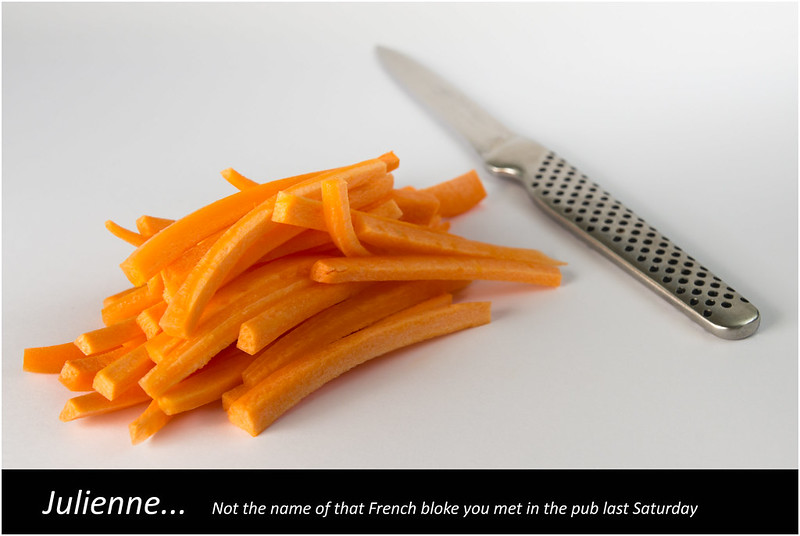
I haven't yet shot Week 39 (Big) but I've managed to pull something together for Week 40: Cut...


Cut (week 40)
by pjm1 (Paul), on Flickr

Sorry it's another producty-type shot but this subject lends itself to that style a bit... I've tried to lighten it up a bit though!

C&C welcome although I realise I'm overdue so much commenting on your photos I won't be expecting it this time around.
 
Cut - A simple idea that works because of good composition and colours. My only crit would be that whilst the focus on the end of the knife handle is really sharp, the carrots seem slightly oof and I wonder if a tad more contrast would help bring out the individual batons, or would that just blow the highlights on the knife??
 
Hi, Cut, I do like a well crafted Knife :)

Well composed and good detail, the caption made me smile :)

Nice subtle shadows from the knife and carrots.

No meaningful crit from me.

Cheers.
 
The clear winner for me on this one is the fantastic colour on the carrots, lovely orange there.

Composition is good, knife blade closer would be the other way of doing it but would lose the "just put down look".

Dof is close, think you have just enough but think it would work with more.

White border works to show the super even white you have (natural light?), and the text is nice, but easy to ignore too if you don't want to see it.
 
Hi Paul, I like the simple composition of it and the DoF works well with the knife blade fading away, colour of carrots has been mentioned, cant really fault it, well maybe the writing not really a fan of that
good to see you back (y)
 
Hi pail

Catch up time
Mineral - colourful and good focus on the salad. Good arrangement. I note a comment on it being a bit tight but i go the other way on these food in bowl shots. I would consider cropping top and left side to remove the edges of the bowl and the table. We know that the bowl is there and do not need to see that - our attention should on the food, not the shape of the bowl. I have looked a t lots of commercial shots of food (Mrs SP has an enormous library of cook books) and it is notable how many do crop away parts of the containers

Smoke - I think that you have nailed that for the theme and most unusual. (y) The question mark is a bit of a distraction as because it is in the mist it is hard to believe that something like that exists and has not been added by the togger.

Bubble - both good but #2 for me as i like the difference in bubble size and the hint of pink and gold.

Communication - as you say, not an object that screams out to be shot. Good capture of the blur and a nice brooding/bright sky. Difficult exposure and i agee with Allan @alsjazzera that maybe even make it more of a silhouette.:thinking:

Dark - disturbing but original idea and very well handled(y) agree that the knife better other way round. Not surprising that Allan @alsjazzera likes it as he does weird things with his toy bears.:eek::)

Cut - The text does not add to the shot IMO. Think that the blade of the knife should be in focus and perhaps laid a little more acutely, even touching the carrots. Good colours and b/g tho.
 
Cut - A simple idea that works because of good composition and colours. My only crit would be that whilst the focus on the end of the knife handle is really sharp, the carrots seem slightly oof and I wonder if a tad more contrast would help bring out the individual batons, or would that just blow the highlights on the knife??

Thanks Elaine... appreciate the considered comments. My DOF may be a touch too shallow despite stopping down to f/9 for precisely this reason!!
 
Back
Top