

You are using an out of date browser. It may not display this or other websites correctly.
You should upgrade or use an alternative browser.
You should upgrade or use an alternative browser.
weekly susiejb 52 /2014 Support
- Thread starter susiejb
- Start date
OP
- Messages
- 7,548
- Name
- susie
- Edit My Images
- Yes
Ta d00d....luscious ...nice description ")
The clips ...I so wish I'd noticed all those patches at the bottom...I'm beginning to wonder if I'd forgotten to put my contact lenses in or sumthin' but I still like the idea and will try again.
The clips ...I so wish I'd noticed all those patches at the bottom
...I'm beginning to wonder if I'd forgotten to put my contact lenses in or sumthin' but I still like the idea and will try again.
Last edited:
- Messages
- 4,182
- Name
- Paul
- Edit My Images
- Yes
Hi Susie. I'm going to be totally evenhanded here... please don't take offence.
Your raindrop shot is beautiful. Yes, it's "one of your shots" but I'm never going to get bored of looking at "one of your shots" because you do them so well. Stunning. Not much point in going over why it's so good, because it's the same as your last few: perfect focus, wonderful lighting, lovely colours and non-distracting background. You are genuinely fab at these and I could happily wander around a gallery of them!
Your bulldog clip idea is great. The only thing I'm not a fan of is the photo of it! Sorry... I do think it's a brilliant concept but there are a few things I'd change:
1. lighting - the lighting seems quite harsh, which is amplified by the shiny things doing their stuff. All of the angles are all over the place (that's the point) so IMO you simply can't use directional lighting without creating big shadows somewhere and some blowouts somewhere. It's actually the shadows which bother me more, so I'd just go for a huge amount of massive diffuse light and a tiny touch of directional to give the shadow etc. IMO, you'd be better off shooting this outside on a cloudy day - loads of nice quality ambient and if you get your flash reasonably close at high power (assuming it's got an ok GN) you will be able to add to it in the way you want, without creating shadows.
2. background - others have mentioned this, so I will just reiterate what they've said: it looks a bit unnatural. I'd be tempted to get a nice terracota plant pot, some earth and then somehow grow the bulldog clip tree out of that. Well, it's an example and IMO much more interesting than a white (or black) background.
3. too shallow a DOF for me - I'd like all the clips to be in focus.
However, it does have some real positives on top of just the idea: the colours are lovely and just right. I think you've handled the highlights pretty well... it's just the shadows per the above which are causing me problems. But, the overarching positive for me is the idea - I think it's genuinely fab which is why I'd absolutely persevere with it and take it to the next level!
(and great raindrops btw... again!)
OP
- Messages
- 7,548
- Name
- susie
- Edit My Images
- Yes
Hi Susie. I'm going to be totally evenhanded here... please don't take offence.
Your raindrop shot is beautiful. Yes, it's "one of your shots" but I'm never going to get bored of looking at "one of your shots" because you do them so well. Stunning. Not much point in going over why it's so good, because it's the same as your last few: perfect focus, wonderful lighting, lovely colours and non-distracting background. You are genuinely fab at these and I could happily wander around a gallery of them!
Your bulldog clip idea is great. The only thing I'm not a fan of is the photo of it! Sorry... I do think it's a brilliant concept but there are a few things I'd change:
1. lighting - the lighting seems quite harsh, which is amplified by the shiny things doing their stuff. All of the angles are all over the place (that's the point) so IMO you simply can't use directional lighting without creating big shadows somewhere and some blowouts somewhere. It's actually the shadows which bother me more, so I'd just go for a huge amount of massive diffuse light and a tiny touch of directional to give the shadow etc. IMO, you'd be better off shooting this outside on a cloudy day - loads of nice quality ambient and if you get your flash reasonably close at high power (assuming it's got an ok GN) you will be able to add to it in the way you want, without creating shadows.
2. background - others have mentioned this, so I will just reiterate what they've said: it looks a bit unnatural. I'd be tempted to get a nice terracota plant pot, some earth and then somehow grow the bulldog clip tree out of that. Well, it's an example and IMO much more interesting than a white (or black) background.
3. too shallow a DOF for me - I'd like all the clips to be in focus.
However, it does have some real positives on top of just the idea: the colours are lovely and just right. I think you've handled the highlights pretty well... it's just the shadows per the above which are causing me problems. But, the overarching positive for me is the idea - I think it's genuinely fab which is why I'd absolutely persevere with it and take it to the next level!
(and great raindrops btw... again!)
Thanks for taking the so much time with your comment Paul ... very much appreciated and I'll take on board everything you've said. I would never take offence at constructive criticism ... in fact I welcome it. I am very much a novice ...mainly driven by my love of nature, so any guidance along the way is really very welcome indeed. And thank you very much for the complement too .... very uplifting
- Messages
- 7,499
- Edit My Images
- Yes
Hi Susie, the clips must have took an age to clip together and balance, well done You have the same problem as I had with mi first pencil shot in that it looks very 2D instead of 3D, my weakness is white bg and lighting so can't offer any tips, sorry
Lovely shot of the balanced rain drops, sharp, good detail and love the little reflections in them, well done
You have the same problem as I had with mi first pencil shot in that it looks very 2D instead of 3D, my weakness is white bg and lighting so can't offer any tips, sorryLovely shot of the balanced rain drops, sharp, good detail and love the little reflections in them, well done
Last edited:
OP
- Messages
- 7,548
- Name
- susie
- Edit My Images
- Yes
Hi Susie, the clips must have took an age to clip together and balance, well done
Lovely shot of the balanced rain drops, sharp, good detail and love the little reflections in them, well done
Thanks Phil ...I think I'll try a more natural background next time too....I was very impressed when I read how you balanced that pencil ....it takes fishing to a whole new level
- Messages
- 13,760
- Edit My Images
- Yes
Hi Susie
Balance - Really like the colours of your first one, and the haphazardness of the clips, but do agree, it needs a shadow to help ground the clips, as with how they are I can not tell which one is on the ground OR if all of them are- a re-shhot/fiddle required on this one
Balance 2 - Well what can I say... LOVE IT... Wonderful detail and colours, perfect DoF/focus too
- Messages
- 8,398
- Name
- Lynne
- Edit My Images
- Yes
Hi Susie
Your water drop shot for balance is super....the right angle, the right focus the right DOF...as usual with your nature shots it's worthy of framing
The bulldog clip shot is a great idea but def needs a slight shadow to ground it....i defer to Paul re lighting etc
Your water drop shot for balance is super....the right angle, the right focus the right DOF...as usual with your nature shots it's worthy of framing
The bulldog clip shot is a great idea but def needs a slight shadow to ground it....i defer to Paul re lighting etc
OP
- Messages
- 7,548
- Name
- susie
- Edit My Images
- Yes
Hi Susie
Balance - Really like the colours of your first one, and the haphazardness of the clips, but do agree, it needs a shadow to help ground the clips, as with how they are I can not tell which one is on the ground OR if all of them are- a re-shhot/fiddle required on this one
Balance 2 - Well what can I say... LOVE IT... Wonderful detail and colours, perfect DoF/focus too
Hi Susie
Your water drop shot for balance is super....the right angle, the right focus the right DOF...as usual with your nature shots it's worthy of framing
The bulldog clip shot is a great idea but def needs a slight shadow to ground it....i defer to Paul re lighting etc
Thanks DK and Lynne ...thank you for hopping in and taking a look .....I'm really pleased you like the nature shot
- Messages
- 1,408
- Name
- Elaine
- Edit My Images
- Yes
Have to agree that the clips look a bit like they are lying flat rather than balancing on each other, but the raindrops are beautiful! Amazing colour, superb dof and cracking use of the diagonal
OP
- Messages
- 7,548
- Name
- susie
- Edit My Images
- Yes
Have to agree that the clips look a bit like they are lying flat rather than balancing on each other, but the raindrops are beautiful! Amazing colour, superb dof and cracking use of the diagonal
Thanks for looking Elaine....the clips are on the re-shoot list

- Messages
- 4,182
- Name
- Paul
- Edit My Images
- Yes
Hi Susie...
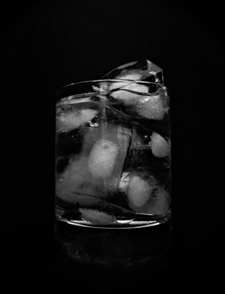
Two lovely pictures there for change. I'll be completely honest and confess I don't entirely get the change connection in either case (despite your explanation in 2) but I don't care as they're such good shots. The first in particular is really nicely processed with fantastic texture and "grit". Only crit for me is a touch of blown highlights on my monitor (edit: not overexposure as I first suggested) on the baby's arm/hand but that aside (and I'm not even that bothered by that, tbh) it's lovely.
The ice in a glass (just missing a slice of citrus fruit of some sort) is also nice, although I think I prefer the first shot. The ice looks a touch flat beneaht the top rim of the glass - looks great above it with some nice lighting on that top most ice cube and rim itself but then loses something as you go further down. It's notorious to light things inside glasses though (I've never even attempted it) so certainly won't criticise something that technically demanding.
Two great shots, lovely dark backgrounds and really absorbing images.
Two lovely pictures there for change. I'll be completely honest and confess I don't entirely get the change connection in either case (despite your explanation in 2) but I don't care as they're such good shots. The first in particular is really nicely processed with fantastic texture and "grit". Only crit for me is a touch of blown highlights on my monitor (edit: not overexposure as I first suggested) on the baby's arm/hand but that aside (and I'm not even that bothered by that, tbh) it's lovely.
The ice in a glass (just missing a slice of citrus fruit of some sort
) is also nice, although I think I prefer the first shot. The ice looks a touch flat beneaht the top rim of the glass - looks great above it with some nice lighting on that top most ice cube and rim itself but then loses something as you go further down. It's notorious to light things inside glasses though (I've never even attempted it) so certainly won't criticise something that technically demanding.Two great shots, lovely dark backgrounds and really absorbing images.
Last edited:
- Messages
- 4,088
- Name
- Graham
- Edit My Images
- Yes
Ice... Not much there to appeal to me.
But the hands are wonderful, just love the relative sizes there, the way the whole of the small hand could grip just the thumb of the grown ups hand is a lovely reminder of how quickly they grow.
I still remember mine when they had little hands like that, and am being constantly amazed by just how big they are now.
I think these two images show just how well a black k BG works when the subject does not need to be sitting on something. When it is, its just too easy to loose it com!pletyely in a sea of black, leaving nothing to ground it, like a shadow or reflection. Having it on a sheet of glass maybe??
Not sure either are completely on theme, but with the hands, I just don't care.
- Messages
- 13,760
- Edit My Images
- Yes
Hi Susie
Have to go with the flow on both of these, the ice shot is a nice idea, but that is as far as it goes, on the other hand, the hand shot is very nice indeed, just struggling with the exact link you have in mind (Change of size ??) anyway, the shot has great detail, really like the PP too, great photo
Have to go with the flow on both of these, the ice shot is a nice idea, but that is as far as it goes, on the other hand, the hand shot is very nice indeed, just struggling with the exact link you have in mind (Change of size ??) anyway, the shot has great detail, really like the PP too, great photo
OP
- Messages
- 7,548
- Name
- susie
- Edit My Images
- Yes
Oh Susie ... Change #1 is awesome
Beautifully composed ... love that gritty, grubby old hand.
This sort of thing is photographers old favourite ... you've just raised it to a new level.
Oh thank you d00d ...much appreciated
OP
- Messages
- 7,548
- Name
- susie
- Edit My Images
- Yes
Hi Susie, nice photos! I like them both very much. Is #1 "change of life"?
Hi Simon ...glad you like them ...I spent ages trying to think of a title for that one ... yep ...Change of Life' reflects my thoughts very well
OP
- Messages
- 7,548
- Name
- susie
- Edit My Images
- Yes
Ice... Not much there to appeal to me.
But the hands are wonderful, just love the relative sizes there, the way the whole of the small hand could grip just the thumb of the grown ups hand is a lovely reminder of how quickly they grow.
I still remember mine when they had little hands like that, and am being constantly amazed by just how big they are now.
I think these two images show just how well a black k BG works when the subject does not need to be sitting on something. When it is, its just too easy to loose it completely in a sea of black, leaving nothing to ground it, like a shadow or reflection. Having it on a sheet of glass maybe??
Not sure either are completely on theme, but with the hands, I just don't care.
Hi Graham ...I think I 'll just put the ice one down to an experiment in avoiding reflections in glass !
The hands ...you've echoed my thoughts really for Change ...how through life we are constantly changing ...it's fascinating how gloriously peachy my grandsons little hands are. I had to be quick with that one ...I only had one shot at it and he was off
Really pleased that you like it.
OP
- Messages
- 7,548
- Name
- susie
- Edit My Images
- Yes
Hi Susie, not keen on the ice shot but the hands are very good, nicely processed too, no crit from me it's just a lovely image
Hi Allan ... thank you for looking ...I'm glad you like the hands ... the more I look at it the more I like it.
OP
- Messages
- 7,548
- Name
- susie
- Edit My Images
- Yes
Hi Susie...
Two lovely pictures there for change. I'll be completely honest and confess I don't entirely get the change connection in either case (despite your explanation in 2) but I don't care as they're such good shots. The first in particular is really nicely processed with fantastic texture and "grit". Only crit for me is a touch of blown highlights on my monitor (edit: not overexposure as I first suggested) on the baby's arm/hand but that aside (and I'm not even that bothered by that, tbh) it's lovely.
The ice in a glass (just missing a slice of citrus fruit of some sort
Two great shots, lovely dark backgrounds and really absorbing images.
Hi Paul ... the ice ... I started this looking down into the glass, which created a shot that I liked, but it was very abstract and it really wouldn't have had any significant link to the theme ... as it is ...yes, it's maybe slightly tenuous. I enjoyed doing it though... and as I said above it was a profitable exercise, in that ... I had to try and avoid reflections in the glass.
The hand was taken in black and white, but I'm very fond of the effect I've used here... it's much softer than b&w but not too soft ...if that makes sense. I was a bit worried about the light my grandsons arm at first, but after looking at if a few time I quite like it .... it's like a little sunglow on his arm (that's my excuse anyway
)Thank you for looking ... much appreciated as always.
OP
- Messages
- 7,548
- Name
- susie
- Edit My Images
- Yes
Hi Susie
Have to go with the flow on both of these, the ice shot is a nice idea, but that is as far as it goes, on the other hand, the hand shot is very nice indeed, just struggling with the exact link you have in mind (Change of size ??) anyway, the shot has great detail, really like the PP too, great photo
Hi DK ...the idea was just the changes life makes to us really ...especially the aging process. Glad you liked it
- Messages
- 1,408
- Name
- Elaine
- Edit My Images
- Yes
Sorry to be repetitive, but definitely #1 for me too It really illustrates the changes that time brings and the sepia tint gives it an extra feeling of warmth and caring that I don't think would come across as well in straight mono.
It really illustrates the changes that time brings and the sepia tint gives it an extra feeling of warmth and caring that I don't think would come across as well in straight mono.
OP
- Messages
- 7,548
- Name
- susie
- Edit My Images
- Yes
Sorry to be repetitive, but definitely #1 for me too
Thanks Elaine ....I really like that tint too I find mono a bit harsh at times.


OP
- Messages
- 7,548
- Name
- susie
- Edit My Images
- Yes
Hi Susie, really like that first one, very interesting subject, not something I have ever done and also I am quite intrigued by the processing would like to know what you have done
excellent take on the theme very different
Thanks Alan
glad you liked them....it's very easy, you mix half a cup of hot (not boiling) water, with half a cup of Epsom Salts in a glass, put a flat stone in from the garden and then place it in the fridge for at least 3 hours. The crystals will grow on the stone and it looks like this ...
You can add food coloring which makes them look really nice, but I'm at my son's this week and didn't like to make too much mess
so I just added the colour in PP. I then took the photo's with my macro lens on ...there's a few more here https://www.flickr.com/photos/susiejb2/ I didn't like to post too many. Quite a fascinating but easy process, and one I'll definitely try out again at home.- Messages
- 4,088
- Name
- Graham
- Edit My Images
- Yes
That first one is amazing Susie, really fascinating to look at.
You've picked a nice focal point, composed it nicely within the frame, great use of the shallow dof again.
It's the split between the foreground and the lovely oof background that does it for me.
Just a suggestion and I've not tried it myself to say for sure.... Maybe an increase in contrast to send some of the darker blues closer to black, and also give a bit more zing to the highlights?
Nice colour choice with the blue though. Works well and looks "natural".
Last edited:
- Messages
- 8,398
- Name
- Lynne
- Edit My Images
- Yes
Hi Susie
going with the flow this week....Hands shot is lovely & right on theme for me.... Few blown highlights & i wonder if it could stand a slightly closer crop ? PP suits it nicely
Grow......fascinating but of the 3 images posted I actually prefer the one you used to show Alan how they look when they've come out of the glass
going with the flow this week....Hands shot is lovely & right on theme for me....
Few blown highlights & i wonder if it could stand a slightly closer crop ? PP suits it nicely Grow......fascinating but of the 3 images posted I actually prefer the one you used to show Alan how they look when they've come out of the glass
- Messages
- 13,760
- Edit My Images
- Yes
Hi Susie
Grow - OOooo I really like them, what a great idea, liking the PP colour you have chosen, and some real nice detail... some lovely bokeh going on there too
Grow - OOooo I really like them, what a great idea, liking the PP colour you have chosen, and some real nice detail... some lovely bokeh going on there too
- Messages
- 4,182
- Name
- Paul
- Edit My Images
- Yes
Hiya Susie...
What a great set of images for grow. Really different, I like the take and especially the tight framing and close zoom on the first two. Colour is great (I realise you added this in post) and basically just more good shots from you
I love coming to this thread!
What a great set of images for grow. Really different, I like the take and especially the tight framing and close zoom on the first two. Colour is great (I realise you added this in post) and basically just more good shots from you
I love coming to this thread!
OP
- Messages
- 7,548
- Name
- susie
- Edit My Images
- Yes
That first one is amazing Susie, really fascinating to look at.
You've picked a nice focal point, composed it nicely within the frame, great use of the shallow dof again.
It's the split between the foreground and the lovely oof background that does it for me.
Just a suggestion and I've not tried it myself to say for sure.... Maybe an increase in contrast to send some of the darker blues closer to black, and also give a bit more zing to the highlights?
Nice colour choice with the blue though. Works well and looks "natural".
Hi Graham ...thank you for the comments
... I did have a little fiddle with the contrasts and yes, you can get some really different effects...they tend to look very snowflake like, in fact I think you can grow them in a snowflake shape which I may try ...it should look good.
OP
- Messages
- 7,548
- Name
- susie
- Edit My Images
- Yes
Love the toning of "grow", and also of the two hands in "change" - and I'm definitely going to try the crystal growing recipe!
Hi Alan @hamacting ..thanks for hopping in
it's nice to see a new face, thank you for the comments. The crystals are so easy to do ...just be careful though if you spill any ...they really do grow anywhere!
OP
- Messages
- 7,548
- Name
- susie
- Edit My Images
- Yes
That's incredible Susie. I must give it a try too.
Hiya d00d ...thanks for hopping by
yes do try it, but remember as mentioned above, they do grow anywhere ...my son wasn't too happy that there was a layer on his lovely wooden worktops ....ooops !!
OP
- Messages
- 7,548
- Name
- susie
- Edit My Images
- Yes
Hi Susie
going with the flow this week....Hands shot is lovely & right on theme for me....
Grow......fascinating but of the 3 images posted I actually prefer the one you used to show Alan how they look when they've come out of the glass
Hi Lynne thanks for looking in ... I did originally do all the Grow in mono, but then I decided to add the colour to give them an icy glow
OP
- Messages
- 7,548
- Name
- susie
- Edit My Images
- Yes
Hi Susie
Grow - OOooo I really like them, what a great idea, liking the PP colour you have chosen, and some real nice detail... some lovely bokeh going on there too
Thanks DK ...I'm really pleased that you like them