

You are using an out of date browser. It may not display this or other websites correctly.
You should upgrade or use an alternative browser.
You should upgrade or use an alternative browser.
weekly Posiview's TP52 for 2014 Week 52 Support added and FINISHED :)
- Thread starter posiview
- Start date
- Messages
- 4,088
- Name
- Graham
- Edit My Images
- Yes
£5 well spent I'd say there. Reminds me of mine from last year so I will of course say great idea and pretty well executed.
Not sure I'm convinced by the red and blue of the sparks though, and it's a shame the blacks of the cable and t-shirt are lost in the black of the background but you have done a good job with the creating of the sparks and the overall processing is very fitting.
Love the work on the eyes in the first, which is, I think, my preferred version of the two.
- Messages
- 4,182
- Name
- Paul
- Edit My Images
- Yes
Hi Andy - great takes! I prefer the second (although both expressions are great) as the PP sparks on the first aren't quite as convincing for me. I'm guessing you've taken some lightning shots and tweaked them in PS? Very well done, especially on #2 ")
For me, #2 would be even stronger without Isabelle's hand and a tighter crop with just the cable coming in from left of frame. Love the PP and effect, eyes in particular. Really super!
For me, #2 would be even stronger without Isabelle's hand and a tighter crop with just the cable coming in from left of frame. Love the PP and effect, eyes in particular. Really super!
- Messages
- 8,398
- Name
- Lynne
- Edit My Images
- Yes
Hi Matey
only you.......
2nd one for me....the look in her eye's, the color of her eye's & skin & the overall lighting...just perfect I think Paul's idea for losing the hand would also work but I kinda like the hand being there...the only very minor crit being the black cable not being visibly between her fingers & the colored wires
only you.......
2nd one for me....the look in her eye's, the color of her eye's & skin & the overall lighting...just perfect
I think Paul's idea for losing the hand would also work but I kinda like the hand being there...the only very minor crit being the black cable not being visibly between her fingers & the colored wires
OP
- Messages
- 19,461
- Name
- Andy
- Edit My Images
- Yes
Two good images Andy, good pp skills in both
Cheers, Phil, I rather enjoyed this one.
Ha Ha #2 is brilliant, hilarious.
Cheers
£5 well spent I'd say there. Reminds me of mine from last year so I will of course say great idea and pretty well executed.
Not sure I'm convinced by the red and blue of the sparks though, and it's a shame the blacks of the cable and t-shirt are lost in the black of the background but you have done a good job with the creating of the sparks and the overall processing is very fitting.
Love the work on the eyes in the first, which is, I think, my preferred version of the two.
Cheers, I noticed the blacks were lost. I could have changed her t-shirt but she was getting a bit fed up.
The sparks, yeah, ISWYM, I used a lightening action and could have spend more time on them.
Hi Andy - great takes! I prefer the second (although both expressions are great) as the PP sparks on the first aren't quite as convincing for me. I'm guessing you've taken some lightning shots and tweaked them in PS? Very well done, especially on #2
For me, #2 would be even stronger without Isabelle's hand and a tighter crop with just the cable coming in from left of frame. Love the PP and effect, eyes in particular. Really super!
Cheers, yeah, I used a lightening action in PS. Should have taken more time, but needed to get posted
Hi Matey
only you.......
2nd one for me....the look in her eye's, the colour of her eye's & skin & the overall lighting...just perfect
Yeah, the wires, more attention to detail needed but I didn't have a white cable, maybe I could have changed to white in post, but needed to get it posted...message to self.....get photograph earlier so tweaks can be done.
Cheers.
OP
- Messages
- 19,461
- Name
- Andy
- Edit My Images
- Yes
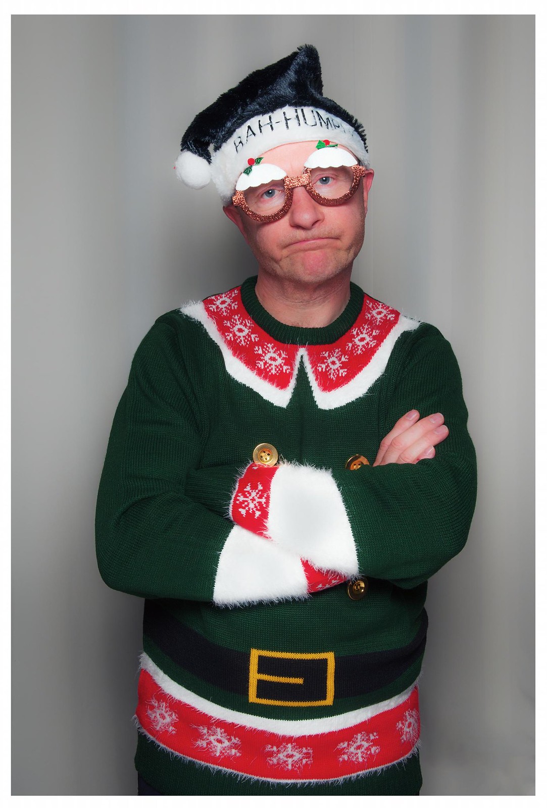
My First (and last Christmas jumper!). Jackie and Isabelle made me buy one because they wanted one for Christmas dinner. Blooming hat and glasses as well. They call me Mr Grumpy...can't understand why
I checked how many selfies I'd done this year before I posted, and concluded I hadn't subjected you to too many
Cheers.
 Week 45 First by andysheader (Posiview), on Flickr
I checked how many selfies I'd done this year before I posted, and concluded I hadn't subjected you to too many
Cheers.
Week 45 First by andysheader (Posiview), on Flickr
Last edited:
OP
- Messages
- 19,461
- Name
- Andy
- Edit My Images
- Yes
Wow that is quite special...
You look utterly delighted.
It's actually a well-taken picture and some good lighting. Good general lack of shadows on the backdrop (ignoring the vertical bands). Bounce flash off the ceiling?
@pjm1 Hi Paul I started with the flash 45° camera right but that wasn't working because the shadows on my righthand side were too strong so I decided to put the flash above the camera shooting down and have a reflector underneath bouncing a bit of light up I actually quite like this one.
Cheers
Was just logging into flickr when that assaulted me Andy!
It's completely wonderful, I love it. Super eye contact and a look that could only come from a man used to getting ganged up on by womenfolk!
Ganged up indeed I have a wife and three daughters nightmare sometimes.
Cheers.
Well what can I say, the picture says it all very amusing
It's not an image you can offer any crit on it just works, I am guessing you have added the BG afterwards
Thanks, Alan the background was actually caught in camera for a change. I had to turn the curtains around because they had strips on.
Thanks, all, also I do have two wear the outfit again, unfortunately, I won't get away with Christmas lunch without wearing it
- Messages
- 13,760
- Edit My Images
- Yes
Hey Andy
Live - A couple of great shots these, love the punchy colours against the black background, the PP for the electrical discharge works nicely and love the effect on Isabel's eyes - a good take
First - OMG... that is Sooooo funny, I can so imagine you when you first put that on
A real well taken shot, lovely and sharp, well lit and soooo well staged, that's a corker
OP
- Messages
- 19,461
- Name
- Andy
- Edit My Images
- Yes
Hey Andy
Live - A couple of great shots these, love the punchy colours against the black background, the PP for the electrical discharge works nicely and love the effect on Isabel's eyes - a good take
First - OMG... that is Sooooo funny, I can so imagine you when you first put that on
A real well taken shot, lovely and sharp, well lit and soooo well staged, that's a corker
Cheers, Dean.
I enjoyed taking both of there.
Live, Cool ideas those, love the colour in the cap on the 1st onem really suits it. 2nd is great, I would like a little more space on the rhs
First. now that made me smile! The image just works, a great sp.
Cheers, Michael, I, conscious that I've yet to comment in yours.
First.........I dare ya!
Cheers, Phil, I will if you will
OP
- Messages
- 19,461
- Name
- Andy
- Edit My Images
- Yes
Thank you everybody for your comments very much appreciated. The second one of the live was Isabelle's idea and she is getting great pleasure in telling me that hers is better than mine
On the second one I really enjoyed it and I decided to order another off-camera flash to help with my lighting and nice Christmas present from Jackie.
Chests all.
On the second one I really enjoyed it and I decided to order another off-camera flash to help with my lighting and nice Christmas present from Jackie.
Chests all.
- Messages
- 1,408
- Name
- Elaine
- Edit My Images
- Yes
Well done to Isabelle - sorry, but I prefer her idea to your original one  The full face and her expression work really well and I think you've made a better job of the sparks on the second one.
Your shot for First is hilarious and I'm sure that you'll forever be known as Santa's Little Helper to all members of TP
The full face and her expression work really well and I think you've made a better job of the sparks on the second one.Your shot for First is hilarious and I'm sure that you'll forever be known as Santa's Little Helper to all members of TP
- Messages
- 6,502
- Name
- Peter
- Edit My Images
- Yes
Balance - Definitely says balance but it does there's something that doesn't feel quite right to it. My attention is drawn to the spoon which I noticed mr.si thought looked a bit CGI and I suppose I agree with. The whites and absolutely white and maybe that has accentuated that feeling. You did say it was a PABD entry though.
Change - A nice bright image that says Autumn and hence hits the theme with the change of colours of the leaves. The choice of a slower shutter speed as helped give the image a bit of energy and hence lift it from the category of just another shot of leaves. Well done for that.
Grow #1 - I always like the fact you are happy to get involved in the images themselves. Don't tell me you had a haircut specially for the week's theme?
Grow #2 - Super. I so like this. It's nice and simple and that's why it works. The outer leaves/shoots are almost glowing with the light. Thumbs up from me. I feel the lack of shadow grounding the cress makes #3 & #4 less impactful than the original though.
Live - You're also happy to get Isabelle involved as well. Not sure she's always happy but you always seem to get it to work. And work it does on these. #2 for me. Crit from me would be that as the t-shirt and wire are black they don't stand out from the background. Maybe a fill in light from the side or behind would give an outline to these.
First - As I said - always happy to get involved LOL. And laugh out loud I did - where did you get that jumper? The expressions says it all though and is spot on for what you obviously set out to achieve. I can't believe it's not your new avatar yet.
OP
- Messages
- 19,461
- Name
- Andy
- Edit My Images
- Yes
Well done to Isabelle - sorry, but I prefer her idea to your original one
Your shot for First is hilarious and I'm sure that you'll forever be known as Santa's Little Helper to all members of TP
Yeah, yeah, yeah, Isabelle is getting great pleasure from comments saying hers is better then mine....
First, I can't wait to get the outfit on again

Cheers.
Balance - Definitely says balance but it does there's something that doesn't feel quite right to it. My attention is drawn to the spoon which I noticed mr.si thought looked a bit CGI and I suppose I agree with. The whites and absolutely white and maybe that has accentuated that feeling. You did say it was a PABD entry though.
Change - A nice bright image that says Autumn and hence hits the theme with the change of colours of the leaves. The choice of a slower shutter speed as helped give the image a bit of energy and hence lift it from the category of just another shot of leaves. Well done for that.
Grow #1 - I always like the fact you are happy to get involved in the images themselves. Don't tell me you had a haircut specially for the week's theme?
Grow #2 - Super. I so like this. It's nice and simple and that's why it works. The outer leaves/shoots are almost glowing with the light. Thumbs up from me. I feel the lack of shadow grounding the cress makes #3 & #4 less impactful than the original though.
Live - You're also happy to get Isabelle involved as well. Not sure she's always happy but you always seem to get it to work. And work it does on these. #2 for me. Crit from me would be that as the t-shirt and wire are black they don't stand out from the background. Maybe a fill in light from the side or behind would give an outline to these.
First - As I said - always happy to get involved LOL. And laugh out loud I did - where did you get that jumper? The expressions says it all though and is spot on for what you obviously set out to achieve. I can't believe it's not your new avatar yet.
Hi, Peter, Balance, I cringe when I look at this...if only I had a cleaner BG.
Grow #1, as always I suffer for my art
Live, #2 again....Isabelle's idea ggrrrrrrrr Yup, I noticed the black T-shirt and floating head :bang:
First, number was from Primark, as I recall getting dragged in there...at least I got a Costs out of it.
Now my new avatar
Hi Andy ...whats not to like about your First ... a great pose, I love the expression on your face, and an excellentt choice in the jumper
Thanks, I actually enjoyed doing First.
Cheers all.
- Messages
- 8,398
- Name
- Lynne
- Edit My Images
- Yes
Hi ya Andy
Love it...the expression makes the image....absolute classic If there's a Leeds christmas meet on...I'm coming
Love it...the expression makes the image....absolute classic
If there's a Leeds christmas meet on...I'm coming
OP
- Messages
- 19,461
- Name
- Andy
- Edit My Images
- Yes
Hi ya Andy
Love it...the expression makes the image....absolute classic
Christmas meet...hhmmmmmm, sounds interesting
OP
- Messages
- 19,461
- Name
- Andy
- Edit My Images
- Yes
Two here. One from me (#1) and one from Isabelle (#2).
Various issues here. Main one was with the lighting and space. I did it in our relatively small kitchen, and would have liked a few more lights.
Anyways, Isabelle and a great time as well.
 Week 46 Smooth by andysheader (Posiview), on Flickr
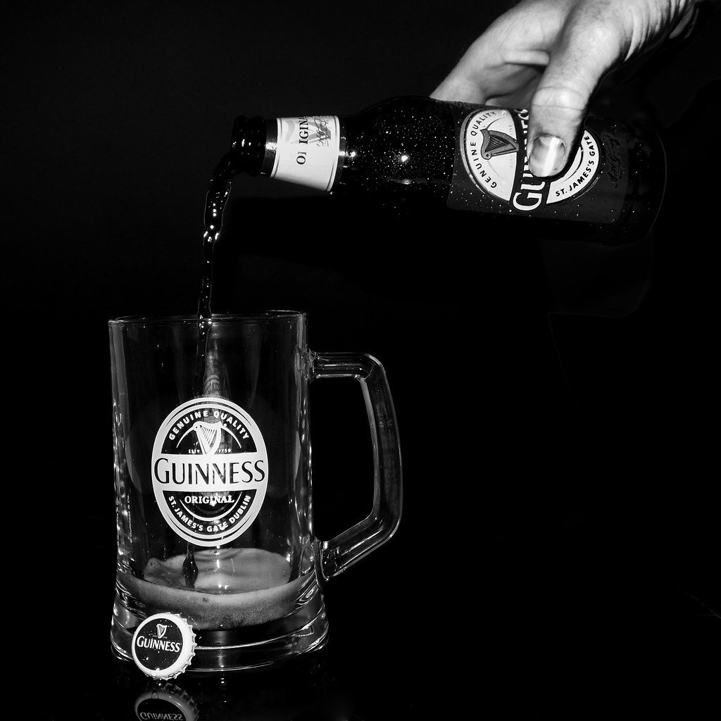 Isabelle's Smooth by andysheader (Posiview), on Flickr
Various issues here. Main one was with the lighting and space. I did it in our relatively small kitchen, and would have liked a few more lights.
Anyways, Isabelle and a great time as well.
Week 46 Smooth by andysheader (Posiview), on FlickrIsabelle's Smooth by andysheader (Posiview), on Flickr- Messages
- 4,182
- Name
- Paul
- Edit My Images
- Yes
Hi Andy... I love both of those - they really press the right buttons for me (carefully lit "product"-type shot). Really super lighting especially on #2 given the difficulties of lighting this kind of subject - really, really well done.
I particularly like the lighting on the stream of Guinness - really nicely done especially with a black liquid
The top one is probably more of a wow shot in some ways, but I prefer the second simply because of the amount of work and thought that has almost certainly gone into it!
(I think the hand could do with a touch more lighting underneath and I'd probably prefer a less tight crop on the bottom of the glass but otherwise superb!!)
- Messages
- 13,760
- Edit My Images
- Yes
Hi Andy
Smooth - Well... I'm going to go with yours, Isabelles is really good, but I'm not so keen on the placement of the lid, other than that I like the rest of the set up, great detail & also like the processing - so a BIG well done to her
With yours I'm really liking the lighting, the condensed water drops and the super reflection... I could drink that right now
- Messages
- 4,828
- Name
- Alan
- Edit My Images
- Yes
Hi Andy
Grow - i prefer the first one with the black b/g as the gree of the shoots show better and I like those little colourful bits in the roots. Not sure if dof is enough.
Live - 2 good imaginative shots. #1 for me as I prefer the close up, the hooded eyes still looking the viewer's way and the vibrancy of all the colours.
First - too good to comment uponPlease tell us you will post a shot of Christmas Day lunch
Smooth - both seem slightly skewed. #1 for me as i prefer the colour against the black b/g. Good touch with the condensation on the bottle and good lighiting.
Grow - i prefer the first one with the black b/g as the gree of the shoots show better and I like those little colourful bits in the roots. Not sure if dof is enough.
Live - 2 good imaginative shots. #1 for me as I prefer the close up, the hooded eyes still looking the viewer's way and the vibrancy of all the colours.
First - too good to comment upon
Please tell us you will post a shot of Christmas Day lunchSmooth - both seem slightly skewed
. #1 for me as i prefer the colour against the black b/g. Good touch with the condensation on the bottle and good lighiting.- Messages
- 7,548
- Name
- susie
- Edit My Images
- Yes
Hi Andy ...two smashing shots ... nice lighting and composition on two, very well done to your daughter....but it's the simplicity of one that wins it for me .....cool, clean, super reflection and lighting, and a pure black background to finish it off.
- Messages
- 1,408
- Name
- Elaine
- Edit My Images
- Yes
Yes, another vote for #1. Simple but dramatic with nice colours and good use of the reflection.
- Messages
- 4,088
- Name
- Graham
- Edit My Images
- Yes
Love the clean simple look of the first, very nice. Inviting with the water drops on it too. Couple of areas that at first look seem to be needing more light but actually find that it fits better with the dark and light theme of the drink.
Did Isabelle do the second one all herself or was it just her idea?
If all her own work... No crit....
Otherwise, is the tricky subject of black item on black BG, and how to make it stand out. The glass is great and the hand and bottle are fine, think it needs a bit more definition in the bottle rim and the pouring liquid.
OP
- Messages
- 19,461
- Name
- Andy
- Edit My Images
- Yes
Hi Andy... I love both of those - they really press the right buttons for me (carefully lit "product"-type shot). Really super lighting especially on #2 given the difficulties of lighting this kind of subject - really, really well done.
I particularly like the lighting on the stream of Guinness - really nicely done especially with a black liquid
The top one is probably more of a wow shot in some ways, but I prefer the second simply because of the amount of work and thought that has almost certainly gone into it!
(I think the hand could do with a touch more lighting underneath and I'd probably prefer a less tight crop on the bottom of the glass but otherwise superb!!)
@pjm1 cheers, I enjoyed these, although the lighting was quite hard. I watched a few Youtube videos on lighting bottles and most had at least 3 lights. The hand yeah, Isabelle's was taken with O(n)CF
Hi Andy
Smooth - Well... I'm going to go with yours, Isabelles is really good, but I'm not so keen on the placement of the lid, other than that I like the rest of the set up, great detail & also like the processing - so a BIG well done to her
With yours I'm really liking the lighting, the condensed water drops and the super reflection... I could drink that right now
@Dark Knight - cheers, the lid drove me up the wall, but I resisted the temptation to change it.
Hi Andy
Grow - i prefer the first one with the black b/g as the gree of the shoots show better and I like those little colourful bits in the roots. Not sure if dof is enough.
Live - 2 good imaginative shots. #1 for me as I prefer the close up, the hooded eyes still looking the viewer's way and the vibrancy of all the colours.
First - too good to comment upon
Smooth - both seem slightly skewed
@superpippo - cheers, Grow, the cress is still on the window cill....I'm hoping for another theme I can use it for
Live, enjoyed these and so did Isabelle...
Smooth, you're right, you know, they are a little on the squiff
First ...
Smooth ... Oh yes, both "slightly skewed", deliberate, no doubt. Love the colours of #1 .. good lighting and chill.
@d00d - deliberate indeed
Cheers.
Hi Andy, Guinness bottle is great, nicely lit with a great reflection and love the frosting on the bottle, thats a nice touch
Isabelle has done a good job too, lighting works everywhere except the hand which is a pity, but well done to her
@alsjazzera
Cheers - I don't even like Guinness
Isabelle was pleased with her and on camera flash as well.Hi Andy ...two smashing shots ... nice lighting and composition on two, very well done to your daughter....but it's the simplicity of one that wins it for me .....cool, clean, super reflection and lighting, and a pure black background to finish it off.
@susiejb - cheers,I've ordered another flash for Christmas to see if I can improve my OCF
Yes, another vote for #1. Simple but dramatic with nice colours and good use of the reflection.
@XenosElaine - thanks
Love the clean simple look of the first, very nice. Inviting with the water drops on it too. Couple of areas that at first look seem to be needing more light but actually find that it fits better with the dark and light theme of the drink.
Did Isabelle do the second one all herself or was it just her idea?
If all her own work... No crit....
Otherwise, is the tricky subject of black item on black BG, and how to make it stand out. The glass is great and the hand and bottle are fine, think it needs a bit more definition in the bottle rim and the pouring liquid.
@overbez - it wasn't easy because we have quite a small kitchen, but we got there. Isabelle's was al her own idea....and I resisted butting in to make changes to hers

Cheers all
- Messages
- 9,095
- Name
- Mandy
- Edit My Images
- Yes
I am a little late to the party of comments, but I have to admit some outstanding work from you, especially the Xmas jumper and the Guinness
Last edited:
OP
- Messages
- 19,461
- Name
- Andy
- Edit My Images
- Yes
Hiya Andy, 1st one for me, well lit, black bottle against the black bg works well with the gold label
2nd needs to be poured to work.....unless once its poured it doesn't last long enough to be photographed
I am a little late to the party of comments, but I have to admit some outstanding work from you, especially the Xmas jumper and the Guinness
@Phil-D it went down the drain, actually, I'm a larger man
@Pinkbikerbabe thanks for popping by :thumbs
OP
- Messages
- 19,461
- Name
- Andy
- Edit My Images
- Yes
Lastminute . Com
A faux entry from me, I'm afraid, not easy to try to actually sow the leaf together and although I managed it, it was a rush job because I'm off here with Isabelle.
Cheers all and looking forward to today's theme.
TP52 2015 is almost here as well
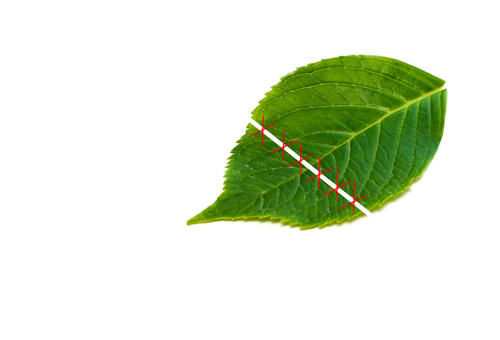 Week 47 Attached by andysheader (Posiview), on Flickr
A faux entry from me, I'm afraid, not easy to try to actually sow the leaf together and although I managed it, it was a rush job because I'm off here with Isabelle.
Cheers all and looking forward to today's theme.
TP52 2015 is almost here as well
Week 47 Attached by andysheader (Posiview), on Flickr- Messages
- 4,088
- Name
- Graham
- Edit My Images
- Yes
actually, I'm a larger man
ipad predictive text quote of the year... (sorry.
)- Messages
- 4,088
- Name
- Graham
- Edit My Images
- Yes
Beautiful idea... but I can;t help but feel that an actually cut and then sown back together one would look more real... you managed to sew a banana... a leaf should be easy!
fantastic rich green there though, and the lighting brings out the texture in the surface really nicely.
fantastic rich green there though, and the lighting brings out the texture in the surface really nicely.
- Messages
- 1,408
- Name
- Elaine
- Edit My Images
- Yes
Ha ha, another very funny one Andy. The actual leaf shot is good with lovely detail to the veins,smashing colour and a nice angle, but the fact there's no shadow under the cut bit does rather give the game away Maybe a threaded needle would have made it a bit more convincing
Maybe a threaded needle would have made it a bit more convincing
OP
- Messages
- 19,461
- Name
- Andy
- Edit My Images
- Yes
Beautiful idea... but I can;t help but feel that an actually cut and then sown back together one would look more real... you managed to sew a banana... a leaf should be easy!
fantastic rich green there though, and the lighting brings out the texture in the surface really nicely.
Ha ha, another very funny one Andy. The actual leaf shot is good with lovely detail to the veins,smashing colour and a nice angle, but the fact there's no shadow under the cut bit does rather give the game away
Completely agree with your crit. More time would enable a better submission, but I've got ironing to do
Cheers.