D
Deleted member 34016
Guest
My Wife and I have just bought a new town centre apartment, very nice not to mention expensive ( Chaucer Court) hence the image names
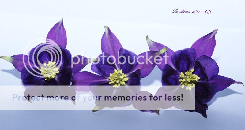
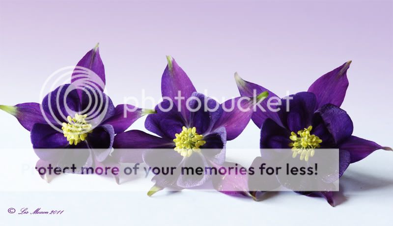
Sold the old house and fancy an easier life- I decide to suprise the Mrs with a print for the new place- she loves Purple and with this in mind I set out looking for a flower that fits the bill & once photographed, could be printed on Canvas
Ive attached 3 images of Purple blooms , which one should I use???? we move at the end of July, so plenty of time
Thanks guys- not really looking for critique on my Photography just suggestions on which would make the better print")
Les
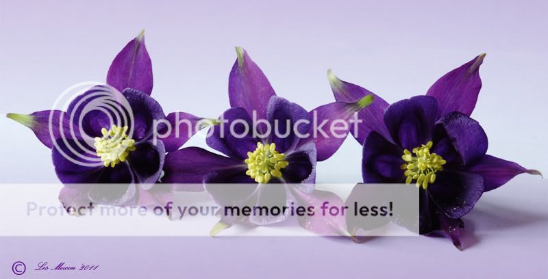
1.
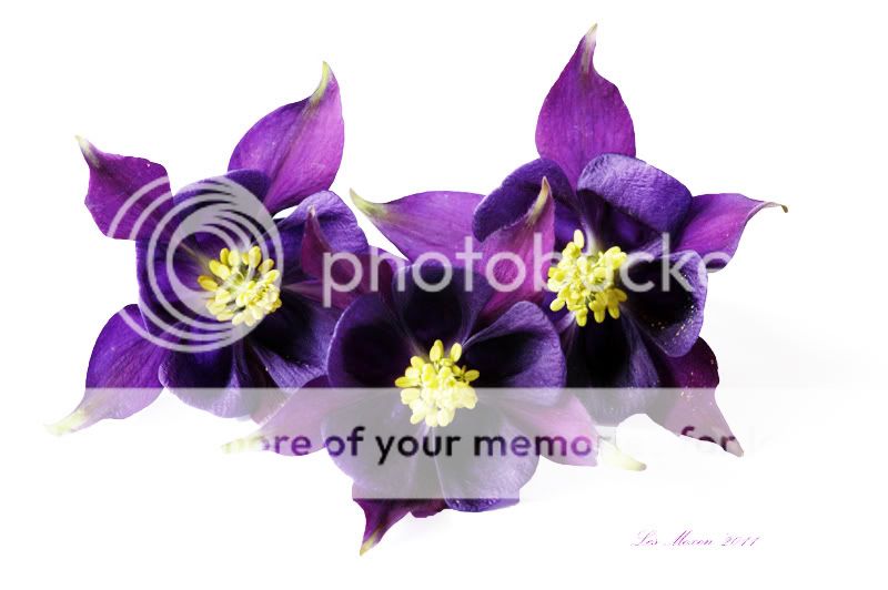
2.with a hint of blue
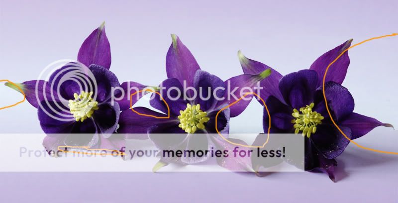
3. with a hint of Purple
Thanks for looking
Sold the old house and fancy an easier life- I decide to suprise the Mrs with a print for the new place- she loves Purple and with this in mind I set out looking for a flower that fits the bill & once photographed, could be printed on Canvas
Ive attached 3 images of Purple blooms , which one should I use???? we move at the end of July, so plenty of time
Thanks guys- not really looking for critique on my Photography just suggestions on which would make the better print
Les
1.
2.with a hint of blue
3. with a hint of Purple
Thanks for looking
Last edited by a moderator: