

- Messages
- 224
- Edit My Images
- Yes
Hey guys - after recovering from the blistering critique I received last time (warning: self-depreciating sarcasm), here are some recent shots I am proud of for one reason or another. I added what was trying to achieve next to each one.
I would appreciate any and all feedback, comments, questions, speculation and rumour.
1. I loved how incredibly blue the ocean was, and how the jetty looked so small in comparison - so I was trying to bring out those two things.
 Jetty by Mr.Dunne, on Flickr
2. The sunset wasn't magnificent, but I really was taken by the romance of two people sitting watching the day slowly die, so I hoped to draw on that feeling
 Couple by Mr.Dunne, on Flickr
3. This bench is literally in the middle of nowhere, looking towards nothing - so I was trying to show how empty the whole expanse is - and how absurd the bench is
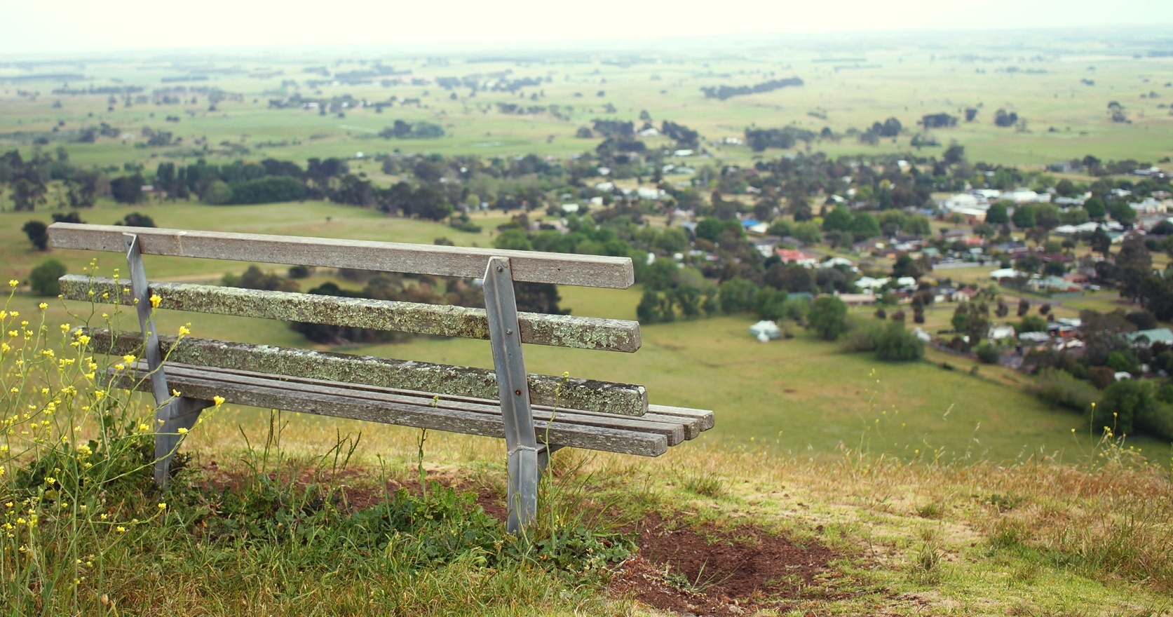 Mt. Rouse by Mr.Dunne, on Flickr
4. When walking alone in a forest I often feel like it streches on forever and my senses get dampened a bit - I was trying to capture that cosy and overwhelming feeling
 Euchalypt Ground by Mr.Dunne, on Flickr
5. With her head down and her hesitancy I hoped to capture the 'slowly, slowly' approach many of us have when we first walk into cold water
 Waiting by Mr.Dunne, on Flickr
I would appreciate any and all feedback, comments, questions, speculation and rumour.
1. I loved how incredibly blue the ocean was, and how the jetty looked so small in comparison - so I was trying to bring out those two things.
Jetty by Mr.Dunne, on Flickr2. The sunset wasn't magnificent, but I really was taken by the romance of two people sitting watching the day slowly die, so I hoped to draw on that feeling
Couple by Mr.Dunne, on Flickr3. This bench is literally in the middle of nowhere, looking towards nothing - so I was trying to show how empty the whole expanse is - and how absurd the bench is
Mt. Rouse by Mr.Dunne, on Flickr4. When walking alone in a forest I often feel like it streches on forever and my senses get dampened a bit - I was trying to capture that cosy and overwhelming feeling
Euchalypt Ground by Mr.Dunne, on Flickr5. With her head down and her hesitancy I hoped to capture the 'slowly, slowly' approach many of us have when we first walk into cold water
Waiting by Mr.Dunne, on Flickr